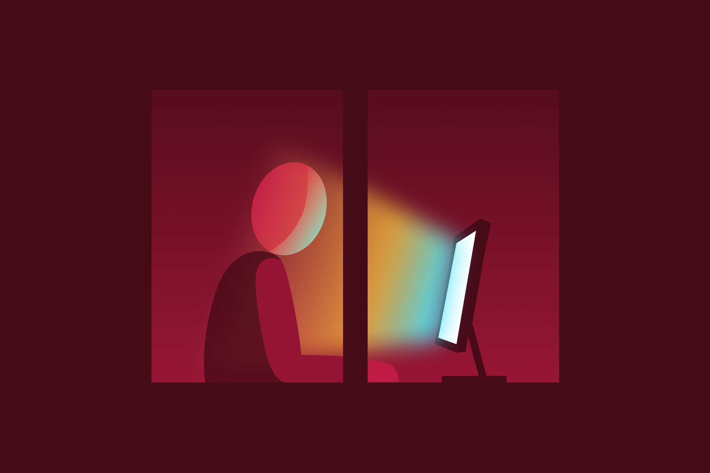
Writing in Sync: Design System Content
Design systems help create a shared language within an organization, but without good documentation, no one will be able to speak that language.
74 Results
Design systems help create a shared language within an organization, but without good documentation, no one will be able to speak that language.
Sparkbox is developing our own Website Carbon Calculator as a hands-on way to explore web sustainability and learn how to reduce digital carbon footprints. We’re asking for your input so we can create the most useful tool possible.
Design systems can be technically complicated, but user-focused challenges are often the sources of the real challenges. The Sparkbox team gathered for a recent UnConference to unpack and solve common issues.
When building an MVP, how do you balance speed and iteration with making sure that the product meets accessibility guidelines? It’s tempting to save accessibility for later, but it’s much easier to avoid mistakes and costly retrofitting by considering accessibility from the very beginning. Dustin shares some strategies for making sure your MVP is built accessibly without slowing down your project.
While utilizing an MVP strategy is an excellent way to approach a product, how you develop that MVP can be just as important. Are you including the most valuable elements to your users? Well, there’s one way to find out…
Sometimes the biggest challenge in an engagement is deciding which problems to solve. With a recent client, we were able to pivot to design and tell their story in a whole new way.
Understanding and implementing the Web Accessibility Content Guidelines (WCAG) can be difficult for even trained experts. Catherine helps us with WCAG 2.2′s newest guideline by explaining the requirements and providing examples of how to improve our user interfaces.
It’s easy to make assumptions about which user interface elements are more or less user-friendly. It’s harder to put in the effort to get to some hard data. But our team did just that when they put three common usability assumptions to the test.
Our team put another common usability assumption to the test: “Read More” links are important indicators that help users click into blog posts and articles to the test. Follow along to learn the results from a first-click test—they might surprise you.
Our team put another common usability assumption to the test: switches for binary selections are worse for usability than radio buttons or checkboxes. Follow along to learn the results from a first-click test—they might surprise you.
Katie Jennings
Vice President of Business Development