
When it comes to binary selection UI elements, our team had quite a few preconceptions about which one was best for usability: switches (also called toggles), radio buttons, or checkboxes.
Our assumptions were colored by age—both our own ages and what we thought older or younger users would prefer. A few of us accused switches of being newfangled interface elements that would confuse older users (perhaps because we are also older these days). Yet radio buttons seemed like outdated interface elements that are rarely used outside of online surveys. And checkboxes? Aren’t those best for UX dark patterns like sneaking a discreet email signup checkbox onto a form? It was time to test our preconceived notions to see if any of them represented actual user behavior.
Putting the Assumption to the Test
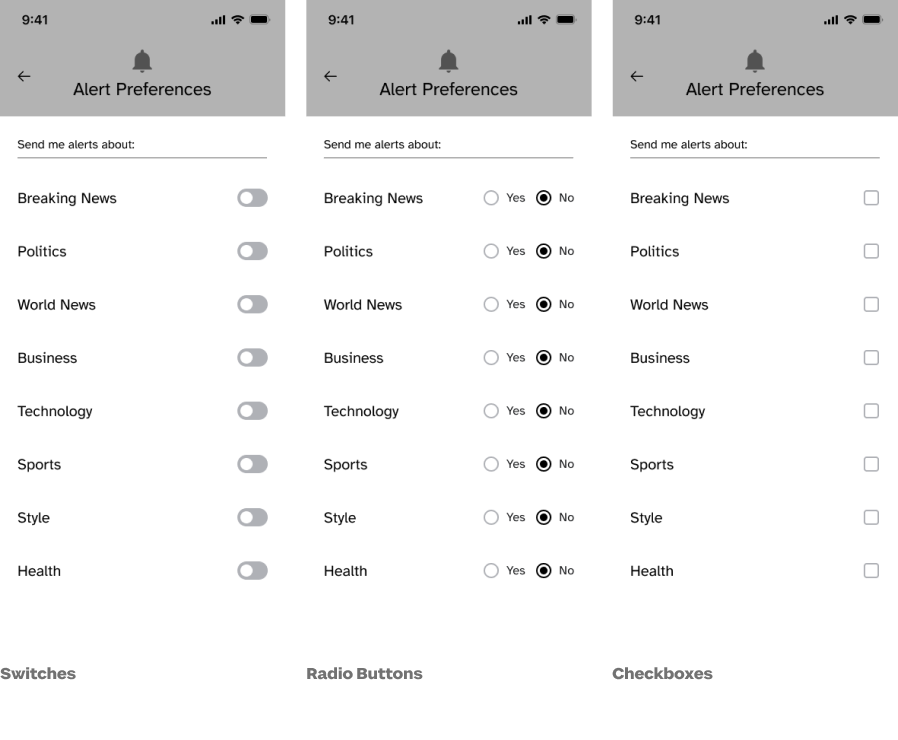
We used UsabilityHub’s unmoderated first-click test with variation sets for our study. Participants were randomly assigned one of three black-and-white mobile-sized designs of a notification settings page. Each screen was the same except for the type of binary selection UI element presented: switches, radio buttons, or checkboxes.
Using the randomly assigned screen, participants were asked to change an alert preference. We captured whether or not they successfully changed an alert, the time it took them to successfully complete the task, and their age. We also captured their screen size because while the design was mobile-sized, our participants were able to take the test on any size screen.
We recruited participants through Sparkbox’s social media accounts, and we also asked friends and family of past and present Sparkboxers to take the study. In addition, we purchased 20 participants from Usability Hub’s participant panel to ensure that we had representation from people aged 18 to 25 and over 55 since our own recruiting efforts were weak in those demographics. As such, our participants were not representative of all web users.
Results
We had 214 study responses representing ages 18 to 74. The result? While our study did not achieve statistical significance, we quickly realized that our assumptions about the user’s age had very little bearing on the seconds it took to accurately operate a switch, radio button, or checkbox.
| Switches | Radio Buttons | Checkboxes | |
|---|---|---|---|
| Successful Clicks | 94.4% | 93.0% | 91.5% |
| Median Time to Successful Click | 7.5 seconds | 8.9 seconds | 6.6 seconds |
| Total Responses | 72 | 71 | 71 |
Because the results were very similar, and we did not achieve statistical significance, it is too close to call a true winner. However, our participants were able to successfully operate a switch more often than a radio button or a checkbox, and they were able to flip the switch more quickly than they were able to operate radio buttons. While our participants operated the checkbox the fastest, the checkbox had the lowest success rate of the three UI elements.
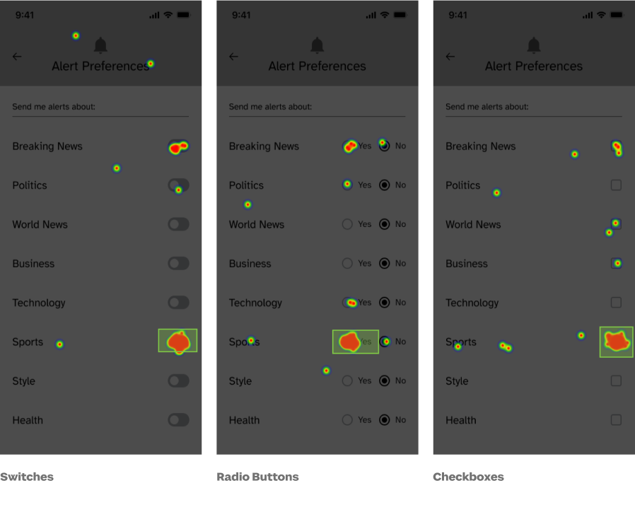
Interestingly, radio buttons posed the only instances of “you’re using it wrong.” Three percent of our participants frustratingly clicked the “wrong” side of the radio button to deselect it. If this weren’t a click test, it would likely be an easily recoverable error. But it did lend a hint of truth to our assumption that radio buttons were an old-fashioned, and possibly out of favor, interface element.
Verdict: False. Switches are easy to use and are no harder or easier to use than radio buttons or checkboxes.
Switches, radio buttons, and checkboxes were all similarly effective when it came to success rate and efficiency metrics for young and old participants alike. The “newness” of the switch interface element shouldn’t stop anyone from using it in a design.
Our take? The usability of the overall design of an interface with either switches, radio buttons, or checkboxes matters more than the choice of UI element.
Thank you to the following Sparkboxers for their assistance with planning, design, analysis, and editing: Angelica Weimer, Catherine Meade, Erin Blad, John Buedel, Kasey Bonifacio, Leah Henderson, Louisa Barrett, Mandy Kendall, Natalie Lestini, Noelle Lansford, Osmond Arnesto, and Philip Zastrow.
Get A Free Guide to Becoming User-Centered
Investing in user experience is a solid and proven return on investment. Fill out this form and start evaluating your organization’s UX Needs, earning buy-in from stakeholders, and hiring help!
