
Imagine you’re creating a design that lists articles and their descriptions on a website—maybe it’s news on a homepage or a list of blog posts. Each listing has an image for the article, the article’s title, a short description, and a “Read More” link. You recall hearing that generic links like “Read More” can be annoying for screen readers if implemented poorly. Since you’re planning to link the headline and the image anyway, can’t you just skip adding a “Read More” link to the design?
Now imagine you’re at a design review meeting and one of your coworkers suggests adding “Read More” links so people know where to click. They share their rationale: “Some people don’t realize they can click on images or headlines.” Another coworker says the whole image, headline, and blurb lockup should be a single link with a hover state indicator, so it doesn’t matter. What should you do?
If you’re overthinking “Read More” links, we’re here to help. We asked 74 participants to pick an article to read from a list and tracked where they clicked to put this debate to rest.
Putting the Assumption to the Test
For our usability study, we used UsabilityHub’s unmoderated first-click test. We received 76 total responses. We recruited 56 of the participants from Sparkbox’s social media accounts and from friends and family of past and present Sparkboxers. We also purchased 20 participants from Usability Hub’s participant panel to capture more responses from people ages 18 to 25 and over age 55. Our participants were not representative of all web users and were able to take the test on any size screen: phone, tablet, or desktop.
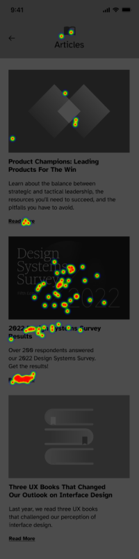
We presented each participant with a black-and-white mobile design of a list of articles and asked them to pick one to read. We used a black-and-white mobile design that showed a list of three articles to test where people clicked. Each article consists of an image, a title, a short description, and a “Read More” link.

Results
We found that 71% of participants clicked the image or the article title to read the article, while only 28% clicked on the “Read More” link. No one clicked on the blurb. Two participants did not click on any article and were disregarded from the results.
38 clicked the image (51%)
15 clicked the title (20%)
21 clicked the link (28%)
0 clicked the description (0%)
Verdict: True. Some people click “Read More” links, but more people clicked the article’s title or image instead.
While our study was not statistically significant, we learned that you should always link images in designs like these. Whether you have a “Read More” link or not, an image is a compelling click target—and so is the article title.
In our example above, the imaginary coworker who suggested linking the entire article likely had the most screen reader-friendly solution. If you choose to link each individual element instead, you should use Aria labels to improve the user experience for people using assistive technology. Use Aria labels to meaningfully describe each “Read More” link and, use Aria-hidden to hide redundant text when you link an image.
Our take? Make the entire article “card” clickable with noticeable hover states and forget about adding “Read More” links to designs.
Thank you to the following Sparkboxers for their assistance with planning, design, analysis, and editing: Angelica Weimer, Catherine Meade, Erin Blad, John Buedel, Kasey Bonifacio, Leah Henderson, Louisa Barrett, Mandy Kendall, Natalie Lestini, Noelle Lansford, Osmond Arnesto, and Philip Zastrow.
Get A Free Guide to Becoming User-Centered
Investing in user experience is a solid and proven return on investment. Fill out this form and start evaluating your organization’s UX Needs, earning buy-in from stakeholders, and hiring help!
