
Let’s take a look at those ubiquitous buttons at the bottom of the form: cancel and submit. We thought it would be more efficient for right-handed people to click buttons that are on the right side of their screen because that’s the hand that controls the mouse or touches the screen. Given you’re designing with a left-to-right written language and more people are right-handed than left-handed, you should default to placing action-oriented buttons on the right side of the screen.
This belief was widespread on our team. One of us swore they saw it presented by a famous UX person at a conference a long time ago (they couldn’t find their presentation notes), and another thought that Material Design makes you right-align buttons because it’s more usable (reading through their current documentation, it does seem like they have a tendency to right align, but it doesn’t seem like a hard rule). It was time for a usability test.
Putting the Assumption to the Test
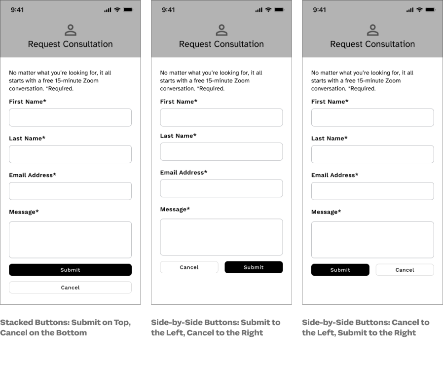
We used UsabilityHub’s unmoderated first-click test with variation sets. Each participant was randomly assigned one of three black-and-white mobile-sized designs of a contact form with submit and cancel buttons at the bottom of the form. Each design represented a different button layout:
Participants were asked to exit the screen without filling out the form. From this, we collected two data points: success or failure and time to click in milliseconds (we rounded to seconds). We also asked whether the participant was right-handed, left-handed, or ambidextrous.
Our participants were recruited via Sparkbox’s social media accounts, friends, and family of past and present Sparkboxers, and we also purchased 20 participants from Usability Hub’s participant panel to beef up our numbers in the 18 to 25 and over 55 age groups. We received 142 total responses. Our participants were not representative of all web users and were able to take the test on any size screen: phone, tablet, or desktop.
Results
While our findings were not statistically significant, they were remarkably consistent across the three layouts we tested. No single design overperformed or underperformed, even when filtered by right-handedness and device screen size.
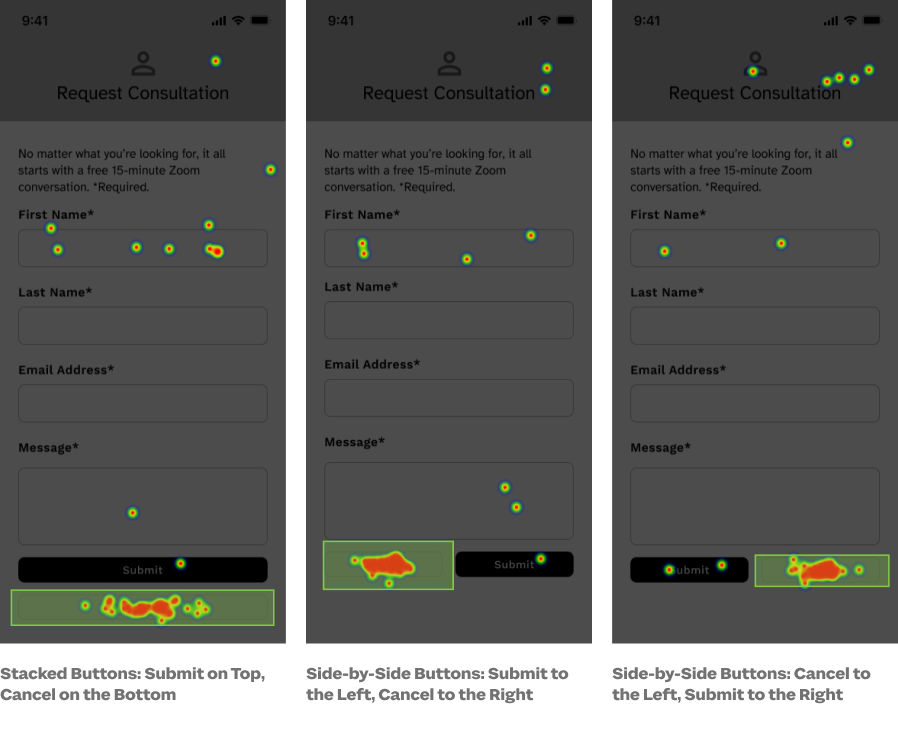
| Stacked Buttons: Submit on Top, Cancel on the Bottom | Side-by-Side Buttons: Submit to the Left, Cancel to the Right | Side-by-Side Buttons: Cancel to the Left, Submit to the Right | |
|---|---|---|---|
| Successful Clicks | 75.0% | 78.2% | 81.3% |
| Median Time to Successful Click | 6 seconds | 7 seconds | 7 seconds |
| Right-Handed Participants | 62.5% | 63.0% | 64.6% |
| Right-Handed Median Time to Successful Click | 7 seconds | 7 seconds | 7 seconds |
| Total Responses | 48 | 46 | 48 |
| Clicked "Submit" Instead of "Cancel" | 1 | 2 | 1 |
Verdict: False. Right Aligning Buttons for Efficiency is Not Supported by Evidence.
All three button layouts performed roughly equally, and none of the layouts had usability advantages or disadvantages. We didn’t see strong evidence to support right-hander click efficiency or success rate on any of the layouts, though we did not run a study large enough to achieve statistical significance.
Our take? How buttons are designed and implemented matters more than a general rule of thumb about alignment.
Thank you to the following Sparkboxers for their assistance with planning, design, analysis, and editing: Angelica Weimer, Catherine Meade, Erin Blad, John Buedel, Kasey Bonifacio, Leah Henderson, Louisa Barrett, Mandy Kendall, Natalie Lestini, Noelle Lansford, Osmond Arnesto, and Philip Zastrow.
Get A Free Guide to Becoming User-Centered
Investing in user experience is a solid and proven return on investment. Fill out this form and start evaluating your organization’s UX Needs, earning buy-in from stakeholders, and hiring help!
