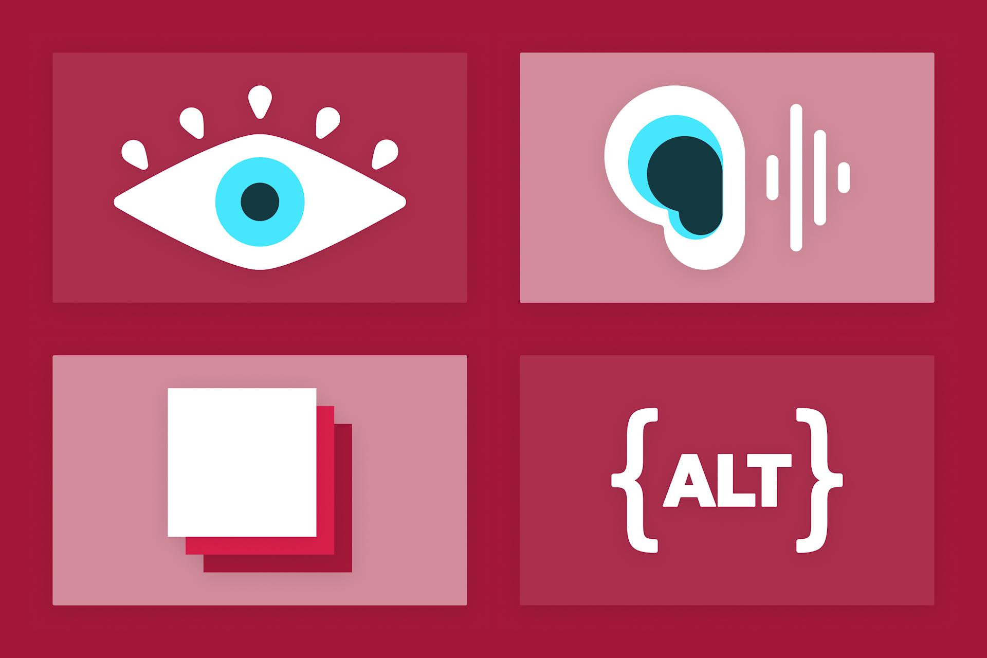
Understanding and implementing the Web Accessibility Content Guidelines (WCAG) can be difficult for even trained experts. Catherine helps us with WCAG 2.2′s newest guideline by explaining the requirements and providing examples of how to improve our user interfaces.
Last October, the W3C released a new minor version of the Web Accessibility Content Guidelines (WCAG). With this update, WCAG 2.2 now includes a new guideline regarding “Dragging Movements.” The guideline is short, but somewhat confusing:
WCAG Success Criterion 2.5.7 Dragging Movements - Level AA
All functionality that uses a dragging movement for operation can be achieved by a single pointer without dragging, unless dragging is essential or the functionality is determined by the user agent and not modified by the author.
The guideline also clarifies that it does not apply to assistive technology interfaces. But what does this mean? On what devices do we need to provide alternatives? What even is a dragging movement? (Answers in the next section!)
Initially I thought I knew everything about what a dragging movement was, but I was wrong! Ah, the web engineer’s folly of thinking we can know all about the internet. I recently watched a talk at Deque’s Axe-Con about how the new WCAG 2.2 applies to native mobile applications, which encouraged me to think more about how mobile users interact with dragging movements. One thing I wished they’d had time for in the talk was to show a few remedy options for common dragging patterns. As a result, I was inspired to write about a few ways real users interact with dragging controls, and how we as web creators might offer more accessible alternatives.
What is a Dragging Movement?
The W3C defines a “dragging movement” as an interaction that follows the following pattern:
The user must tap or click to establish a starting point
The user must then press and hold that contact
The user continues to hold contact while performing a repositioning of the pointer
The user then releases the pointer at an ending point
Some users will be unable to both hold down a pointer (often a mouse or finger gesture) while also moving the pointer to a new location on the page. For this reason, we must offer alternative input methods that do not require the user to “hold and drag” a UI element.
There are some minor exceptions to the Dragging Movement guideline indicated. First, a keyboard alternative, while necessary, does not always meet the requirements of this guideline, as mobile users often do not have access to a keyboard. Additionally, this guideline does not apply to scrolling gestures or anything created by a CSS overflow.
In many interfaces, it may be acceptable to eliminate the draggable UI element entirely and opt only for a different set of input controls. However, offering multiple interaction options can make web pages more usable for individuals with different preferences or abilities.
How Do Real Users Interact with Dragging Controls?
We see dragging movements on many types of web applications. Here are a few common examples of web controls that require a user to drag an element, and how we might provide an alternative way to interact with those controls.
The Reorder List
In the talk I mentioned above, the speakers gave an example from Spotify. In the Spotify app, users are able to reorder songs in a playlist by dragging them to the position they prefer.
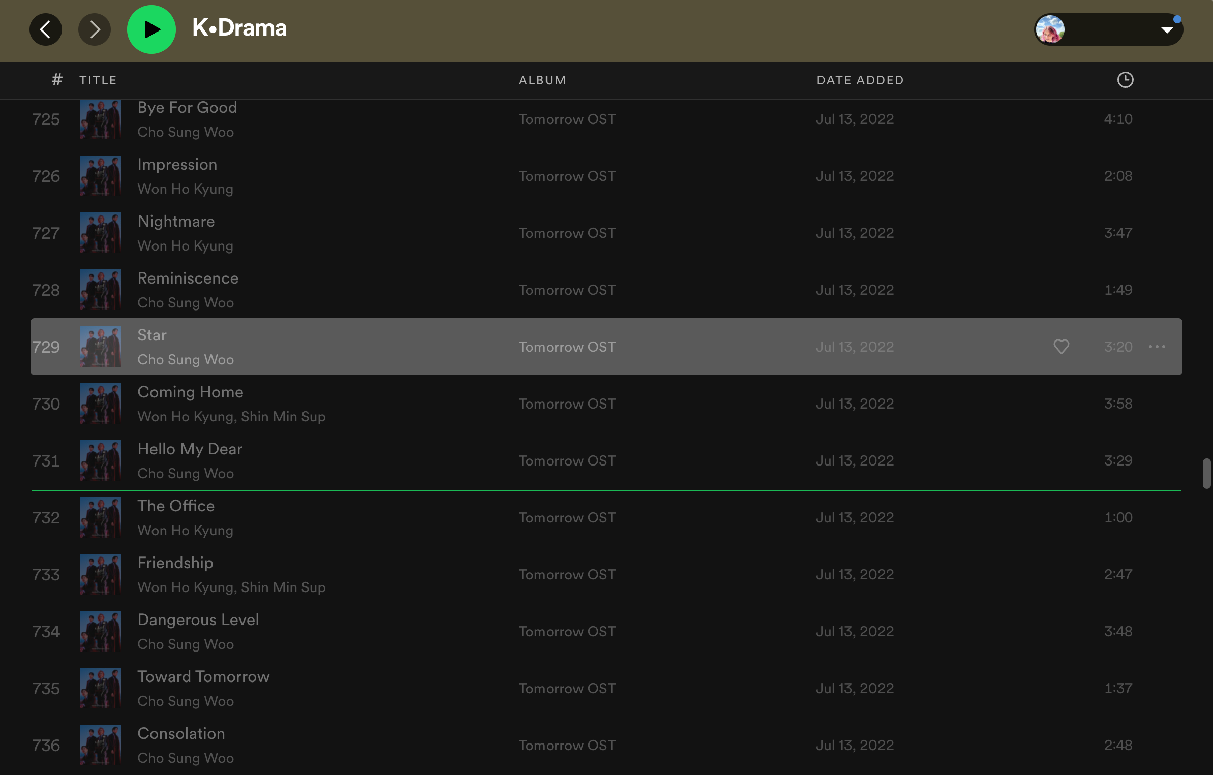
In this screenshot, I’ve “picked up” the song Star on my K-Drama playlist, which has been highlighted in gray in the interface. While I’m “holding” the selected song, a green line appears to show me where I am currently pointing to “drop” the song in the new order.
Reordering items in a list is one of the most popular applications of a drag-and-drop interface. Many applications, such as ToDo lists, email inboxes, and file organizers allow users to manually reorder items this way. One way to immediately improve this type of interface for people with cognitive disabilities is to add a clear indicator that the items are draggable. This is often done with a sort of “handle” icon, though that icon is hardly universal and can range from arrows to something like a “hamburger” icon and more. On-screen instructions are typically a good indicator, as well. Steam’s wishlist offers this type of reorder list icon:

A number of years ago I worked on a similar feature in our work with The Described and Captioned Media Program (DCMP). DCMP’s main audience is made up of members of the disabled community, and as such, accessibility is one area their web applications must excel in. We were implementing a “Clips and Quizzes” UI which allowed teachers to create classwork for their students. This included reordering videos in a playlist.
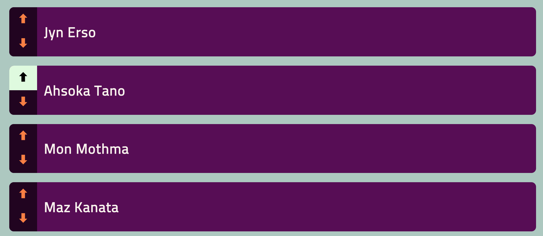
While we implemented keyboard accessibility on DCMP using the Dragon Drop accessible reorder library (which is great, by the way), we still needed another input method for reordering items. Our designers created a button layout, which I’ve prototyped here on Codepen, sans dragging movements. Each item has the ability to be moved up or down in the list by clicking on the appropriate buttons. (Forgive any accessibility mistakes in that pen, it’s an outdated prototype, but hopefully you get the point.)
Another possible solution to a reorder control is to include text inputs with each item in a numbered list. Then users would have the option to type in exactly the number in the order that they wanted. The Steam interface I showed above has this functionality available, as it is great for managing long lists that change over time, like a video game wishlist. If I click on the number “1,” I can type in the new position I wanted the game to be, e.g., “12.” Then the interface moves the game to the new place in the list. This is a clunkier interaction than a drag-and-drop or even buttons; however, it is much more broadly accessible as text inputs naturally work with many assistive technologies.

The Card Sort
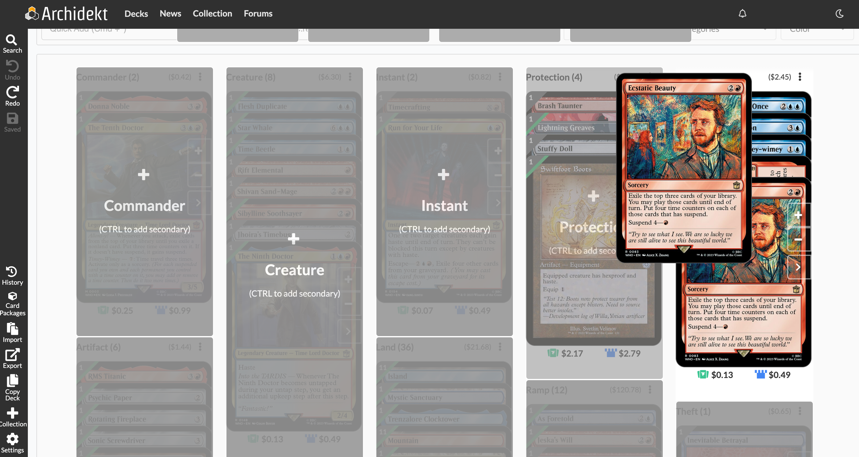
A popular Magic: the Gathering (MtG) deck management tool, Archidekt, takes “card” sort quite literally. Here is the user interface for a Donna Noble & The Tenth Doctor Commander deck, a type of play format of the card game Magic.
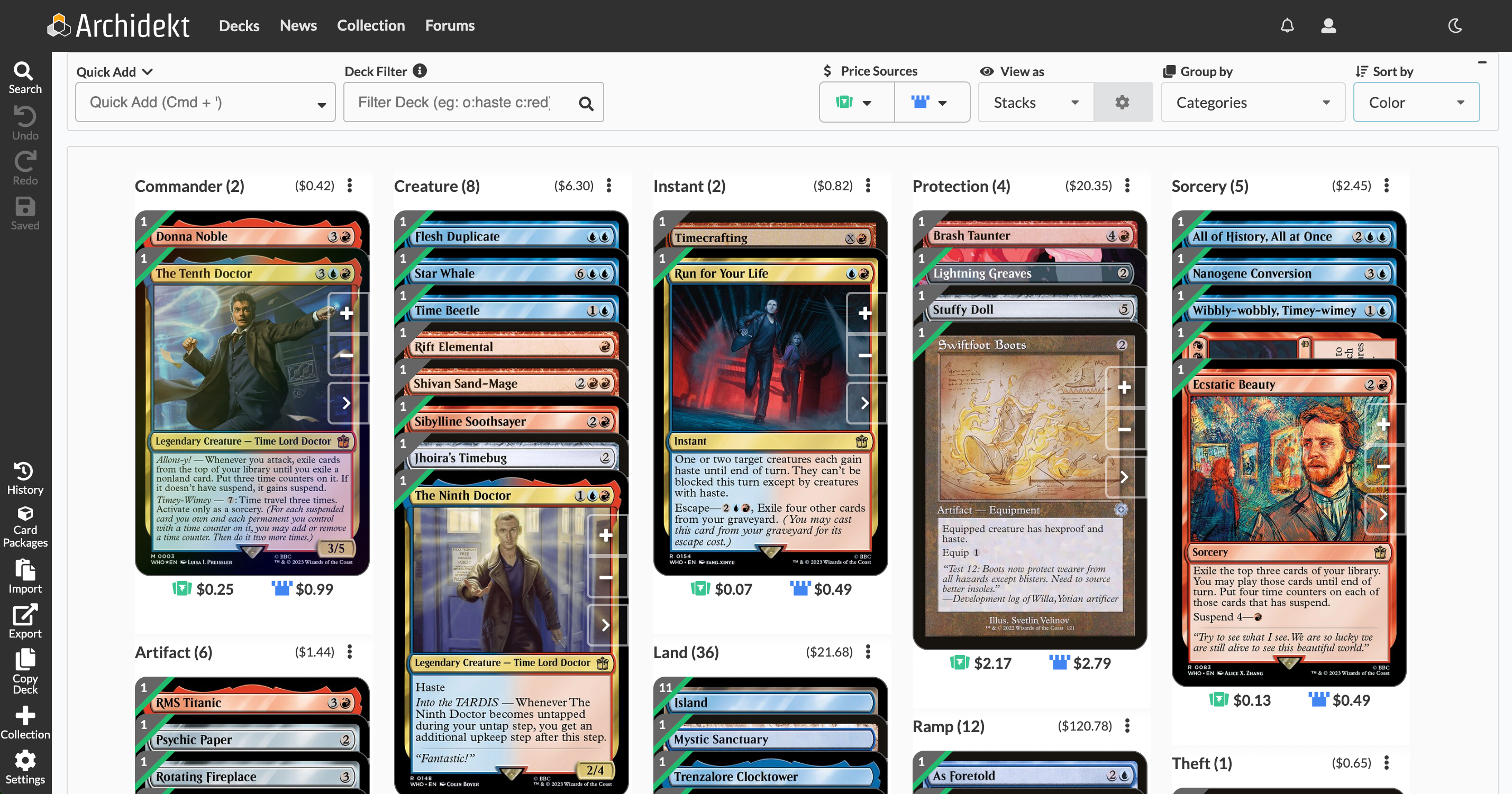
Each MtG card on Archidekt is an interactive UI item that can be “picked up” and dragged to any other category for manual sorting.
If you’re not a big nerd like me, you may be familiar with similar functionality in many project management applications, such as Jira or Trello. Or perhaps you’ve played Microsoft Solitaire on a Windows computer.
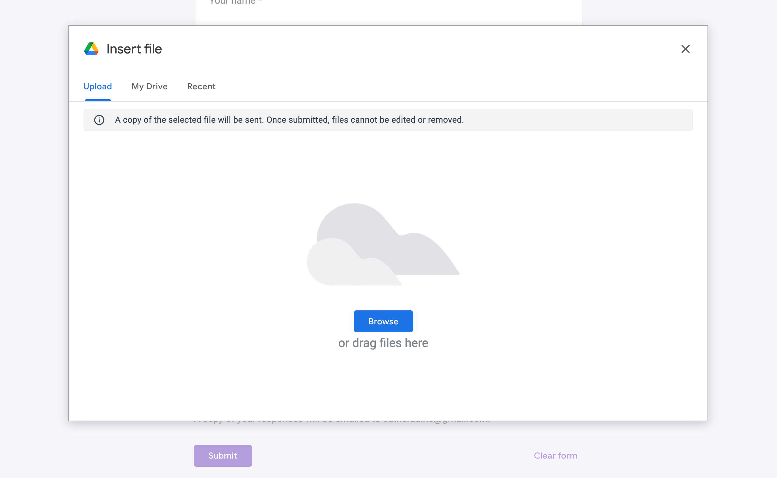
This UI pattern, of dragging and dropping a card from one section of a page to another, is similar to a much more common web pattern: the file uploader. A file uploader will almost always allow you to drag a file directly from your desktop or local directory onto the webpage field. We also already know the alternative input method that works best for a file uploader: the “browse…” button, a.k.a. <input type=”file”>. A file uploader typically lets you upload files by selecting a button to trigger a file browser modal, where you can use the keyboard and typed search to navigate to your chosen file.
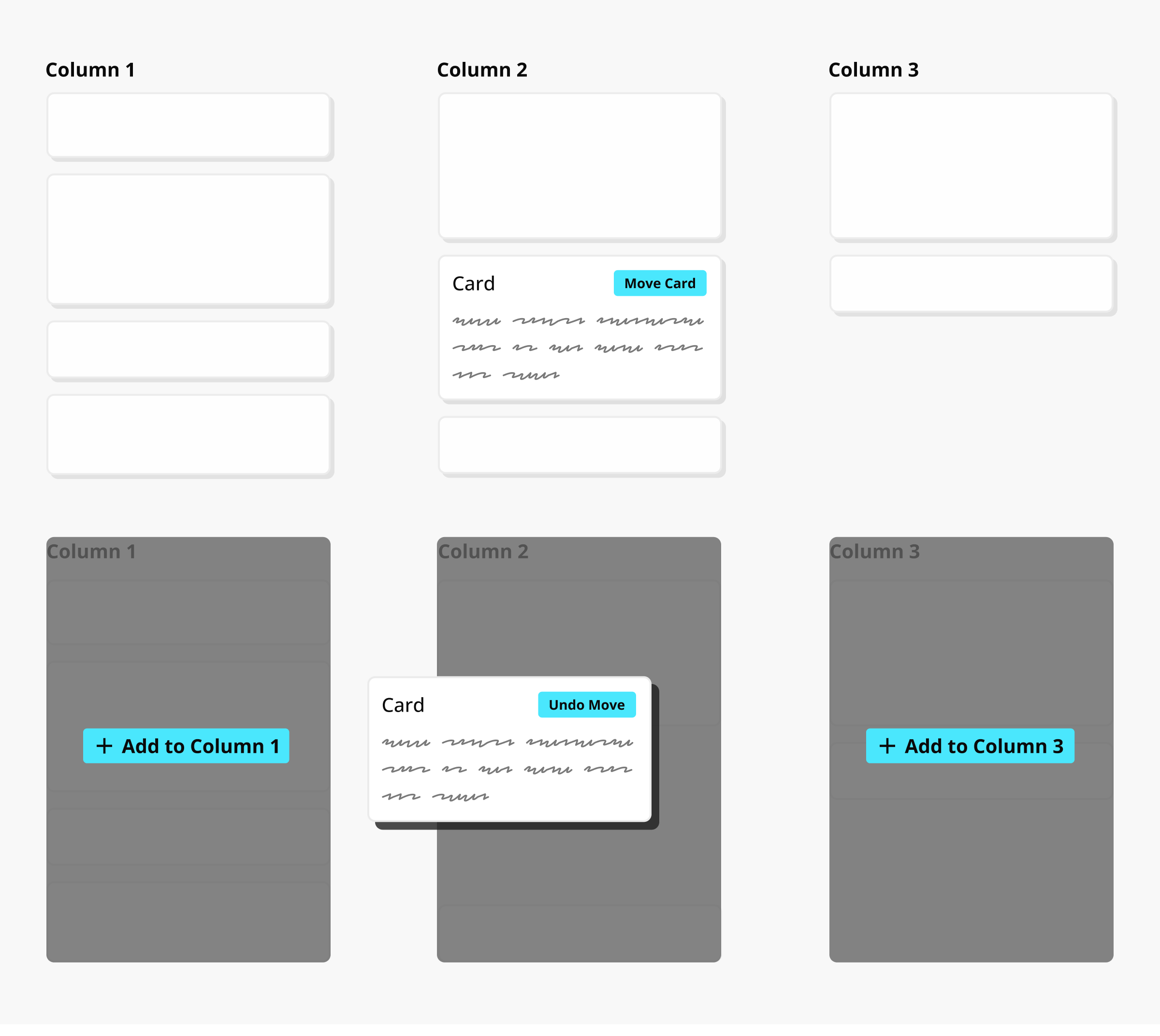
If a “browse” interface doesn’t make sense for your application, there are other options. A card sort function is really about moving one element to a category area, or “bucket.” Unlike a list reorder, that “bucket” typically already exists on the page someplace as a large selectable area. On Archidekt that may be gray boxes labeled “Creature” or “Protection,” while on Jira they may be columns like “In Progress’’ and “Done.” This type of reorganization can be accomplished by adding a “move” button to the card itself. Selecting the “move” button once would enter the same selected state as “picking up” a card, and then selecting the appropriate category bucket would move the card from one category to another, just like “dropping” it. This UI pattern still requires button selection and pointer movement, but the user is no longer required to do both at the same time.
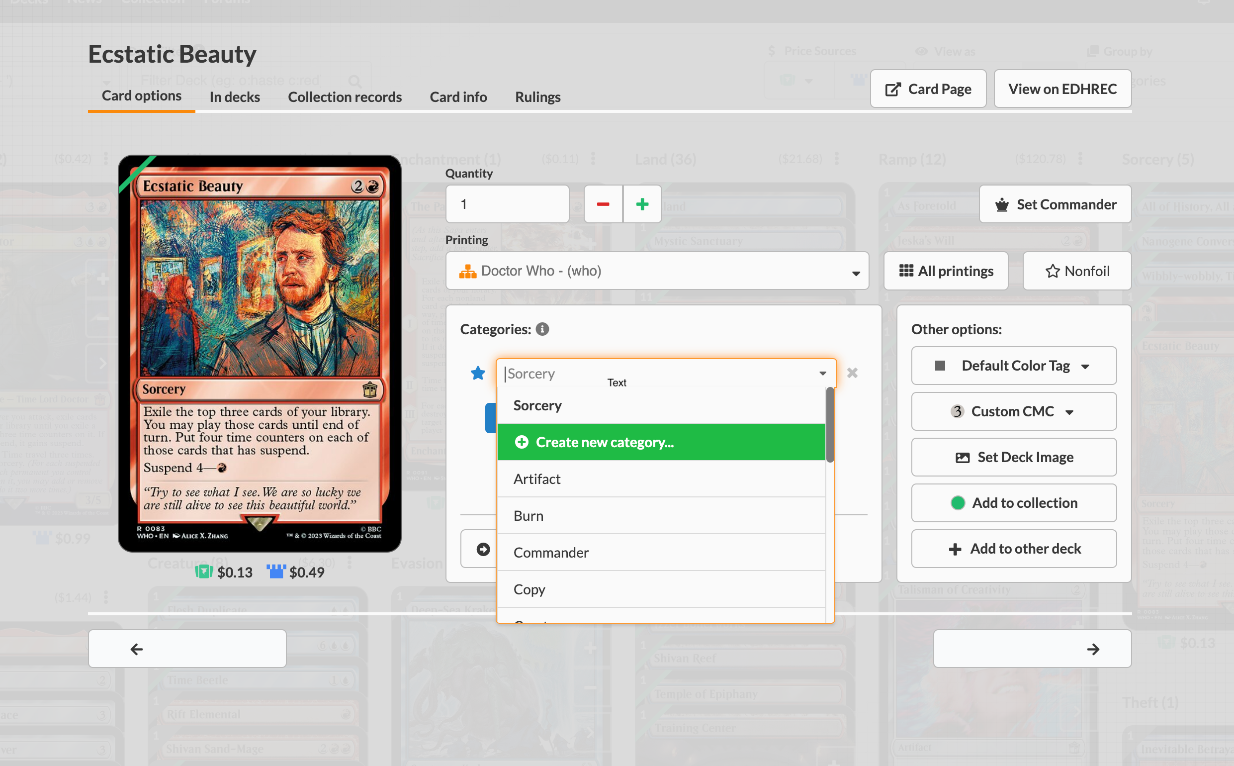
Archidekt already provides alternate categorization functionality. If you select the card’s arrow icon button (or double click the card) to open a detailed card view modal, you can then choose a category from a select input.
Jira offers similar functionality in its detailed card view, as well.
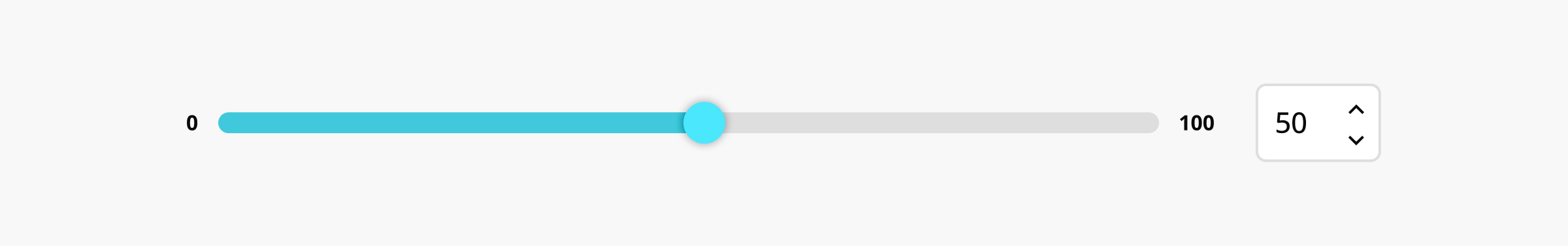
The Slider
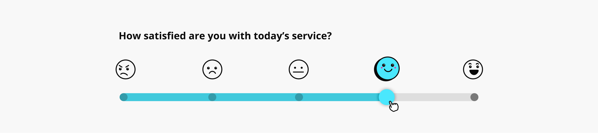
My last example of dragging movements is the slider, or range selector. This element is most often an HTML range input, e.g., <input type=“range”>. While you often see them as volume or brightness controls or used in forms to select a value in a range of numbers, Instagram’s Stories feature includes this adorable slider functionality to answer a quick poll.

In this example, I’ve posted a picture of my calico cat on my Story, along with a poll sticker asking the question, “How cute is Kismet?” Users can respond by dragging a “heart eyes” emoji (😍) from the start of the slider (not cute) to the end of the slider (super cute!).
On a touch device, a slider typically counts as a “swipe gesture,” and is therefore exempt from WCAG 2.2 2.5.7. However, on a computer with a mouse pointer, a range input definitely meets the four steps I outlined at the beginning of this article, with a click-drag-release pattern.
Sliders are complex elements in an interface, so this is one area I may recommend you reevaluate whether a slider is truly the best input option. When using the native <input> element, a default alternative is built in. A user can click or tap on the track to immediately move the “thumb” selector to that position. However, this still causes accessibility concerns, as precision amounts are difficult to achieve. In most cases, especially with dollar amounts, a text input is a better choice. A popular food ordering app uses a slider for selecting a tip amount. The slider moves at uneven intervals, depending on the speed of the swiping/dragging gesture. I personally find this a frustrating experience when trying to select a specific tip amount, even if the slider element looks cool.
When a slider is necessary, like I mentioned under “The Reorder List,” both buttons and text inputs provide quality alternatives. A single text input can be placed over the slider “value” entry, allowing the user to simply type in the desired numerical value.
For values other than numbers, such as emoji, satisfaction, or any other vague range, adding buttons may be a more usable choice. Just be careful to ensure that the interval of progression doesn’t also frustrate the user, e.g. moving through a range of 1-100 by 0.5 on every button click.
Web Accessibility Requires Compromise
These are just a few of the common web interface patterns that include dragging movements. Many more elements exist, including other, less common types of organization/sorting features, many types of sliders, like carousels, as well as some touch-screen gestures translated for the web, such as the “swipe right/left” features of dating apps. It would be an impossible feat to list all dragging movements in this one article.
Hopefully these examples give you the inspiration to increase accessibility in your own web interfaces. While accessibility guidelines do sometimes enforce strict design and development constraints, they aren’t always all-or-nothing. As with everything we build on the web, we must compromise between usability, aesthetics, and scope. Remember, accessibility accommodations often increase usability for everyone.