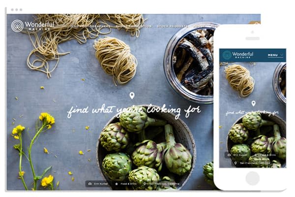
We have the chance to work with amazing clients on dream projects, and we were fortunate enough to add Wonderful Machine’s newly launched site to that list. While guiding the redesign through content strategy, design, and development of the frontend and backend, we were able to collaborate with the Wonderful Machine team closely—building up each other’s teams and ideas to create big results.
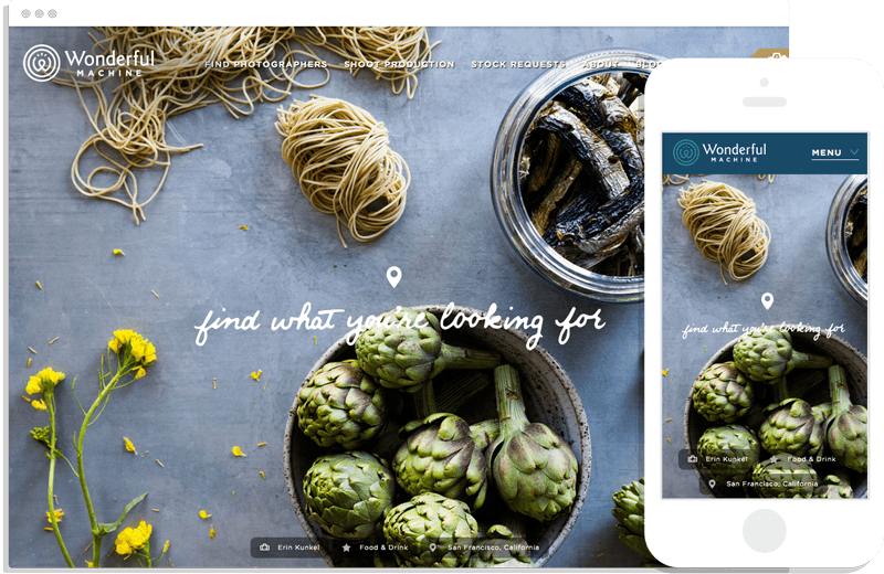
Balancing Audience Needs
Wonderful Machine is a production company with a network of more than 700 highly curated commercial photographers worldwide. Not only do they provide comprehensive shoot production services for clients like Target and American Express, they also make their network of photographers available to smaller clients through a specialized search.
While the Wonderful Machine team was doing a great job meeting both client and member photographer needs, their former website wasn’t carrying its share of the load. Balancing the needs of these very different audiences is tricky. We were able to simplify the site for all users by letting the primary site content focus on clients, and we sectioned off photographer information into a separate portal.
A Search That Serves Everyone
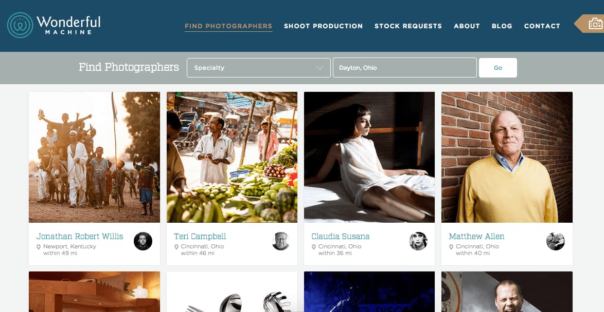
The two key things clients are most often looking for when searching to hire a photographer are:
Where the photographer is located.
What kind of photography the person specializes in.
The photographer search had to be intuitive for potential clients, but it also needed to promote their member photographers around the world in a fair and balanced way. The largest challenge to this balanced promotional requirement was what to do when someone searched for a location—especially in a dense location like Los Angeles.
If you search for LA, you’ll find just over 30 photographers within 50 miles. Listing everyone by proximity from the central point of the city would mean that the same photographers would always appear in the same order, giving someone who lived 0.2 miles away from that point a lot more exposure than someone who was 13 miles away. However, as a client, if you’re looking for the right person, you aren’t going to care that he or she is just a little further away from central LA.
We wound up balancing the needs to be intuitive for clients and also fair for photographers by allowing just enough randomization for people close to the location searched. The information is now clear for the searcher and fair for the photographers.
No Templates Without Real Data
A lot of our projects fall into one of two categories. In one, we design and develop static templates, which we hand over to our clients to internally integrate them into their content management systems. And in the other, we design and develop templates, which we integrate ourselves into a new, customized CMS. We had been treating these two types of projects much the same way. Something we no longer want to do.
In the past, we found ourselves refining static templates only to refine them all over again once they were in a CMS and populated with real content. We would even spend time designing and developing some modules that, when faced with real content, ended up being unnecessary altogether. We set out to make that process better with Wonderful Machine—the very first time the client saw a template, it was already hooked up to the CMS, ready for production content.
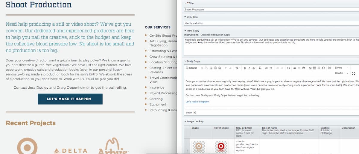
What we thought would mean time better spent on the right things actually turned out to be even more powerful than that. We did just enough content planning and static design and then quickly moved to actual webpages that were driven by the CMS. We intentionally delivered the one template—a detail page—that would serve the majority of the site content first. By giving them very early access to the CMS, Wonderful Machine was able to start developing pages right away.
All too often, we tell clients to get writing immediately on a project. However, we don’t give them the ultimate content tools until we’ve basically finished our work.
The reality is that people often feel stifled and confused trying to write outside the final environment for their content, so content gets written in a mad rush at the end. The content is then not as good as it could be, and you often find new styles that need created to fit the real content at the very end. It’s far from ideal.
With the approach we took with Wonderful Machine, we kept our designs confined to basic page styles and gave the client early access. Then, we saw where common themes emerged in the actual content and made the unique styles at that point. We avoided over producing unique styles that they wouldn’t need and also discovered true unique style needs early.
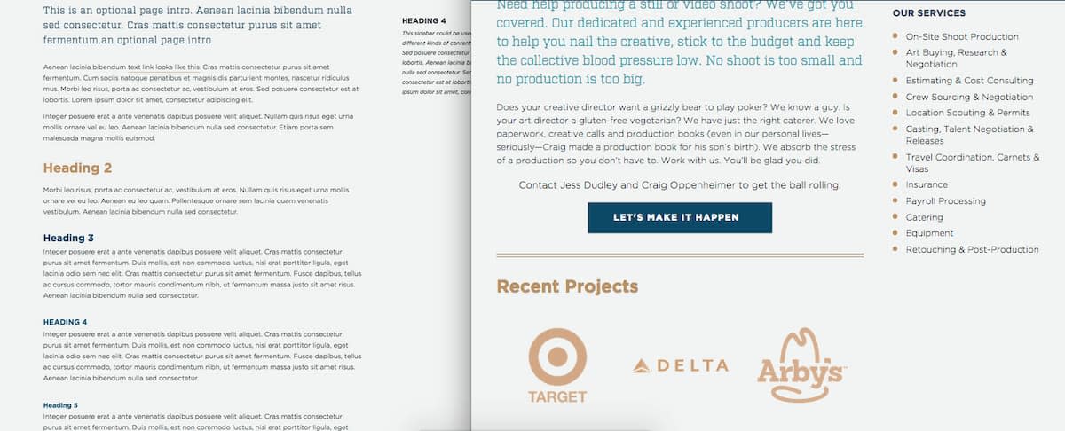
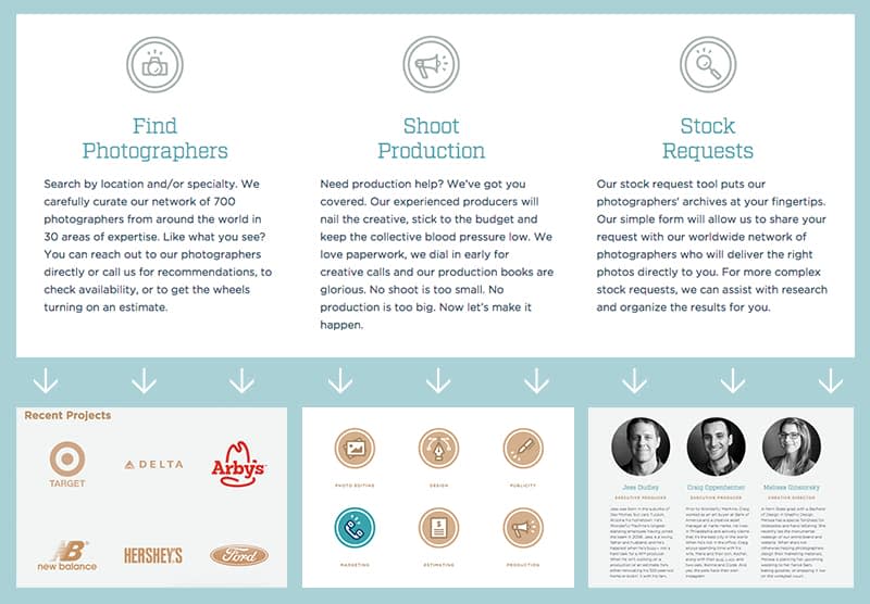
Letting our client have control over the site right away meant they were invested in everything they saw, and they were required to make progress in order to see the site come together. It also allowed us to make progress on all fronts at the same time, in a true collaborative way.
We did just enough content and design planning to get ourselves in the browser, and then we were able to make smart choices about everything together in the final place the user would consume content. Of course, having a very dedicated client was a huge factor in making this work. If Wonderful Machine hadn’t stepped up to consistently add quality content early and often, this wouldn’t have gone nearly as smoothly.
Getting Builds on CircleCI and Deploying to Our Hosting Environment
We brought CircleCI into the game and moved building dependencies away from the hosting provider. Doing this allowed us to use the build tools that were best for the project without being locked into a certain hosting solution.
Using CircleCI’s containers, we could require any developer dependency that we needed. This allowed us to build our static assets (through our build process) and zip them up as an archive on CircleCI. We then used a deployment manager (like Mina), curled (downloaded) the CircleCI asset, and unzipped the build on our production server directly.
This meant our production servers no longer needed our development dependencies, only CircleCI did—and it does a great job in supporting them. This also gave a record archive of each build, and we could do fast rollbacks to previous builds using the deployment manager. (Look for a more detailed post on this process later.)
Weekly Design Pairing
Wonderful Machine came to us based on past design work, and they were looking for a smart, new design to go with amazing new branding they had done internally. We knew the design had to stand up to and honor super high-quality photography, so we had to get it right. Jeremy and Patrick consistently met at least once a week so that Jeremy could provide design feedback and refinements frequently. Pairing regularly allowed us to refine as we developed, working through sticking points as content responded to browser widths, and making iterative improvements to the overall site experience.
We also were lucky to work with Wonderful Machine’s Creative Director—and creator of the new brand—Melissa, as our key contact at Wonderful Machine. This meant we got great design refinement feedback from the client frequently too.
Great Collaboration. Big Results.
We’re so pleased with how well this redesign project went, the partnership we formed with Wonderful Machine, and the response they’ve seen from clients and photographers. Before the relaunch, Wonderful Machine was receiving roughly 20 new member requests from photographers. Just two weeks after the relaunch, Wonderful Machine received almost that same amount in a single day!
The level of talent, dedication, determination, and openness Wonderful Machine brought to the process was key to making something powerful for their users and their company. Check out Wonderful Machine the next time you need some top-notch photography—or the next time you need a lovely site fix.
