How we partnered with KUB on a modern site design and robust design system its team can easily maintain and leverage to create new features more quickly and consistently.
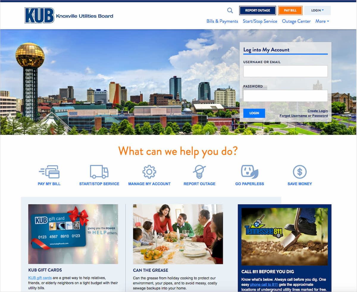
One of the main goals for the KUB website redesign was to produce a design system that the KUB team could maintain and use moving forward. Before we built the library, we were tasked with creating a visual design and experience that was friendly, clean, and easy to navigate.
The Design Challenges
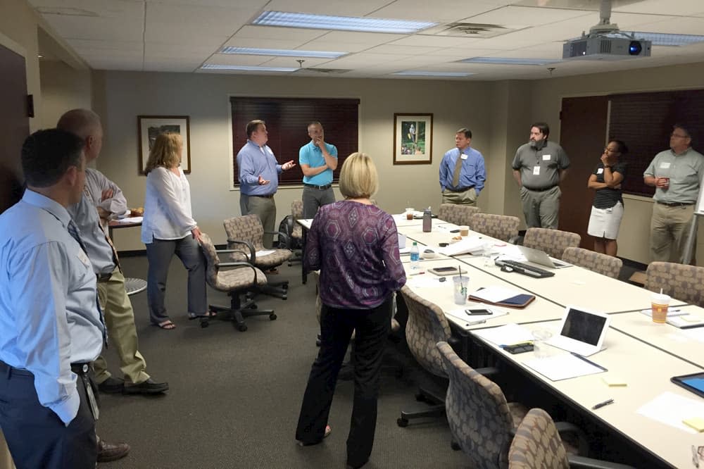
A large team of stakeholders means that getting everyone on the same page is vitally important to an engagement. We did this by holding a two-day kickoff meeting and talking about design at this earliest stage, making sure we were confident of the internal expectations on design.
We also worked to debunk the expectation that the KUB team would be shown multiple design concepts at multiple screen widths. While we completed a good number of static explorations, we explained that our process is iterative and that we strive to get into browser as quickly as possible in order to not spend hours and hours polishing static comps.
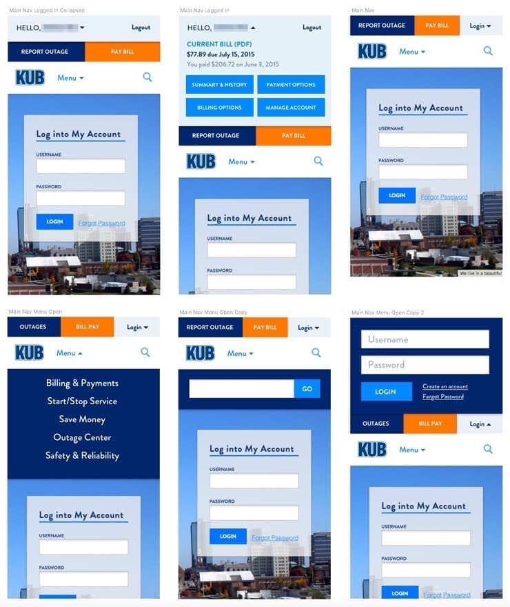
One of the main focuses of the site was the Outage Center, which is primarily used by customers on mobile devices during a storm but also has an important audience in news outlets (typically looking for a lot of detail on their desktops). The user experience was critical to make sure all users could access all needed information on a very small screen (and beyond). Other challenges included how to handle interactions in a multi-level navigation on interior content pages, designing complex forms for starting and stopping utilities, and account management.
Our Approach
Style Tiles and Establishing Direction
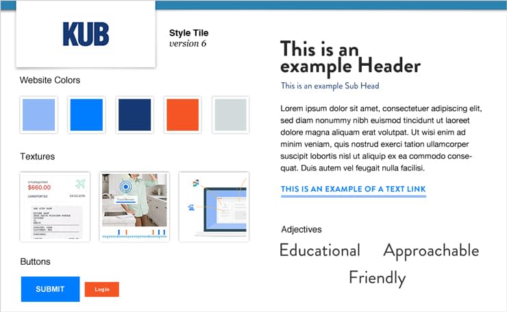
In the kickoff meeting, we presented a series of style tiles that helped us start to gauge the team’s design expectations. Each style tile represented a visual language and contained a color palette, typography explorations, button styles, and a couple words describing the look such as “conservative” or “friendly.”
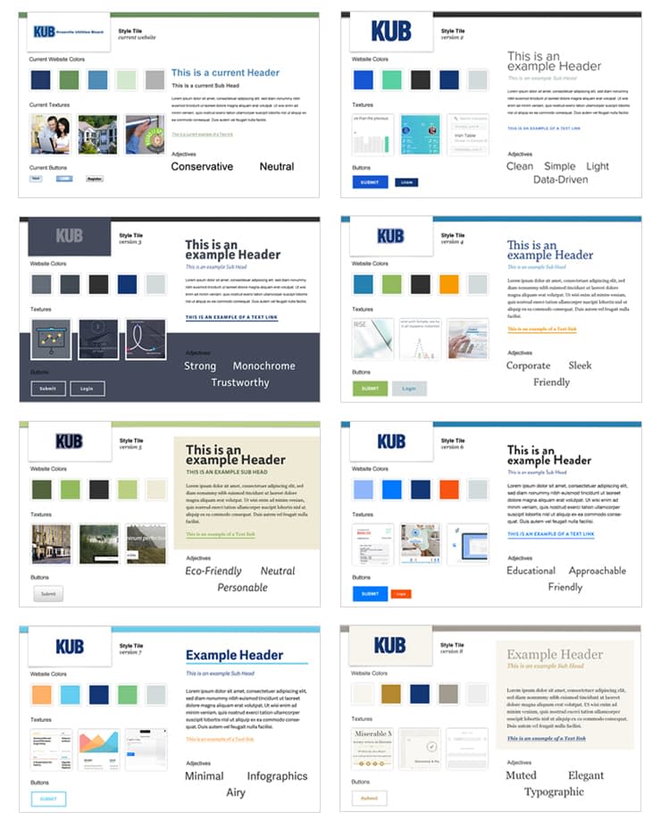
From the presentation and resulting discussion, we gathered some useful information that we used as we started visual design. The KUB team responded to clean white space, simple color palettes with pops of color, and sans serif fonts. We learned some things that they didn’t like such as muted color palettes, dark page backgrounds, and anything that felt too fussy or fancy. From our discussion, we developed a strategic visual vocabulary that we referenced as we were designing the UX and UI, and we referred to those words when it came time to present a design concept.
Visual Vocabulary:
Clean
Bright
Pops of color
Simple
Friendly
Not cluttered
Intuitive
Establishing goals was a critical part of kickoff, and the combination of goals with a visual vocabulary allowed us to be very strategic with our design decisions. The engagement goals were:
Be the quickest, easiest, and most accessible place to complete a task with KUB.
Provide findable, relevant, precise content for our audiences.
Increase website customer satisfaction.
Another critical piece of the kickoff meeting for our design effort was content exercises. Understanding content is helpful in the design process because it gives designers and UX designers an idea of how to handle the hierarchy of content on small screens and large screens alike. We also spent some time listening to the KUB team of stakeholders present some existing websites that they liked and chatted about how other utilities handled content and user experience on their sites. See our post about planning the redesign efforts for more details about how we structured and met the team’s expectations around content, UX, and more.
Element Collages
As wireframes began, we simultaneously started developing an element collage, which basically takes a few select pieces of content or modules from the site and starts to apply styling. The goal of an element collage is to quickly explore a visual concept using chosen pieces and parts of the site. This allows us to present a design concept to a client and effectively communicate the intent of the visual direction without having to spend a large amount of time designing several pages with no feedback. This is also a very effective way to make progress on design while content plans are underway.
For KUB, we developed a single, static element collage influenced by the team’s kickoff feedback and presented it to the team.

When we presented the element collage, we mentioned some of the words in the visual vocabulary. For example, the element collage made use of friendly typography and an approachable interface.
Implementing Approved Visual Concept
After the KUB team approved the visual direction of the element collage, we started to think about how we’d approach design of the most-used elements and templates. Because of how the KUB team needed to get approvals—periodically by reviewing with an executive team—we did more static design of pages than we typically do on an engagement. That said, we tried to only do enough to get approvals or to inform development and leave much of the refinement to design pairing in the browser. Our work was broken up into a few different phases where we focused on various sections of the site.
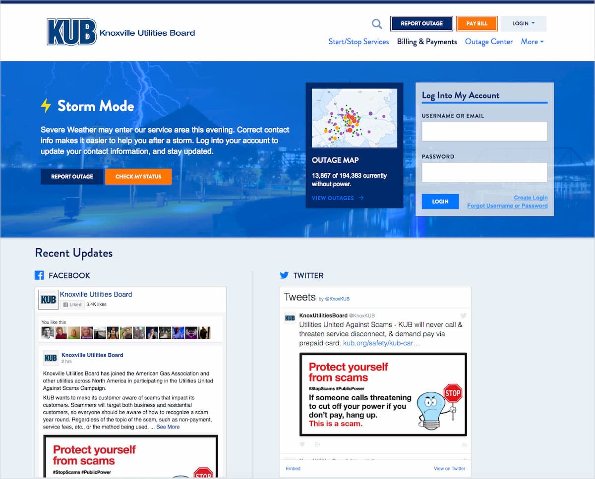
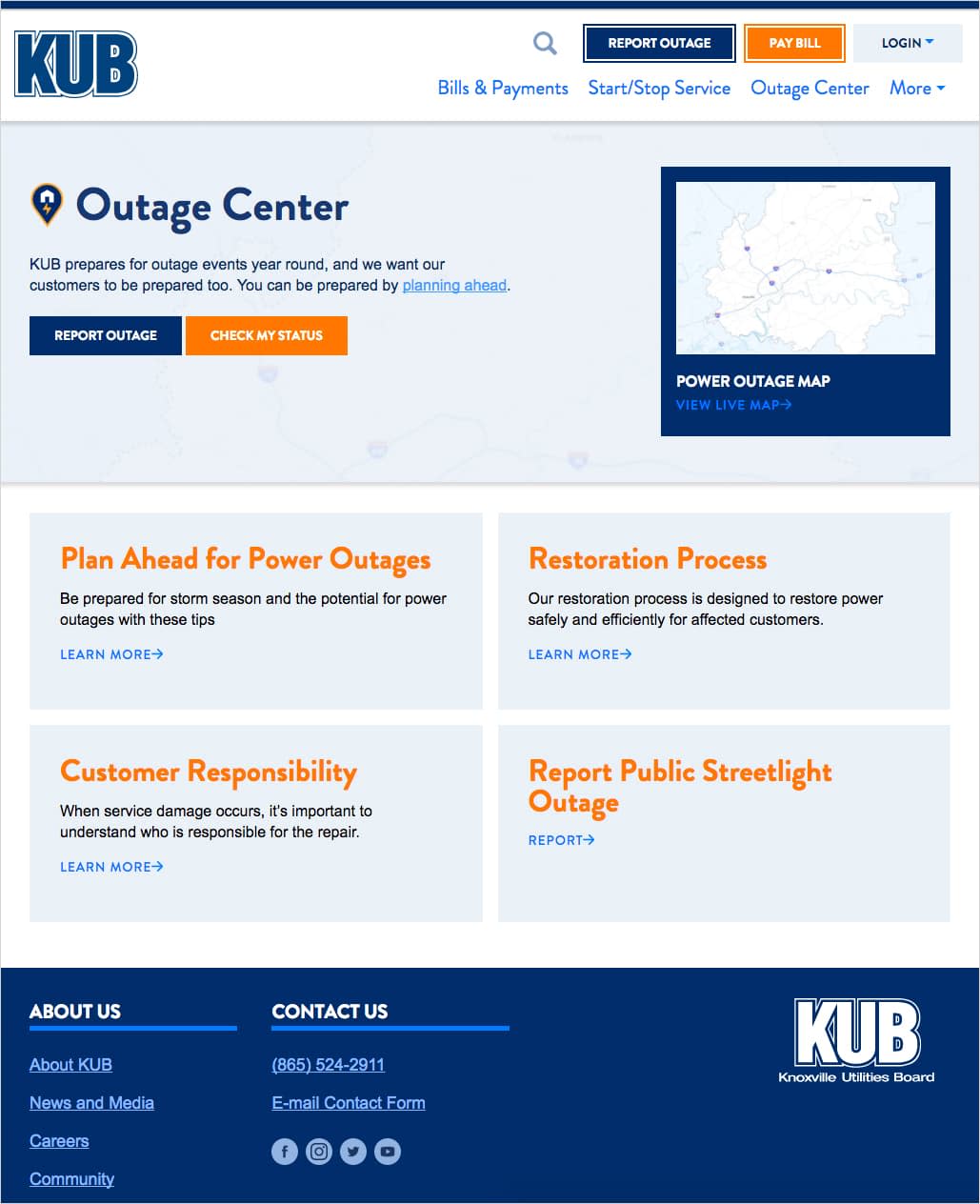


The Outage Map
The Outage Map template was one of the most challenging areas we tackled. Static designs were created (for both large and small screens due to complexity), but as we moved the design into the browser, we quickly found areas to improve the responsiveness. So frontend developers did some experimentation, and we made some fairly significant changes to the UI and layout.
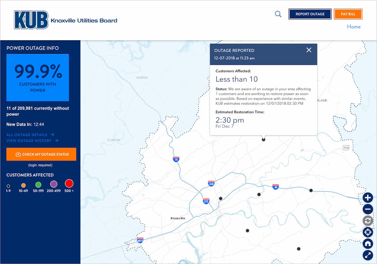
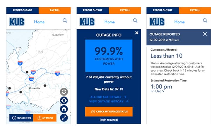
Most of the tweaks to the Outage Center were done in browser as there were so many different interactions on the map that affected the design. Many of the challenges we faced had to do with scrolling. We wanted the map to be a full-screen experience to avoid having to scroll to content below the map and accidentally scrolling the map itself. This meant that we needed to provide a UI for all actions and display needed data on the screen at all times or provide a trigger to reveal that content. Prioritization of content on the Outage Center was very important as it informed what buttons would overlay the map and remain exposed and what content would be housed in a slide-in “drawer.” Experiences like these are validations for why we move to the browser quickly to prove, and refine, our designs.
Design system
From the beginning, KUB was sold on the idea of creating a technology-agnostic design system to keep their current properties consistent—and also live beyond the initial phase of development to serve them well into future updates and web properties. To make this vision a reality, it was important to establish a workflow from the start that ensured the design system would drive all design changes to the Ember applications and ExpressionEngine site using the new design system. This meant that if there were ever any problems with the design as integrated into the CMS or Ember applications, we always went back to the design system to implement a solution and then carried it forward to both web platforms. Check out the post on our co-development process.
The design system we created consisted of general text styles, discrete components, layout methods, and entire page templates. Although the design system we built is primarily a system of components, early in the engagement, we focused on completing entire pages to establish some momentum and the morale boost that comes from seeing an entire page complete.
The first page we focused on was the homepage. After reviewing the designs, we identified the individual components that made up the entire page and began creating them in isolation. This discipline ensured that components were styled in a way to work on any page, not just the one we were working on at the moment.
Pairing
We almost always work through wireframes at small screens to establish priorities. For this effort, most of the designs created were for large screens with just a handful for small screens (ie. navigation and maps). Armed with small-screen wireframes and large-screen designs, our frontend developers took on the responsibility of making the design work across screen sizes—reviewing and adjusting with the help of our design team before completion. To respect everyone’s time, frontend developers scheduled larger chunks of time to review multiple components. If the changes requested were complex or uncertain, designers and developers would have a live pairing session to work through modifications. For simpler changes, developers simply took notes during the review session and implemented them solo.
After the design system was developed, KUB developers could create a new page or workflow by inserting the applicable patterns. Our team would pair with them on technical or visual adjustments.
Transitioning Ownership
When creating a design system for a client, one of the difficult tasks is transitioning ownership of the design system to the internal team with the objective of continuing to maintain and evolve the library. Throughout most of the engagement, the Sparkbox team did almost all the frontend development, delivering frontend assets and templates to the KUB team for integration. However, from the very beginning, KUB was involved in running the frontend builds locally on their machines to generate the assets they needed for each drop release. Around two-thirds of the way into the engagement, KUB developers began making small changes to the design system, starting with minor bug fixes and improvements. From there, KUB became increasingly involved in both developing new patterns and releasing those changes for integration. One of the last sections completed on the engagement were some mapping page templates, and by that time, the KUB developer did the bulk of the frontend development on those features. Now the KUB team has taken full ownership of the site and can fully utilize the design system to maintain the site and create new pages as needed.
Faster, More Consistent Features
Great websites and teams benefit from having a robust design system to go along with their website. Not only are we proud of the updated designs and improved user experience we delivered for the KUB website, we are thrilled their team can easily continue to maintain the site and create new features more quickly and more consistently. And hearing customer feedback like, “the new design is fabulous!” is just icing on the cake.