Discovering how we can add value for a customer plays a big role in how we start projects. But companies must adapt to changing needs every moment, and continuous discovery throughout any long-term product or website build is necessary to make sure we’re always building the right thing. We’ve worked with Aperian Global for almost two years to help them modernize their core GlobeSmart products, which help individuals and companies more effectively conduct business around the world. An underlying goal of our work with Aperian Global’s team was to help them become a more iterative software company, and—as is common in our partnerships—our transparent, co-lead, sustainability-focused process has been just as valuable as the features we’ve delivered.
The Value of Planning
Our Projects Director, Drew, likes to say, “I can never get enough planning. Ten minutes of team discussion can save hours of development churn.” And our Vice President, Rob, likes to say, “We’ll know more about your project tomorrow than we do today.” These two statements together have a heavy influence on the continuous, “just enough” approach we take to planning. On a small project that may be only a few months from start to finish, you might have the luxury of doing discovery at the beginning and not needing to drastically re-discover and evaluate throughout. While continuous discovery is always encouraged, much of discovery for these types of projects can happen at the start. However, long-lasting products and future improvements to any website require consistent, continuous discovery. Finding the right balance in how much to plan at the start and when to reevaluate assumptions requires some customization for each team and situation. However, the types of steps you can take to make that happen are fairly consistent.
Continuous Discovery Planning Process
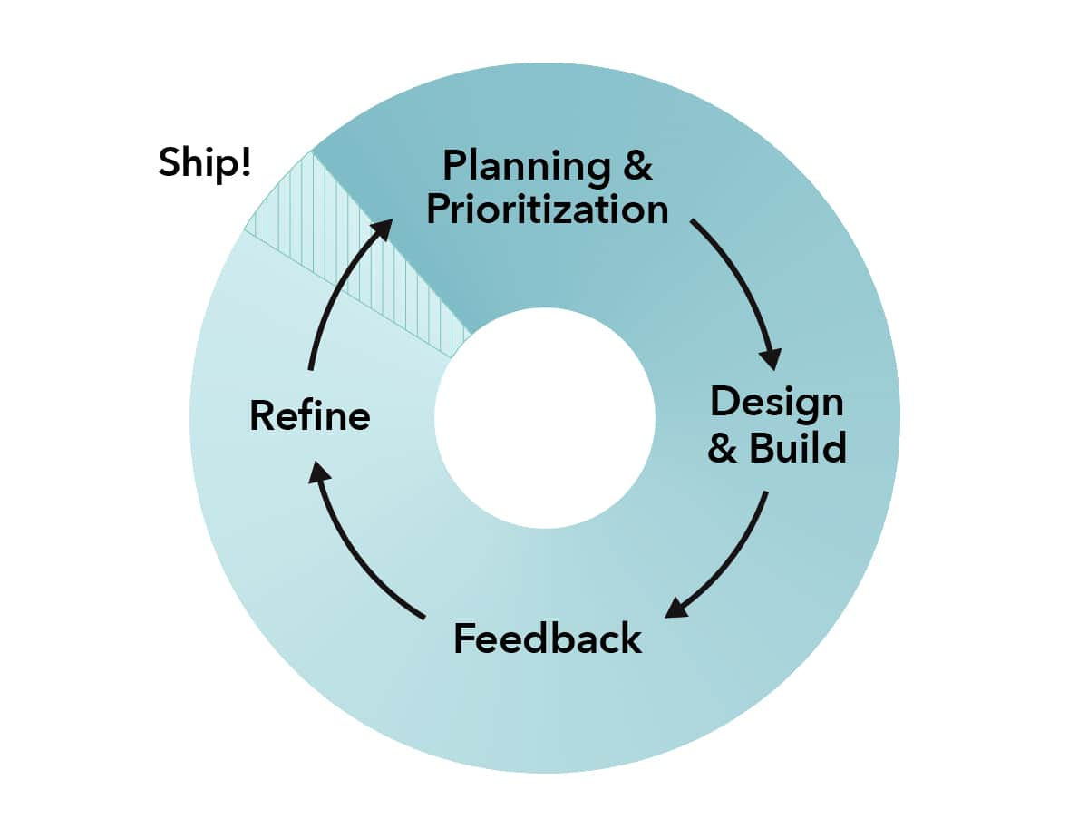
With Aperian Global, we were able to find a solid planning process that allowed us to be transparent with their team, which had a strong understanding of their project but was less technical than ours. The following continuous discovery cadence follows proven planning concepts that work well across various types of teams and allowed the internal Aperian Global team to confidently steer decision-making in a hands-on way without them being burdened with having to understand each technical nuance.
Planning & Prioritizing
Every epic started with a high-level planning discussion to identify user needs and prioritize development features based on their value. Our next step was to create detailed plans for those features. At this stage, we’d frequently be in discussion with Aperian Global’s team, refining plans, prioritizing features, and employing usability testing.
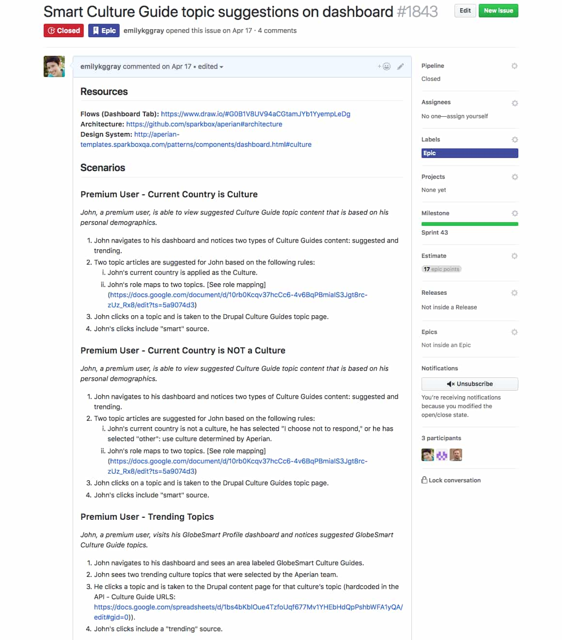
Once features were well planned, we put them through the wringer with scenarios. Based on our knowledge of the features needed, our team would break down all the scenarios a user might run through as part of that feature. And then we met with the Aperian Global team to review and refine those scenarios. Scenarios planning allowed us to take the time each week to identify all the types of users who would be impacted by that epic’s features and the scenarios in which those users would find themselves. Creating scenarios was one of the most powerful tools we had to ensure the Aperian Global team had great confidence in their ability to direct the work, and that we were building the right things. Scenarios also helped us identify and prioritize shippable moments based on just-enough-value feature sets.
Developing
Once a feature had approved scenarios, our team created diagrams that covered what would happen within the React app, CMS, and API. With several moving pieces happening in parallel, it was very important that we had these diagrams to make sure we normed around a common set of criteria and naming conventions to keep everything functioning as one cohesive unit. Diagrams gave us a shared understanding of the contracts across the system. As a bonus, when different team members joined the project, these diagrams proved valuable in onboarding to explain how things worked and how to approach new features.
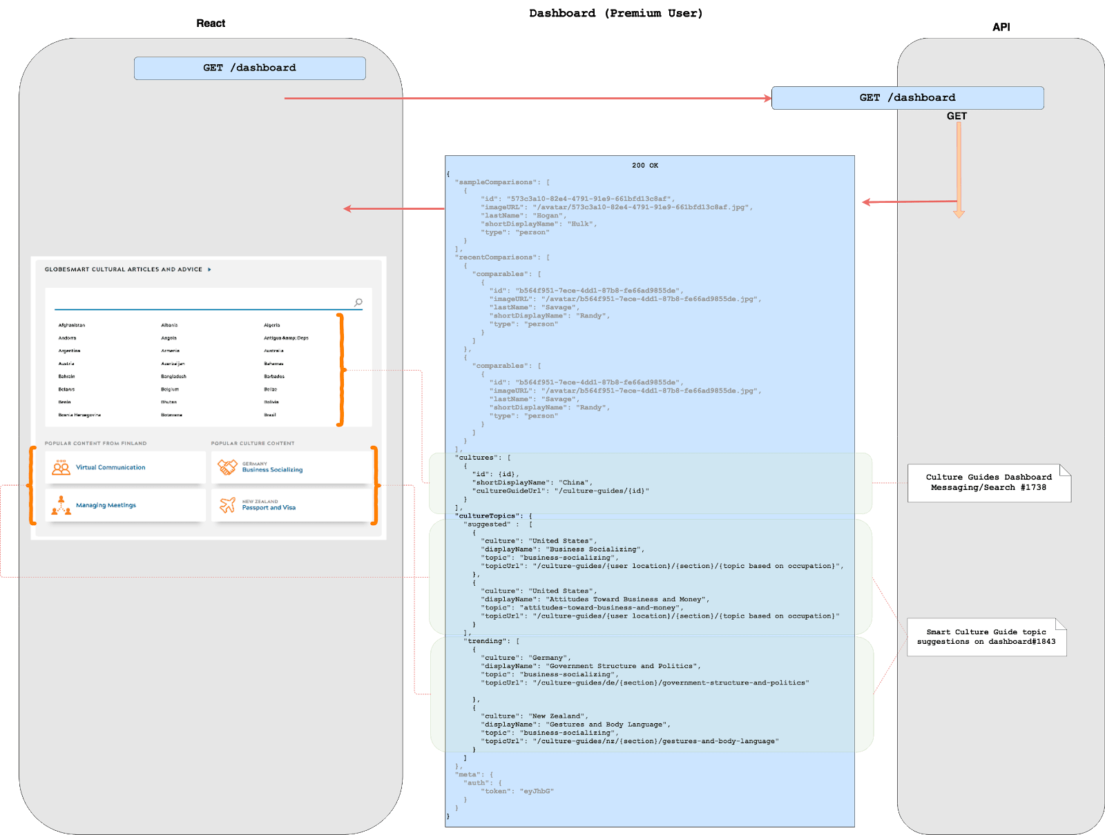
Diagrams prepared developers and the core product managers to meet weekly to break down the features into individual cards with good details that meant anyone on the team could pick them up with confidence and keep the product moving forward cohesively. Having these known and scoped cards meant that we had what we needed when we were ready to plan our two-week sprints.
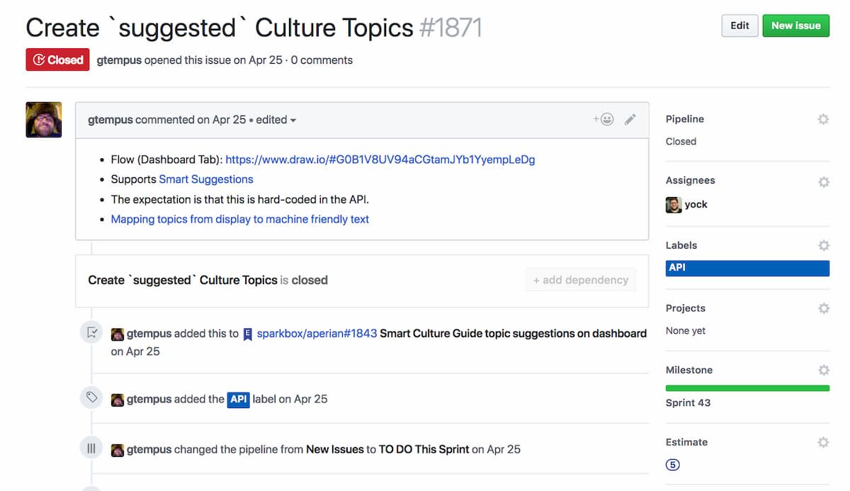
Continually Discovering Throughout the Sprint
Once we were in a sprint, daily standups and communication through Slack and Github allowed the core Sparkbox and Aperian Global team members to stay in sync with how things were developing, to clear roadblocks for one another quickly, and to adjust plans mid-sprint when needed. Frequent deploys via Ansible to AWS infrastructure allowed us to reach out often to get even more in-the-moment feedback outside of those formal meetings. Tested, refined, and proven software is the development success metric. The best way to work through the inevitable assumptions embedded in plans is to integrate the various parts of the system early on. And sharing those early integrations with Aperian Global allowed us to test those assumptions informally during sprints and formally at demos.
Demos happened at the end of each two-week sprint to allow the larger Aperian Global team to have great exposure and input in the direction the product was taking. We learned adjustments to make during demos and during quality assurance testing, which was performed by the Aperian Global team. With intentional prioritization of bugs and a keen sense of value to their customers, the Aperian Global team was in a solid position to decide when we had created enough value to ship to customers. And shipping to production and encouraging users beyond the product team to test things helped us refine even more. There were certainly moments where we all learned about something we needed to adjust, but these tight feedback loops meant that we were never far from an opportunity to course-correct.
Continuous Discovery in Action
Comparisons
Aperian Global offers trainings and online products to help individuals, teams, and organizations work effectively across boundaries. At its core, Aperian Global’s products are about understanding yourself, the people around you, and how to take the best of everyone to make the best in business. A core feature of Aperian Global’s GlobeSmart product is the “comparisons” tool that allows two or more individuals to gain valuable insight into how to work together more effectively.
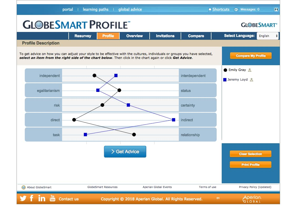
The tool’s advice helped us realize how we, as a Sparkbox team, could work together even better to make great decisions that relied on one another’s strengths. However, in the old application, the Aperian Global team and users agreed that getting to this advice wasn’t intuitive. Additionally, we knew we needed to have a more modern design wrapped around this highly impactful tool.
Powerful advice wasn’t easy to find in the old application.

YouTube embeds track user data for advertising purposes. You can watch the video on YouTube if you prefer not to grant consent for YouTube embeds.
To make navigating to advice more intuitive, we surfaced topical advice right on the main comparison page and added the idea of “top advice” driven by the biggest difference between two users to help them see the value and promise of the content before they choose to click through for the full topical advice.
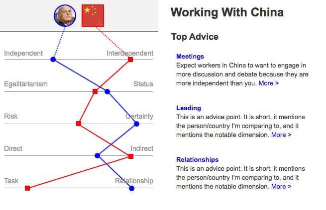
The comparison feature has a strong dependency on logic-driven, topical advice. This important content would live in a headless CMS that would surface the content to the API—and the API would do the heavy lifting to generate the context-specific advice. We architected an author-friendly CMS and worked through many scenarios with the Aperian Global team to understand the core logic that would drive the advice that users would see in a myriad of situations. We did a heavy amount of testing with the Aperian Global content team to refine our algorithms and feel confident early that the API was generating the correct advice.
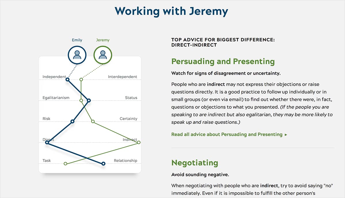
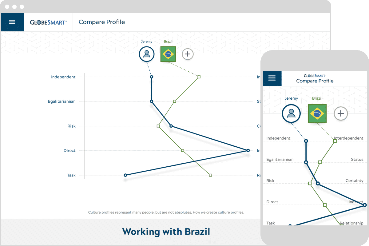
With the ability to see up to 30 other profiles to compare against on a screen, we needed to make sure that all users could easily keep straight who they were in the comparison, and who each of the other users were. We started to distinguish different profiles first by highlighting the primary user’s profile. The new design made the signed-in user’s profile stand out through a slightly wider line and drop shadow—giving prominence and the illusion that the user’s profile line sits on top of the other lines.

In addition to making the signed-in user stand out, each profile’s avatar is outlined in a color that corresponds to their profile line’s color and is connected to the individual avatar with a dotted line. Another way we differentiated the profiles was by having a different default avatar shape for cultures, which took on a square avatar shape and plotted profile points.

YouTube embeds track user data for advertising purposes. You can watch the video on YouTube if you prefer not to grant consent for YouTube embeds.
Culture Guides
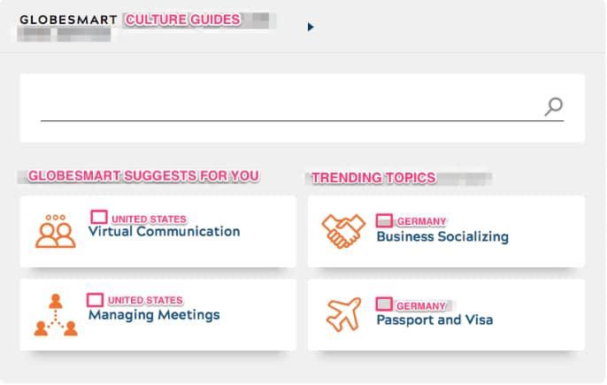
GlobeSmart users are able to run comparisons against a representative profile for almost 100 cultures to see how they compare to that culture’s norms. Aperian Global’s culture guides take the insights a user can glean about a culture to the next level with highly detailed articles around communication styles, diversity and inclusion, effective leadership styles, and up to 60 other topics. Based on user interviews, we knew that current users were quite busy, were hoping for a clearer way to find the most relevant content in the moment, and were hoping to have more images and videos to bring the valuable cultural insights to life.
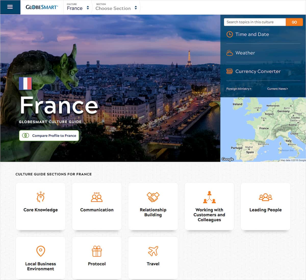
During content planning, we believed that busy users would be best served by adding a new page type to the experience of culture guides. The vision was to let users confidently find relevant content, while also giving them easy ways to get only as much insight as they needed or had time for at that moment. The main pages we proposed for the culture guides were:
High-Level Home
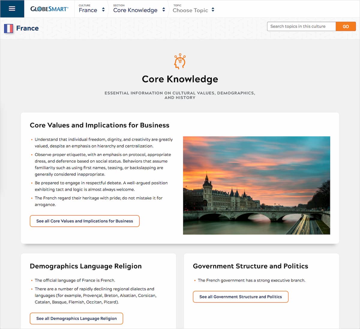
Topical Summary-Level Section
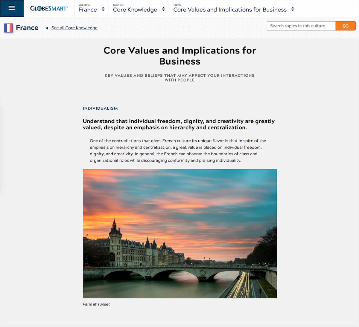
Detailed Understanding Topic Articles
In addition to continuous discovery efforts with the Aperian Global team, we also sought feedback from users. During usability testing of the new navigation and pages from an Axure prototype hooked up to static designs, we gained confirmation that the new, proposed section page had significant value in allowing users to get quick overviews and also aided in the goal of making it easier for them to confidently find the content they were looking for.

“I can see the main parts within the section, and decide what is most important and click in to read more.” - User Testing Participant
While we wanted to help users get the additional contextual images and videos they desired, we also realized that it would require a lot of effort, time, and budget from the Aperian Global team, something teams busy on a redesign often don’t have. To accommodate this, our design focused on one key image on the homepage, and allowed for reuse of other images and videos throughout the remainder of the pages. This approach allows the Aperian Global team to add media as they are able, and maintain a beautiful, consistent design even when they don’t. And we executed the content management of these pages in a way that meant the Aperian Global team didn’t need to write and manage more content in order to create the new section pages. They merely had to flag which content they wanted to appear on the section and home pages, and manage that content in one location.
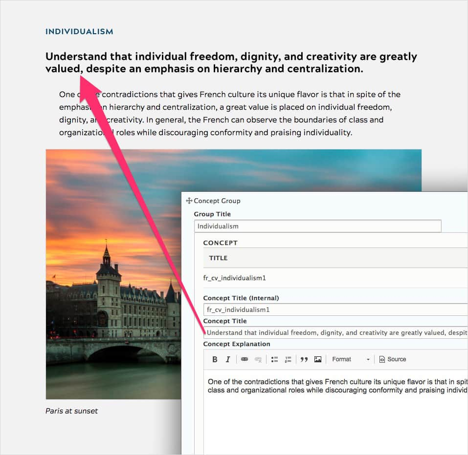
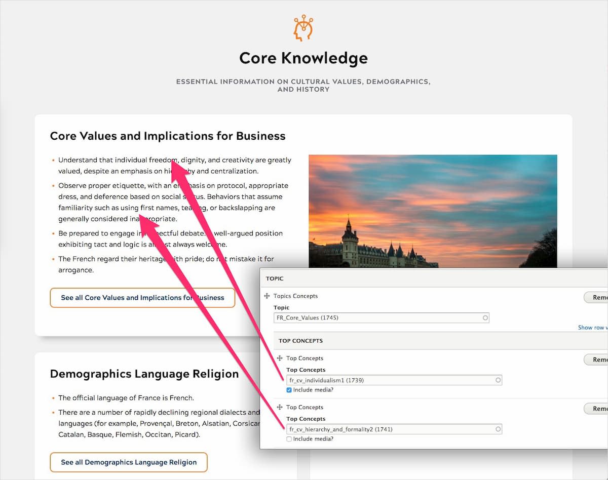
We built out the designs in the design system and adjusted how we delivered the design system to limit the performance weight of what the React app needed and what the now no-longer-headless CMS needed. And we worked closely with an Aperian Global Drupal contractor to get the design system integrated.
Expanding the Team
Speaking of that Drupal contractor, we knew from the start that one of Aperian Global’s goals was to have us help create a team they could rely on to continue carrying out the vision we crafted together. Working closely with some of their contractors was part of this effort, and we also helped Aperian Global write a job description for an internal hire and conducted several interviews to help them find the right first developer on their internal team. Our support continued beyond hiring that team member. In addition to working together closely on new features in the day-to-day, we also devoted time each week to invest in their developer and make sure he understood this complex system inside and out, and could maintain—and eventually—architect its future.
The foundation of continuous discovery made having a slightly shifting group of developers and directing team members on the project much smoother because there was a solid cadence and opportunities to learn already built in.
Empowering Iteration Advocates
Being able to work iteratively was a top goal internally for Aperian Global as part of our engagement. The shift from waterfall to agile is a long one that requires vision, discipline, and consistent reevaluation. However, seeing the payoff from early and often adjustments has allowed the Aperian Global product team to become iteration advocates for their entire company. They can point to situations where we collectively refined a feature to make it better through these tight feedback loops, which adds more fuel to their continuous discovery fire. We’ve seen a tremendous shift in how Aperian Global approaches software development based on the framework of sprints and continuous discovery.
Together our teams have worked hard to deliver the right high-value features for their users first, and we’ve built a backlog of reimagined and completely new features we’re all excited to see come to fruition in the future. With the Aperian Global product team’s advocacy for iteration and a strong process behind them, we’re sure the product will go far as we continue to support their development.
And you can see as those iterations happen, too. Sign up for a free account and take a spin through all the great features that already exist to help you work more effectively with someone in the next cubicle or on the other side of the globe.

