A leading academic medical center in the Midwest reached out to Sparkbox to make their commitment to quality care on their patient-facing website match their exceptional in-person services. Their web team managed a website for patients that included a “find a doctor” search, location information for several hospitals and medical facilities, and was also the entry point for online appointment scheduling and access to electronic medical records. Through careful analysis of web analytics, the web team had noticed that parts of their existing patient homepage suffered from low user engagement. On top of that, they had enhanced some patient self-service tools and wanted to promote them. It was time to optimize the homepage user experience.
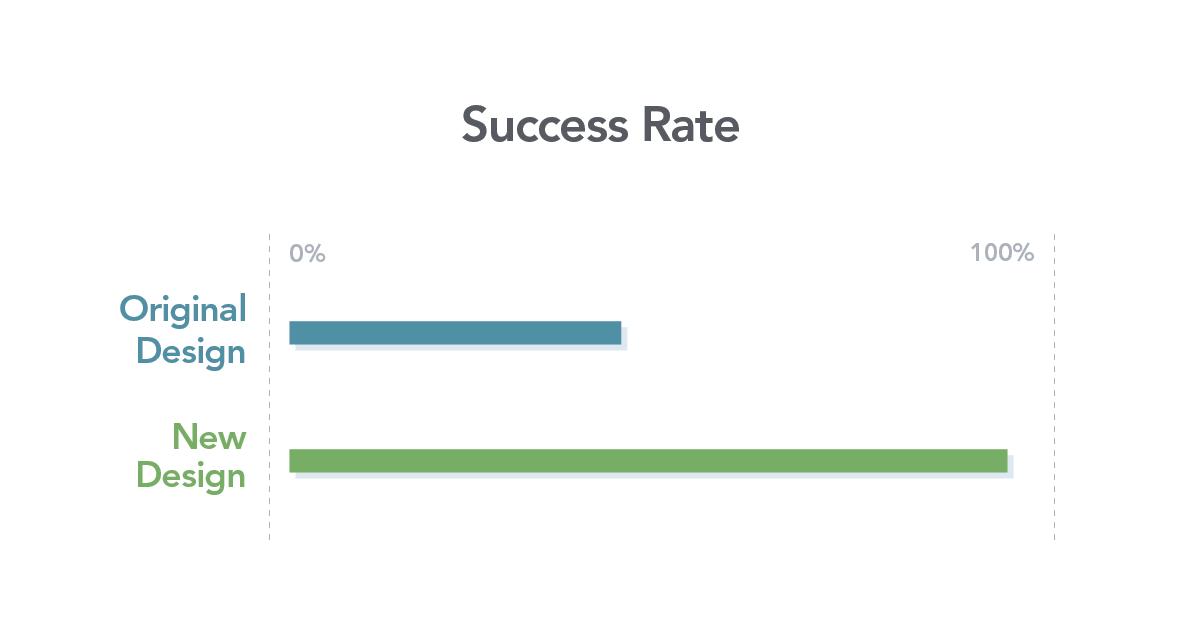
To drive strategic, grounded improvements, we conducted user research to determine what to change about the homepage and mocked up those changes. Then we tested the new approach for effectiveness and usability, and found that the success rate doubled on a key task.
User Research: What Do Users Want?
Our first step was to find out what users wanted and needed from the homepage. We set up a series of interviews with past patients of the health system. They told us what they used the website for the most, what was difficult about the site, and what parts of the healthcare experience they expected to manage online. We also talked to internal website stakeholders about what we could surface on the homepage to users that would add value for both patients and the organization’s mission.
This first-person user research has proven vital on our projects in providing our clients with strong strategic suggestions. We were able to combine this research with findings from website analytics to propose ways to optimize the homepage experience. We then created a homepage wireframe and design mockup to illustrate these recommendations.
We test because educated guesses only get you so far, and continual iteration is needed to drive valuable success.
Homepage Comparison Testing: How Much of an Improvement Have We Made?
Our next step was to see if these recommendations would make a difference before having the client’s web team devote time and money to developing them. To do this, we performed a first-click test of the new design, using the current design as our benchmark. We test because educated guesses only get you so far, and continual iteration is needed to drive valuable success.
We learned that users found the link to their electronic medical records four seconds faster with the new design, and that a different layout for hospital and medical office locations significantly improved findability—a 94% success rate for the new layout versus a 45% success rate with the initial design.

In addition to these large, first-pass successes, we also learned that one of our new navigation labels wasn’t helping users find the right content any easier than the current label, so we went back to the drawing board to come up with a more user-friendly navigation item.
Usability Testing Website Flows: What is Tripping up Our Users?
Even though we’d already implemented one testing method, there was more to learn about the usability of the website beyond the homepage. For instance, how well does the navigation work? What about smartphone usability? How easy or difficult is it to accomplish the top user actions, like finding a doctor?
Seeing mobile users interact with the website is a powerful reminder to build thoughtfully and with empathy for life’s circumstances.
To identify areas for improvement, we ran moderated usability tests on both desktop and mobile prototypes of the website. Through usability testing, we identified what worked well and what didn’t. Notably, we found seven usability issues that affected all users, and four more that were specific to mobile users.

By being able to see real users interact with the website, the team was able to further empathize with their needs and gain strong first-person experiences to carry with them throughout future decision making. In the case of smartphone testing, we were able to see what environments people were using the website in, and how this could affect their experiences, whether they were in a grocery store parking lot or the breakroom during lunch hour. It’s easy to overlook the “anywhere” nature of mobile devices when you build, maintain, and test your website from a comfortable office. Seeing mobile users interact with the website is a powerful reminder to build thoughtfully and with empathy for life’s circumstances.
Result: A User-Centered Optimization Plan
By the end of the engagement, the medical center’s web team had a realistic roadmap to make evidence-based improvements to their homepage that make sense with their budget and project priorities. And since they also participated in the usability testing planning and observed the test sessions, they gained insight into the process and tools to effectively run more tests on their own. Most importantly, the insights gained from user research and usability testing empowered the web team to invest in homepage design improvements with the confidence that it will be a powerful first step on a continual path toward improved quality care.
Get A Free Guide to Becoming User-Centered
Investing in user experience is a solid and proven return on investment. Fill out this form and start evaluating your organization’s UX Needs, earning buy-in from stakeholders, and hiring help!

