
Most of the sites we design and build for clients start with flat Figma or Sketch files from a frontend designer. Those files are sent to the client for approval and then to the development team’s tech lead and project manager, who break them into manageable work.
Full designs of a website can be overwhelming to view. They often include multiple pages and layouts and dozens of necessary UI components. Often, developers won’t know where to start. That’s where the “decomp” comes in.
A “decomp,” or decomposition exercise, helps the team understand the scope of work from the very beginning, allowing for a quicker, cleaner UI build out.
Breaking Down Your UI Designs
Decomposing has been a theme in computer science work since nearly the beginning, and it refers to breaking a problem down into small, meaningful chunks of work.
“A decomposition paradigm in computer programming is a strategy for organizing a program as a number of parts, and it usually implies a specific way to organize a program text.” —Wikipedia, “Decomposition”
Those smaller pieces of work often equate directly to new stories in your sprint. Decomposition happens either at the beginning of a project or whenever a site is ready for new UI work. It can be an exercise that just the tech lead performs, with or without a project manager, or with any combination of your development and design team. The goal of a decomp is to identify the scope of the project and recognize any technical challenges early. A decomp’s deliverables are often organized sprints and prioritized cards (such as Jira or Trello cards) that include, at minimum, screenshots of each UI component.
A Step-by-Step Example
The first step to decomposing your page is to get quality screenshots of each design. If I’m working alone, I like to print physical copies so that I can use a pencil to draw lines exactly where breaks are. But digital screenshots are acceptable, too. Any editing tool that allows you to draw boxes will work to decompose these screenshots. (I recommend against editing the files directly unless you’re interested in upsetting your designer.)
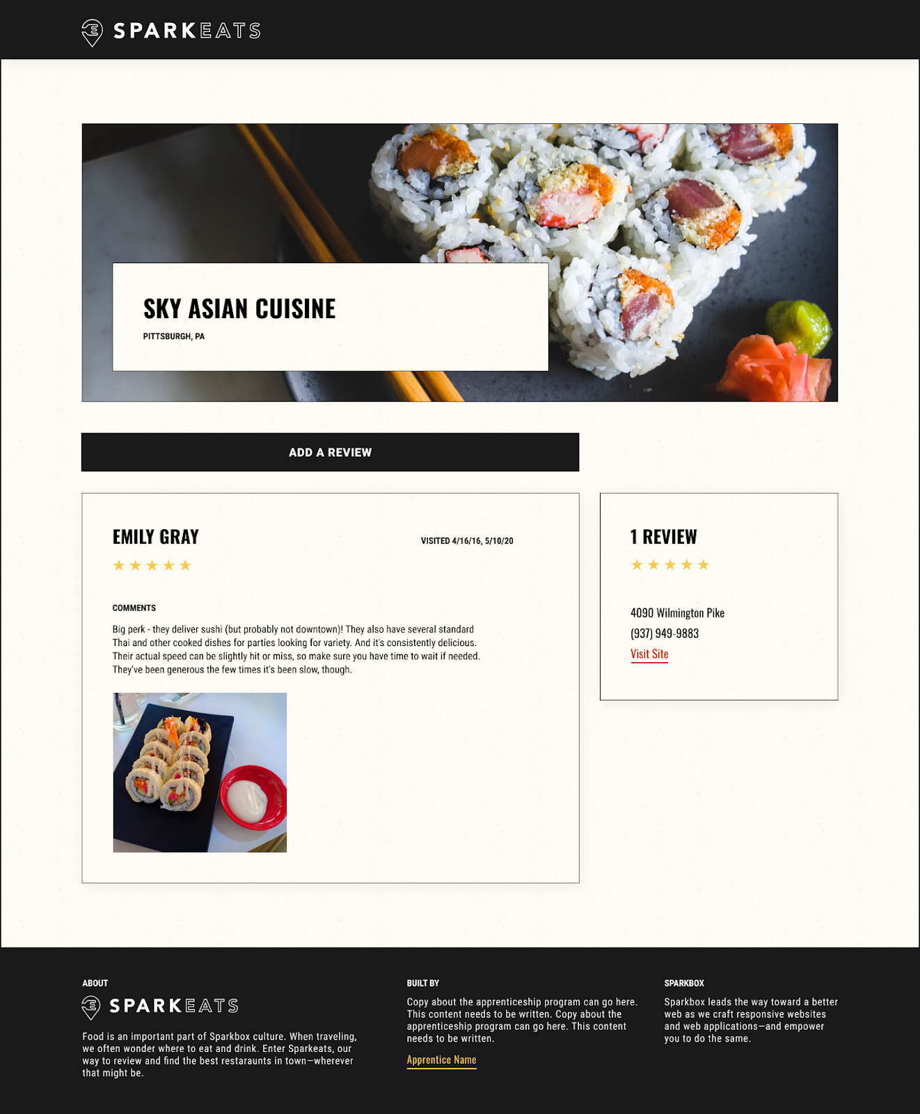
For this article, I’m going to use some of the files Sparkboxer Merani designed for our Full-Stack Apprentices’ upcoming SparkEats refresh. I’ll also be using Skitch to digitally mark up the screenshots.
Once you have screenshots, the next step is to draw boxes around each section or “block” on the page. Aim for blocks that are large enough to function individually but small enough that you’re not building the entire page.
Personally, I choose blocks based on how I would organize .scss files in ITCSS and often those translate directly to BEM class names. There are no “right” answers, only what works best for your team.
Here’s a screenshot of the page completely marked up with decomp. I’ve “penciled in” names for things based on how I think about the element, not necessarily which semantic elements I would choose when writing code. The best stories clearly explain a problem and offer details on how to solve it, but they ultimately leave the solution up to the individual who performs the work. For us, that means not choosing HTML tags at this stage and letting developers choose the ideal options when they pick up the card.
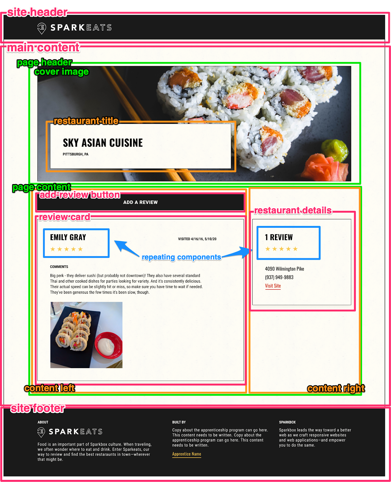
At the top of the page, I’ve highlighted the “site header.” This includes the SparkEats logo, which likely operates as a link back to the homepage. Many other sites will include a navigation bar or “hamburger” in this top section, and I would probably separate the navigation into its own block of work.
At the bottom of the page is the “site footer,” which has a lot of content but isn’t much more than a three-column layout. For this reason, I did not make any subcomponents.
In the center of the page is the “main content” block. When making cards, I likely wouldn’t make a card for this wrapper, as it’s probably a <main> element with very little styling other than a max-width. I would write a “layout” card to include the “main” container, along with the “page header” and “page content” wrappers, which live inside the “main content” block. “Page content” includes a “content left” and a “content right” element, probably built responsively with some CSS Flexbox.
“Page content” also includes (no surprise) the majority of content on the page. At the top is an Add A Review button. I initially could not decide on the naming of this button, as it is likely reused on other parts of the site, and naming the component after the specific functionality of the element may hinder its reusability. Additionally, this “button” does not open a modal, but rather, links the user to a different page—meaning it is not a “button” at all, and is, in fact, a link (<a>) element. You can read all about the accessibility differences between buttons and links on Carnegie Museums Studio web accessibility guidelines. However, because we are human, I would still confusingly name this link element style a “button” because it visually resembles what is considered a “button” in our shared web design language. The style itself may be applied to both link elements and button elements. I may go with the improved name of “primary button” to allow our button/link system to grow gracefully.
That leaves the “reviews card” and “restaurant details” elements. These are both pretty straightforward components made up of mostly text elements. The rating value, or “stars” component, is repeated in both sections. I’d make a point when writing the cards to reuse the styles and not duplicate the work between them. Functionally, that likely means blocking one of the cards until the other is finished.
Now that we have a completed decomp, defining the work necessary to build the page is much more manageable. I can make a card for each of these components, title it what I’ve titled the block, e.g. “Build Review Card Component,” and include both a screenshot of the component (everything inside the box I drew) and a screenshot of the page (to see the component in context).
Build With the Right Tool For the Job
Keep in mind that a decomp exercise is just another tool in your developer toolbelt. It is not going to be the best tool for every situation, design, or team: just as a flathead screwdriver isn’t the best tool for getting nails into the wall. You may wish to adjust the decomp format for different purposes. For example, starting a new design system often requires an audit with similar high-level concepts but very different execution. However, decomposing your designs is a valuable practice for reducing complex problems to smaller, meaningful pieces of work. I hope putting this into practice helps your team build a better web in less time.
