
I love to organize things. My clothes closet, the pantry, and my computer desktop to name just a few. Everything is neatly categorized by style, type, color, size, and function. I know exactly where everything is and can find and use what I need quickly. As a developer, I love design systems for the same reasons. I can quickly find and implement the color, font, or button style I need while being confident that the component I’m creating accurately reflects established brand guidelines.
Recently, I had the opportunity to perform an audit for a client. For this particular client, the first step in planning their design system was evaluating a select number of pages that represented a mix of elements and components on their current website and then reviewing their web design style guide. The client understood the importance of performing an audit as a first step in planning a design system. That sentiment was echoed by the respondents of Sparkbox’s 2019 Design Systems Survey. When asked about the values and challenges of a design system, 71 in-house respondents identified poor planning as one of the contributing factors of unsuccessful design systems.
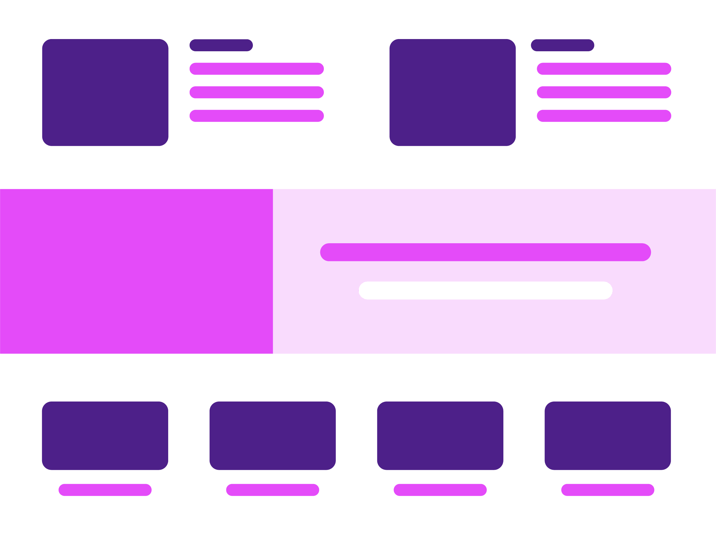
Website Decomp
A short while ago, I embarked on an expedition to declutter and reorganize my closet. It was time for all of the clothing that didn’t fit and the shoes I didn’t wear to find a new home. I pulled everything out of the closet and laid it on the bed. Each piece was carefully evaluated and categorized into keep or donate. I continued to categorize all of the items as dresses, sweaters, shirts, skirts, dress pants, and jeans. This process of decluttering, categorizing, and reorganizing can also be applied to the process of decomposing a website.
Working alongside developer Kasey Bonifacio, we approached the design audit similarly to the start of a new web design project. We began decomposing the existing website into components, elements, and building blocks—or as Brad Frost calls it, performed an interface inventory. With a list of ten pages to audit, we printed each page, cut each into smaller pieces and parts, and laid everything out on a large conference room table. Now the real fun was about to begin!
As identifiable patterns and commonalities began to emerge, we categorized the individual pieces and parts. While doing so, we noted items that would benefit from becoming reusable components. In the development of a future design system, each category would have its own section of implementation examples and documentation. Here are the main categories we identified as integral for a design system:
Global Components
We identified global components as the first category to evaluate. Global components are items found on each page throughout the site. This includes the header, navigation, primary search, and footer.
Type
Next, we assessed the typefaces used across the site and the typography of heading elements.
Color
The client’s primary product line features a vast color palette. We noted color swatches and their layout into color palettes.
Interactive Components
We classified interactive components, such as buttons, search inputs, product filters, navigation, and pagination, according to their function.
Data Elements
We classified as data elements those elements used to present customer ratings and reviews of the client’s product line. These elements included star rating icons, bar charts, and tables.
Content Blocks
The final category comprised components we identified as content blocks. Content blocks contain any or all of the following elements: heading, subheading, body copy, image(s), and a button or link. They can be informative or possess a call-to-action.
What We Found
After organizing all of the components and elements into categories, we were able to observe and document areas in which a design system could prove to be beneficial for our client. Let’s take a closer look at a couple of those observations.
Typography
The findings of the 2019 Design System Survey identified a typography system as one of the most common and useful elements within a design system. We were pleased to discover our client had prominently used their branded fonts throughout their site with only a couple of exceptions. We identified areas in which they were using user agent font styles and default font styles imported from a popular third party application. We researched the third party application Bazaarvoice and discovered the capability to apply custom styles. We recommended the client incorporate custom font styles for all third-party applications on their site. For an example of organizing font styles, take a look at the typography in Atlassian’s Design System.
Color Swatches

As noted before, the client’s primary product line features a vast color palette. The color palette is presented in an array of color swatches. We discovered an inconsistent pattern on the text treatment applied to the color swatch from one product to the next product. For example, a color swatch could have a label in titlecase text of Ocean Blue or a label in uppercase text of OCEAN BLUE. A design system with a single, reusable swatch component defining a text style, text alignment, sizing, and spacing improves the consistency of the user experience.
Search Inputs
We noted different search input components. Each search input used different placeholder text.
Magnifying glass icon in the left of the input field
Magnifying glass icon inside a button to the right of the input field
Search button to the right of the input field
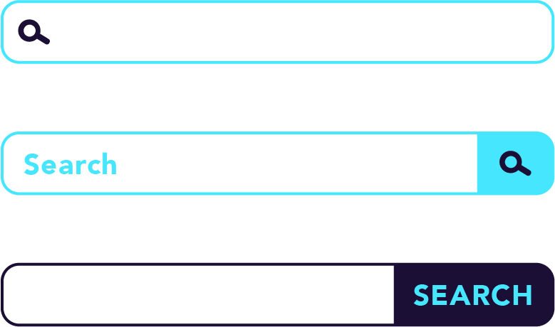
For the sake of consistency, the styling of all search inputs should be unified. When components such as search inputs are styled consistently from page to page, the user experience and accessibility of the site improves. A design system eliminates inconsistencies and provides a single source of truth. The styles applied to the search inputs on the United States Web Design System provide a good example of consistency.
Pagination
In regards to pagination, we noted two different user experiences. One experience listed items at the bottom of the page that linked to additional items on subsequent pages. The second experience listed all items with infinite scrolling. Infinite scrolling has accessibility issues as navigation and search options become burdensome for assistive technology users. We recommended the client eliminate infinite scrolling. Take a look at the pagination on Indiana University’s Rivet Design System. Although there are multiple pagination options, the styling is cohesive throughout. Also note the documentation that provides a clear understanding on how to implement each pagination option.
Buttons
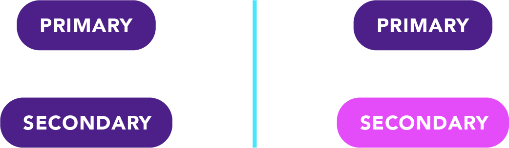
By all appearances, the button styles throughout the site presented a consistent experience (minus those within third-party applications). But a closer look at the code base revealed areas where a design system could prove to be beneficial. Visually, the primary and secondary buttons looked exactly the same. In most cases, the secondary button should be a differentiating style that compliments the primary button. We recommended defining unique styles and specific use cases for the primary and secondary buttons. The default states of the CTA-Button on Bulb Products Solar Design System are a good example of distinctive primary and secondary buttons.
What’s Next
A design system is the ultimate closet organizer and perfect storage solution. In my closet, you will find my sweaters and shirts occupy a different section than my skirts, dress pants, and jeans. My leggings are folded and neatly placed on a shelf, while my shoes line the bottom of the closet in perfect order. In a design system, elements, components, and documentation are efficiently organized into meaningful, purpose-driven sections. Foundational settings and elements such as typography, heading styles, and color swatches occupy different sections with the design system than global components such as the header, navigation, and footer. Content blocks, data elements, and interactive components are precisely categorized into their separate compartments as well. Each and every item within a design system has its very own designated space, resulting in a blissful epitome of organization.
Performing an audit before implementing a design system provides valuable insight into the challenges and complexities involved while laying a strong foundation for future success.
Subscribe to the Design System Calendar
Please share your name and email below. We’ll send you the information you need to subscribe and gain access to ideas, reminders, and resources throughout the year.
