The following article outlines Jän and Jeremy’s collaboration on the refreshed Sparkbox brand, including our logo and overall visual language.
About Rebranding
From Jän Ostendorf:
One thing about being in design is that you’re never satisfied. Some may say we are perfectionists; others believe that nothing is ever good enough for those in design. I like to think we at Sparkbox strive to be our best in everything we do. We seem to have a natural culture that drives us to do things right.
We don’t have any sacred cows. We question everything, and we allow ourselves to entertain thoughts of reinventing whenever necessary. We wouldn’t ask our clients to do anything we wouldn’t do ourselves, so when we started to entertain redesigning our website, we decided to go back to the very beginning.
We’ve known that our brand needed further development and refinement because we have been in a state of growth, change, and evolution since our inception. The redesign of our site was an opportune time to realign our brand to who we have become. Just as Caterpillar is “ruggedness” and Coca-Cola is “the real thing,” we distilled our essence to two simple words—Build Right.
At the heart of who we are, we love to build things—websites, web apps, and the like—and we like to do things right. Build Right is the core and foundation of our brand, connecting what we do with how we do it.
We believe we are primarily in the business of delivering content to as many people (and their devices) as possible. Building right allows our customers to touch more people—unhindered, unbridled, and free. We liken ourselves to freedom fighters.
We believe you’ll see all of this in the design of our logo, site, and voice. We’d love to have your feedback on how we can improve. We value being a part of the conversation moving our industry forward.
A Refreshed Brand Mark and Visual Language
From Jeremy Loyd:
We loved our original logo—it was flexible, easy to use, and the bolt worked great as a small icon. Best of all, it had a gritty, hand-crafted, blue-collar feel.
Not to mention it was the logo we launched with just a couple of short years ago.

However, we’ve known for a while that we needed something more unique. Over the past two years, Sparkbox has grown in personnel, recognition, capabilities, and clients. In that same time, design elements similar to our bolt icon have become widely overused by other organizations, and we needed something more identifiable. That said, we still wanted to preserve the hand-crafted, industrial feel of the logo along with the clever brand voice.
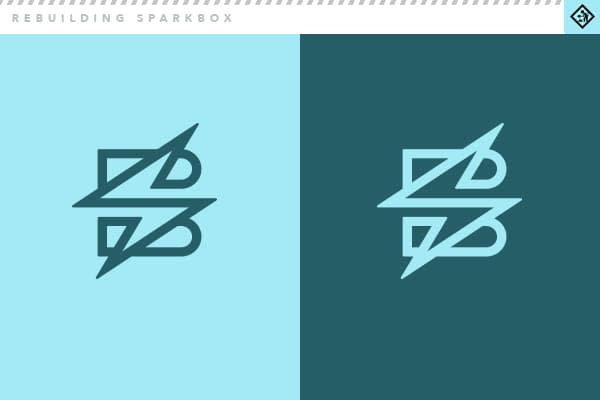
After pushing ourselves and hours of beating our heads against the wall, we’ve arrived at an ID system that we feel meets what we set out to do. The main focal point of the system is a monoweight icon that overlays the bolt—representing an “S”—onto a stylized “B” shape. We wanted, if possible, to keep some variation of the bolt because we liked the nostalgic feel and reference to our “spark”. This proved harder to accomplish than expected; the previous simplistic icon worked so well at any size (perhaps why it is used so much). Eventually, however, our creative lightning struck, and we arrived at our new mark.
The icon is unique, identifiable and maintains a bit of that industrial feel. We’ve heard from some that it has a “rock ‘n roll” feel too, and that’s more than fine with us. We envision using the icon and Sparkbox text separately most of the time, but we have created a lockup with the two together.

And because we love crests and badges—well, we created one just for us. For special applications such as shirts, mugs, beer steins, etc.

On the typography front, we are using a condensed, hard-edged sans serif typeface called Adelanto for setting our Sparkbox text. We feel like this face carries some of the Midwestern attitude we embrace. As a supporting typeface, we chose Avenir Next for its geometric, retro look and versatility, and for body copy, we’ve chosen Museo Slab.

We had a decent amount of discussion around our color palette. The blue/green color used so prominently on our original site had—in our minds at least—become associated with us. Wanting to not depart from it entirely, we decided to tweak our blue/green color to more of a cyan, and we’ve kept the orange as an accent along with our host of grays. This may evolve a bit as we go, but we’ll see.

We’ve loved the opportunity to refresh our brand, and we can’t wait to show you how it plays out in the evolution of our site.
