
A common challenge for even the best of web designers is crafting the right words to describe and explain a design concept. So when it comes time to present that concept to a client or internal critique, many designers find it difficult to justify and explain the visual decisions that were made. This is because the act of designing has a lot to do with emotion and feelings. “It just feels right.” This intuition often helps to get into the right ballpark from an aesthetic point of view, but this explanation often doesn’t fly with a client, especially if the design concept looks drastically different from their expectations. There’s no question it’s a challenge to put words to a design concept, but if we really believe our concept is right, and we want our clients to come along with us, we must be better at verbally communicating the visual choices we make.
Using Goals
One of the most effective ways to explain a design concept is to relate it directly to the goals. Creating engagement goals with your client is a very valuable exercise for many reasons. First, it gets everyone on the same page. Second, it gives everyone a filter to evaluate the various parts of the engagement, whether it’s content, UX, UI, etc. Establishing goals can take time depending on the number of stakeholders, and it’s best done at an in-person meeting, such as a kickoff.
Discussing and voting on engagement goals in a kickoff meeting gets everyone on the same page from the start, and serves as a guide towards making decisions throughout the engagement.
Taking it a step further, determining Objectives and Key Results (OKRs), as Dan Mall shares in this 99U article, is a great way to specify goals as well as to measure if those goals are being met. These should be documented and accessible to all team members throughout the engagement. Having the goals in hand when creating the design aids in making visual decisions and helps to start attaching tangible language and reasoning into a concept as it’s being designed.
So when presenting a design concept, if we talk about how the visual choices we’ve made help us accomplish the goals we’ve previously established and framed the conversation around that, along with our reasoning behind the color, typography, and layout choices, the discussion will be way more productive. It’s hard to argue with sound reasoning.
In Practice
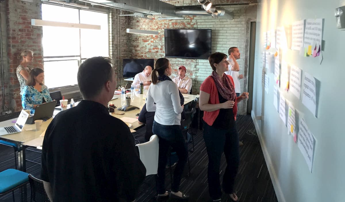
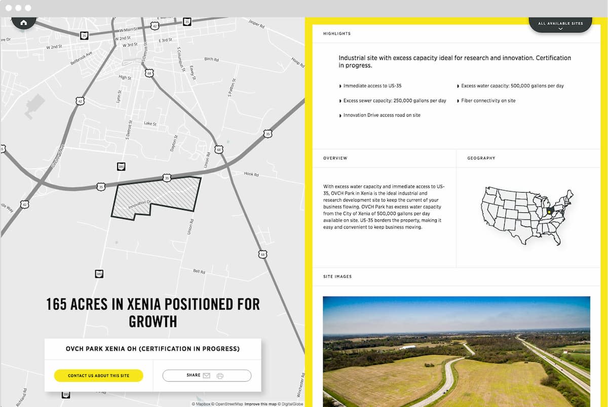
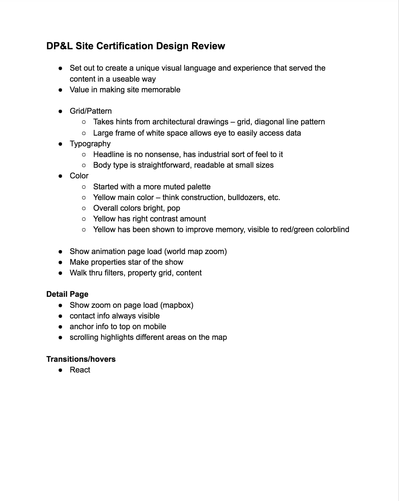
Here’s an example. A utility client of ours, Dayton Power & Light came to us and wanted to create a site that promoted industrial real estate in West Central Ohio available for development (read the entire case study here). One of the main goals of the site was to create something memorable and unique. So in our initial design meeting, we presented a design concept that would be built in React and make use of interesting page transitions and an always-present map on the left half with scrolling info on the right on larger screens. We used Mapbox to plot points of interest with custom iconography. We presented several examples of sites that used similar transitions and animations. During and after presenting, we made sure to verbalize the goals—specifically the desire for the site to be unique and memorable and how we’re achieving that through this concept. Because of this, the client was on board with our approach.
Framing the Conversation
It’s not enough to pull up a jpeg or prototype of a website and say, “What do you think?” to a client. Especially if we’re presenting to a large group of stakeholders, this opens up the conversation to go many disparate directions. Instead, let’s have a plan going in. Attack the explanation up front, and frame the conversation around the reasoning behind the visual concept.
Establishing a visual vocabulary around a design concept is another great way to attach words to visuals. These can be words that are collected from previous conversations and generated throughout the design process. In the case of Ohio Certified Sites, the client had said they wanted the site to be “memorable” and “unique.” So we repeated those and other familiar, descriptive words when presenting visuals.
In Practice
Using an example from the earlier-mentioned engagement, we had made some unexpected design choices that needed to be explained in the initial design concept meeting. Instead of just getting initial feedback, we wanted to explain our reasoning behind the decisions up front. One of these decisions was the color palette, specifically the yellow color. The site isn’t directly connected to the DP&L brand, but there was an expectation from the stakeholders that it would carry some of the same brand feel—colors, typography, etc. The main brand color is blue. Because of the fact that the audience for this site could essentially be located anywhere in the world and not have previous brand knowledge of DP&L, we strayed from the corporate color palette and used a bright yellow. We explained we chose the yellow because it demanded attention to the “content” side of the page, had the right amount of contrast with the content, and also referenced common coloring of construction equipment (think bulldozers, frontloaders, etc.). We also pointed out that yellow has been shown to improve memory (think post-it notes and highlighters) and related that back to our goal of making a unique and memorable site. Initially, the business team had doubts about getting buy-in on the new color palette from their leaders, but we made the design case and were able to get approval.

Going in with a plan and reasoning behind your design is important. You’re answering your client’s questions before they ask and possibly answering questions they didn’t know how to ask. Presenting this way may not mean every concept sails through with no changes, but your client will understand it better and be able to better make logical business decisions.
A Few Other Tips:
Confidence
Be confident when presenting design. If you’re not confident when presenting a design concept, it’s hard to get people on board. There’s some salesmanship that has to happen here without being “salesy.” You have to believe that the concept you’re presenting is the right one for the job. Many designers often don’t feel comfortable communicating verbally (myself included). After all, our expertise is in visual communication, right? But it’s worth spending time crafting words to go along with a design concept. That, along with helpful internal critique and discussion, will help you feel more confident going into a design presentation.
Ask Specific Questions
One way to get helpful feedback is to ask focused questions. This is helpful to steer the conversation in an area where you’d really like feedback. Design presentations can often turn solely into discussions on content, which can get things off track. Certainly, some content discussion is expected, but hopefully, much of that has already been talked about. Asking questions also includes the client’s participation in the details of design, making them feel part of the process. So instead of asking vague questions like, “What do you think?” ask something more along the lines of, “How do you think this concept supports the goal of _______?” or “In what ways does it fail?” Again, referring back to the goals helps to keep everyone on the same page and on the same team.
Cheat Sheet
Often times, when we present a design concept, we use my laptop to connect to the projector or display. I’ve found it helpful to create a document beforehand that contains notes and attaches words to visuals in the concept. I print this out and take it to the meeting as a backup to ensure I hit all the points I want to or help me out if I forget.
Explain Like Joanna Gains
Talking about design when presenting to a client can be intimidating, but it doesn’t have to be. If you ever want to hear a designer do a good job of explaining his/her work, watch the popular show Fixer Upper on HGTV. When Chip and Joanna do the big reveal each episode, listen to the descriptive words Joanna uses to describe the aesthetic she created. She does a great job of referencing the client’s wants/needs (goals) and really selling the design with confidence.
I hope these tips will help you attach words to your design concepts and present design in a more effective way.
