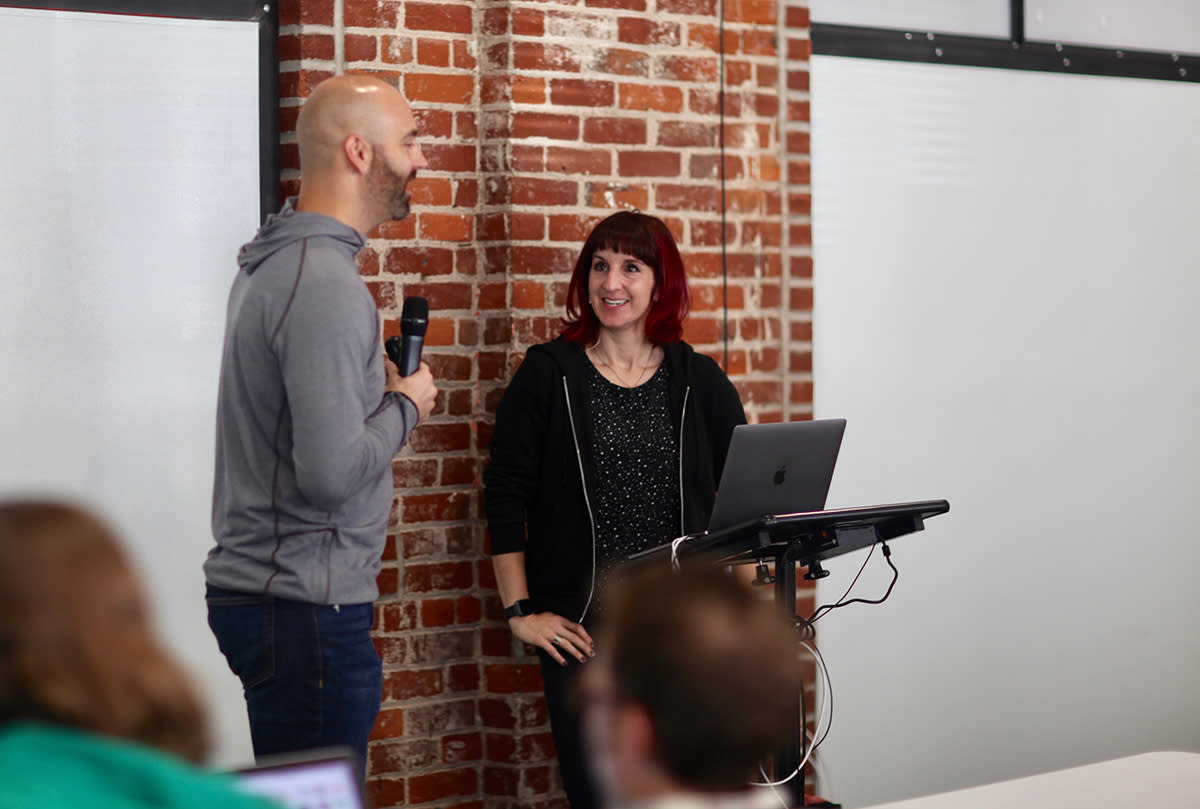
Like many, my first experience with web animation began with Adobe Flash. The year was 2009, and I had just finished creating my first animated website. I loved bringing static vector art to life. Flash forward (no pun intended!) to 2017, and my appreciation and curiosity for creating beautiful web animations has only continued to grow. Imagine my excitement upon learning Val Head, web animation expert, consultant, and author would be presenting at the 2017 Maker Series.

Meet Val
Val is a web and UI animation pro specializing in UI/UX animation. As a consultant and design advocate at Adobe, she shares her passion for the power of web animation with designers and developers. She curates a weekly UI animation newsletter and recently published a book on designing interface animation for the web. At the Maker Series workshop, she presented the essentials to begin designing and creating effective web animations.
UX in Motion
Web animation has evolved into one of the most powerful ways to engage and communicate on the web, but what makes good animation? How does animation affect the user experience? How do I know if what I’m creating is good? Val answered these questions with a list of principles and best practices for implementing meaningful animation.
Great animation has purpose and style. The purpose should always focus on the user. Having a clear mental model of the different layers or places the user will interact with each step of the way will establish continuity. Val shared Cotton Bureau’s site as an example of how this works well.

YouTube embeds track user data for advertising purposes. You can watch the video on YouTube if you prefer not to grant consent for YouTube embeds.
When the user selects an item and places it into the shopping cart, a menu appears to the right on a layer above the item. The shopping cart and checkout experience always align to the right-hand side of the page. It’s clean, simple, and consistent.
How are you communicating with the user? Thoughtful animation, such as a button transitioning from blue to green, or from blue to red, can provide users with valuable feedback, letting them know when something has or has not happened. Val iterated how animation can be used to direct the user’s attention to a specific area or action with guiding gestures, hints, and cues. The Farmer’s Dog does an excellent job of using guiding tasks to take the user on a journey to create the perfect dog food. Animations fade into and away from the form in such a way that users feel like they are having a conversation. The resulting experience feels pleasant, fun, and natural.

YouTube embeds track user data for advertising purposes. You can watch the video on YouTube if you prefer not to grant consent for YouTube embeds.
Performance is often referred to as a function of written code that renders quickly and efficiently. Every millisecond counts while waiting for content to display. But what if the user has an exceptionally poor internet connection? It’s a simple but common problem that traditional performance metrics cannot always resolve.
Val shared how animation can be used to help create the perception of better performance. Research has shown users will wait longer for content to load when they are given something to focus on. Custom loading animations can provide a unique brand experience that builds credibility and directs the user to focus on progress. Many social media platforms display skeleton content while real content is loading. The use of skeleton content creates the sense that something is arriving, thus reinforcing the perception that the real content is loading faster.
Animation in Design Systems
“If animation is always left to the end, it can never be more than decoration.” - Val Head
Good UI animation starts at the beginning of a project and takes the whole team. Better animation communication results in a shared vocabulary, easier buy-in, better solutions, established values, and repeatable, reusable patterns. Ideally, animation should be part of your style guide.
Val shared three methods to cultivate conversation and to get the most out of building animation into design systems.
Deliverables
Motion comps
Interactive prototypes
Deliverables are the things that start conservations. Simple storyboards and sketches allow the team to quickly explore what will move and why.
Motion comps are videos that playback the details of how an animation looks and behaves. They allow the experimentation of animation property values, such as duration, delay, easing, and iteration. Motion comps are created using tools like Adobe Animate CC and Tumult Hype.
Interactive prototyping tools, such as Principle, Atomic, CodePen, Framer, and GreenSock allow designers and developers to not only see the animation in motion but to actually interact with the element. Questions like ‘What will the interaction be like to use?’ and ‘How will the animations interact with real input or data?’ can be explored.
Storyboards, motion comps, and interactive prototypes allow teams to get the feedback and input necessary to establish and implement a concise animation strategy.
Essentials of CSS Animation
After a fast-paced morning filled with learning when and why to use animations, our next step was to learn how to implement them. Val presented three CSS properties and an at-rule used to make animations come to life.
Transforms
Transitions
Keyframes
Animations
The CSS property transform allows elements to be translated, rotated, scaled, and skewed. To make this possible, the value functions available to the transform property include translate, rotate, scale, skew, matrix, and perspective.
The transition property is shorthand for the four properties transition-delay, transition-duration, transition-property, and transition-timing-function. Transition properties are commonly used to add character to buttons using pseudo-classes such as hover and active. Transition properties require a starting point, an ending point, and a set amount of time for the transition to occur.
Keyframes are points along an animation sequence. Unlike the transition property, which can only animate given two points of reference, keyframes animate along multiple points. Multiple points allow for greater control, flexibility, and creativity of the intermediate steps taken within the animation sequence. Keyframes are implemented in CSS using the at-rule of @keyframes and a name to identify the animation. The name of the keyframe is then referenced as a value in an animation property.
Let’s take a look at how animation properties and the keyframes rule work.
See the Pen Dancing Robot by Heather Taylor (@heatherdesigns) on CodePen.
A Final Thought
The UX in Motion principles and best practices guide designers through the early stages of exploring how they can use animation to improve the user’s experience. Animation in Design Systems offers a variety of resources to take the next steps in exploring how an animation will look and feel. Finally, the Essentials of CSS Animation gives us the properties necessary to implement animation.
When it comes to animation, Val offers these final words of wisdom:
“Animation cannot fix things that are already broken in your design.”

