On June 13th, Sparkbox welcomed Derek Featherstone as part of the Build Right: Maker Series. Right away, Derek presented us with this picture.
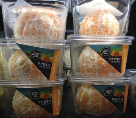
We were baffled at the amount of plastic going to waste, but we failed to consider individuals with limited hand dexterity who might see this as an accessible way to eat healthy food. Derek challenged us to question our pre-existing perceptions on accessibility by pushing us to understand that we knew less than we thought. Through Derek’s workshop, we acquired better insight on how to foster inclusion and how to continue our mission for a web built right.
Takeaway #1: Consider Inclusion in the Design
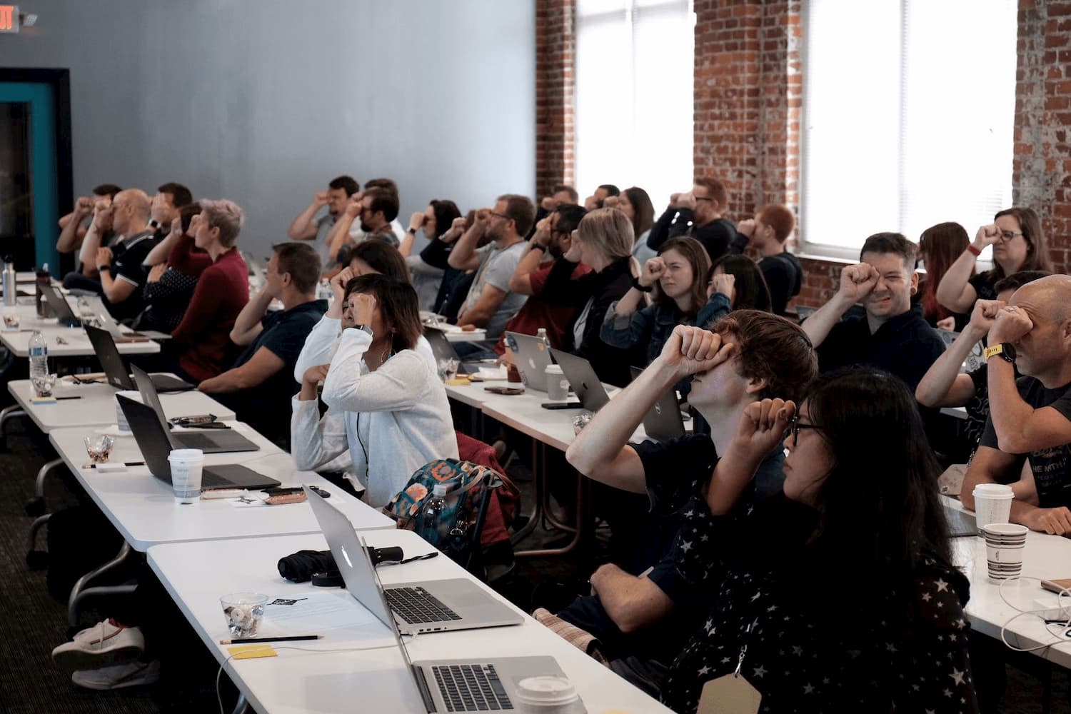
During his talk, Derek gave us examples of accessible and inaccessible designs, explaining to us what made these designs succeed or fail. While looking at these examples, we did various exercises that put us in the position of a person who has a disability. We began by doing the “straw test.” For this test, Derek explained that you make a loose fist, as if you are holding a straw, and look through it at your design. This view gives you a sense of how a person with low visibility might read or navigate your design: some may have to zoom in on a page significantly in order to read it, restricting their view to a smaller portion of the window.
As we looked at multiple design examples, we started noticing that the designs that passed the straw test ultimately followed the Gestalt Design Principles. One of the main principles we discussed when doing the straw test was the principle of proximity: objects that are related to each other should be close in the space. Someone with a visual impairment would greatly benefit from the content appearing in close proximity.
Here are two example forms Derek presented to differentiate between failing and passing the straw test.
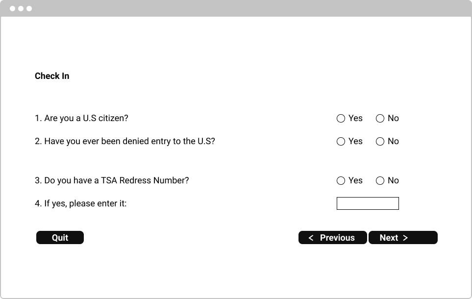
In the form above, performing the straw test would be taxing. As an audience, we all found it hard to continue moving our heads back and forth multiple times to ensure we were clicking the correct buttons on the screen.
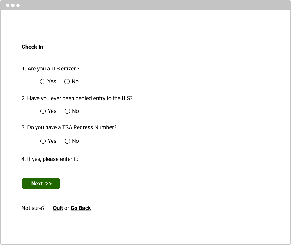
We found this second form easier to fill out with the straw test as we only needed to move our heads from the top of the form to the bottom once. We all knew exactly which questions and buttons correlated due to their proximity.
Following the Gestalt Design Principles will help you make inclusive designs that are easy for everyone to consume.
Takeaway #2: Integrate Inclusion in the Process
“Nothing about us, without us” —Michael Masutha
When accessibility is treated only as a requirement for building a website and as an afterthought, inclusive design is oftentimes left out, which can result in an unintentionally exclusive solution. This means that last-minute adjustments are made for people with disabilities. In his talk, Derek emphasized that we need to design with people with disabilities and address accessibility throughout the user experience design process. This allows us to create a more inclusive design that is a better product for everyone.
The video below shows an adaptive Xbox controller with inclusive packaging. Microsoft invited gamers with disabilities into their design process, and as a result, created a design that was inclusive down to its box.

YouTube embeds track user data for advertising purposes. You can watch the video on YouTube if you prefer not to grant consent for YouTube embeds.
Accessibility is an outcome; inclusivity is a process.
Derek urged us to enable the participation of people with disabilities, inviting them to contribute and disrupt the design process for a better outcome. Rather than just assuming their needs, we must rely heavily on their feedback.
“Inclusion should be considered a core value within the design process.” —Derek Featherstone
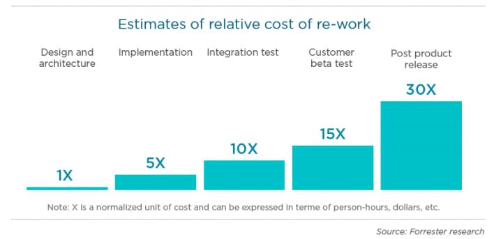
In order to achieve the best possible outcome, we must invest in the process. Teams commonly address accessibility at the end of the user experience design process and then realize changes need to be made. This causes an influx of unnecessary iterations to achieve accessibility. Re-working the product gets more and more expensive the further it progresses towards completion. Working inclusively within the design process is much more cost-effective than working on accessibility after release.
Inclusive, not Just Accessible
With an inclusive product and process, we bring power to our designs. Accessibility is a great start, and our industry should be focusing on it. But simply being accessible according to a checklist does not make a website inclusive. For the greatest outcome, we need to be more open-minded to learning from others.
Inclusive design leads to better solutions in addition to achieving accessibility requirements. When we design with people with disabilities, we create a more inclusive design for everyone and build a better web for the future. With these two takeaways from Derek Featherstone’s workshop, we can start to incorporate inclusion into our everyday work.

