
For web designers, it’s our job to make the web beautiful and easy to use. We use visual tools such as typography, color, images, layout, and animation to draw in users and guide them through their internet journey. While this is great for creating a more visually engaging web, there can be a cost. The more visual flair we add, the slower a website can become. Design for the web comes with a performance cost that can actually damage the websites we are trying to improve.
For example, the longer a site takes to load, the faster users will leave in frustration. Many factors contribute to slow websites, but one that is rarely talked about is the site’s design. Designers can sometimes make decisions without considering the performance implication of those decisions. Let’s change that.
The Culprit: Images and Fonts
A fast site can be associated with un-engaging design, but that doesn’t need to be the case. There’s a balance to be struck. Smart, performance-minded design decisions result in sites that are fast, functional, and beautiful. Images and fonts are two of the largest factors in site performance and both tend to be chosen before a line of code is written.
Images
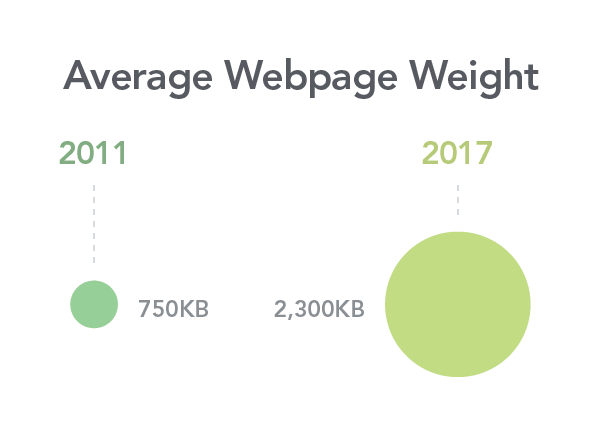
For most websites, images represent the largest volume of data loaded. In 2017, the average site used 1.8 MB of images or roughly 60 percent of the total page weight. And the numbers continue to rise. The performance impact of bloated webpages is even more noticeable on older devices and those with slow connections. With the continued rise of mobile website usage, now over 50 percent, performance continues to be an important consideration. We need to design and build for users who do not have the newest device or fastest connection.
This is not to say we should remove all images, rather, we should carefully consider the images we do use and how we use them.
Consider the Page Layout
An image’s physical size is the number one factor in its file size. For example, a full-width image will need to be a much larger file than an avatar image. While they are dramatic, full-page images should be used sparingly. To improve performance, constrain your images to a set width instead of letting them “bleed” to the edges of the screen. This allows you to set a specific file size in the CMS for all images in that space. Or, instead of relying on a hero image to set the tone for the page, use large text as the main focal point. This will improve performance by requiring less data and can often result in a more unique layout.
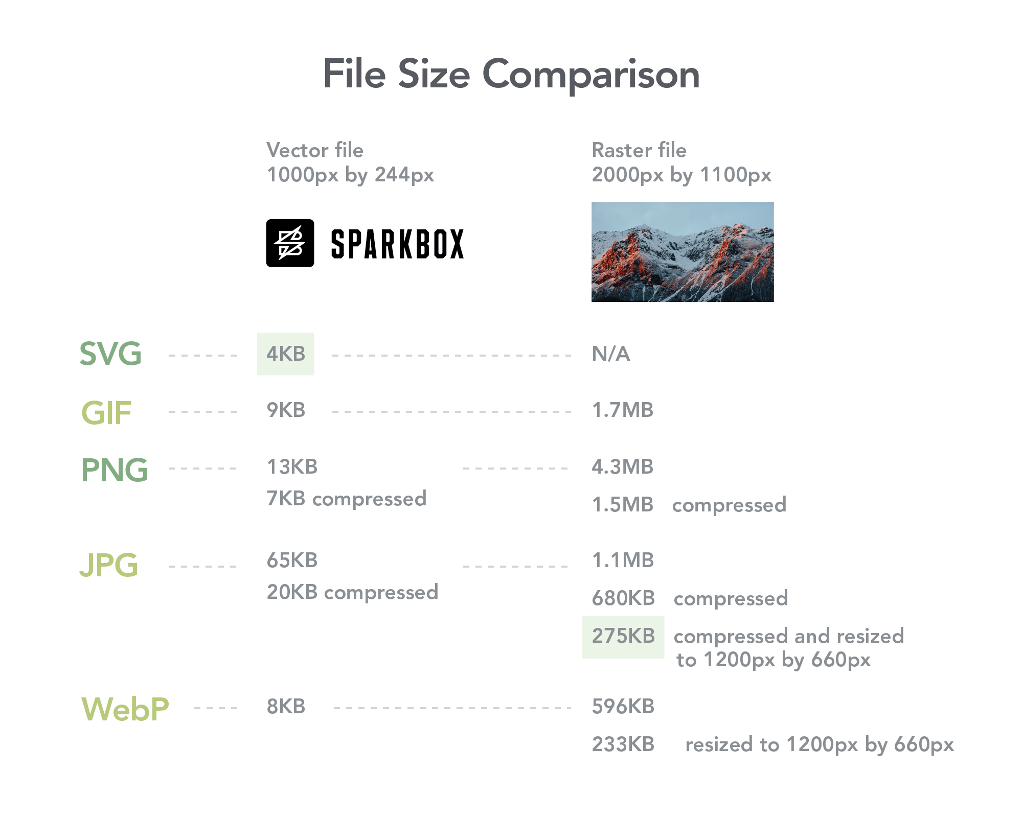
Consider File Type
File type is also a large factor in file size. SVGs are generally the smallest file size for image assets. They are great for illustrations, icons, and simple animations but should not be used for photos since they are vector-based. GIFs can be useful in a pinch but their limited color palette and large file size versus SVGs give them few ideal use cases. PNGs are great for photos with limited color palettes, transparent assets, or when you don’t have access to a vector file. Everything else, including most photos, should be JPGs.
It’s worth noting that SVGs can deliver visual flair with a smaller file size compared to other formats. Designers should consider using an illustration over a photo to save data.
In addition to the well-known image formats listed above, there’s also a new web image format on the horizon. Google’s new WebP file type might be worth looking into. It promises roughly 25 percent better compression over PNGs and JPGs and maintains the same visual quality. You can use WebP today by utilizing the <picture> element, which allows for fallback image formats.
Consider Compression
Raw stock photos are fine in your design file, but you should avoid passing on any excessively large files to users. Compression is your friend here. First, resize the image to fit the space in the design. Then, compress it using Photoshop or a free, online tool such as CompressJPEG. This will shave off any unnecessary data. There’s a balance between the smallest file size and the quality of the image. By resizing and compressing the image yourself, you can verify the final image has both.
For CMS-based projects, it is important to communicate image and file size recommendations with stakeholders, which you can include as comments in the CMS. Ideally, image optimization should happen as part of the CMS, but if not, it is helpful to create a document to guide the client as they optimize images in the future.
Consider Responsive Images
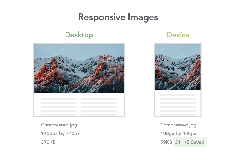
You can work with developers to take your images one step further. Consider using srcset or the <picture> element to deliver unique images depending on the size of a user’s screen. This “responsive images” technique allows you to provide different images for desktop and mobile browsers that are sized appropriately. For example, you can direct the code to use an image that is 1400 pixels wide when the browser is a certain width and an another image that is only 400 pixels wide when the browser is smaller. In this way, the image used will always be the appropriate size. This is especially helpful when accounting for the horizontal orientation of desktop screens versus the vertical orientation of mobile screens.
Typography
While font files are not as large as images, fonts are still a potential quick-win for performance. With fonts, it is less about size and more about the fact that the font assets are render blocking. This means the page will be blank until the custom font files have loaded (as opposed to images that can load after HTML and CSS). In some cases there could be a flash of fallback system fonts before the custom font displays.
What can designers do to avoid this?
Consider Using Fewer Typefaces and Font Weights
Every new font and font weight means more files for the browser to load. For example, if you use bold and regular Futura, you’ve loaded two separate sets of font files. Do your best to limit the number of fonts and weights to three or less. But this doesn’t mean your design will be boring. Color, size, spacing, and capitalization are a few of the many attributes you can change to create variety and hierarchy in your type styles.
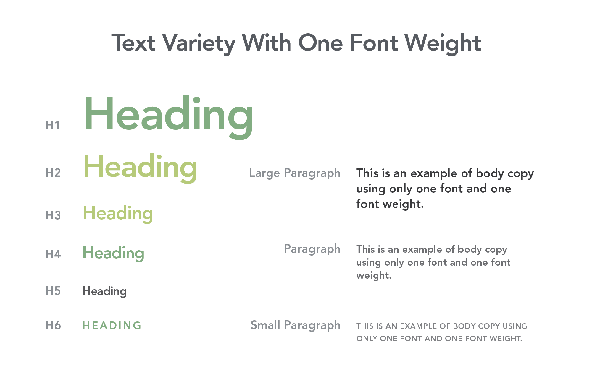
Another way to save data is to use a system font. This matches the font of your website with the font of the system UI so you don’t load any extra resources. As a bonus, users will be more familiar reading it, since it is what the rest of the system UI is using. A unique heading typeface can help add any personality that might be lost in using a system font.
The Magic of Variable Fonts
There’s a new technology on the horizon that might change everything. Variable fonts promise one file that allows for complete control over many properties. Almost limitless control gives designers more flexibility while improving performance for users. You can experiment with variable fonts today, but unfortunately the browser support is not great yet.
It’s a Balance
Improving performance doesn’t mean we should remove all fonts and images. It just means we should be more aware of how the design decisions we make impact user experience. Performance is a balance between content and design. As designers, we should do our best to be mindful of the real performance impacts our decisions have.
