
HTML gives us six levels of headings to use in our webpages. Many pages don’t need that much hierarchy, so it’s easy to forget about styling the headings beyond h3 or h4.
Forgetting to style headings is a problem because on any site displaying authored HTML content, there’s a chance that someone somewhere will try to use them. Does your site have a CMS, comments section, or CRUD interface? They could show up.
This is a problem because the default browser styles for the lower heading levels are NOT GOOD. For example, here’s what the default styles for headings look like in Google Chrome (live demo here):
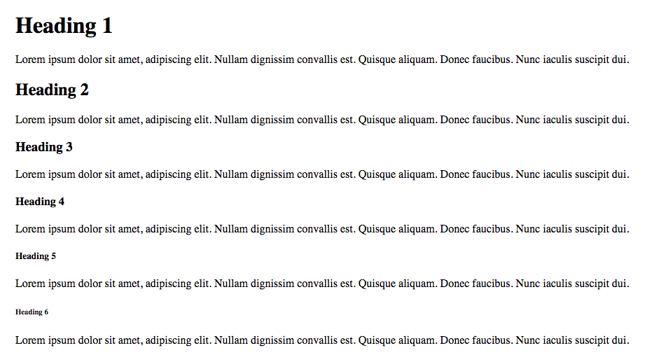
The h4 is passible, being just a bolded version of the body text. h5 and h6 are actually smaller than the body text by default, which feels wrong to me. Smaller heading text muddies the relationship between the title and the content it is supposed to represent.
It’s a bummer having standard HTML elements that look broken on your site. Let’s look at some options for fixing this:
(Quick note, I’m assuming that you want global styles for your headings in the first place... in some cases you don’t)
Fixing It With Size
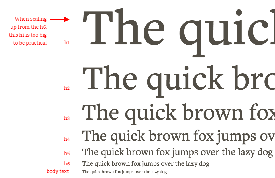
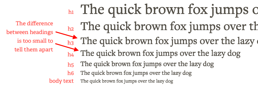
One way to fix this is to shift our smallest passable heading styles down to the h6 and make our remaining sizes larger from there. This can work great, but there’s a balancing act here. If you make the difference between heading sizes too big, then your h1s/h2s could end up bigger than you want. If you make the difference too small, users won’t be able to clearly differentiate one heading from another.
Using a modular scale calculator can help you find a ratio that looks good and balances these concerns. Just don’t sacrifice the look of highly visible h1s, for the sake of infrequently used h6s.
Fixing It Another Way
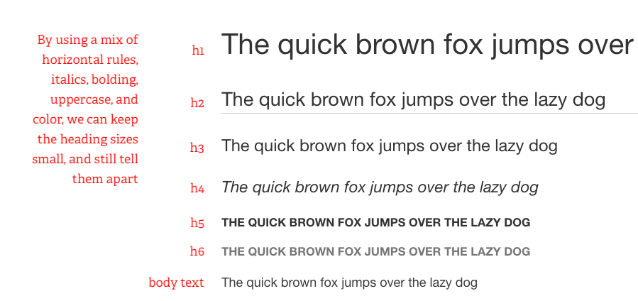
Size is just one of the tools we have for signaling text hierarchy. Others include:
Font weight
Italics
Uppercase / Lowercase
Smallcaps
Different Fonts
Underline
Color
There are many ways you can use these... here’s one example:
You should experiment with these tools and see what works best for your situation. A couple things to keep in mind:
Underlines are typically used for links, so while they make good headings for print applications, you probably want to avoid them on web pages.
Using TOO MANY EMPHASIZERS AT THE SAME TIME can send mixed signals.
How About Not Fixing It?
Sometimes you just know you won’t need six levels of headings for your site. In these cases, you can choose to style your h5 and h6 to look the same as your h4. This way, you effectively have four levels of headings, but it won’t look broken if somebody uses the h5 and h6.
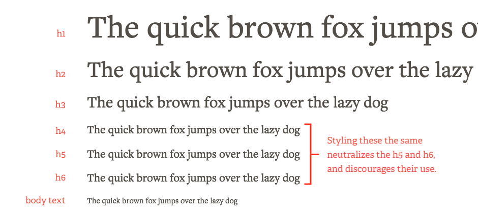
There are downsides to covering up the differences between these elements visually. If your content was displayed in another context (like an RSS feed or a screen-reader) then those differences would be exposed. That being said, we’re only talking about this option since you know you aren’t going to use these levels.
Other Examples
If you want to see how others are handling this, you can browse through style guides. Most style guides have a typography section that show their heading levels.
I’ve also found it helpful to browse through the styles that come with word processing tools like Microsoft Word or Google Docs. Often, these programs have multiple “themes” you can browse through and apply to see how they style different heading levels.
You can get pretty far without thinking about h5s and h6s, but the edge-case is out there, so if you’re working on a project, I’d encourage you to just drop an h6 into your page and see what it looks like. A proactive quick-fix could save you from the future headache of broken-looking content.
