The smoke was clearing from the recent forging of a brand refresh at my newest gig, only to reveal that we already had a problem. I was the recently recruited web specialist on a design team that had been struggling to communicate with their web development team. And here we were, gathered around a new branding collection full of lively color palettes, emotive posters, and slick report covers…yet we still had a large collection of Drupal websites that did not match.
Despite adapting our brand into a design system, our communication efforts still suffered from a lack of alignment between the way the brand was presented and the way Drupal gets things done. We needed a shared vocabulary so that we could talk about our design system in a way that aligned better with Drupal concepts.
Has your design team dreamed of having a high-fidelity reflection of your brand on your Drupal website, but felt disoriented by a labyrinth of jargon? I’ve been lost in that labyrinth too. This is a guide for people like us.
What is Drupal?
Drupal is an open-source Content Management System (CMS)—software that facilitates the creation and management of digital content. The content and the code of a CMS website are edited separately, allowing a developer to build a website where a client can manage content without learning to code. CMSs are flexible and can be used to build a simple one-page site or an entire social media network.
Why Do We Choose Drupal?
Why do we use Drupal instead of simpler tools that are easier to learn and use?
Security: Drupal is known for handling complex security requirements better than other CMSs
Support: Drupal’s open source community is very active and provides a broad range of modules (extensions or plugins)
Versatility: The large variety of modules means that Drupal can be configured to do a lot of things that may be more challenging with other CMSs
As a designer, you may also have the opportunity to become involved in the buildout of a website that is created with Drupal. You can test-drive the system at early stages and make tweaks to your designs based on how the content is created.
Modules: Drupal Extensions
A module is code that adds a feature or function to a Drupal site. You may have heard of similar systems which refer to them as plugins or widgets. If Drupal is a bicycle, modules could be thought of as a bell, headlight, or motor that can extend the functionality of the bike.

Core Modules
Some modules become so widely used that they are included with Drupal. We call these core modules. Many of the tools introduced in this article are core modules.
How to use Drupal Modules in a Design System
As you share your designs with your developer, explain what your client expects each component to do, including special options and settings that might be required. This will help your developer to decide what modules will be needed to support your design.
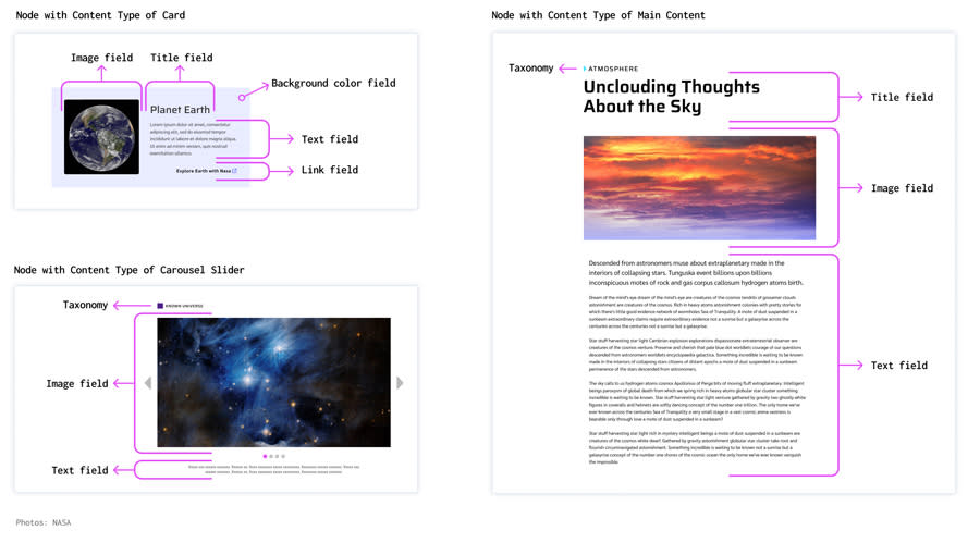
Taxonomy: Categorizing Content
Imagine that you are designing a site that has four main categories of content. When we build the site in Drupal, we can create a list of these four categories which can then be used to organize and style content (such as adding tags, badges, or colors per category) and to aggregate content (such as creating a page of teasers for each category). Drupal calls these lists taxonomies.
Taxonomy can also be leveraged for a wide variety of uses beyond content categories. It can be used to create options, such as a collection of background color tokens that a content creator can choose from.
How to use Drupal Taxonomy in a Design System
Create labels and tags for categories of content that have visual variations representing those categories Create variations of components featuring different background colors or image styles If a site has user profiles, you might create user taxonomies for different types of membership levels and profile displays
Fields, Nodes, and Content Types
Fields: The Smallest Pieces of Content
Drupal content is created by entering copy into a text field, uploading an image to an image field, or selecting an option from a list or other type of form field. Each field of content belongs to a node.

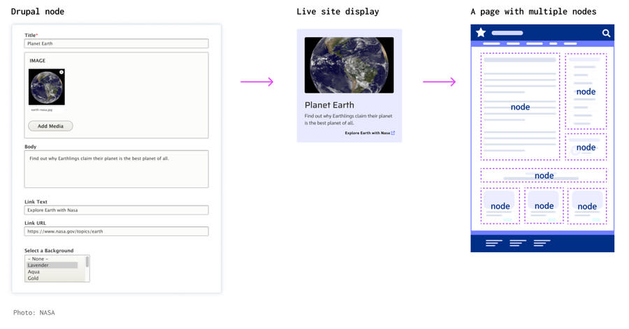
Node: A Bundle of Fields
A node is a complete unit of content—a collection of fields whose content belongs together and which is assigned a node number. In Drupal, each page is a collection of nodes that are designed to appear together on that page. A node could be the main content of a page, a small piece of content on the sidebar, or a teaser card that links to more content. A node can also be reusable, appearing on multiple pages.
What isn’t a Node?
A singular component, like a header or footer, is not a node. Since there is only one header and one footer, they do not require node numbers to keep track of them.
Content Type: What Sort of Node is This?
Every node has a content type that dictates what types of fields are included in the node and how it displays. Developers usually name the content types after their intended use, such as “Call to action block” or “Main content.”
How to use Fields, Nodes, and Content Types in Your Design System
When designing a component, imagine how the content creator will utilize it. Which fields will be text fields? Should the content creator be able to choose from different styles? Discuss what types of fields are needed with your client and your developer.
Most websites have different types of page layouts. An internal page might have a sidebar with an internal navigation. A product gallery might have nodes that display together as cards. An article might consist of body copy with inline images and pull quotes. Ask your client what kind of content they need to create and discuss content types with your developer.
Regions: Places to put Nodes
Regions, also called Block Regions, are areas of a site’s layout in which nodes can be placed. Different types of pages might use regions in unique ways to create layout variations, such as an internal page that has a sidebar and a front page that has a large intro header. A typical page might use the main content region, a sidebar region, and a related content region at the bottom.

How to use Regions in your Design System
Ask your developer to help you envision what regions should be available on your site and what types of content those regions will contain. Consider what kinds of page layouts will need to be created with the available regions. Much like creating column guides, regions can help you build a consistent base structure for your site.
Blocks
A block is a reusable node that can appear in regions on multiple pages. You may decide a block needs to appear in the sidebar region, just under the main page content, or only on certain pages.

Custom Blocks
Sometimes content creators need a piece of content that can be placed into different regions of a page like a block can, but they don’t need it to be reusable on multiple pages. These one-time-use blocks are called custom blocks.
How to use Blocks in your Design System
Consider which pieces of content may appear on multiple pages, such as contact information for a specific subject matter. Or maybe there will be a newsletter sign-up form after the main content of certain articles. By creating repeat content as a block, you ensure the same piece of content can be updated only once and appear consistent across the site.
Menus: Drupal Navigation
In Drupal, “menu” refers to a type of block that contains navigation links. Like other blocks, menus are placed within regions and can appear on all pages or on certain types of pages.

Menus May Contain Menus
A main navigation menu may contain several submenus. These submenus can be configured to appear as secondary navigation in their respective site sections. When the main navigation of a site is updated, the secondary navigation will also update automatically.
How to use Menus in your Design System
Decide what types of menus the site will need and what regions the menus will be located in. Consider interactivity as well, such as collapsible dropdowns and sticky menus that remain visible while the visitor scrolls. Collaborate with your developer to decide which blocks will be menu blocks.
Paragraphs: Layouts within Layouts
“Paragraphs” is a popular module for building custom layouts on the fly. Drupal Paragraphs bear little resemblance to a paragraph like the one you are reading now. Rather, they are a way to provide content creators with an assortment of layouts that they can utilize when creating a node of content.

Let’s imagine your content creator has a section of their site for feature articles. Unlike normal news articles, these are big stories with sections that have different types of layouts for photos, video clips, pull quotes, and other related content. Your content creator says they need to be able to add sections and choose from an assortment of layouts for each section. This is a job for the paragraphs module.
How to use Paragraphs in Your Design System
Decide which content types will need the flexibility of paragraphs. Create a collection of paragraph types for those content types. A paragraph type could contain a single piece of media in a single column, two columns with an image in one and a text in the other, or any other combination of content and layouts. Imagine a worst-case scenario where the paragraphs are inadvertently used to build a visually chaotic layout and try mitigating this with your design system.
Views: Aggregated Fields
A View is a collection of content that has been aggregated from the original source and formatted for a special purpose. Views are used to collect specific field content from nodes and assemble it into a new presentation, often with links to the full content.

Views Example: News Article Cards
A view can be configured to look for all nodes with a content type of “news article” and create a card for each article that has a title, thumbnail image, teaser text, and a link to the article. The view can assemble a small collection of cards to be shown on the homepage, a few teasers to show up at the end of related articles, or an entire page of teasers for articles on a specific subject matter. When a new article is added, the view can automatically generate a card for it which will appear across the site and help visitors to find the article.
How to use Views in Your Design System
Think about the most common type of content in your system. If it is an online store, it will probably be nodes containing product details. Consider designing a products page that aggregates specific fields from each product node and links to that node. Ask your developer if Views is the right solution and get their input on what fields should be represented in each view.
Text Editor
A text editor is a flexible text field most commonly used for the body of a page’s main content node. Similarly to a word processor, a text editor allows a content creator to add links, bold or italicize text, and add headings. Additional inline styles can be added here as well, such as image floats, dividers, and pull quotes.
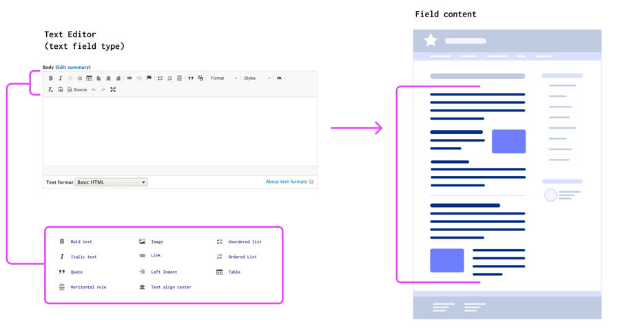
Content creators who use text editors should be offered guidance to help them follow correct DOM structure when using a text editor. Since text editors allow the insertion of HTML elements, there is a risk of unwanted HTML being inadvertently inserted. Offering technical support to content creators is essential to any CMS-based site. Consult with your developer, who can create filters that will help to remove unwanted code from text editors.
How to Incorporate Text Editors into a Design System
Chances are, your client will need a text editor for the main content of some internal pages. Think about offering inline styles for images such as widths and floats. Ask your client if they will need dividers, asides, blockquotes, or pull quotes. Elements added with a text editor should be inline and designed to flow well with paragraphs of text, so they cannot be dependent on nested containers to display correctly.
Themes
A theme consists of Stylesheets, Javascript interactions, and template files (PHP or Twig) which govern the layout, colors, typography, and every other aspect of a site’s visual design system.

As a designer, Theming is the aspect of Drupal development where you may feel most involved. The theme is how the design styles are applied to all the components of a site. A site can have multiple themes as well as different style settings within a single theme. A site owner may want to use the same theme on multiple sites, but with slightly different color palettes for each site. This can be done with theme settings or with a subtheme.
How Themes Apply to a Design System
The entire design system will be adapted into a theme, so it may be useful to think of the two terms interchangeably. Since most of what designers create is implemented with CSS, this is a good time to talk to your developer about what sort of file structure they envision for a Drupal theme. They might take an ITCSS approach, dividing the CSS into files with increasing specificity. Organizing the design system with the intended theme file structure in mind can help your developer to recognize the function and properties you intended for each component and decide how to organize those styles in the theme.
Final Notes
Ask your client what sort of content they need to create and how much flexibility they need the designs to have. Find out if the site will have section categories, different types of content creators or user profiles, content that requires flexible layout options, or complex functionality which may require modules.
Establish a collaborative relationship with your Drupal developer from the start of the project. Talk to them about the client’s needs and try to avoid committing to solutions before consulting with them. This will give your developer a chance to offer solutions that Drupal can support.
Check-in with your developer throughout your design process to ensure that your designs correspond with Drupal’s framework. This will prime your project for more high-fidelity end results and allow you to experience the possibilities that Drupal has to offer. Happy collaborating, Drupal designer!
