We spend a lot of time internally—and externally, with our clients—talking about the value of having fast and frequent feedback loops during our development process. Typically, our projects use continuous integration tools coupled with code quality and code testing suites.
For teams working on or maintaining design systems, testing should be at the core of their development workflow. Along with code testing, design system teams may also find a lot of value in visual regression testing user interfaces to be sure that the system is maintaining its consistency and integrity.
What Is Visual Regression Testing?
In software engineering, regression testing is the act of repeatedly testing an already tested program for defects—or regressions—due to modifications.
Visual regression testing expands on this idea by testing for and discovering visual defects due to modifications to the software. These changes can be obvious or subtle.
In practice, visual regression testing can be as simple as capturing a collection of screenshots from a user interface and comparing that collection against a baseline of original or reference images that serve as the “source of truth.” Detected differences are highlighted and can serve as an alert that a potential regression may have occurred, or an unintended change may have crept into an interface. We often use a testing pyramid to explain the various types of tests and their expected roles and outcomes. We can use the testing pyramid visual for design system testing as well!
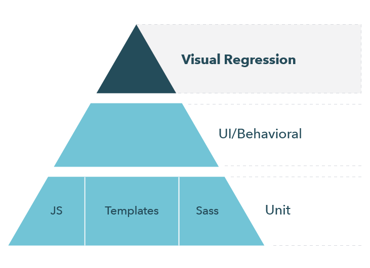
The top level of our pyramid encompasses visual regression tests, which have high value for a design system. Visual regression tests complement your unit and integration tests to validate that not only are your components functioning correctly, but they’re also free of visual defects or regressions.
Where Does Visual Regression Testing Fit in Your Dev Process?
At Sparkbox, our development process revolves around GitHub’s flow. Developers work locally on their own branches and then open pull requests to initiate a discussion about their commits.
When a pull request is created, continuous integration tools start to run against the code in the branch. It’s during this step in the workflow that we run our automated tests, and if any of the automated tests fail, we block the branch from being able to be merged into the master branch.
Just like with our automated code tests, we want to ensure that no visual defects are making their way into our sites and apps. Ideally, we should lean on our continuous integration tools to have them run visual regression tests during this part of our workflow, and we should stipulate that any detected visual changes must be explicitly approved before the branch can be merged.
Teams that use a similar workflow are in luck! Newer visual testing tools on the market are built with the previously mentioned workflow in mind. We prefer the cloud-hosted method of capturing and reviewing snapshots that these tools offer because it helps us keep a tighter and faster feedback loop, and non-developers don’t need to run applications locally to validate snapshots. We’ll discuss a few of those cloud-hosted tools later in this article. But if your team’s workflow is different than ours, or if your needs are different, there are many other non-cloud-hosted tools that perform visual testing, and I’d encourage you to investigate which of those would be right for your team or project.
Visual Regression Testing for Design Systems
In our 2019 Design Systems Survey, of the 24% of respondents who implemented automated testing on their design system, 58% said they performed visual regression testing. I’m not surprised that the majority of our respondents who are actively testing their design system have some kind of visual regression testing strategy. It’s incredibly difficult to keep track and verify what visual changes are rippling out across a product or suite of products and how changes to one component can affect other components.
Did a button component’s padding change to accommodate lengthy words or an additional language? How does that padding look at different screen sizes and in different browsers? Does it look the way that the designer intended? All of those questions can be answered by running a visual test against the component’s changes and having a human validate that all of the detected changes are also all of the intended changes.
Visual Testing Tools for Design Systems
Tooling for visual testing, just like tooling for design systems, has evolved quite a bit over the past several years. It wasn’t that long ago that we wrote about automating visual testing with a tool called Wraith. While Wraith is still an excellent tool, several newer tools fit perfectly in the context of creating and working within design systems, especially for teams who use a similar workflow to ours.
Percy
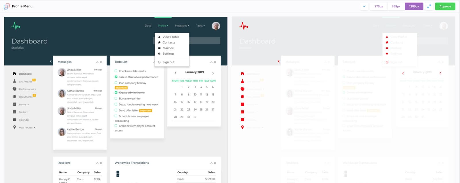
Percy touts itself as “your all-in-one visual review platform,” and that’s incredibly accurate. Not only is Percy framework agnostic, but it also integrates directly with continuous integration tools, and it gives us that all-important required approval step.
Percy’s demo app is a nice way to see what working with the tool is like. The demo gives you access to the full dashboard and a demo project complete with examples of in-progress work that you can review.
To get an idea of what Percy is like in a design system, you can register for a Percy account. Shopify’s Polaris design system is currently using Percy, and because it’s a public GitHub project, you should be able to see its visual testing in action by looking at any of the open pull requests in the repository and clicking through to see the results of the Percy tests.


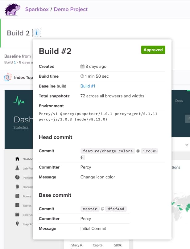
Percy’s pricing is based on the number of snapshots per month. So for larger design systems that evolve frequently, it might be wise to consult Percy’s pricing tool to get an estimate of what it might cost your team.
Chromatic
Chromatic is geared toward React, Vue, and Angular applications that use Storybook for developing and maintaining their UI components. In fact, Chromatic is developed by the folks who created Storybook.
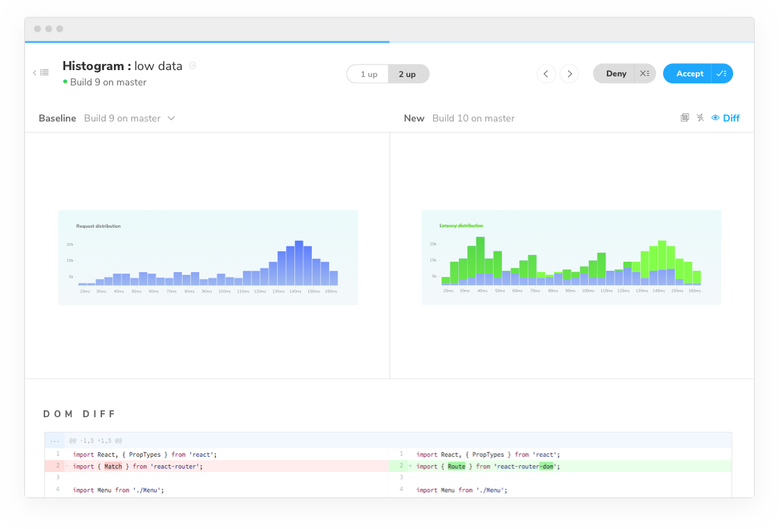
Chromatic’s testing and review processes are somewhat similar to Percy’s. When you create a pull request, Chromatic automatically runs and creates a set of side-by-side screenshots showing a before-and-after view with any differences noted. Those differences can be approved or rejected, and the branch can then be unblocked from merging.

Chromatic’s pricing is also based on the number of snapshots per month.
Applitools
Applitools is another visual testing tool that can integrate with projects in a number of different ways, including via end-to-end testing with Cypress or via Storybook.
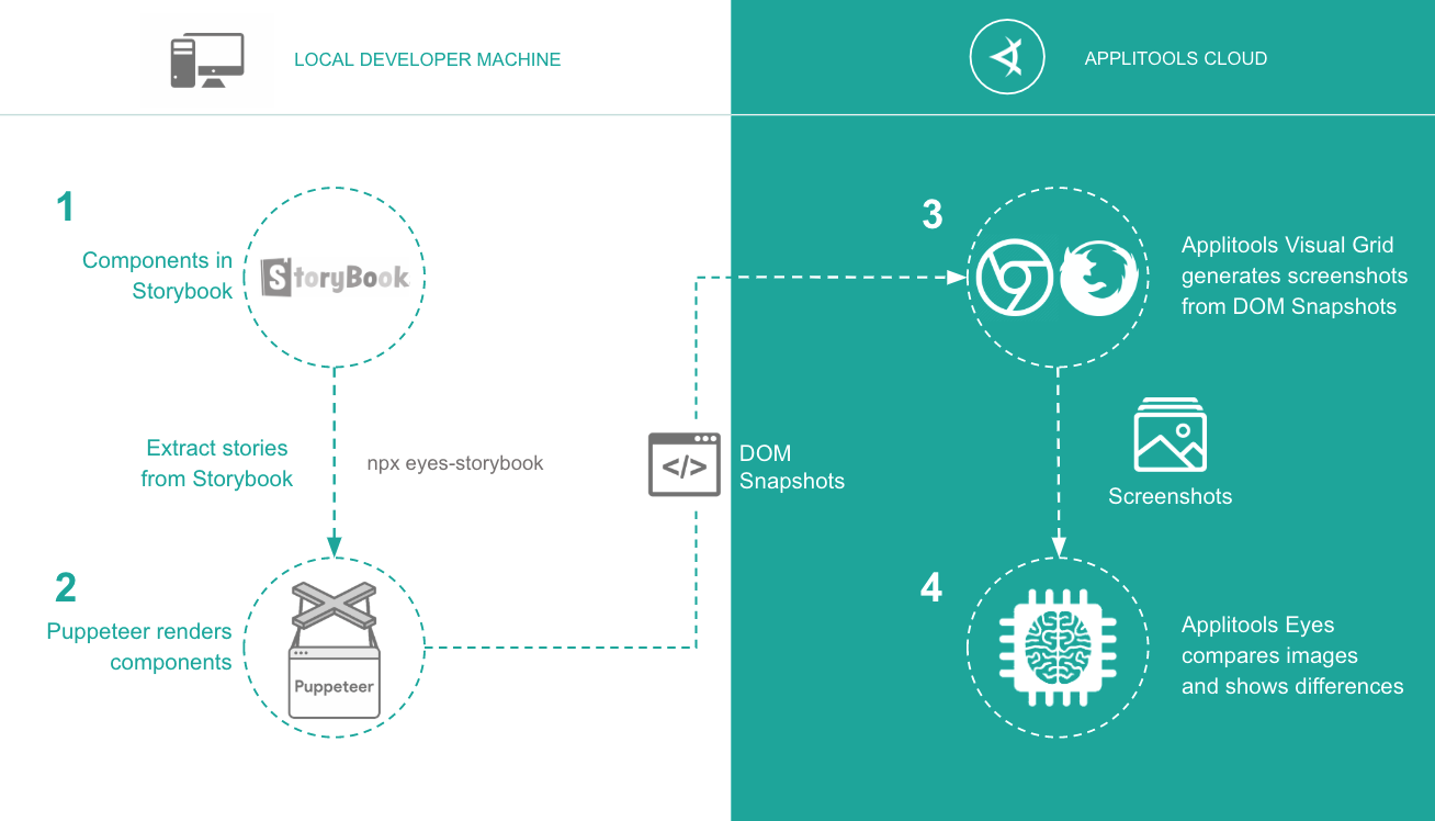
Unfortunately, Applitools doesn’t really reveal their pricing model—you have to contact them for more information—but the product is feature-rich, and their site has a plethora of integration tutorials.
Visual Regression Testing Should Be Part of Your Design System Workflow
Design systems enable our teams to build better products by ensuring a level of consistency and reusability. We want to stand behind our code and our interfaces by proving that they’re well tested and forward moving—not regressing. We’ve seen that modern visual regression testing can fit into any number of preferred workflows, and it’s an especially valuable part of a design system’s dev workflow. If you or your team is already using one of the tools I mentioned above or has a different strategy for visual regression testing, especially in a design system, we’d love to hear from you.

