
In a recent case study, Austin shared how we evaluated, reorganized, and streamlined site content for Blacks in Technology, which serves as “a global platform for black women and men in technology.” In addition to refactoring content, we also set out to create a bold, modern redesign. Inspiration for the redesign was influenced by our desire to incorporate the latest web technologies, which included the use of CSS Grid for the site’s grid layout.
Why Use CSS Grid?
The advantage of using CSS Grid for layout is the capability of content to display in rows and columns, creating a two-dimensional layout. Another advantage to using CSS Grid is the potential for improved performance. It takes less code to write a layout with CSS Grid, and less code equals faster processing!
CSS Grid has been in development since 2012 but only recently have developers been able to use CSS Grid across almost all major browsers without an experimental flag. 2017 was a banner year as Chrome, Edge, Firefox, Opera, and Safari implemented support for the CSS Grid specification.
So we can immediately start using CSS Grid right? Absolutely! But with one caveat. According to www.caniuse.com, approximately 10 percent of the population is surfing the web on older versions of browsers that do not offer support for CSS Grid or on browsers, such as Internet Explorer, which offers partial support when the prefix of -ms- is applied. The biggest takeaway I learned while working with CSS Grid is the necessity of providing fallback layout styles. It’s important to provide all users with a similar experience. For Blacks in Technology, we choose to use Flexbox as a fallback for browsers that do not support CSS Grid.
The Grid
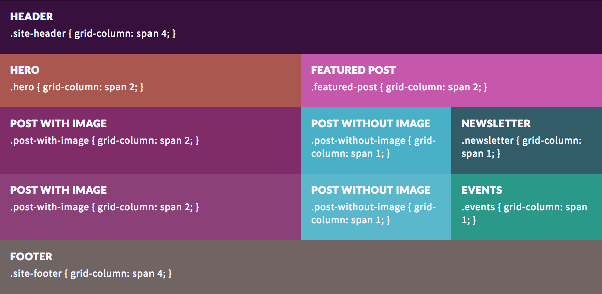
The Blacks in Technology redesign is based on a four-column grid layout with a variable number of rows determined by the width of the browser window. CSS Grid gave us the capability to quickly create a modular layout consisting of independent blocks of content that worked exceptionally well for our new design.
Here’s a list of the content included on the homepage within our four-column grid layout, with multiple blocks of blog post content fulfilling one of Blacks in Technology’s primary goals for the site—featuring its writers.
Top-level navigation with a search dropdown
Hero block prominently presenting Blacks in Technologies’ purpose
Featured blog post block
Two blog post blocks with images
Two blog post blocks without images
Newsletter sign-up block
Event calendar block
Footer
Let’s take a look at the CSS we used to create the overall grid. In the code snippet below, each class identifies a section or division within the layout. Note that the sections do not have a set height, nor do they span a set number of rows. We have identified sections within the grid where content lives. For this layout, the content determines the height of the row in which it resides.
.grid-container {
    display: grid;
    grid-template-columns: repeat(4, 1fr);
}

.site-header {
    grid-column: span 4;
}

.hero {
    grid-column: span 2;
}

.featured-post {
    grid-column: span 2;
}

.post-with-image {
    grid-column: span 2;
}

.post-without-image {
    grid-column: span 1;
}

.newsletter {
    grid-column: span 1;
}

.events {
    grid-column: span 1;
}

.site-footer {
    grid-column: span 4;
}
Writing Flexbox Fallbacks
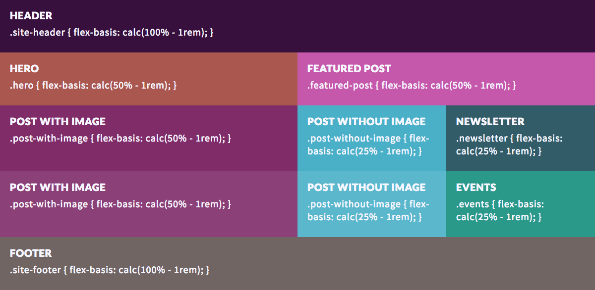
When we reviewed the new Blacks in Technology site design in Internet Explorer and an older version of Safari, we discovered several areas where content was displayed in such a way that it was not clearly visible. Blog post titles that were neatly organized in our CSS Grid layout stacked upon one another in a jumbled display of text. We felt it was important for content to be accessible and readable across all browsers and devices, including those that may not have been updated recently, such as my personal second generation iPad, ahem… To accomplish this goal, we added CSS fallback properties using Flexbox.
Step 1
The first step in preparing to add fallbacks began by placing all the CSS Grid properties into @supports feature queries. Feature queries analyze whether or not the browser supports a given CSS property, in this case CSS Grid.
.grid-container {
    // If the browser supports CSS Grid, apply the properties within the @supports feature query.
    @supports (display: grid) {
        display: grid;
        grid-template-columns: repeat(4, 1fr);
    }
}

.site-header {
    @supports (display: grid) {
        grid-column: span 4;
    }
}

.hero {
    @supports (display: grid) {
        grid-column: span 2;
    }
}

.featured-post {
    @supports (display: grid) {
        grid-column: span 2;
    }
}

.post-with-image {
    @supports (display: grid) {
        grid-column: span 2;
    }
}

.post-without-image {
    @supports (display: grid) {
        grid-column: span 1;
    }
}

.newsletter {
    @supports (display: grid) {
        grid-column: span 1;
    }
}

.events {
    @supports (display: grid) {
        grid-column: span 1;
    }
}

.site-footer {
    @supports (display: grid) {
        grid-column: span 4;
    }
}
Step 2
At this point, content across all browsers will look exactly as it had before applying the feature queries. The next step in the process is to add Flexbox properties above the feature queries. Browsers that understand feature queries will apply the display properties within the feature queries. Browsers that do not understand will ignore the feature queries and use the fallback display properties.
.grid-container {
    // If the browser doesn’t support CSS Grid, let’s give it flexbox properties.
    display: flex;
    flex-wrap: wrap;
    @supports (display: grid) {
        display: grid;
        grid-template-columns: repeat(4, 1fr);
    }
}

.site-header {
    flex-basis: 100%;
    @supports (display: grid) {
        grid-column: span 4;
    }
}

.hero {
    flex-basis: 50%;
    @supports (display: grid) {
        grid-column: span 2;
    }
}

.featured-post {
    flex-basis: 50%;
    @supports (display: grid) {
        grid-column: span 2;
    }
}

.post-with-image {
    flex-basis: 50%;
    @supports (display: grid) {
        grid-column: span 2;
    }
}

.post-without-image {
    flex-basis: 25%;
    @supports (display: grid) {
        grid-column: span 1;
    }
}

.newsletter {
    flex-basis: 25%;
    @supports (display: grid) {
        grid-column: span 1;
    }
}

.events {
    flex-basis: 25%;
    @supports (display: grid) {
        grid-column: span 1;
    }
}

.site-footer {
    flex-basis: 100%;
    @supports (display: grid) {
        grid-column: span 4;
    }
}
Learn More
If you haven’t had the opportunity to check out CSS Grid, now is a great time! There are a plethora of resources available to help get started.
For visual and auditory learners, I recommend Learn CSS Grid with Wes Bos in 25 Pretty Good Videos.
CSS Tricks offers great reference guides for both Flexbox and CSS Grid.
Grid by Example by Rachel Andrew has “everything you need to learn CSS Grid layout.”
Una Kravets created Grid to Flex, a handy tool that allows you to toggle between implementations of CSS Grid and Flexbox.
Sparkbox’s Development Capabilities Assessment
Struggle to deliver quality software sustainably for the business? Give your development organization research-backed direction on improving practices. Simply answer a few questions to generate a customized, confidential report addressing your challenges.
