
At Sparkbox, we love building and talking about design systems and pattern libraries. Over the past few years, we’ve experimented with several ways of building them.
We’ve collected and displayed our components with tools like Drizzle, Fabricator, and Pattern Lab. We’ve custom-built design systems with the help of a static site generator called Assemble. And, we’ve even kept things simple by pulling partials into a view in Rails.
Recently, we started working on a large React project and saw the need to have a similar showcase for the UI patterns inside the app to aid in developer efficiency. Enter: Storybook.
Tell me a story... 📣📖
Storybook calls itself a “UI Development Environment.” What the Storybook team means by “environment” is that Storybook runs inside your project but also allows for complete isolation of your React components. When you install Storybook in your project, the result is a completely isolated collection or book where your React components live on their own. Developers are then free to work on components in that isolated environment, outside the context of the full application.
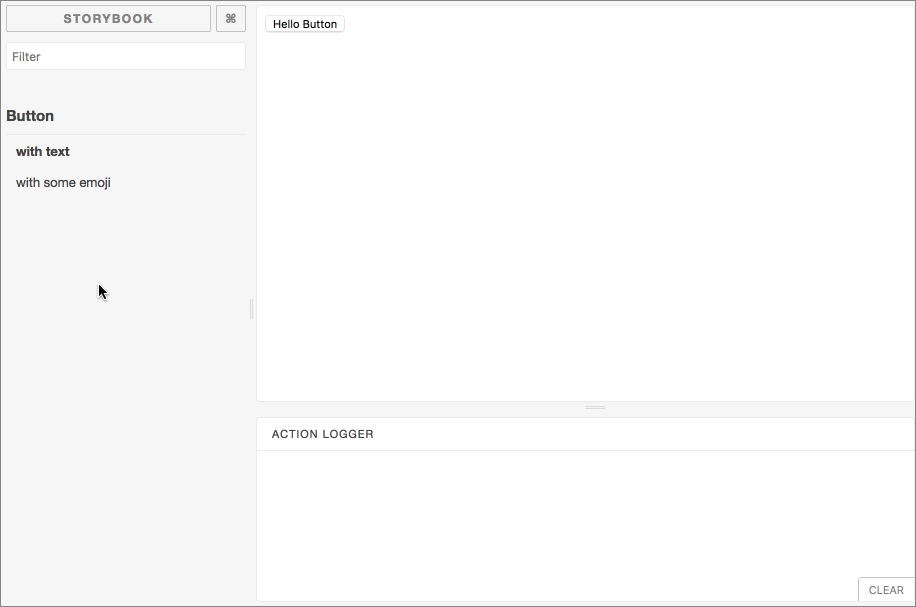
Storybook is all about writing...stories. You can think of a “story” as a single state of one of your components. In keeping with the metaphor here: when you write a set of “stories” for your components, you get a storybook. For instance, you may want to show several variations of a <Button /> component.
storiesOf(‘Button’, module)
.add(‘with text’, () => (
<Button onClick={action(‘clicked’)}>Hello!</Button>
))
.add(‘with some emoji’, () => (
<Button onClick={action(‘clicked’)}>😃 😎 👍 💯</Button>
));
What we’re doing here is creating “stories” about a component called “Button”; one with some text (Hello!), the other with some emoji (😃 😎 👍 💯). The result is a navigable collection of components where anyone can view the rendered code.
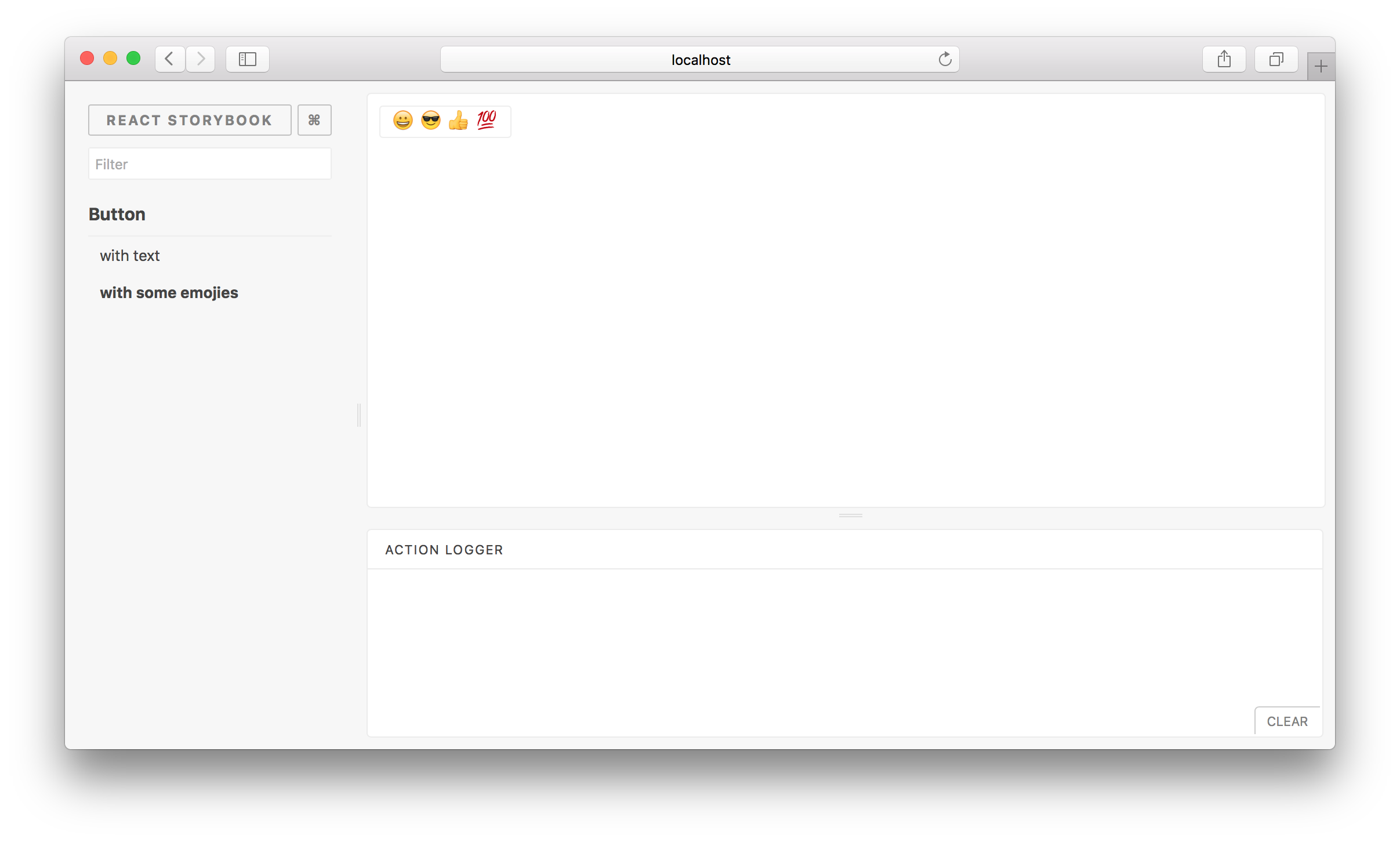
Additionally, Storybook provides a way to easily inspect a component’s actions, which the above code shows with {action(‘clicked’)}. When a component is interacted with, its actions get logged to the “Action Logger” frame, which comes with the default Storybook install.
This is a quick and easy way to see what a component should be doing when it is interacted with in some way, especially when the results might not be rendered in an immediate or visual way to those using the app.
The above examples were taken directly from the Storybook documentation, but a great, real-world example of how a project uses Storybook to showcase its components and their variations is the Airbnb team’s react-dates project.
Ready-to-go and extendable
Out-of-the-box, Storybook might have everything your team needs to start working right away. But another area where Storybook shines is through its addons. The Storybook team maintains several addons, but because the project also has an addons API, you can lean on community-contributed addons or create your own if needed.
The Knobs addon provides a way to dynamically edit props while viewing a component in Storybook. This is a great way for folks outside the development team to test components without having to know or work with browser developer tools.
If you’re building a design system, make sure to utilize Storybooks’ DocsPage. This function is a documentation template that can be a handy addition that allows you to show rich descriptions of your components and also show the source code for the component.
The moral of the story
We’re still experimenting with Storybook and discovering its possibilities, but so far, it’s provided us with a good design system experience in React. The real win has been Storybook’s ability to show us how interactions will work and what to expect when we plug our components into the full React app.
Additionally, Storybook has begun to provide a path toward “self-documentation” in this project. Can’t remember what props can be passed to a component? Take a look at it in Storybook. Need to bring new team members up-to-speed on a project? Have them walk through the components in Storybook.
Personally, I could see Storybook being an incredibly useful tool not only for the developers on our team, but for QA and testing folks, and even designers who want to see what different types of data look like when rendered inside certain components.
As with anything web-related, the future is unwritten and ever-changing, but I see Storybook as a useful tool that we’ll be able to write a lot of chapters with.
