If you spend a little time browsing the style guides at styleguides.io, you’ll start to notice something: they are all very different. Pivotal UI is mostly code snippets, while BBC’s GEL doesn’t have any code at all. The Boy Scouts of America Brand Identity is a PDF, while AirBnb’s Javascript Styles are a README on Github. And Buzzfeed’s is the only style guide that demonstrates the right way to spell “cray-cray” (hyphenated), and “yaaass” (three a’s, two s’s).
So when you set out to build a design system, pattern library, or style guide, what is your compass? With all these possibilities, how do you make sure you’re building the right thing?
When a company builds a design system, they have a goal they’re trying to achieve. Maybe it’s improving brand consistency, preventing duplicate work across teams, or increasing code quality. Your design system can’t achieve these goals if it isn’t adopted, and it won’t be adopted unless it addresses individual user pain points. Correctly identifying and addressing those pain points will determine the success or failure of your design system.
Identifying and solving user pain points is a familiar job for startup founders and product managers, but if you’re working on a design system you probably aren’t one of those people. It’s more likely that you’re a designer or developer, and you haven’t had to do this job before. If that’s the case, you need to start thinking of your design system as a product, and the best way to build products is to focus on users.
Your Users and Their Pain Points
If your design system doesn’t help them, they won’t be willing to incur the costs of adopting it.
Who will be using your design system? Are they internal or external to your organization? If they’re internal, then what are their jobs? Consider these types of users and some pain points they might have:
Marketers: “I hate it when I work on a campaign for weeks only to have it rejected at the very end of the process by a manager higher up in the organization.”
Marketing Developers: “I have to be able to move fast and all these code reviews are slowing me down.”
Frontend Developers: “It’s the worst when my update breaks something on a different part of the site. It’s embarrassing because rolling back a deploy impacts everyone.”
Backend Developers: “It’s hard for me to understand the code written by the team in our New Delhi office.”
Product Designers: “Our design team is so big that we always end up with visual inconsistencies across our website.”
Content Authors: “It always feels like I need to go through six rounds of revisions for everything I write. So frustrating.”
A design system could help with many of these pain points, but see how different these pain points are? A solution that addresses a marketer’s needs will look a lot different than one that addresses a backend developer’s needs. And marketers at your organization have different needs than those at other organizations. You’re going to have to find out what those needs are. If your design system doesn’t help them, they won’t be willing to incur the costs of adopting it.
Let’s look at three existing design systems and see if we can understand how they meet the business need, while at the same time addressing user pain points.
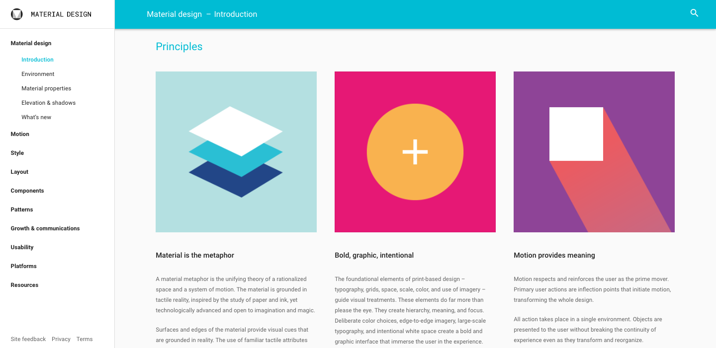
Google’s Material Design

Google needed a more consistent user experience for users of its applications. Yes, it needed consistency for Google-built consumer software (Gmail, Calendar, Docs, etc.) but, more importantly, for the third-party applications on platforms like Chrome Add-ons and Android Apps. Consider how superior the iPhone was to Android from a user experience perspective. Google needed to respond to that.
Material Design addresses this by inventing a cohesive design language, demonstrating its look and feel, and providing tools that make it easy for designers and developers to implement.
Google began building Material Design themes and components right into the Android platform, for Android versions 5.0+. It worked to make it so the easiest way for a developer to stand up a good-looking Android interface was to use Material Design. This solved a developer pain point—“building custom app interfaces takes a lot of time and effort”—and as Material Design apps flourished, it gave Android users the more consistent experience that Google was going for. As an Android user myself, I’ve watched the apps on my phone change over time to use Material Design conventions, and I’ve been pleased with the result.
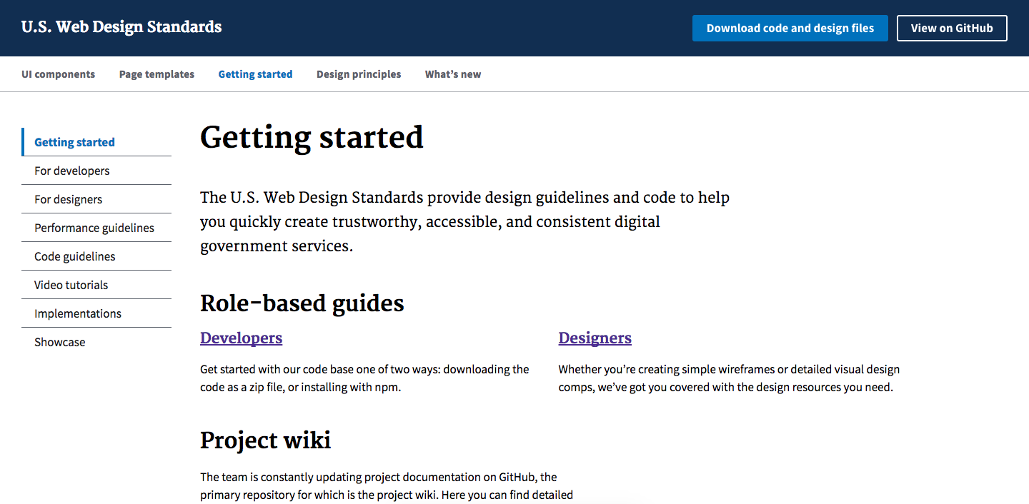
US Web Design Standards

Modern. Credible. Trustworthy. These are not words that you think of when you think about Government technology. There’s this perception that the federal government runs on old technology built by government employees who are paid by a steady stream of tax dollars and have no personal incentive to learn and push the technology forward. This perception is validated and publicized all the time, like we recently saw with the Healthcare.gov fiasco.
Turning this perception around isn’t an easy problem. The US Government needed the developers across its agencies to write modern, accessibility-focused code. It also needed designers across its agencies to consistently and visually portray credibility, warmth, and trust in their designs.
The US Web Design Standards were built by 18F to provide a foundation of code and design assets that agencies could use to build this consistency and trust.
One of the developer pain points this style guide focused on was Section 508 compliance. US Government websites are required by law to comply with baseline web accessibility rules, which adds cost and complexity for developers who aren’t familiar with those requirements. Using the US Web Design Standards templates and components gave developers out-of-the-box component accessibility. And since there’s no silver bullet for wholistic accessibility, 18F offered guidance to help teams reach full compliance.
Addressing this pain point helped drive adoption (as demonstrated by the project’s showcase and public analytics). As adoption continues, the improvements in consistency will help restore the trust that the government is working to repair.
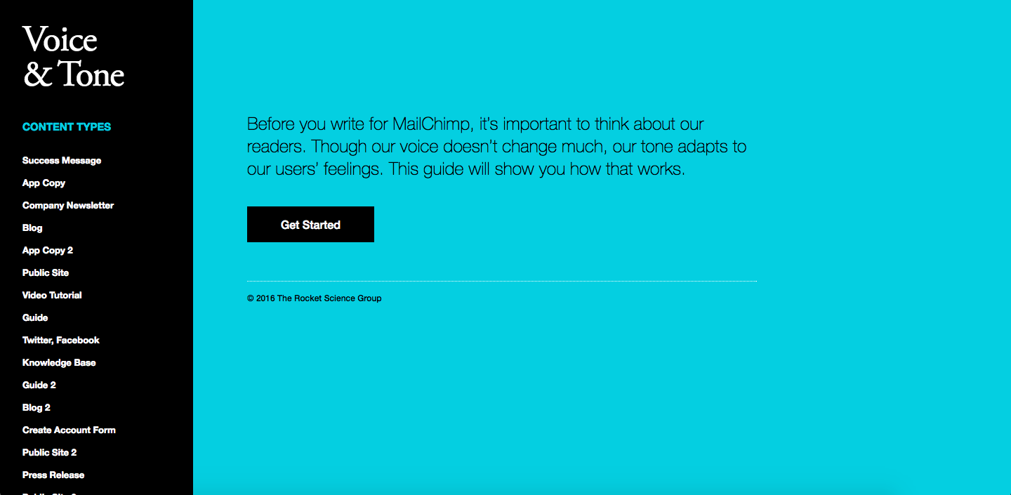
MailChimp’s Voice and Tone

MailChimp is an email marketing product that has grown in popularity over the last decade. MailChimp is well known for its fun, carefree brand, but communicating with that voice is a lot harder than it sounds. Consider this quote from Aarron Walter, former Director of User Experience at MailChimp, about the brand mascot, Freddie:
Because we knew that talking mascots have a rough history in software design, we set strict ground rules for Freddie from the beginning. Remember Mr. Clippy, the cartoon assistant in Microsoft Office from 1997 to 2003?
…Clippy was our anti-inspiration. We wanted to achieve the opposite of what he did in Microsoft Office. We never wanted Freddie to provide feedback about the app, deliver stats, or tell you when something has gone wrong. He’s not there to help. He’s simply a layer of fun that enhances a usable workflow, and above all, he has to stay out of the way of our busy users.
Aarron Walter, Designing for Emotion
See how much deliberate thinking is happening behind the scenes to create that fun and carefree image? As MailChimp has grown to 500+ employees, the voice of that brand can no longer be maintained by a single person, and the company risks losing that brand image it crafted.
So, MailChimp created the Voice and Tone style guide to help its growing number of employees communicate consistently on brand. The format is pragmatic, showing examples for common cases.
Writing a blog post? Write like this.
A tweet? Check out this example.
Legal content? Here’s how you should adjust your tone.
Looking at this, it seems like MailChimp focused on Content Creators with pain points along the lines of: “How do I maintain the voice of the brand when my situation feels so different.” Time will tell how effective the style guide is, but from the outside, it looks very user-focused.
No Size Fits All
If you were to straight-up copy the format of one of these products, not only is that ethically problematic, but you’d risk spending lots of time and money building “solutions” to problems that don’t exist at your organization. That’s called a poor product-market fit, and it means your design system won’t get used. Thus, there’s no ideal design system, just an ideal design system for a given situation.
So what’s your situation? Will building a design system solve your potential users’ pain points? Whose will they solve? If you’re not sure, then it’s time to find out.

