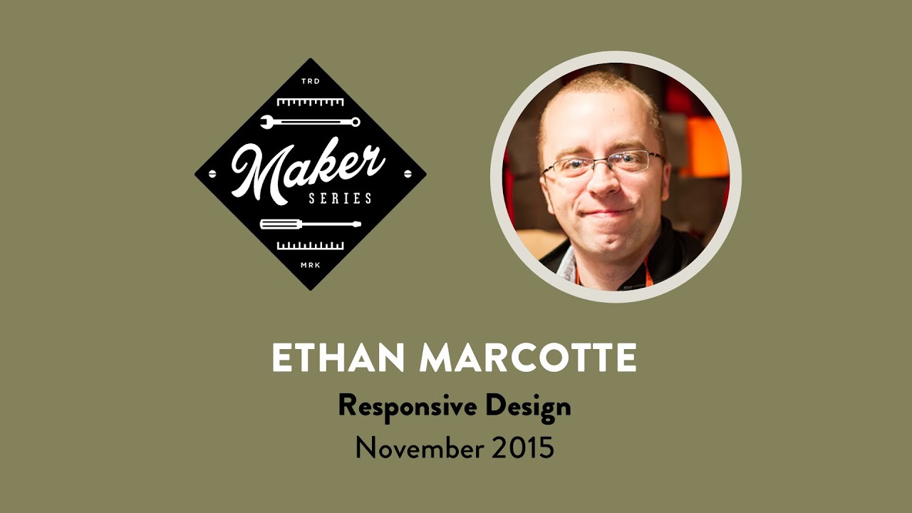
Dear Ethan,
Hi, how are you?! We hope you’re doing great. We know that we, along with 45 fortunate participants of the Midwest Web community are doing great this week too, thanks in no small part to your wonderful Maker Series workshop.
See, the reason we’re all feeling so peachy after spending a day with you is not only because you imparted valuable wisdom and insights into your Responsive process, but because it’s really special to meet someone like you. Your kind and thoughtful demeanor is something that anyone in the web industry could learn from. Every question that was asked of you was warmly thanked and greeted, you learned our names, and you carefully considered your responses to our eager questions. It’s humbling to be around someone so impactful to our work, who existed in a workshop among us as equals.
Our favorite question you answered was from a woman who asked you how she could begin to learn about building responsively. We’re sure this is a question you’ve answered many times since 2010. You answered it with the best possible sentiment we can imagine, one that was truly inspiring: “You’re sitting in a room full of people still learning this, we’re all still figuring it out!”–and we love that. Hearing you talk about responsive web design, the philosophies behind it, and the endless possibilities we can plan for instilled a refreshing optimism into our process. Sure, collectively the web industry has spent the past 5 years coming up with tools, frameworks, and processes to build upon RWD, but the way you talk about the core of it—the real, true, fluid and open nature of the possibilities that responsive design has taught us—is something that our industry often overlooks.
Beyond the inspirational anecdotes and metaphors, there were also many key takeaways that we learned like “one in five 16-24 year olds access the web on video game consoles”—that’s really incredible, right?! Do you have a DS, Ethan? Any favorite games? Some of us around the office play DS games, maybe we should start testing on those.
You told us the three most used and least helpful words in Responsive Web Design are “mobile,” “tablet,” and “desktop.” We couldn’t agree more, though we sometimes still have a lingering bad habit of using them. We’ll work on that.
You taught us to emphasize conditions and features, not devices. The “device agnostic” approach that Trent Walton so eloquently has explained. We should build for different connection speeds, accessible features, and other scenarios like this. Most people in the room were really excited by this idea, we know we sure were.
We learned about “cutting the mustard”—something that all the attendees seemed eager to discuss. We may have just been hungry by talking about mustard so close to lunch, but that was a super important discussion to have. You shared with us how Javascript can ask browsers if they’re capable of handling the rest of our RWD code. Really smart idea.
Well, Ethan, these are just a few standout moments. We could wax poetic about this all day. We really can’t thank you enough for spending a few days with us here in Ohio. And not just for the past few days, but for the past few years. Our favorite part about Responsive Web Design is how the community has built on your idea and to see how much it’s flourished. Thank you for writing that article—and subsequent book—all those years ago. Our industry is better for it, and we’re so happy you’re a part of it.
Sincerely,
Your Pals in the Midwest

YouTube embeds track user data for advertising purposes. You can watch the video on YouTube if you prefer not to grant consent for YouTube embeds.

