There are a lot of automated accessibility tools out there. So how do you decide which one to use? We’ve started a new research initiative, reviewing different options to help you decide which tool is right for your project. Read our research method.
Welcome to Our Accessibility Research Tooling Initiative
We’ve written time and time again about the importance of including accessibility early in a project. We know by now that creating accessible web pages results in a better user experience for all people. Plus, accessibility just makes good business sense.
Automated accessibility testing tools are valuable resources that allow developers to continually check their work in between more exhaustive manual accessibility testing. We’re so thankful to all the folks who have worked hard to create these awesome tools. However, with so many tools with different strengths, it’s hard to know which one to use.
This year, Sparkbox has put together a research initiative to evaluate a number of popular automated accessibility tools. We aim to help designers, developers, and team members know how each tool excels and which tool can meet your needs.
How We Test
We may claim to be experts, but we do not claim to be perfect. We are humans, and while we have tried to be as objective as possible in our evaluations, it is impossible to cover all potential use cases and pipelines. To aid in standardizing our scores for each tool, we have taken a few steps.
We built a single-page static website with HTML and CSS. This page includes a specific number of common and uncommon accessibility issues and code defects. This site is not related to or connected with any live content or organization. We’ve picked out what we think a “robot” should be able to find, and we’ve also listed a few issues we expect can only be identified with manual testing. Each tool will be tested on this page, either in Codepen format (debug view) or locally via a repository of the same code and an npm server.

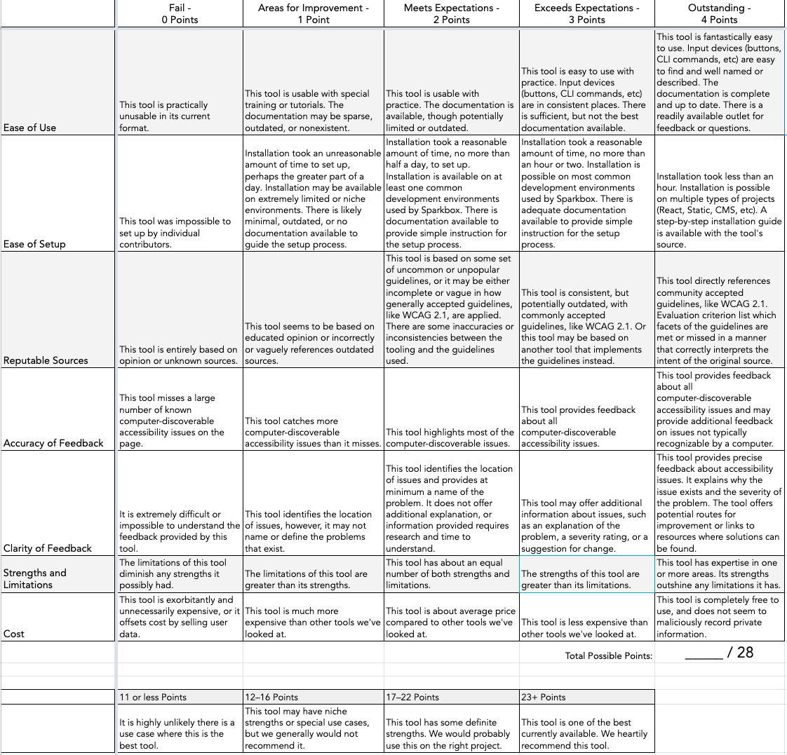
We have also created a rubric in order to score each tool consistently. The Accessibility Research Rubric covers ease of use, ease of setup, how reputable the “source of truth” is for each tool, accuracy of feedback, clarity of feedback, strengths and limitations, and cost. Each category is worth up to 4 points for a perfect score of 28/28 points. While each individual review may be written by a different member of the Sparkbox dev team, two developers and members of the Accessibility Task Force, Catherine and Corinne, will test and rate all of the tools in order to unify and standardize scoring across reviews.
Any tool that scores 23 or more points from all three developers will earn the rank of “Sparkbox Recommends.”
The Tools
We have chosen four popular automated accessibility audit tools for our first round of research: aXe browser extension by Deque, WAVE by WebAIM, Lighthouse’s accessibility suite by Google, and Team Pa11y’s CLI tool. These are the tools Sparkbox uses most commonly with our clients and on internal projects. Each has unique strengths and weaknesses, which we’ll share in their individual reviews.
The Accessibility Issues
The following list of bugs are the accessibility defects we’ve “planted” in our testing page. Each is given a rank that indicates whether or not we believe the defect can be detected by an automated testing tool.
| Test Site Issue | Tools Should Find | People Should Find |
|---|---|---|
| Insufficient contrast in large text | ✅ | — |
| Insufficient contrast in small text | ✅ | — |
| Form labels not associated with inputs | ✅ | — |
| Missing alt attribute | ✅ | — |
| Missing lang attribute on html element | ✅ | — |
| Missing title element | ✅ | — |
| Landmark inside of a landmark | ✅ | — |
| Heading hierarchy is incorrect | ✅ | — |
| Unordered list missing containing ul tag | ✅ | — |
| ID attributes with the same name | ✅ | — |
| Target for click area is less than 44px by 44px | ✅ | — |
| Duplicate link text (lots of “Click Here”s or “Learn More”s) | ✅ | — |
| div soup | ✅ | — |
| Funky tab order | — | ✅ |
| Missing skip-to-content link | — | ✅ |
| Using alt text on decorative images that don’t need it | — | ✅ |
| Alt text with unhelpful text, not relevant, or no text when needed | — | ✅ |
| Page title is not relative to the content on the page (missing) | — | ✅ |
| Has technical jargon | — | ✅ |
| Using only color to show error and success messages | — | ✅ |
| Removed focus (either on certain objects or the entire site) | — | ✅ |
| Form helper text not associated with inputs | — | ✅ |
| Pop-up that doesn’t close when you tab through it | — | ✅ |
Robust Reviews
By the end of this research project’s first phase, we hope to compile a robust set of reviews teams like yours can utilize when selecting an integrated accessibility auditing tool. The four tools we have chosen are the most popular among our clients and represent our anticipated best of today’s free options. Our goal is to make it just that much easier to build an accessible web.


