Testing accessibility can be a challenge—not only knowing the tools but also knowing what to test. If you’re trying to make your site accessible for screen readers but don’t use one yourself (or have never listened to someone actually use one), you’re probably doing it wrong. I say this because that is exactly what happened to me.
Several years ago, I built a JavaScript modal with very specific tab and shift-tab functionality to be sure that it could be navigated via the keyboard. When I asked someone who uses a screen reader to test it out, I saw how miserable it was. They found it incredibly hard to navigate what I thought was a simple dropdown menu. My assumptions as to how it would be used were not at all accurate.
Accessibility testing within design systems is just as challenging, and I am not alone in thinking that. On Sparkbox’s 2019 Design Systems Survey, several respondents commented on the difficulties of accessibility testing a design system.
“We found ‘accessibility unit tests’ to be kind of an impossible thing.”
“It is not a one person kind of job.”
“Running accessibility tests as a unit test has not been very helpful.”
So while this can be hard, here are two recommendations for better accessibility testing that you can apply to your design system.
What to Test

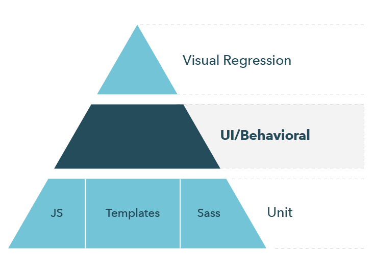
While some accessibility testing at the bottom of this pyramid can be hard—such as validating correct aria attributes—so much of it is testing how the user interacts with the elements of your design system. Many elements are difficult to test in unit tests, including color contrast for people with visual disabilities, adherence to the WCAG principles, and correct voiceover text. These things that affect accessibility are largely behavioral. Using a tool like Lighthouse to load the design system and run tests against it in a browser environment makes these elements much easier to test.
Automated Testing
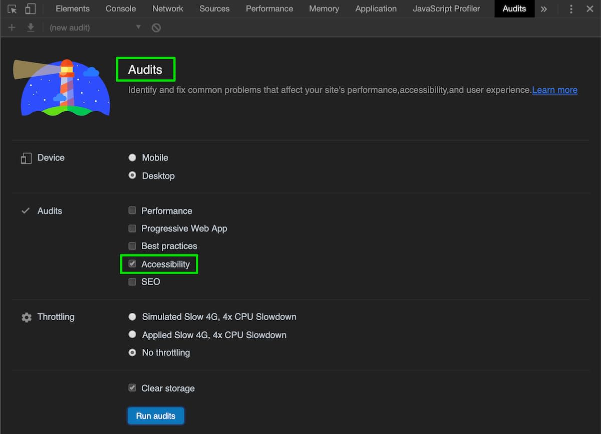
Lighthouse is a great way to help your team stay on top of accessibility best practices. It is my go-to tool for running one-off tests on a given page. You can use Lighthouse from the Chrome dev tools under the Audits tab. Select Accessibility, and then click Run audits. You will get back results for names and labels missing from elements, contrast issues, aria labels, and more.

Lighthouse can also be run from the command line or programmatically from Node.js. This is a great way to add a degree of accessibility testing to your build pipeline. Adding this to a local build task or CI server would be a great way to help catch issues that slip past code reviews.
Using lighthouse-ci, makes it easy to add this step:
lighthouse-ci https://example.com --accessibility=90
Adding this check to an existing site that may not have a great score can feel daunting. However, we can overcome that by starting the bar at the current score. If your current score is 67, then set your CI server to check for that:
lighthouse-ci https://example.com --accessibility=67
Then you can purposefully work on increasing that number up to your desired accessibility target. Set yourself some benchmarks so every time you reach one, you can increase the value of the CI task until the results reach your desired target.
The Lighthouse results will give you an overall accessibility score for your design system. However, this can give a false sense of completeness. Automated tools can only get us so far. They’re great for helping us catch things that we missed, but they can’t cover everything. There are so many different types of disabilities that can affect how someone uses the web. We often make assumptions based on how we think people will use our site—as I did with my JavaScript modal. We can instead consult actual users who rely on screen readers and assistive technologies, supplementing automated testing with manual testing.
Manual Testing
No matter how much we automate accessibility testing, it will never tell us what real users experience. The most reliable way to accessibility test a design system is to have people who use accessibility tools on a regular basis test our sites. And not just that—it’s also helpful to experience it with them.
Listening to someone using a screen reader while navigating a site I worked on has been one of the most nerve-wracking things I’ve had to do as a developer. However, the value of understanding how our site actually functioned was worth the uncomfortable feeling of watching our site not work for them. Watching these experiences allows us to personally see the issues users run into and then correct real problems.
There is no substitute for quality manual testing. Find somebody who really understands assistive technology to test your design system, or better yet, find many people who use different forms of assistive technologies. There are also companies like Knowbility that offer these services.
Make the Web More Accessible
Of the respondents in our 2019 Design Systems Survey who did automated testing on a design system, only half of them tested for accessibility. We need to find ways to improve this number—making the web more accessible is better for all of us and is the right thing to do.

