We’re all passionate about accessibility here at Sparkbox. For me, my interest and passion for accessibility started during my years of creating fun, accessible science lessons for middle and high school students. It was always my goal to create equally engaging and meaningful content for all my students, regardless of learning style. For instance, after working with students who had attention deficit disorder I saw first-hand the advantages of providing them with visual representations of an atom with movement. The movement brought engagement and context so critical to their understanding.
Accessibility is important because it creates a more empathetic web and improves everyone’s experience. Movement in the form of animation, video, or gifs, can bring greater context and insight. However, some users find non-essential screen motion annoying or distracting. Others with cognitive disabilities may struggle to balance their attention or understanding. The effects of certain types of motions can even trigger actual vestibular disorder symptoms that impact a person’s ability to use the application. Thus, providing animation inaccessible ways is an important part of designing a better web.
Although I was originally introduced to accessibility in a highly specific way, I’ve adopted Sparkbox’s accessibility mindset: human-centered design and the social model of disability. This approach best serves the needs of all users as it does not presuppose their abilities, needs, and preferences. Our baseline standard of development is providing as much accessibility as we can—at all times—as a means of presenting a premium experience for as many people as we can.
For example, I was creating an attention-grabbing pulse animation for a band advertisement recently and decided to learn how to make a “prefers reduced motion” media query. The animation would still be fun and get the user’s attention, but I would write a new block of code containing animation with movement adapted for those who have animation preferences enabled. Here’s what I did.
What are “prefers reduced motion” media queries?
A reduced media motion query is a media query in a CSS file that detects when a user has selected the reduced motion preference for a device. Using the prefers-reduced-motion media query, you can specify an alternate experience that doesn’t involve as much motion.
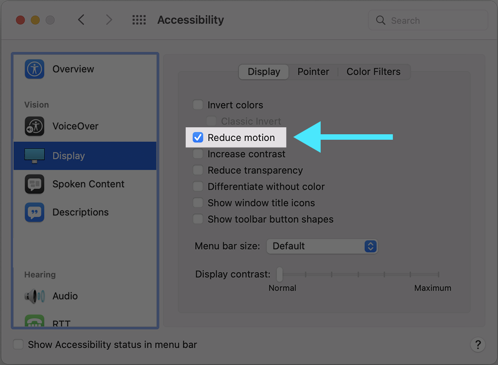
On an Apple computer, users can control reduced motion preference in System Preferences > Accessibility > Display settings.

The Mozilla Developer Network has details for controlling this preference for several other operating systems and devices.
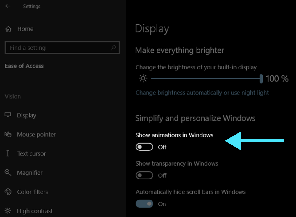
At the moment, Windows does not support a ”prefers reduced motion” media query. However, users are able to go into Settings > Accessibility > Visual Effects > Animation Effects and turn off animation effects.

Similarly, Android phones only provide an option for turning off animation effects altogether instead of reducing the motion. Ideally, Windows and Android users should be able to reduce motion instead of eliminating it because some animation can be beneficial to users.
Why reduce motion instead of eliminating it altogether?
Though WCAG Guideline 2.3 requires strict limits on the types of animation that can exist without pause functionality, you do not have to eliminate all animation to create an accessible website. While you can simply eliminate all motion in the query, providing users with subtle, effective animation is helpful in a number of ways.
Without the animation, the user experience is diminished from its original intent. While animation seems like an “extra,” animation can provide users with important cues such as state change, signifiers, and spatial orientation.
Accommodations are not one size fits all” For some users with cognitive disabilities, motion can provide focus, inform priority, distinguish differences, and generally provide clarity and engagement.
What does a “prefers reduced motion” media query look like?
This CodePen, containing an advertisement for a band, provides an example of a potentially triggering effect that has been refactored. The animation spotlights the members’ faces with pulsating circles to bring attention to them.
While this particular effect does not bring significant value to the user, it does demonstrate how a pulsating effect can be refactored to a less-triggering type of motion. If a user selects “prefers-reduced-motion,” the circles will continue to “pulsate,” but with a more gentle and slow radiating effect rather than a disorienting pulse.
How are these queries designed?
To provide users with an option to reduce screen motion, the developer writes a specific media query at the end of the existing code block with a title “prefers-reduced-motion.” This new code contains altered animation effects that slow down, decrease, and/or substitute types of motion that could potentially trigger vestibular effects.
Here is a snippet from the CodePen which plays reduced motion animation by default:
// Reduced motion animation of circles pulsing is the default animation.


@keyframes low-motion {
  0% {
    opacity: 0; /* changes opacity only--not size of circles, much more subtle */
  }

  50% {
    opacity: 0.5;
  }

  100% {
    opacity: 0;
  }
  /* different transparencies are layer and show different opacities to suggest subtle movement */
}
The low-motion animation uses only changes in opacity and no transitions. It targets the “hoop-circle” class which is responsible for the size changes of the pulsating circles. In this class, slight transformations of scale and z-index layering for each hoop circle are used to create a sense of subtle movement.
Another animation, hoop-animation, provides full motion for the pulsing circles. This animation plays when users indicate no preference for the “prefers-reduced-motion” setting:
// Vigorous animation of circles pulsing is used when there is "no-preference" for the “prefers-reduced-motion” media query setting.

@keyframes hoop-animation {
  0% {
    opacity: 0;
    transform: scale(0.5);
  }
  2% {
    opacity: 1;
  }

  90% {
    opacity: 0.1;
  }
  100% {
    transform: scale(1);
    opacity: 0;
  }
}
This media query allows hoop-animation, the animation with full movement, to play when “no-preference” is indicated for “prefers-reduced-motion”:
  /* Media query for no preference on reduced motion allows user to see full motion in animation. */
  @media (prefers-reduced-motion: no-preference) {
    // full-motion animation
    animation-name: hoop-animation;

    /*animation delays in sequence to create pulse effect*/
    &:first-child {
      animation-delay: 0;
      transform: scale(0.5);
    }

    &:nth-child(2) {
      animation-delay: 1000ms;
      transform: scale(0.5);
    }

    &:nth-child(3) {
      animation-delay: 1500ms;
      transform: scale(0.5);
    }
  }
}
Conclusion
The most important thing I learned as a teacher was that one size definitely doesn’t fit all. When designing lessons, websites, or anything for people it is important to consider the varying needs of all end users. Writing “prefers-reduced-motion” media queries allows users to control their ability to perceive reduced motion on sites we design. It’s a great way to take a conscious step on the path to a better and more accessible web for everyone.

