Sometime late in 2011—being the type nerd that I am–a website called “Typefight” caught my eye. Instantly, I was fascinated with the concept behind the site: pit two letters (the same glyph) created by two different designers against one another and have the community vote on which is better. I’m not sure what I liked better: the idea behind the site, or the fact that there were so many people out there that were interested in watching or taking part in these battles.
Check Out All the Pretty Brutality
How It All Began
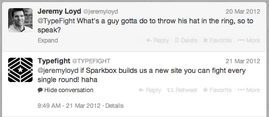
After voting on fights for a few months, I finally worked up the nerve to send a tweet asking if I could join in on the “alphabetic altercations” as they referred to them. It went a little like this:
And so, even though the thought of Sparkbox building a new site was intended to just be a joke, I personally loved the idea of being involved with something so brilliant and interesting—not to mention the fact that we love challenges and side projects here. We talked internally and decided it would be a great side project to take on. Our team consisted of myself as designer, Ethan Muller as frontend developer, and Rob Harr as backend developer.
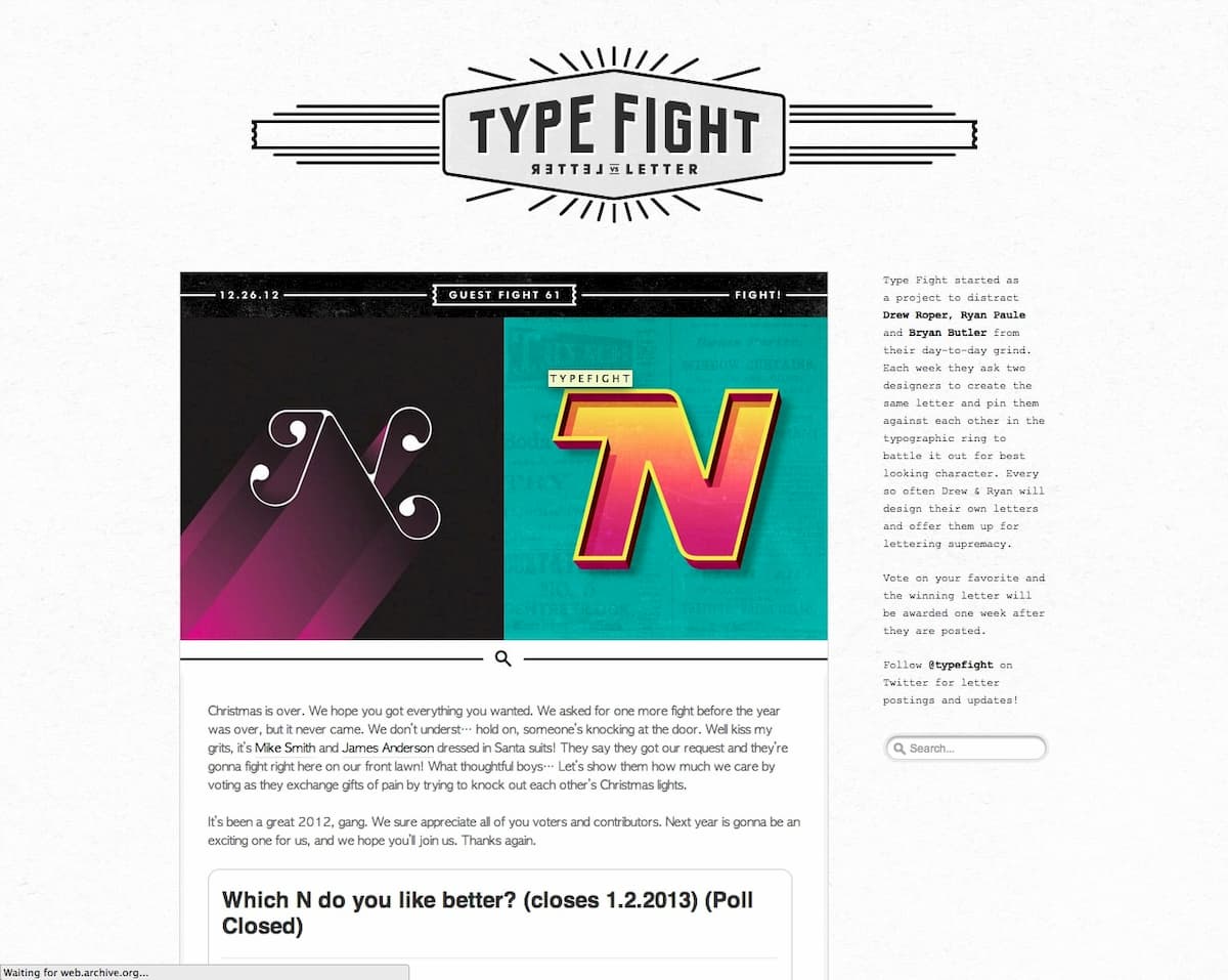
I quickly learned that the site was the brainchild of a few awesome designers, Drew Roper, Ryan Paule, and Bryan Butler. I asked if they were serious about a site redesign, and they said they were. The site they were using was a tumblr theme that they had somehow managed to get to bend to their will, using a voting plugin to tally the votes. I must say, they did a darn good job at it too, and it served them well for a couple years.
Let’s Get Ready to Rumble
So after arranging the details of partnering with the “Typefight guys,” as I affectionately call them, we started to talk about the goals of the new site. One of the main priorities was to make the site responsive, which it wasn’t at the time. TypeFight was looking to us to provide direction on how the site would work on mobile. The other main priority was to give the design of the site a fresh look now that the constraits of the Tumblr theme were lifted.
At the time, we were using (and still use) Keynote to help us create priority guides, which help us prioritize content in a linear manner in order to know what content comes before what on a mobile device. I created a quick guide to aid us:
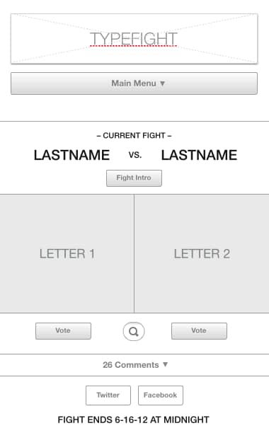
In this case, the main purpose of the guide was for me to be sure that I had all the content that they wanted at site launch.
Mood Board
While I was creating the priority guide, the TypeFight guys put together a really nice and extensive (30 pages!) mood board to establish a general look and feel for the site. They grabbed inspiration from all over the internet and divided what they found into inspiration categories: branding, aesthetics, layout, webfonts, mobile UI, and functionality/voting. It was a really helpful foundation to build on.
The Design
Finally, it was time to start designing. I remember having a conversation with the TypeFight guys that I’d love to start the initial concept and collaborate from there. All of them being REALLY good designers themselves, I wasn’t sure how that would go over. But they were gracious, and with the plans to make the site responsive, they were open to seeing a new perspective on the site. I knew this was their baby and that they had every right to have the final say on the design and tweak it to their liking. With that said, I was a bit nervous to throw out the first concept.
Round 1
I remember it taking longer than I thought to arrive at a design that I thought worked. The biggest challenge in my mind was figuring out how to not give away which designer did which letter. This was something that was preserved in the previous iteration of the site, but later we axed because designers would tweet/dribbble their design and voters tended to know anyway.
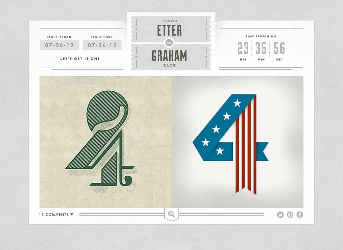
Generally, the aesthetic was well liked by all this first go around, and we decided to take another run at the arrangement of the header, names, fight clock, etc.
Round 2
While creating the first concept, I had started a second. To be sure I was doing my due diligence on exploring the best design option, I went ahead and played it out, curious to see what the guys would have to say about a bolder, more rigid direction. We all agreed this design option was a little weaker than the previous one shown.
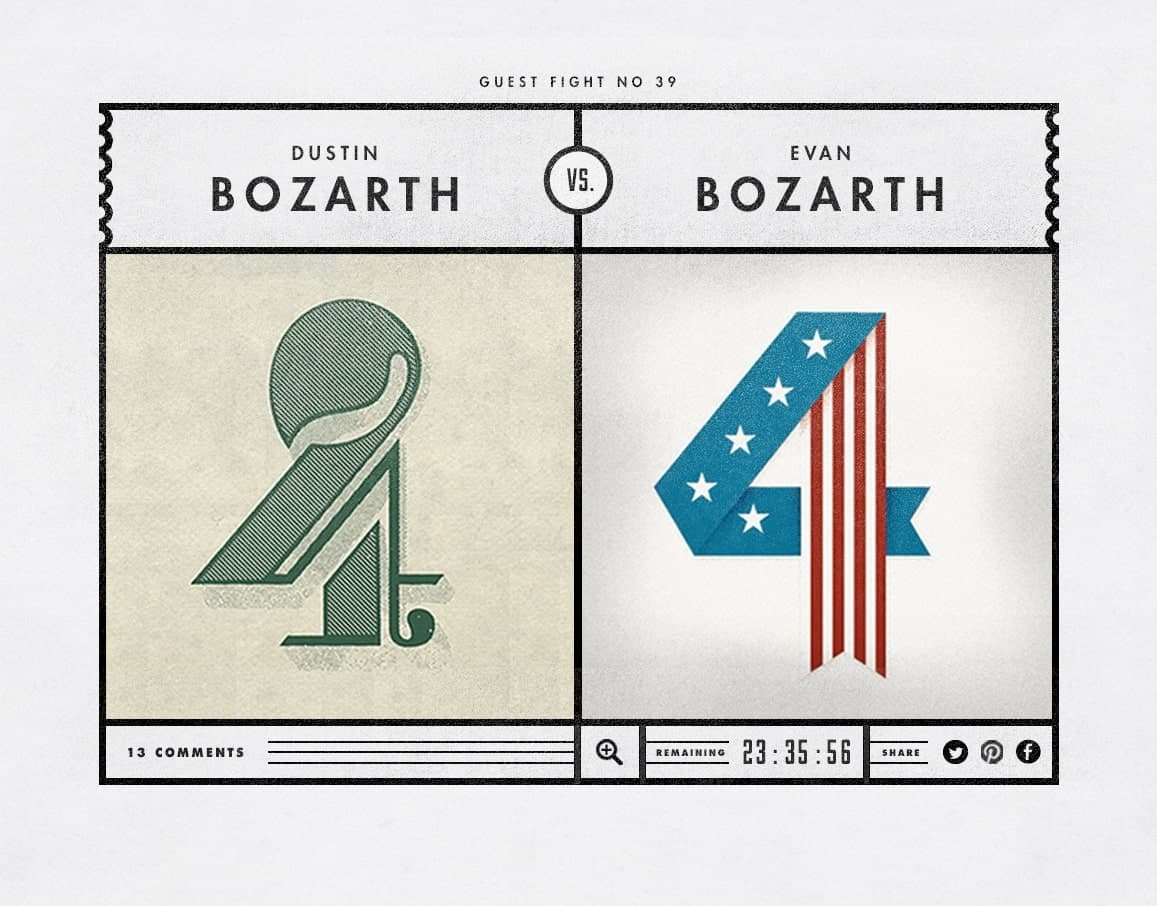
Round 3
At this point, we started passing the psd files back and forth, and the TypeFight guys began to iterate on the original concept. A few Skype calls later, we had a consensus on a direction. At this point, the TypeFight guys started designing out the other template pages: about page, gallery, etc.
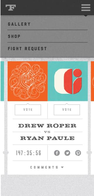
I started doing mockups of what the site would look like at a phone width, around 320px, thinking about how some of the interactions would work. There were a few things we changed due to how it would affect mobile devices. For example, we really wanted to create hover states on the letters so you could click the letter you wanted to vote for. However, we thought it would be more intuitive to add an actual “vote” button below the letters for touch devices. We wound up keeping that feature on the desktop view as well.

The Brand
Meanwhile, the TypeFight guys had also been working on a new logo, type treatment, and mark for the new site. I was pretty blown away when I first saw it.

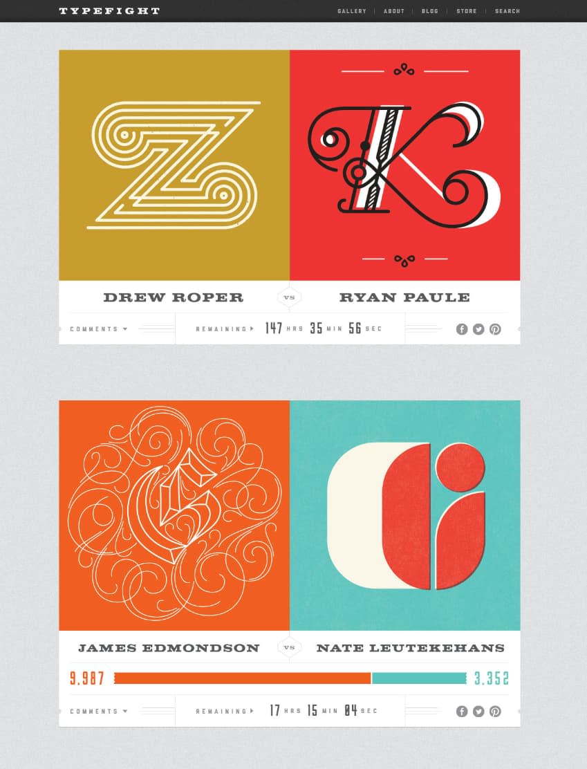
Development
We put a lot of love into little interactions on the site. Since the primary audience of the site is designers, we thought this would be a good excuse to spend extra time on fun details. Things like the animation of the voting bar and the zoom on the letters were tweaked to echo the cheeky character of the rest of the site (see the About page).
Probably the biggest development challenge we faced was the file sizes of the images. We have a lot of ideas to fix this in the future, but a simple adjustment of adding pagination has helped a lot with site speed.
Finish Him It
We’re proud of the site we built and the friends we made in the process. All in all, the site took a little over a year to build due to the fact that it was done entirely during each individual’s spare time.
I’d like to say a big thanks to Drew, Bryan, and Ryan for giving us the chance to work on the site, and for their patience with us through the process.
The site is still evolving as there’s much to figure out and many more challenges to address. We’re looking forward to making TypeFight even better in the future!
