
All of our web designs here at Sparkbox start with a grid. These grids vary in complexity based on the application, but the task is pretty cut and dry: design elements in the grid to help users understand content in a beautiful way.
Before we started building responsive sites this task took one iteration, albeit with various critiques and concepts along the way. Responsive sites changed that process dramatically. Instead of designing for the basic grid (960px wide), we were confronted with a multitude of resolutions and screen sizes to design for, from 960px to 320px and everywhere in-between.
So where do you start?
We started with what seemed like the obvious choice: the largest size. We designed a couple pages on our full size grid, in this case 960, with a base of two 480 columns and liked what we came up with.
This set of designs gave us some basic columns to work with. The 960px grid could take care of bigger sizes. We had nice 480px grids to work for horizontal iPhones, Droids, and other smart phones. We could also just make that column fluid at some point to work for the 320px minimum resolution of vertical phones.
There was a missing link in all this though. We struggled for a while to figure out how to handle the resolution in between 960px and 480px. We tried a lot of options until we stumbled upon the 600px wide column.
Why 600?
It fit.
A 600px wide column fit nicely in the screen when the size drops below 960px. It also fit the iPad’s vertical width of 768px. The size took care of everything from iPads to netbooks.
It scaled.
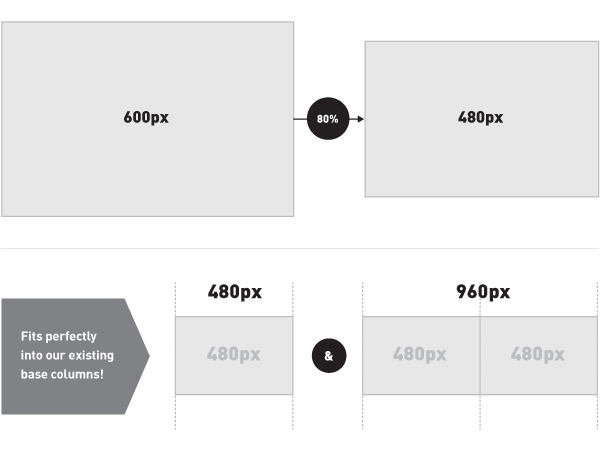
A 600px wide column allowed us to easily scale down one set of assets instead of building multiple versions. An image at 600px wide fit perfectly into our widest column, then we used CSS to decrease its size by a nice even 80% and it’s back down to 480px, which works perfectly for our columns on bigger and smaller screens.
A change of thinking
Starting with the widest column didn’t seem like the most obvious place to start designing, but it proved to be the most important resolution we tackled. All the other columns became derivatives of this missing link and, in the end, our site was a lot easier to design after making this our starting point.
