I came to web development after spending close to 10 years working as a planner in state, city, and regional governments, where I spent most of my time working with data—collecting it, analyzing it, and using it to create reports, charts, and maps. It was a skill set I thought, after my transition to web development, that I wouldn’t be using much. I was wrong. Since becoming a developer at Sparkbox, I’ve contributed to two projects that involved the analysis and presentation of data. For both of these projects, the State of Open Source Security site for Snyk and the 2018 Design Systems Survey site, which was based on data collected by our team here at Sparkbox, my background helped us to create sites that provide useful information and look amazing.
Through working on these sites, I began thinking about some of the skills I had learned and how I might be able to pass them along to my fellow developers. Data visualization is a hot topic in web development these days—and has been for a while—but there is a lot more to it than making pretty charts. Truthfully, there are a lot of things to think about, and people center their entire careers around learning to develop effective data visualizations. But even if you don’t go that far, here are three simple things that we, as a development team, can do to help make our client’s data look great and provide accurate and useful information to their users:
Think about the story your data is telling
Be transparent and honest
Keep your audience in mind and simplify when possible
Think About the Story Your Data Is Telling
Storytelling has to be one of the hardest things about creating effective data presentations. It is hard in large part because, as Cole Nussbaumer Knaflic notes in her book “Storytelling with Data,” while we learn in school about telling stories and about math, “no one teaches us how to tell stories with numbers.”
But figuring out the story you are telling with your data is one of the most important things you can do. A lot of resources will tell you that the best way to go about this is to analyze the data first and let that analysis drive the story. And while all data products should be based on an honest consideration of the data, in reality, the process is more iterative than that, and you and/or your client may have unique insights that are worth presenting. In their book “Data Fluency,” Zach and Chris Gemignani of Juice Analytics advise creators of data products to consider both the knowledge of the creators and the needs of the audience, and warn that not doing so can lead to “a directionless and sprawling document.”
With both the Snyk and the Design Systems Survey sites, one of the first things I did once we had a draft of the site content, was go through and add a one-sentence description of each proposed chart. This way, we were able to ensure that the conclusions we were making were actually supported by the data, and were able to see how the data fit into the overall story we were trying to tell. Sometimes this helpful work resulted in changes to how we were presenting the data and sometimes in changes to the conclusions we were making.
For example, in one of the early versions of the Design System Survey site, we included a headline about successful design systems being maintained by internal teams. But using the one-sentence description method, we were able to see that the data did not support the initial conclusion we were proposing. The data said nothing about whether or not the teams that maintain the design system were internal. It’s worth noting here that sometimes the story you or your client wants to tell is not the story the data is telling.
Be Transparent and Honest
Alberto Cairo, who holds the Knight Chair in Visual Journalism at the School of Communication at the University of Miami, wrote in his book “The Truthful Art” that a good visualization, among other things, is “presented in an attractive manner, but always remembering that honesty, clarity, and depth must come first.” In general, it takes being conscious of how you are presenting your data and making sure that you are honest both with yourself and your audience about how you have obtained, processed, presented, and framed that data.
Sometimes this means adding a section that describes your methodology or a sentence that clarifies how you are using or manipulating the data. Sometimes it can mean adding footnotes, additional chart labels, or even a separate document. The goal is to provide as much information as necessary so your audience can understand where your data comes from and how you have used it. Not only is this just good practice, but it also goes a long way toward developing a sense of trust between you and your audience, which is essential if you want the data you are presenting to be taken seriously.
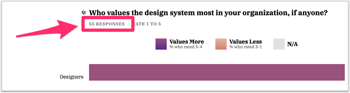
This is why, on both sites I’m discussing in this post, we were careful to be very clear about where our data came from and how, if at all, it had been manipulated. On the Design Systems Survey site in particular, we were very conscious of how we were limiting our sample size based on how respondents answered particular questions. We described this in the text and also added the sample size to each chart label so readers could clearly see how many responses we were presenting for each question.
Keep Your Audience in Mind and Simplify When Possible
“Your challenge as an author of data products,” wrote Zach and Chris Gemignani in “Data Fluency,” “is to build a bridge of understanding between your data and the intended audience.” This is not an easy thing to do, and you will not always be successful, but putting in the effort to understand your audience and then thinking about how best to build that bridge will always be worth it.
This comes back around to my first point: thinking about the story your data is telling. There are many ways to summarize and present data, and sometimes it take some trial and error to figure out which will be most interesting or compelling for your audience. The balance is finding the method that works best but also does not oversimplify. One great way to work through this is to get input from people who may be less familiar with the data, which we did to to bring clarity to the Design Systems Survey site’s stacked bar charts.
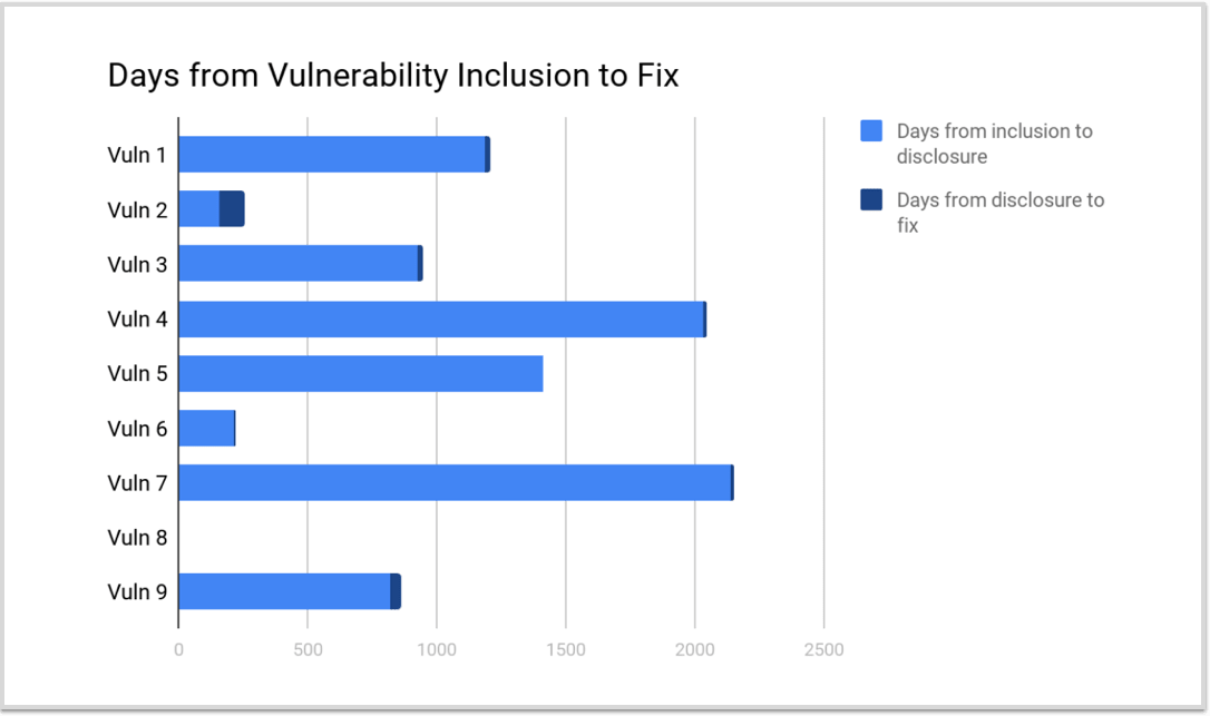
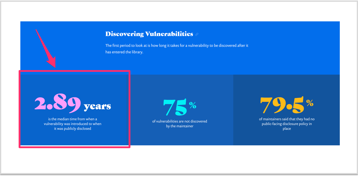
This aim toward simplification was also one of the main considerations with the Snyk site and is how we ended up representing some of the data in callout boxes instead of charts. In the section on Discovering Vulnerabilities, we originally had a chart that showed the number of days it took from the inclusion of a vulnerability to when the vulnerability was addressed for the nine npm packages whose vulnerabilities had affected the most applications. As you can see below, the chart was difficult to read. We figured out that the most important information wasn’t necessarily the number of days it took to address a vulnerability for these nine packages, but rather the median amount of time—in years, instead of days—that it takes for a vulnerability to be addressed. This information was much more clearly presented as a data callout in the final site rather than the chart in the original draft.
So Much to Consider, So Much to Learn
As Edward Tufte wrote in the first sentence of his seminal work on data graphics “The Visual Display of Quantitative Information,” “Excellence in statistical graphics consists of complex ideas communicated with clarity, precision, and efficiency.” The idea is to present quantitative data—numbers—in a way that is honest and easily understood. It sounds easy, but in reality, there is a lot to consider.
I titled this article “Data Presentation Basics for Development Teams” because I want everyone to understand that the work of presenting data belongs to the whole team—project managers, content strategists, UX/UI professionals, designers, developers, and anyone else involved in the process. In order to create a successful data presentation, it takes the entire team working together from the very beginning of the process.
While I hope you find the above tips useful, I’ve barely scratched the surface of all that is involved in creating good, attractive, and effective data presentations. I’ve put together below a list of books, websites, and videos to help you dive in further. I can’t wait to see what you create!
Additional Resources
BOOKS
“Data Fluency” by Zach and Chris Gemignani
“The Truthful Art” by Alberto Cairo
“The Functional Art” by Alberto Cairo
“Storytelling with Data” by Cole Nussbaumer Knaflic
“The Visual Display of Quantitative Information” by Edward Tufte
“The Wall Street Journal Guide to Information Graphics” by Dona M. Wong
