
We’ve all been there: You’re almost done with a long, stressful day, and you want to get that very last email sent out before you step away—even though that migraine has already started. But while opening up your email, you can feel how sensitive you are to the light of your screen. As you’re writing, you notice you’re having a harder time than usual telling the letters and icons apart from the background. You decide to invert the colors on your computer and all of the sudden your eyes feel less strained. Now that you feel a bit better, you crank out that email, hit send, and look forward to unplugging for the night.
That, friends, was contrast hard at work making text, icons, and images easier on your eyes. By simply inverting the colors on a computer–perhaps darkening the background and lightening the text–the eye strain was lessened and the experience was better. Contrast is important for all our users, not just those with migraines, low vision, or some level of color blindness. It improves the readability and experience of everything we build for the web. Let’s talk about factors that can affect contrast and the tools available to us to check and improve contrast in our projects.
Contrast: A Brief Overview
Contrast is the measurable difference between two colors. This difference is expressed as a ratio. The closer the two colors are, the smaller their ratio and the lower the contrast. Generally, the lower the contrast, the more difficult it is to read text. However, according to the WebAIM Million report for 2022, around 84% of website home pages still include low-contrast text.
When we don’t ensure our content meets contrast guidelines, we’re creating content that’s inaccessible and potentially unreadable for roughly 8% of men, and 0.5% of women. Extrapolate that across the world population, and you’re talking about alienating almost 350 million people! That number doesn’t even take into account other people with other vision issues or reading disabilities that may grapple with lower contrast content.
Why is Contrast Important?
Not all people perceive colors and text in the same way. For many of us sight is something we take for granted, especially when interacting on the web. Oftentimes, people who have color vision deficiencies, low vision, or even temporary changes in vision (like a migraine) struggle with color contrast. They easily find themselves in a world of confusing and sometimes illegible sites.
Providing enough contrast between text and its background allows all readers to experience and interact with the web the way it was intended. By following the contrast guidelines in WCAG 2.1, even people with color vision deficiencies will be able to better perceive and understand the text.
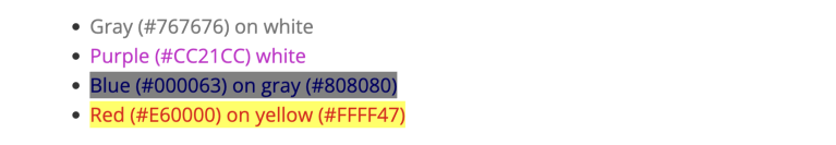
If you’ve explored the Web Content Accessibility Guidelines, then you know that the minimum contrast ratio must be at least 4.5:1 for normal text (or 3:1 for bolded text). Some sites even strive for the “enhanced” level of contrast of 7:1 for normal text. It’s important to know that those ratios have to be reached without rounding. By hitting those contrast thresholds, you’re providing content that is readable for a wider audience regardless of how they perceive color.
What Impacts Perceived Contrast?
Opacity or transparency (alpha):
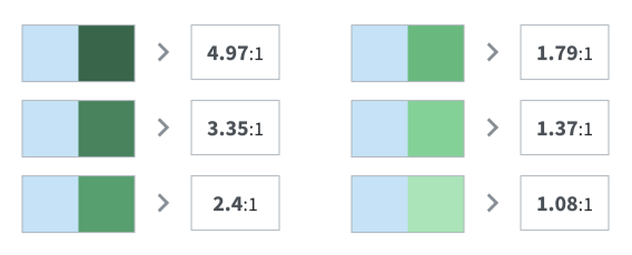
Transparency can be very impactful on contrast ratios. In the screenshot below, the blue color does not change but the transparency of the green in contrast does. When the green’s alpha value changes, the contrast ratio lowers and the colors get harder to tell apart.
Images of text:
Any text within a graphic element is considered an “image of text.” If that text is necessary information, it still needs to pass the contrast threshold. In the advertisement below, the “50 most played songs by genre” text is subject to meeting contrast guidelines since it is the headline of the ad. But since the word “music” is in the brand mark, it is exempt.

Outline or halo:
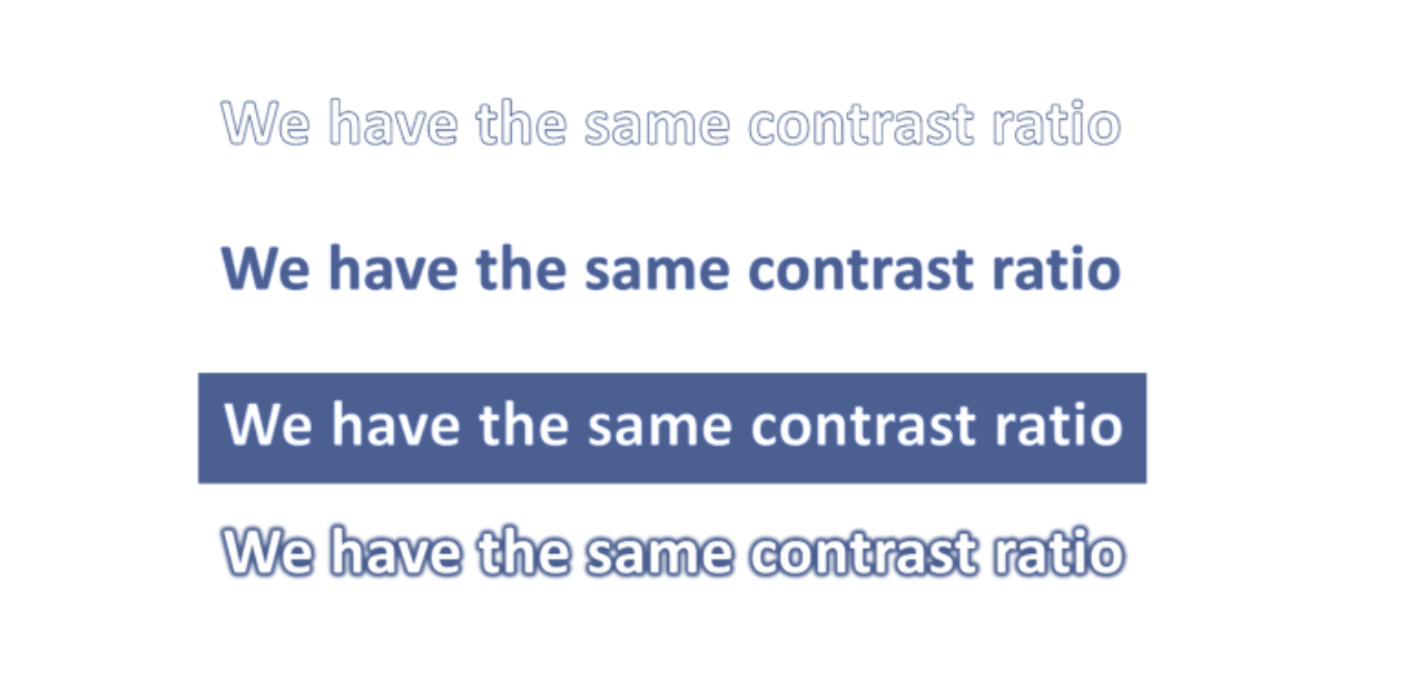
According to the WCAG requirements, text effects can also be used when measuring contrast. Below are examples of text that have similar contrast ratios, and technically pass AA requirements. When examining these examples, it’s clear that the perceived contrast is different, and therefore the user experience is different. To provide a comfortable reading experience, these situations may require additional reviews, feedback from your team, and collaboration with usability experts; all before using best judgment and UX best practices.
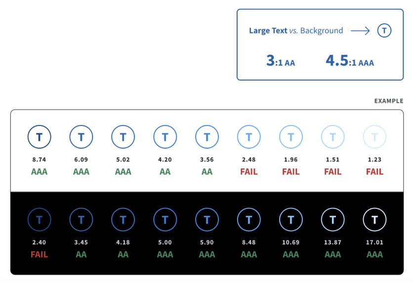
Size of text:
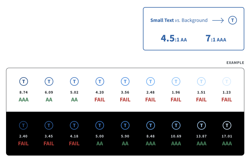
Text is considered small if it is 18pt (bolded 14pt) or smaller. Anything above these limits is considered large text. Small text naturally has lower contrast, while large text has a naturally higher contrast because it has a larger stroke. As the text color changes in the examples, you’ll see how and when AA and AAA conformance requirements are met.
What Can We Do to Help?
Yes, we are in 2023, but contrast is still posing an issue for scores of users. Looking at data from the WebAim Million report, between 2021 and 2022 the percentage of website home pages with contrast failures decreased by only 2.5%! The good news is, there are plenty of ways to improve the projects we work on and build understanding for people who experience contrast problems.
Be diligent about meeting the sufficient contrast ratio of 4.5:1 for AA WCAG conformance
Consider using a single-color background instead of busy background patterns or images to avoid detracting from the readability of text
Make browser tools like Lighthouse, Axe Dev Tools, or WAVE part of your accessibility check process—although these tools cannot detect all contrast issues (like the contrast of text in images), they can give us a starting point to investigate further
You can also tap into users’ preferred contrast settings by using CSS to:
Utilize
prefers-color-schememedia queries, so you can set custom CSS variables for light and dark mode color palettesLeverage the
prefers-contrastmedia query to check if a user has requested their web content to have more or less contrastUse the
color-schemeproperty to detect the user’s operating system preferences and render specific elements in certain contrast modes—this property typically targets elements that a developer may have less control over, such as form controls or scroll bars
Assistive Technology to Enhance Contrast
Creating additional aids to alter the contrast for users has become more common. Tools that adjust the foreground and background colors of your site can be helpful for users that need or want to switch contrast levels. Some ideas are listed below to help you get started improving your own projects’ contrast. These tools are just a starting point however—it’s always important to conduct user testing when possible. By including people with a variety of color deficiencies and other vision issues in user testing, we can ensure that what you are building is accessible to those users who may be impacted most by low contrast.
Mac Contrast Settings: Within the Accessibility > Display menu, users can increase the contrast, invert colors, and even coordinate their entire computer to their personal color vision deficiency.
Windows High Contrast Mode: In the Ease of Access > High Contrast menu, users can select High Contrast Mode. This renders semantic elements the same color across all sites in order to create consistency for the user (all links are yellow, all selected text is aqua, etc).
WhoCanUse: WhoCanUse is a tool to check contrast and experience color palettes at multiple levels of color vision deficiencies and other visual issues. It also determines which level of WCAG conformance your contrast reaches.
Fix Contrast: The Fix Contrast extension can automatically increase the contrast on a website. It’s currently available for Chrome, Firefox, and Edge, with Safari coming soon. Once active, it can boost the contrast to a “medium” level (AA conformance) or to a “high” level (AAA conformance).
Contrast checker websites: Both contrast-ratio.com and contrastchecker.com let you input your color combinations to check the contrast ratio. ContrastChecker lets you view your selections in grayscale as well.
Stark: The Figma plug-in, Stark, not only checks contrast but does lots of other accessibility-related checks as well. Thankfully, the contrast checker is free.
Adobe Color: Adobe Color is another powerful tool to simulate color deficiencies. It can also offer suggestions to improve checked contrast.
It’s About Empathy
While researching this article, I started to realize more and more how much I take being able to easily read text and web content for granted. Contrast has rarely, if ever, prevented me from getting the information I need. Yet despite my having never experienced vision adversity, I thought I understood the importance of color contrast. I was wrong. I didn’t really grasp what it would feel like not being able to pick up the color red, or how difficult it is trying to read with glaucoma. These tools provide a glimpse into what the web is like for people with some level of color deficiency or low vision and build empathy and compassion in those of us without such challenges. By being aware of contrast and adhering to WCAG guidelines to ensure our users don’t encounter low contrast, we can continue to create an inclusive web.
