Everyone assumes the fix for AI-generated UI going wrong is better documentation. The more we tested that assumption, the less it held up.
My hypothesis was narrower and more useful: if you watch an AI get a design system’s UI wrong, most mistakes should point to a specific hole in that system’s documentation. I was wrong, and the way I was wrong turned out to matter more than the hypothesis itself.
The Experiment
I ran a real test: point Claude at IBM’s Carbon Design System, and asked it to build five common UI patterns: a data table, a multi-step form, a settings page, a file uploader, and a notification center. I picked Carbon deliberately, for two reasons. First, its documentation is good enough that I regularly point clients to it as an example of what thorough, well-organized design system documentation looks like. Second, IBM has taken an unusually active approach to making Carbon itself AI-accessible. I’ll get into specifics in the recommendations below, but it made Carbon a fair test of a system that’s already trying to get this right, not just an easy target.
While Claude managed to extract these foundational patterns and populate them with sample data, the resulting interface revealed several recurring flaws. Key UI elements suffered from color contrast breakdowns that created immediate accessibility barriers. Layout logic proved equally fragile, as Claude repeatedly stacked components directly on top of one another, breaking their underlying functionality.
Then, I didn’t just look at the output. I asked Claude to explain, honestly, why each mistake happened. Was it missing documentation? Was it a misunderstanding? Was it something the tool itself couldn’t do, no matter how good the docs were?
What came back surprised me. Almost none of the real issues were “the documentation didn’t say this.” Most of them were some version of “I found the answer and didn’t use it,” or “I knew the right component existed and reached for the wrong one anyway,” or “I wrote this from general pattern familiarity instead of checking.” Even when providing every detail Claude needed to create a pattern, it chose to cut corners.
Worse, when I checked Claude’s own explanations against the actual documentation, Claude had mislabeled its own research shortcuts as documentation holes.
What Did We Expect to Find?
Going in, my hypothesis was that AI mistakes and documentation holes would line up cleanly: wherever Claude got something wrong, I should be able to point to the exact gap in the docs that let it happen. I was hoping to prove that we could use AI to test the AI-readiness of documentation.
Claude’s initial assessment of this hypothesis was that it was proven with this test. Claude labeled multiple mistakes as a lack of pattern documentation in the IBM design system. However, I knew this was not the case. One of my favorite aspects of Carbon is the “Placement” section in each component. This section displays how each component variant sits on a page, and often shows how other content should display around it.
When I questioned Claude as to why it missed this, it said it was because I didn’t ask.
What Did We Actually Find?
I pushed Claude to account for every mistake, then asked it to check each one against my hypothesis: was this a hole I could point to in the documentation, or something else? Claude said yes, twice. However, when I compared Claude’s reasoning to the real documentation I provided, it was obvious that the issue was not the documentation itself.
Invented composition
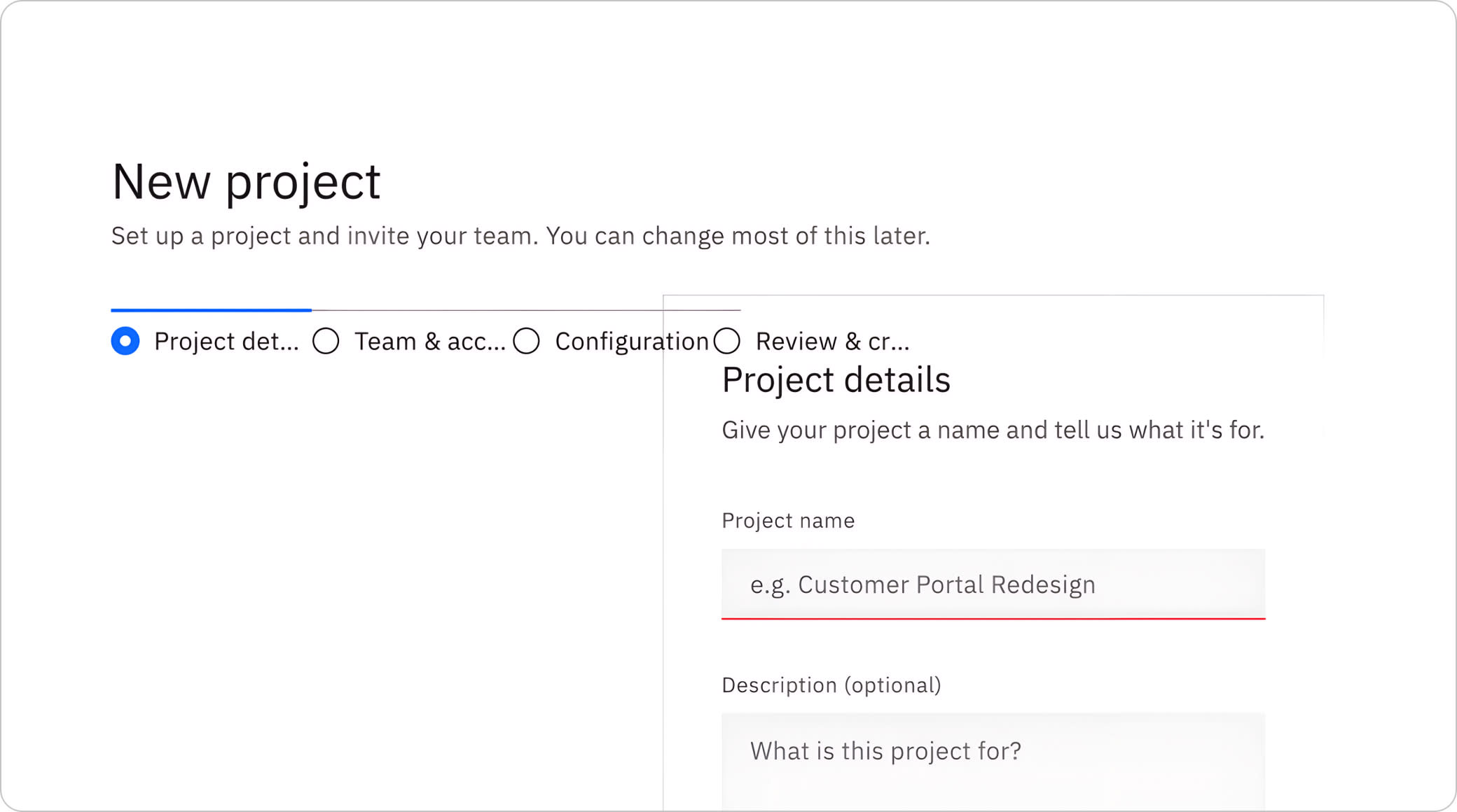
In many designs there were overlapping elements. Claude incorrectly labeled component layout and placement as a documentation hole; it claimed that Carbon’s component pages never show a full, assembled page built end to end, which is false. Carbon has a dedicated Patterns section covering Forms, Filtering, Dialogs, Empty states, Login, and more, exactly the composed guidance Claude said didn’t exist. Claude never checked it.
In the example below, the progress indicator and the form panel overlap instead of sitting side by side:
Assumed content guidelines
Same mistake as above. In the multi-step form design, Claude did not mark fields as required. When I asked why, this is the response: “What I can’t tell you with confidence is whether Carbon’s own documentation prescribes a specific required-field pattern (an asterisk, helper text, something else), because I didn’t check — I just reached for a convention I’d seen elsewhere without verifying it against Carbon’s actual guidance.”
Unexpected behaviors
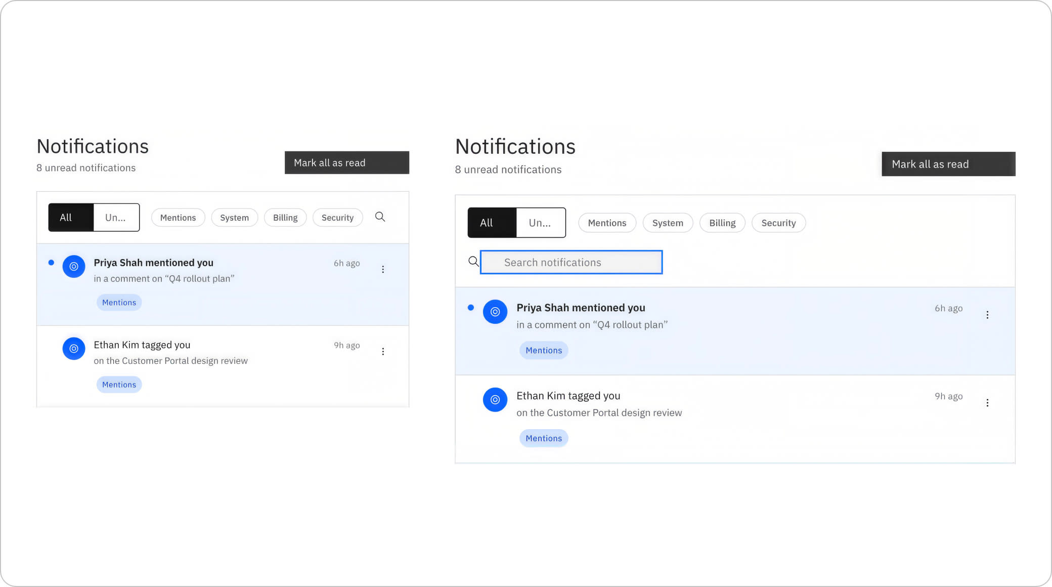
In a few cases, behavior clearly specified in the documentation was missed entirely. For example, inside the notification center’s expandable search bar, clicking the search icon should expand to take over any extra space in the design. Instead, the search bar expanded, grew the width of the entire notification center, and wrapped to a new line.
Missed rules
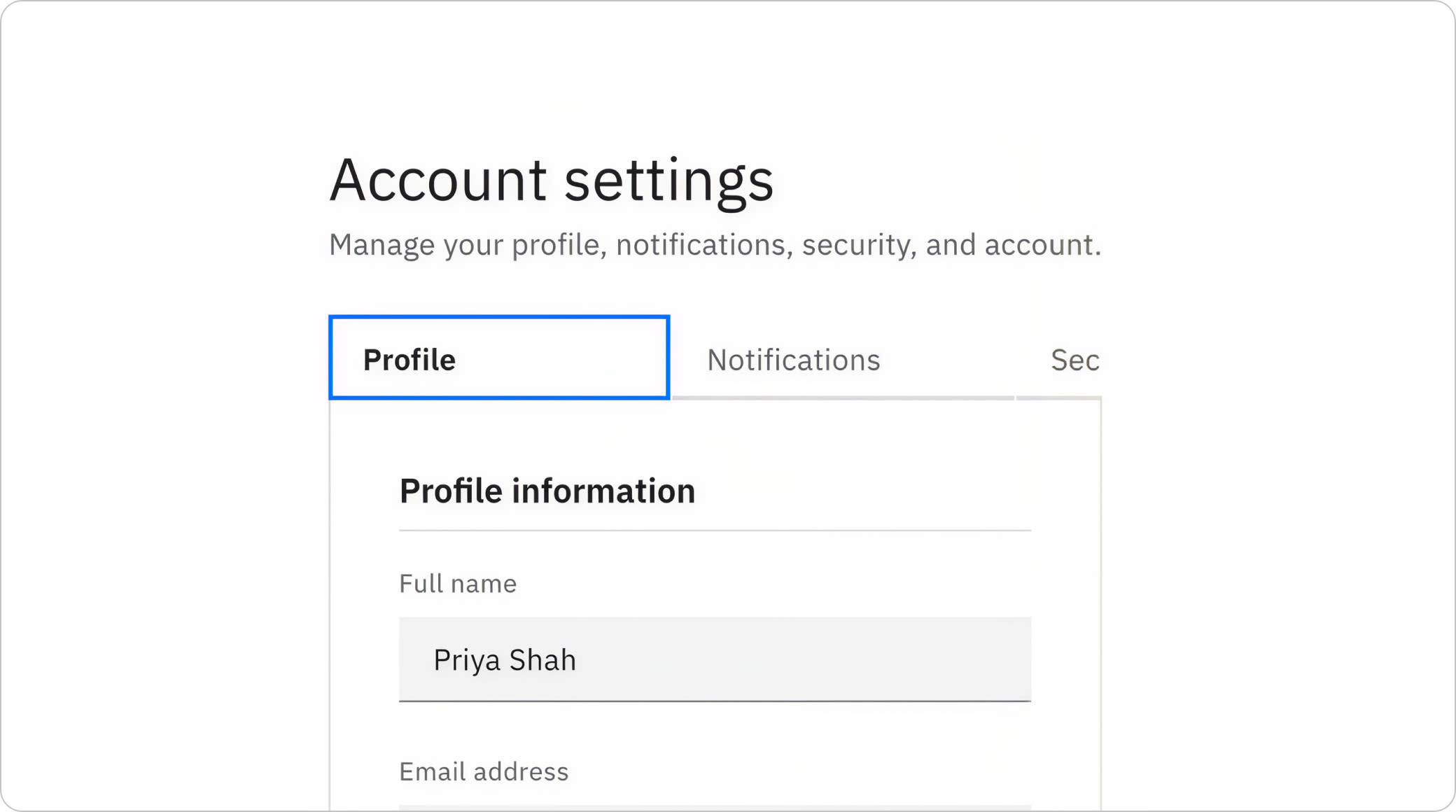
When individual sub-components lacked explicit behavioral guidance near the top of a page, Claude frequently ignored the documentation altogether. Take label truncation: Carbon’s Overflow guidelines explicitly state that label text must never be truncated, yet Claude truncated labels across the Account Settings layout anyway. Prompted to explain this choice, Claude admitted, “I found it [the documentation outlining this behavior] and chose not to act on it.”
Ultimately, every issue fell into these two buckets: Claude repeatedly bypassed documented guidelines for convenient shortcuts, and it lacked any mechanism to evaluate its own output. In many instances, the model located Carbon’s explicit architectural rules only to swap them out for familiar, lower-effort alternatives. What started as an effort to pinpoint documentation gaps had unraveled, steering me toward a much broader exploration of how we actually support AI-assisted design system work.
So What Would Actually Help?
IBM, for what it’s worth, has already built a solution for the problems above. Carbon ships an official MCP server with tools for documentation search, code search, and even a code audit against Carbon’s own guidelines. That’s a direct, machine-queryable interface to the system, not just a rendered doc page an AI has to infer everything from.
Here’s what I think could help:
Continue to cross-link in documentation
Carbon’s Patterns section already covers composition, form conventions, filtering, and more. The content isn’t the problem. It lives one navigation level away from the component docs someone is actually looking at, and neither an AI nor a person in a hurry reliably makes that extra click. Cross-link aggressively, in both directions.
Separate what this looks like from what makes it work
A screenshot proves nothing about whether the underlying behavior is wired correctly. Pair every visual example with a note on what logic it depends on, especially for anything that changes based on screen size or interaction.
Build or point to verification tools, not just reference material
Since neither Claude nor a non-technical prompter can reliably eyeball contrast failures or structural bugs, the safety net has to live in tooling, something that checks the output and reports back in plain language, independent of who or what built the page.
Teach the prompting, not just the system
This is the piece I think gets skipped entirely. A short, repeatable set of questions a non-technical person can ask their AI tool: which variant of this did you use and why, what did you build without being able to verify, what’s a design decision you made versus a documented spec. That kind of honest gap analysis is exactly what drove every finding in this piece.
Don’t trust an AI’s self-diagnosis without checking it
When I asked Claude why each mistake happened, the answers sounded reasonable and were sometimes wrong in a specific, dangerous way: Claude blamed the documentation for gaps that were actually its own research shortcuts. If you’re using an AI’s own explanation to decide what to fix, verify that explanation against the actual source before you act on it.
Final Thoughts
I went in thinking AI would uncover blind spots in design system documentation when it comes to AI-readiness. What I actually uncovered were blind spots in how deep Claude searched and how often its reasoning collapsed under scrutiny. That’s the sharper, less comfortable truth: even a test built to flag documentation gaps demands a second layer of verification, because the AI running it can’t reliably tell the difference between “this isn’t documented” and “I didn’t find it.”
A design system was never just a component library. It was always a shared language. Right now, we’re teaching that language to a new kind of reader, and we haven’t finished writing the dictionary.