Hello Again!
In my last article, I talked about using aria-label in your markup in order to make sure screen readers are saying the right things to blind users. Go give it a read if you missed it.
Talkin’ ‘bout Menus
I’m not talkin’ ‘bout your three-page portfolio site. I’m talkin’ ‘bout your 200+ page ecommerce monster with triple-nested menus that are hard enough to click through with 20/20 vision.
The Hazards of Hiding Things
In Pt. 1, I mentioned that screen readers will read out the rendered content rather than the HTML that’s sitting in the DOM—unless instructed otherwise. That being said, a common practice for designing a giant menu is to hide it behind a button.
Eg:
<button href=”#” class=”menu--toggle” aria-label=”menu button”>Menu</button>
<ul class=”menu”>
  <li class=”menu--item”>item</li>
  <li class=”menu--item”>item</li>
  etc…
</ul>
With some CSS that looks something like:
.menu {
  display: none;
  //  some other rules
}
This results in a menu that is neatly tucked away from view, waiting for us to hit that toggle button. The side effect of this technique being the rendered HTML is now hidden, which means a screen reader will blow right by it.
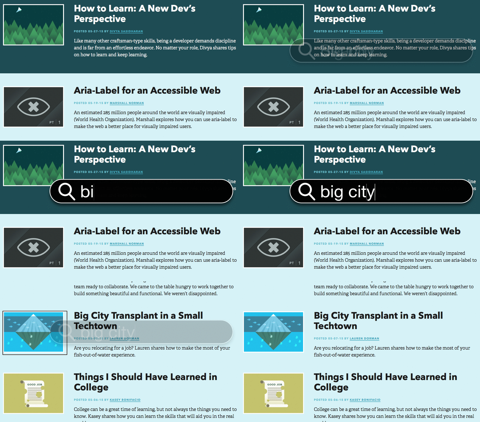
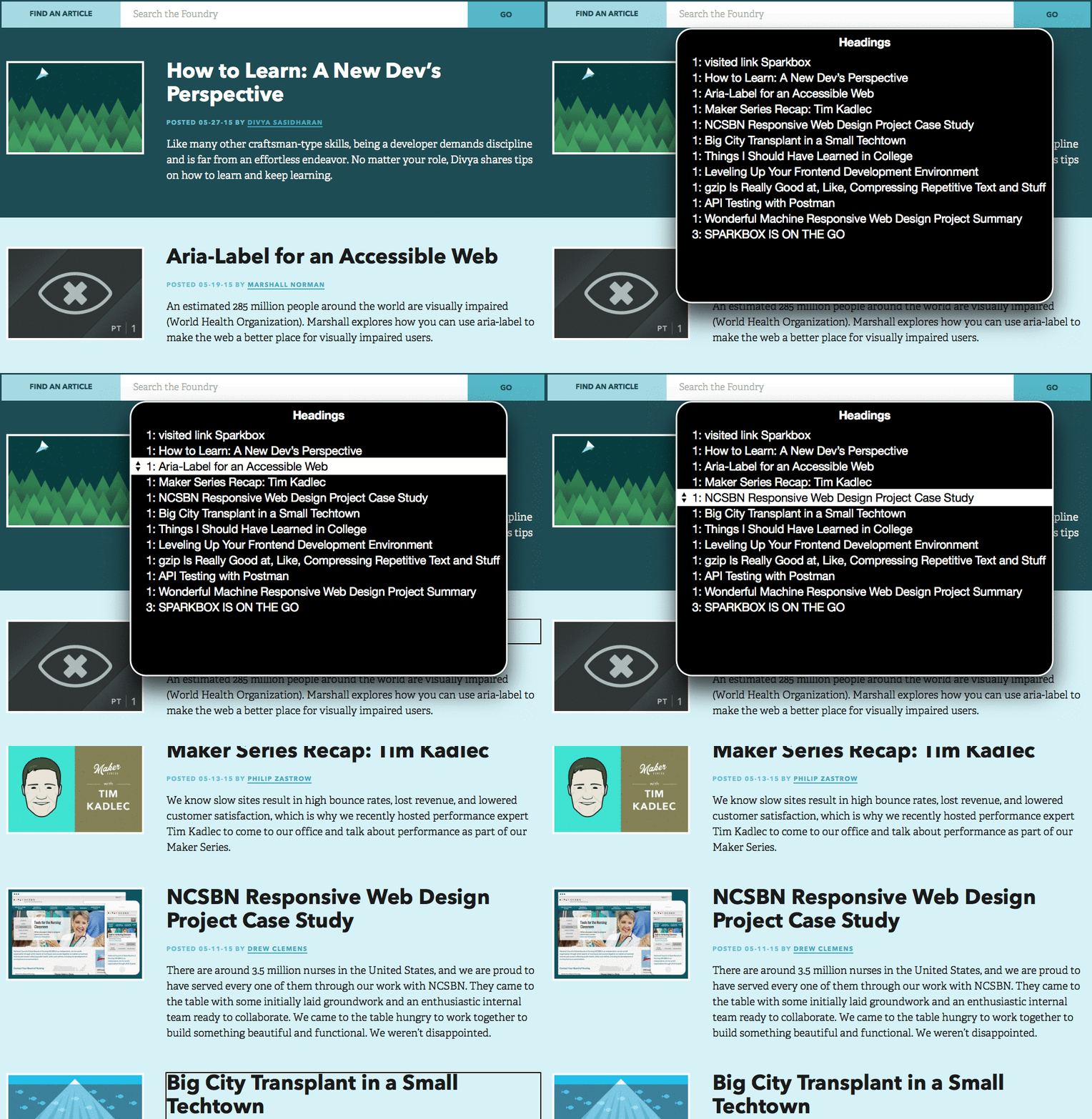
Sure, a blind user will notice the “menu button” label and maybe hit that to uncover the menu. But often this isn’t how blind users will use a site. We’ve developed a great working relationship with Kevin, a blind man who has been helping us in our quest for an accessible web by testing some of our sites. Kevin informed us that he will use VoiceOver’s “find” feature to quickly get to what he needs, or he will use the Rotor feature to quickly scan all the headings or links on a site. Neither “find” nor the Rotor will see anything behind the display: none; property.
VoiceOver’s “Find” Feature

VoiceOver’s “Rotor” Feature to Find Headings

Solution 1: Hiding Menus Off Screen
Using display: none; isn’t the only way to visually hide something. Pushing the menu off screen with positioning is a nice way to get content off the screen but keep it in your page’s rendered content.
Eg:
.menu {
  position: absolute;
  left: 9999px;
  &.active {
    left: 0;
  }
}
The code above or something similar will do the trick. This is nothing new. This technique does a good job of keeping things hidden while keeping them visible to screen readers. However, it can introduce problems if you decide you want to add some animation to your menu because now you have to bring it into position then animate it (in which case you would probably use a display: none; like mentioned above).
Solution 2: ARIA Hidden
aria-hidden was created just for these situations!
This property will allow screen readers to see or ignore particular parts of the content.
If our hidden menu’s markup looked like this:
<button href=”#” class=”menu--toggle” aria-label=”menu button”>Menu</button>
<ul class=”menu” aria-hidden=”false”>
  <li class=”menu--item”>item</li>
  <li class=”menu--item”>item</li>
  etc…
</ul>
The screen reader would see aria-hidden=”false” and know to read the content inside that element, despite the presence of display: none; in the CSS.
But wait—there’s more—aria-hidden=”true” will tell a screen reader to ignore things. So if we’re on a product page and there is a series of images, we can hide them from screen readers and save a visually impaired user the trouble of keying through them.
It would look something like this:
<ul class=”product-image-list” aria-hidden=”true”>
  <li class=”product-image”><img src=”#” /></li>
  <li class=”product-image”><img src=”#” /></li>
  <li class=”product-image”><img src=”#” /></li>
</ul>
Being able to use the aria-hidden attribute to turn things on and off for screen readers can save frontend devs a lot of trouble when it comes to writing CSS.
Building Blocks
Keeping parts of your site’s content hidden behind menu buttons or expandable elements is just fine. But there’s a good chance this content is something important to your users. The next time you build that beautiful offscreen nav, think about how it works for users relying on screen readers.
It seems so simple, but using a little attribute like aria-hidden is often overlooked. If you start applying this method combined with what we talked about in Part One, you’ll be off to a good start in building an accessible site.

