
At Sparkbox, we strive to build a better web and one of the ways we do that is through caring about the web experience for all users—including sighted users with vision impairments.
As web designers, we should focus on the needs of users with visual impairments, such as color blindness and low vision, especially when you consider that vision loss becomes more and more common as people age. Designers, however, should consider how their work will be seen by all sighted users, no matter the condition of their vision.
Educate Yourself
To avoid being overwhelmed by the broad topic of accessibility, it is helpful to start small and be consistent. Read articles, try a color blindness filter, ask questions, and tell others what you learn. By doing so, you will gradually improve the accessibility of the work you touch.
It’s important to note that not every client or organization that you work with is going to value accessibility in the same way. Some will see it as vital, while others may not be familiar with it. It’s then our job to educate others on the importance of always covering the basics of accessibility. From there, it can be up to the client on how deep they want to dive into the world of accessibility.
Start With the Basics
Vision impairment is one of the most common disabilities for web users, and visual accessibility is something we should be watching for from the moment we open our go-to design tools. It starts with an essential principle of design: contrast.
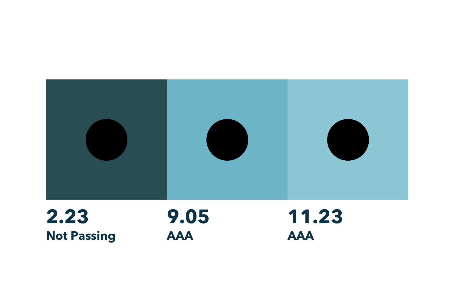
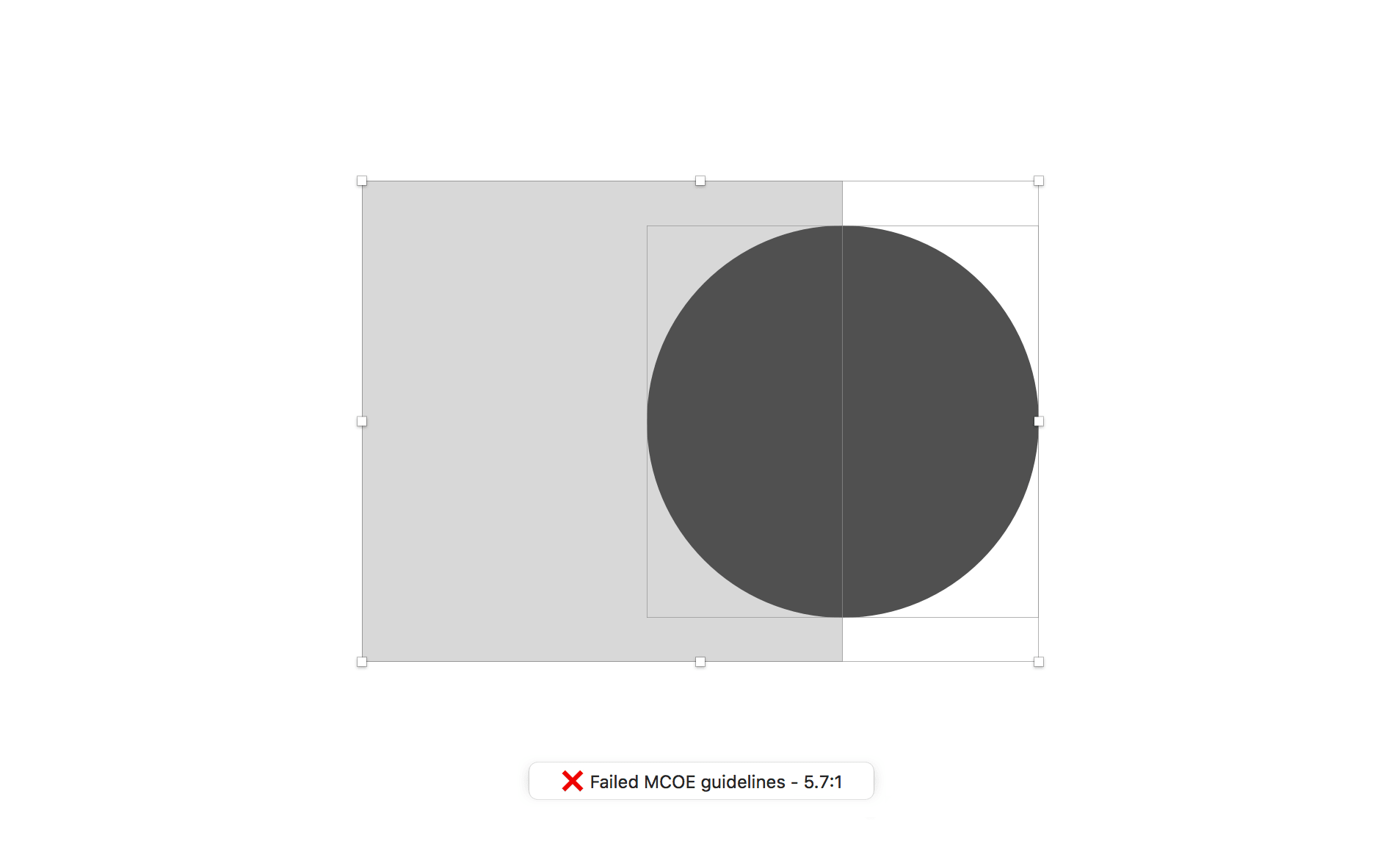
On the web, this has less to do with using complementary colors or colors with different hues (red versus green) and has more to do with the lightness/darkness or luminance of a color. This helps to account for color blindness where it is harder to distinguish between hues.
To ensure everyone can use the sites we design, be sure to use strong contrast when you are distinguishing between two elements. Web Content Accessibility Guidelines(WCAG) determines ratings for color contrast that can be easily found with some of the tools listed below. If you want to know more about how web color contrast is calculated, take a look at this article.
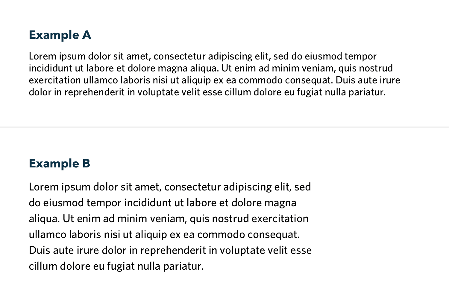
Contrast is especially important when it comes to typography. Font choice, type size and weight, line length, and leading (vertical space between lines of text) all have a huge impact on accessibility. If the content of your site is too small or the lines are too long, it will decrease legibility for all users, not only those with visual impairments.
Here are a few rules of thumb to get you started:
Avoid using type that is smaller than 16px, especially for important information.
Try to keep your paragraphs of text to between 40 and 75 characters long and don’t be afraid to increase the type size and leading.
Look at how the type will appear on a phone versus a large desktop and make adjustments as needed. Typically, as your font size gets smaller, the relative spacing between lines should increase.
Setting up strong typography now will save time down the road. Remember, treat these as guidelines, knowing that things like line length will always change in the wild world of responsive browsers.
Pushing Towards Better Solutions
Sometimes these guidelines can feel constricting but accessible design does not equal unappealing design. There can be a balance and healthy tension between accessibility and boundary-pushing design. Oftentimes, this leads to more creative solutions that are accessible to everyone, regardless of vision ability.
Constraints are actually a good thing. When accessibility rules start to feel constricting it’s helpful to take a step back and remember that the goal is to design great experiences for all users, and a design that doesn’t accomplish this goal is a design that has essentially failed its purpose. There’s a time and place for low contrast and small typography, but the main content on your website is probably not the right application. It’s important to distinguish between decorative elements, where accessibility rules don’t apply, and the actual content of your site.
Tools
For designers, there are numerous tools that we can use to double-check our design decisions for visual accessibility before ever writing a line of code. Here are a few tools we use at Sparkbox:
Colorable
Colorable is a web-based contrast test for color palettes. It is helpful when testing a large volume of colors or creating a new palette.

Sketch Color Contract Analyzer
Sketch Color Contrast Analyzer does what it says it does. It is really helpful for quickly testing contrast between two elements from within Sketch. Keyboard shortcuts come in handy here.
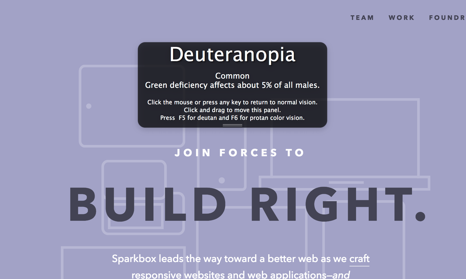
Color Oracle
Color Oracle is a free color blindness simulator that essentially filters your screen so you can test your design against a variety of color vision impairments.
Hex Naw
Hex Naw works great for quickly testing multiple color values against each other and is a great tool to start with.

Let’s Do This
We’re all learning here. Web accessibility can be a daunting and complex topic, but it is important that we don’t shy away from it. Don’t wait until the last minute to check things like readability and color contrast. Educate yourself, try things, and continue to improve your accessibility chops. Together we can make better web experiences for all.
