We’ve evaluated automated accessibility testing tools to help you determine which is best for your project. Learn the strengths and weaknesses of the WAVE Browser Extension.
Establishing an accessibility workflow is an important step in ensuring that your site is usable by every member of the internet. With the number of tools that are available out there, each with their own assortment of strengths and weaknesses, it can be difficult to hone in on which tool is best for you and your needs. Sparkbox’s goal is to research a variety of accessibility tools and empower anyone to run accessibility audits. In this article, I will review the WAVE browser extension from WebAim by using it on a testing site that has planned accessibility issues. This review will rate the plugin based on the following areas:
Watch a walkthrough of the tool and a short review or keep scrolling to read the full review. Jump to the conclusion if you are in a hurry.

YouTube embeds track user data for advertising purposes. You can watch the video on YouTube if you prefer not to grant consent for YouTube embeds.
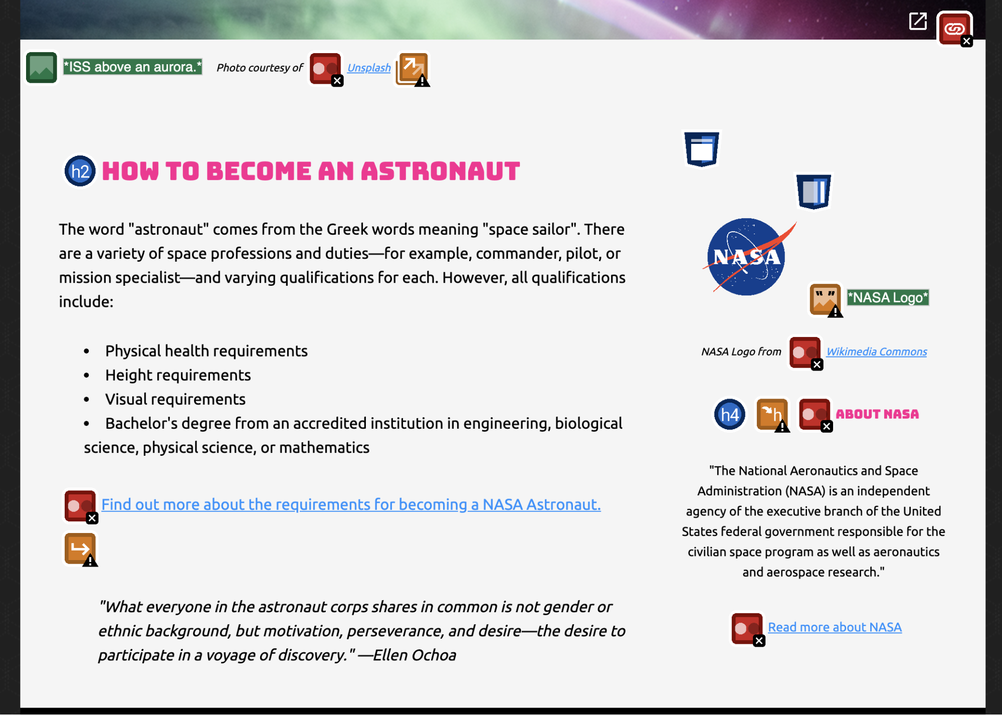
In order to fully vet accessibility tools like this one, Sparkbox created a demo site with intentional errors. This site is not related to or connected with any live content or organization.
Ease of Setup: Outstanding (4/4)
Setting up the WAVE browser extension takes only three clicks before you’re ready to start testing. After navigating to the WAVE site, click on “Browser Extensions” to get a brief overview of WAVE and find the links to install it in either Chrome or Firefox. Like some other browser extensions we reviewed, WAVE is limited to only testing in supported browsers, and it will not work in Edge.
Ease of Use: Exceeds Expectations (3/4)
After installing the extension, navigate to the page you’d like to test, click on the extension’s icon in your toolbar, and begin analyzing the output. You may also run the extension by pressing Command + Shift + U (Control + Shift + U) or by right-clicking on the page and selecting the “Wave this page” menu item. Although you will have to manually run WAVE on each page you wish to test, the turnaround time from running the extension to getting your results is extremely quick and allows you to dive right into making your changes.

WAVE utilizes a very large list of icons—approximately 110—to indicate which accessibility items are or are not working on your page. These icons are organized by issue type and color and present themselves at or around each relevant element. WAVE provides reference links to the WebAim site for each icon within the key provided and also has a documentation page on their site that breaks down the meaning of each icon.
While the process is quick and the list of items WAVE can detect is extensive, the sheer number of differing icons that appear after any given audit can confuse new users. As previously mentioned, WAVE does a great job of providing references and documentation for each issue, but new users will likely need to use the tool several times before they start feeling comfortable with it.
The extension only provides a manual experience, which may become tedious to use on larger projects. Consider this before settling on WAVE as users will have to reload the page, navigate to the proper location, and run the extension again each time an item is updated. Unlike other tools we’ve reviewed, WAVE does not currently offer an integrated tool to make up for this deficit. With that being said, however, WebAim does note that Pope Tech offers a paid tool that utilizes WAVE in order to provide an “enterprise-level web accessibility evaluation system.” While this review focuses specifically on the WAVE browser extension, the paid tool might be worth investigating for larger organizations that have the budget.
Reputable Sources: Exceeds Expectations (3/4)
The WAVE site expressly states that it has “numerous tests for accessibility, including many checks for compliance issues found in Section 508 and WCAG 2.1 guidelines.” After the extension has run, users are able to see which WCAG guideline and level (A, AA, or AAA) is being addressed in the key provided.
While WAVE aims to follow the WCAG 2.1 guidelines, it is important to note that it redirects users to a WebAim checklist when they click on the issue at the bottom of the respective reference. WebAim is a reputable source as well as the creator of the WAVE extension, but redirecting to WebAim instead of WCAG calls for users to be diligent and ensure that WebAim’s information is up to date with the latest WCAG guidelines. Not redirecting directly to WCAG creates an additional step and potentially more work for the user.
Accuracy of Feedback: Meets Expectations (2/4)
When used on our testing site, WAVE caught 8 out of 13 of the errors that we expected an automated tool to find. WAVE’s site does acknowledge that it “cannot check all of the issues in [the WCAG 2.1] guidelines.” WAVE believes in both catching known accessibility issues, which it defines as outright “Errors,” as well as facilitating and assisting the user in the evaluation of potential accessibility issues, which WAVE defines as “Alerts.” For example, while it is not wrong for an image to be missing an alt tag, WAVE still labels this as an “Alert” in order to encourage the user to look into that image and make sure that leaving it blank was their true intent.
Some of the issues that WAVE missed include ID attributes with the same name, an unordered list with a missing <ul> tag, and a click area that is less than 44px by 44px. With that in mind, a number of these missed issues are items we would certainly expect an automated tool to catch.
Another thing to note is that some of the items the tool caught weren’t marked as outright errors but were instead marked as warnings. This goes back to WAVE’s philosophy of helping to facilitate accessibility evaluations instead of making assumptions for the user. These warnings are still very useful, but they require the user to look more deeply into what is happening on the page in order to make a final decision on if the item needs to be fixed or not.
To see all the test site issues that WAVE found or missed, skip to Accessibility Issues Found.
Clarity of Feedback: Outstanding (4/4)
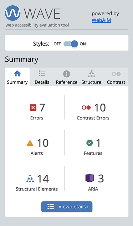
After the extension runs, WAVE provides a key of each of the issues occurring on the page.

While the icons can be confusing at first, the key assists in condensing and breaking the issues down into errors, warnings, or features so that the user can immediately note the severity of the issue they’re looking at. When a user selects any of the individual issues, they are navigated to a reference tab. This reference tab is extremely useful in breaking down what the issue actually is, explaining why it is occurring in plain, user-friendly language, and providing potential fixes to the problem. Each reference tab also provides links to WebAim in order to verify the validity of the information provided.
Cost: Outstanding (4/4)
The WAVE extension is free to use for both Chrome and Firefox. In addition to being free, WAVE also explicitly states that it does not gather any of your data and ensures “100% private and secure accessibility reporting.” If you are looking to pass on the manual efforts of running the extension on each page and integrate this tool into your build process, there is also a WAVE API that you can pay for.
Strengths and Limitations: Exceeds Expectations (3/4)
The WAVE extension has many strengths, especially for being a free-to-use-tool. WAVE provides extensive and robust feedback. It does this by utilizing a list of approximately 110 icons, which detail where issues are occurring on the site and to what level these will affect the end user. (However, a user does have to familiarize themselves with the icons to find them useful.) It gives easy-to-understand references for each of the issues shown so that users can know both why the error is occurring and what WAVE suggests they do to fix it. Setting up and running the extension is also very quick.
The limitations of this tool are that the number of icons on the page can be overwhelming for new users, it has to be manually run on each page, and it does not catch as many errors as the other tools on our list. Instead, it relies on helping the user make decisions on the final accessibility outcome. While the latter is an admirable goal, it may not always be the most effective or desirable, especially for users who are new to accessibility.
All in all, WAVE’s strengths outweigh its weaknesses, making it a great tool to use for beginners and experts alike.
Conclusion: 🏆 Highly Recommend (25/28)
For those looking to begin improving or developing their accessibility workflow, utilizing the WAVE browser extension would be a quick and easy way to do so. While the extension didn’t catch all of the issues we expect a tool to catch, it has a very elegant and easy-to-use UI that will allow users to not only analyze their site for issues but also improve their overall knowledge of accessibility as well. Pairing this tool with manual testing such as keyboard navigation, VoiceOver validation, or usability testing will help to provide a holistic view of your site’s overall accessibility.
Accessibility Issues Found
| Test Site Issue | Tools Should Find | People Should Find | WAVE Found |
|---|---|---|---|
| Insufficient contrast in large text | ✅ | — | ✅ |
| Insufficient contrast in small text | ✅ | — | ✅ |
| Form labels not associated with inputs | ✅ | — | ✅ |
| Missing alt attribute | ✅ | — | ✅ |
| Missing lang attribute on html element | ✅ | — | ✅ |
| Missing title element | ✅ | — | ✅ |
| Landmark inside of a landmark | ✅ | — | ❌ |
| Heading hierarchy is incorrect | ✅ | — | ✅ |
| Unorder list missing containing ul tag | ✅ | — | ❌ |
| ID attributes with the same name | ✅ | — | ❌ |
| Target for click area is less than 44px by 44px | ✅ | — | ❌ |
| Duplicate link text (lots of “Click Here”s or “Learn More”s) | ✅ | — | ❌ |
| div soup | ✅ | — | ❌ |
| Funky tab order | — | ✅ | ✅ |
| Missing skip-to-content link | — | ✅ | ❌ |
| Using alt text on decorative images that don’t need it | — | ✅ | ✅ |
| Alt text with unhelpful text, not relevant, or no text when needed | — | ✅ | ✅ |
| Page title is not relative to the content on the page (missing) | — | ✅ | ✅ |
| Has technical jargon | — | ✅ | ❌ |
| Using only color to show error and success messages | — | ✅ | ❌ |
| Removed focus (either on certain objects or the entire site) | — | ✅ | ❌ |
| Form helper text not associated with inputs | — | ✅ | ❌ |
| Pop-up that doesn’t close when you tab through it | — | ✅ | ❌ |


