Photoshop is far and away the most popular application for web designers. This isn’t news to anyone. For good reason, it has been the tool of choice since the dawn of digital time, and its merits have been well documented.
Illustrator has long been mocked as a tool for use in web design. This is no surprise either. Like its more popular and prettier cousin, Photoshop, Illustrator has its roots in print design. It has had a harder time hiding its paper-prone blemishes though, as its vector nature has made it a strange partner for the rasterized world of the web.
However, this post is not an attempt to pit the two against one another. Frankly, I’m not interested in dodging the flaming arrows which would most certainly follow. I’m not even sure I’d go to bat for one over the other anyway. That’s not my point. My goal is simply to document how Illustrator can be used for web design. There have been some fairly distinct improvements to Illustrator in CS5 which allows it to dress up in Photoshop clothes. You may be surprised.
If you think your project warrants it, here are the essential CS5 settings and practices to get you started with Illustrator for web design.
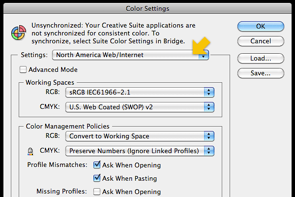
Color Settings
If you get caught working with CMYK images, you’ll probably have your design card confiscated. Please visit your “edit” menu and modify your color settings to “North America Web/Internet” before you embarrass yourself.
New Document Settings
The standard new document profile “Web” is a good place to start, though you’ll likely want to change document size. There are a few essential settings you really need to get going. Your units should be set to “pixels.” In the advanced menu, your color mode needs to be RGB, raster effects set at 72 dpi, preview mode in “pixel,” and the newly available “align new objects to pixel grid” should be checked.
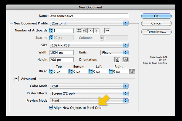
This “align new objects to pixel grid” is the secret sauce that really makes Illustrator viable for any kind of web design now. It achieves by default what you may have tried to achieve in the past with elaborate snap-to-grid and guide scenarios. It’s not perfect, but it’s a vast improvement. Try it; you’ll like it. It will be the difference between crisp vertical/horizontal lines and nasty unintentional anti-aliasing.
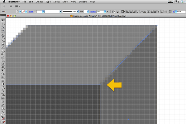
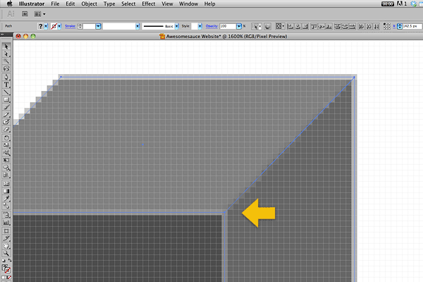
Transform Palette
Once you have your document open, you can always choose to “align to pixel grid” (or not align) at the object level.

Preferences
This one is tricky to understand without actually trying it. Go to your preferences, open “general” preferences, then select the option to “use preview bounds.” This affects how object size is reported in the “info” and “transform” palettes.
For example, make a 10×10 pixel box. Then add a one pixel stroke (aligned to outside). With “use preview bounds” selected in preferences, this box will now register as 12×12 pixels due to the added stroke. Without this preference selected, the stroke is ignored by the info palette, and the box still registers at 10×10. The same behavior occurs with objects carrying effects such as a drop shadow—the additional pixels are added to the object’s overall reported dimensions.
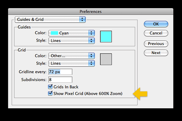
You’ll also want to look at the “guides & grid” preferences. There you’ll find the option to “show pixel grid” when viewing at 600% or higher.
View Menu
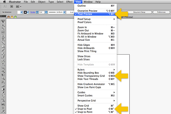
To complete the Photoshop-like illusion, you’ll want to visit your “view” menu and choose the “pixel preview” mode, “show transparency grid,” and probably “snap to pixel.”
You’re now working in an application which you could call Photostrator. Or Illushop. Or we could just forget I wrote that.
Conclusion
Really, the biggest issue with designing for the web in Illustrator is not the design product you achieve. The largest concern is the disruption in workflow for teams accustomed to Photoshop. If you are a designer handing layouts over to a front-end developer, you’ll either need to provide some basic Illustrator training, or you’ll need to export your layouts to more familiar Photoshop files.
I’ve found that, when necessary, the export to Photoshop feature works nicely in CS5. It sometimes flattens objects that Illustrator has a hard time translating to a PSD, but this happens far less often than I experienced in the past. Now, Illustrator is exporting pretty well-layered PSD documents with editable text. Your vector objects are not kept as editable PSD shape layers, however, and you’ll still want to do a few minutes of layer naming and clean-up before you hand the PSD document off to a developer.
If you are the designer and the front-end developer, you’ll probably find that you have less issues. Working in Illustrator may fit you as an individual better than it does a team.
Depending on the needs of your particular project, Illustrator can be a good solution. Some designers even use it as their tool of choice due to its unique features. Others have abandoned Photoshop and Illustrator altogether for their strange step-cousin. If you’ve been using Photoshop exclusively, or even if you haven’t, I’d encourage you to try Illustrator or some of the other web design tools. You may find that it provides a fresh perspective just by putting on a change of clothes.
Any other tips on using Illustrator as a web design tool? We’d love to hear them!
