
We recently usability tested four higher education websites with college-bound high school students as part of our best practices for mobile navigation research. While watching these prospective college students perform a few basic tasks that included finding admission deadlines, the sticker price of room and board, and most critically, if the school had a major they were interested in, we noticed a few common issues.
Four ways many higher education websites could improve their user experience:
Fixing these issues could improve a prospective student’s user experience of any college or university’s website, resulting in a less frustrating and more positive impression of the school.
4 UX Best Practices for College & University Websites
Use clear, familiar navigation labels
Make sure top-level navigation labels are distinct and plainly stated.
A few of our tasks had the participants look for answers to questions, like where the school was located and how many undergrads lived on campus. Most felt like this would be in a Campus Life section, but the waters were muddied by navigation labels like Meet Swarthmore or Meet Princeton (and so on), which caused participants to be uncertain which section the information would be presented in. So, they’d pogo-stick between sections looking for an At a Glance or Fast Facts page to bail them out. Several admitted that they’d just ask these questions of Google and pull the answer from the results page. In this case, fewer top-level navigation choices with very little overlap may have made navigation easier.
The most successful Academics section navigation schemes used strong trigger words like “majors and minors” and “undergraduate degrees” early in the student’s journey.
Programs, Areas of Study, Departments & Schools, and Majors & Minors were all navigation labels used to direct prospective students to degree offerings once they were in the Academics section. In our usability tests, we noticed that while high school students successfully navigated to Academics, but once inside the section they were looking for keywords like “majors and minors,” “degrees,” and “undergraduate” that were not always as clear. As novices to higher education, they weren’t thinking about everything the university offered, like graduate degrees or all the schools or departments within the college or university. Be sure to incorporate keywords that map to the prospective undergrad’s language so they can easily find their way.
Invest in the organization and navigation of degree programs
Program finders and filters made finding degree options easy to find. Being able to sort or filter all of the academic programs by degree type, topic, and in some cases, delivery mode (online, satellite campus, etc.) made options clear for prospective students. We did notice two areas for improvement, though.
Pay attention to mobile performance when building a program finder.
When conducting the study on mobile devices, we noticed that one university’s program finder had a large page size that took nearly 10 seconds to become fully interactive. This was incredibly frustrating to use on mobile. Run a performance audit so this doesn’t happen to you!
Organize by subject or topic, not by the university or college’s org chart.
To users, not seeing a degree on the list means that the school doesn’t have it. So using school or department names as a substitute for true topical or subject filtering can backfire. For example, a prospective student may look for a music education degree in the School of Education, but it might be listed instead under the School of Music and Performing Arts because that’s the department that administers it. All music programs should be together, and all education programs should be listed together, even if this means you have repetitive listings. Keep in mind that this issue is not limited to only program finders; it can also happen with static lists.
Be transparent about costs and important dates
Although everyone’s financial aid and scholarship situation is different, a straightforward presentation of tuition, fees, and room and board costs reduces frustration.
Surprisingly, a question about how much it costs to live on campus stumped four out of five usability testers on one of the websites we tested. They buried actual costs under “affordability” marketing content. One participant suggested that when costs and fees are obscured, it means they are hiding how expensive it is, so this may be a case where a lack of transparency causes prospective students to jump to conclusions. Websites that successfully presented cost information did so with a page clearly labeled with the word “cost” (like Tuition and Costs, Cost & Aid, etc.) and used a table.
Application deadlines and requirements benefit from strong layouts and good labeling.
Our prospective students were looking for words like “dates,” “deadlines,” and “checklists” within the admissions section of the website. Navigation labels that included these trigger words were generally high-performing.
On a few sites, our participant’s ability to quickly grasp admission dates and deadlines suffered because of a lack of information design. These pages relied much on lengthy blocks of copy or long-winded bulleted lists. The easiest to use pages were broken up by headings, well-spaced lists, tables, and show/hide sections to present application checklists, requirements, and chronological lists of deadlines for each type of admission.
Optimize site search
Pay attention to site search analytics to better understand search behavior and improve the results your search tool delivers.
Unfortunately for our participants, using the website’s internal site search typically resulted in a frustrating mismatch with what they expected. They were using their “outsider” language and had high expectations from search because they are used to Google’s search suggestions and personalization. Most of the site searches on higher education websites couldn’t guess well enough to deliver useful results for their searched keywords.
For example, one of our participants searched for the keyword “apply” on a university website. The first result was an admissions “Apply” page, but unfortunately, it was for the graduate school. They didn’t realize that they were on the wrong page on a totally different website until they were reading the application checklist.
Other searchers looked for the name of a major they were interested in, tried to figure out costs, or looked for how many undergraduate students were enrolled. These types of searches ended with pages of results that seemed irrelevant, or worse yet, netted zero results.
For site search, our participants’ expectations are what Google provides. This means a website’s site search should step up their game by implementing a search tool that is good at making suggestions and fuzzy connections. To improve an existing search tool, use site search analytics to look for the keywords that produced visits to more than one page of results, a re-search, or zero results. Focus on filling these content gaps or adapt the language used on the page (like in meta keywords or descriptions) to improve your site’s searchability.
Go Deeper with More UX Insights
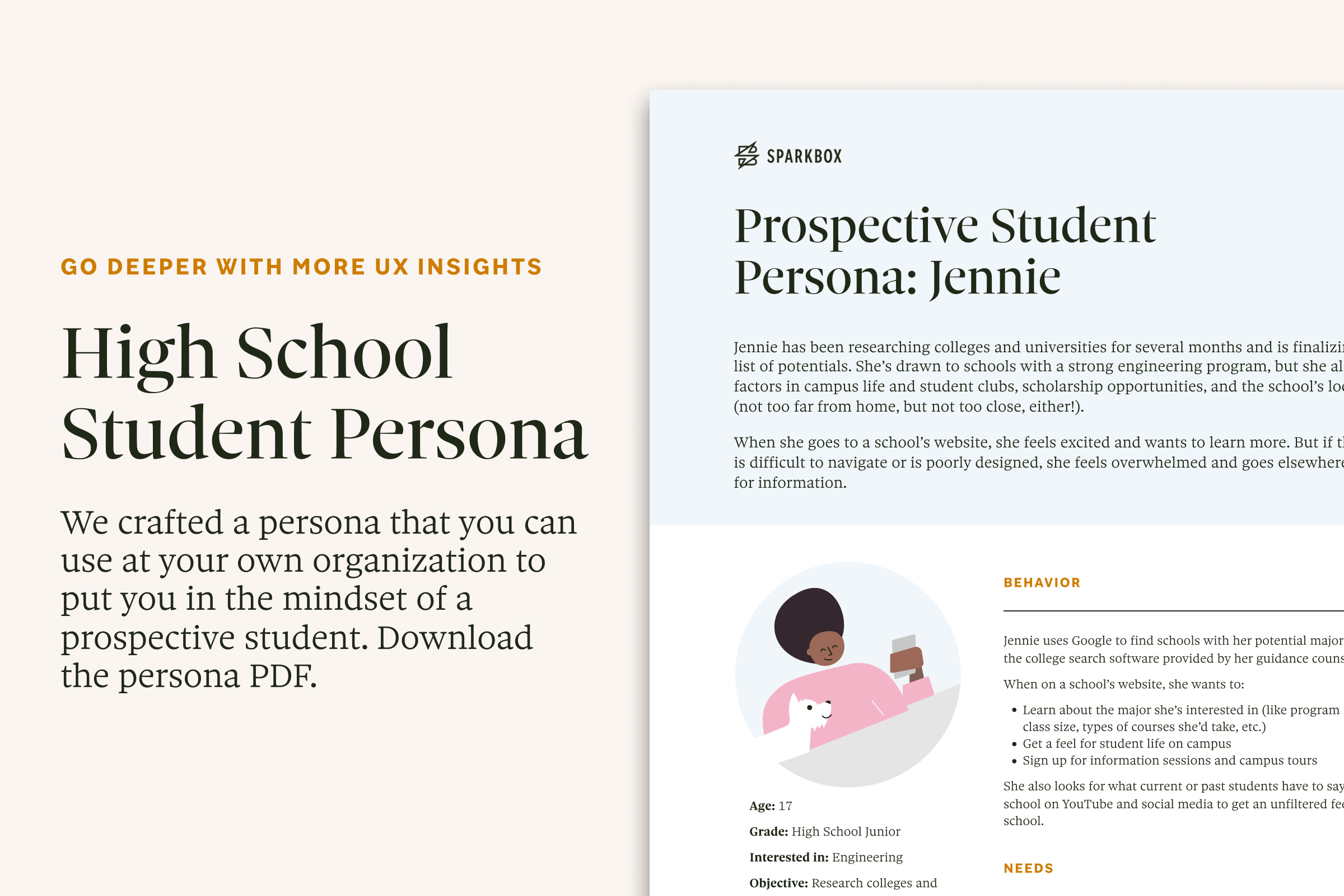
In the course of our research, we conducted interviews and usability tests with more than 10 high school students who were anticipating enrolling full-time at a 4-year college or university. Based on this, we crafted a persona that you can use at your own organization to put you in the mindset of a prospective student. Download the persona PDF.
Mobile Navigation Best Practices for Large, Content-Rich Websites
We developed 5 guiding principles for mobile navigation on large websites that will help you improve wayfinding and information scent on your website. Review the findings.
Recruit Participants for User Research
Our toolkit streamlines the process of brainstorming where to find users, actually contacting users, and tracking your wins so that you can add user interviews and usability testing to your design repertoire. Sign up for access to the toolkit.
A Note About the Audience
Our usability test participants were from a variety of backgrounds: some will be first-generation college students, while others had parents or siblings who had been through this before. Some had it all figured out, while others had barely thought about college. Some lived in cities; some were more rural. They had one thing in common, though. They all fit the traditional perception of an incoming first-year student who is planning to live on campus, attend full-time, and graduate in 4 to 5 years.
Contrast that with figures from the National Center for Education Statistics, which reports that in fall 2019, 38% of undergraduate students were part-time, and 34% were enrolled at 2-year institutions. And, we know that the Covid-19 pandemic caused upheavals on campus in 2020, with potential impacts to future years.
That said, it was eye-opening for us to put ourselves in these students’ shoes, to a time before words like “registrar” and “bursar” entered our lexicons, and before the org chart of a university—with its schools, colleges, and departments—was part of our mental model for higher education.
Whether a student is one of those “traditional” college types or is a part-time student who is holding down a job and maybe has kids at home, we think that these usability suggestions will make higher education websites easier to navigate for anyone.
We Can Help
Sparkbox’s recent work in the education sector includes laying the foundation for a design system at the University of Georgia, partnering with the Stanford School of Humanities and Sciences to develop flexible Drupal themes, and designing tools for teachers for the Described and Captioned Media Program. Let us know how we can partner with you on your next project.
Get A Free Guide to Becoming User-Centered
Investing in user experience is a solid and proven return on investment. Fill out this form and start evaluating your organization’s UX Needs, earning buy-in from stakeholders, and hiring help!
