Here’s a quote from Seth Godin’s book “The Dip”
The Dip is the long slog between starting and mastery.
Responsive web design is two years old. In those two short years since the publication of the article coining the phrase, our industry has seen an amazing amount of churn as front-end developers everywhere have traded in pixels for percentages. We’ve applied fluid grids, flexible content, and media queries to everything we can think of — all in the name of a better, more accessible web. These three techniques alone are not terribly difficult to implement, but we all agree, there’s much more to the web than front-end development.
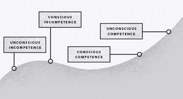
Consider the “Four Stages of Learning,” originated by Noel Burch in the 1970′s. Here’s a concise — if not bland — description straight from Wikipedia:
The Four Stages of Learning provides a model for learning. It suggests that individuals are initially unaware of how little they know, or unconscious of their incompetence. As they recognise their incompetence, they consciously acquire a skill, then consciously use that skill. Eventually, the skill can be done without consciously being thought through, and the individual is said to have unconscious competence.
Take a look at this visualization:

This model wasn’t intended to apply to an industry as a whole, but I do believe we can see our collective reflection in this concept if we look with an open mind.
Two years ago, most of us weren’t aware of the impact a solution like responsive web design could have. Now, many people are realizing the potential and we’re beginning to see some very usable patterns emerge. One of the actionable premises of this model of learning is that “people only respond to training when they are aware of their own need for it and the personal benefit they will derive from achieving it.” Assuming this is true, you can infer that we (people who make websites) must understand the potential of our craft before we really strive to embrace it. In order to do this, we need a few fantastic examples.

As an industry learning a new skill (building sites that work on any device), I believe we’re straddling the “unconscious incompetence” and “conscious incompetence” stage. We’re finally starting to see “the responsive dip” before us and how great these experiences can be if done properly. In order to get through the dip, I believe what’s needed is for those involved in the responsive web creation process other than front-end devs to really participate in the conversation. Specifically, we need the careful consideration of user experience experts at all resolutions.
Now, I’d like to pivot the direction of this article a bit.
There have recently been two high-profile articles written with some criticism of responsive web design. Jakob Nielsen wrote the first, entitled “Repurposing vs. Optimized Design.” The basic premise of Nielsen’s article is that “it’s cheap but degrading to reuse content and design across diverging media forms.” He points to the “tight platform integration” of Apple (controlling hardware, software, and content) as a prime example. After some consideration, I believe most of us would also come to his conclusions if we performed the same tests on today’s responsive sites.
Hold that thought.
The second article critical of responsive web design was written by Peter Yared, entitled “What’s next for mobile now that adaptive design has failed?” Mr. Yared’s obvious misunderstandings of the actual definition of responsive web design aside, his point is actually relevant: “it’s incredibly difficult to monetize on mobile devices.” Again, I believe we can all agree that advertising and responsive web design are, at this point, difficult to mix. Take the beautiful redesign of Smashing Magazine — when you size your browser to a width less than 1020px the ads simply disappear. (As a note, the fantastic folks at Smashing are well aware of this and are working to find a better solution.)
Just because we haven’t found perfect solutions to the problems these two undoubtedly intelligent gentlemen highlight, it doesn’t mean we shouldn’t try. If we consider that our industry is still learning this new skill, perhaps we can admit that sometimes things get worse before they get better. I believe this is precisely the case with responsive web design.
I also believe that there is a lot of room in this space for other solutions. Responsive is fantastic, but it’s one of many techniques available to us. Our industry is starting to see the value in combining the ideals of responsive with other techniques (mobile first, lazy-loading, RESS, etc.) to create relevant, performant sites.
While the old saying, “Just because you can, doesn’t mean you should” is true, the opposite is also true.
“Just because you can’t, doesn’t mean you shouldn’t.”
The fact that we don’t know how to do something today doesn’t mean we shouldn’t strive to do it tomorrow. Can you imagine where we’d be if we didn’t believe this? History is full of amazing people doing things previously assumed impossible. We’re not talking about landing on the moon here, we just want to make the web better.
I say we need to keep pressing forward, keep pushing responsive, mobile first, standards, and accessibility as far as we can. Certainly we’ll make some mistakes along the way — mistakes that we’ll learn from. It may be another year or another decade, but we can make it through the responsive dip. We just need to do it together.

