
A project with bottomless budget, unlimited time, and unlimited scope may sound like a dream; in reality, though, every project has guardrails. Whether it’s a budget, time, or scope limitation, restrictions are what drive innovation to that first release, the Minimum Valuable Product (MVP).
You might be more familiar with the term “Minimum Viable Product.” I prefer “Valuable,” though, because it is a truer reflection of what we’re called to do in our work of building responsibly. Viability has a hint of struggle. Its definition is “workable.” We don’t want to deliver something that’s just “workable.” We want to deliver something that’s truly valuable. The Minimum Valuable Product responsibly tests a feature set that we believe will solve a primary problem for a specific audience. This is exactly what our mission was for YoPortfolio.
Defining Value
YoPortfolio’s founder came to Sparkbox with the vision for a specialized stock portfolio application for personal investors and just enough budget to bring the application to life. The client was testing an idea to see if he had a feature set that personal investors would find valuable. Until getting the product into users’ hands, though, it was up to us and YoPortfolio to determine what would be most valuable to include in the first release.
YoPortfolio came to us with a well-defined document of the application’s ultimate features and differentiators. Laden with examples, calculations, suggested user experiences...it was a guide to not only a first release but a second, third, and fourth as well. To be good stewards of YoPortfolio’s budget, we needed to take that list and identify what would make the first release something of value.
Foundational Items
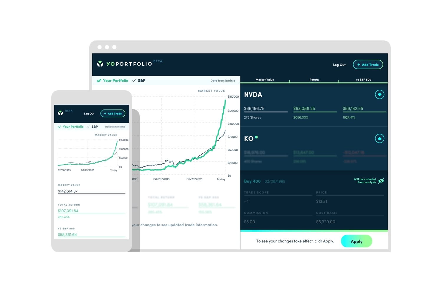
In helping our client determine what that first release would include, we separated the deliverables into two categories: basic needs and differentiators. Basic needs included things like having a user login, the capability to add trades and all the distinguishing factors of that trade (buy vs. sell, share price, date, etc.), and a trade history view. But even Basic needs can be executed in ways that add value.
Creative, warm language and design elements that align with the brand make the sign up process feel friendly, personal, and add a nice element of fun.

YouTube embeds track user data for advertising purposes. You can watch the video on YouTube if you prefer not to grant consent for YouTube embeds.
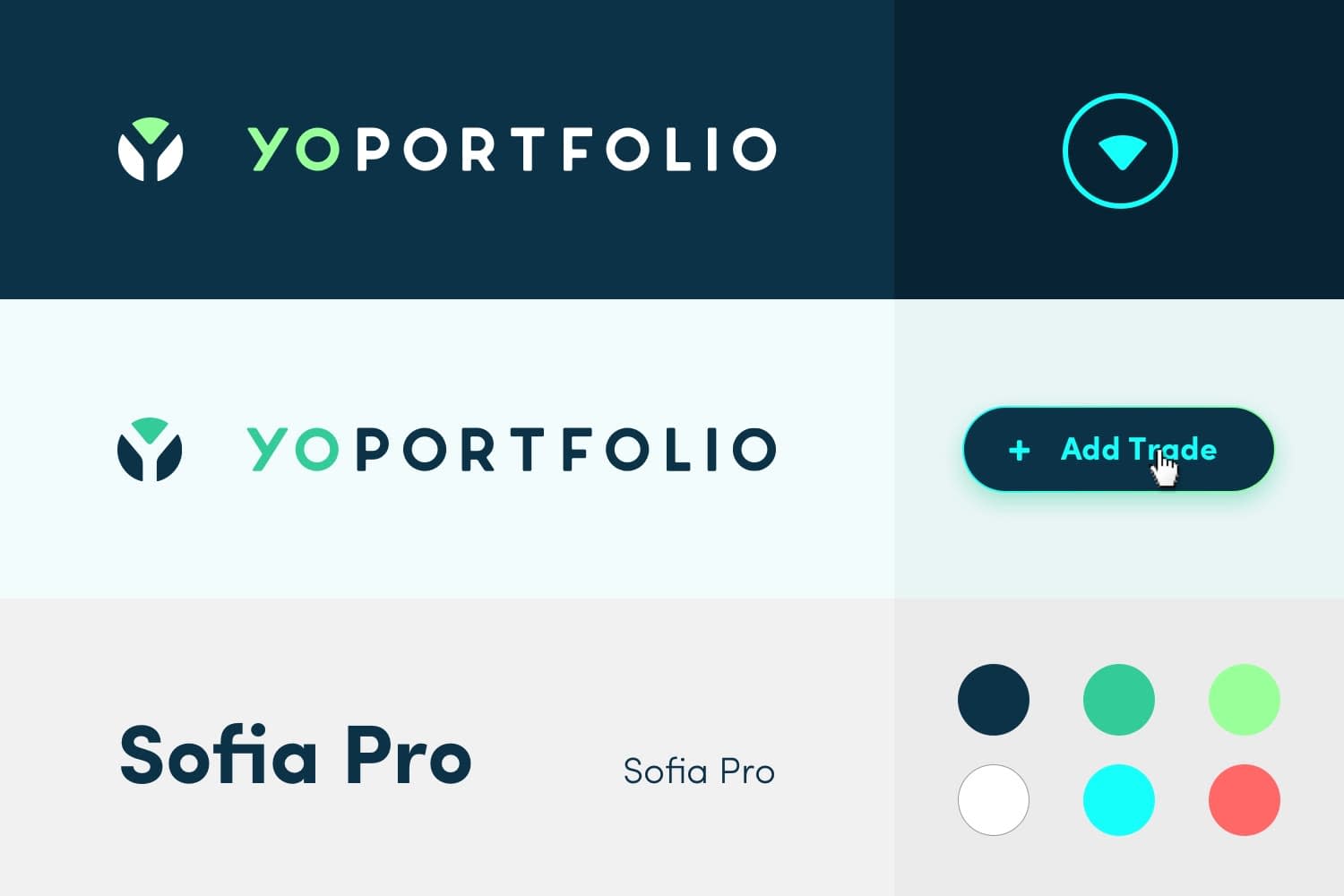
Creating a modern, clean, and casual feel was our mission. We executed on this whenever we saw an opportunity. From the color palette and font selection, to the logo and companion brand elements.
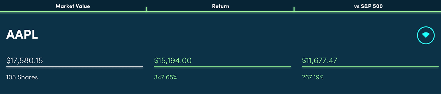
Even the way we displayed the financial summary information for each stock is tidy and simple. Clearly color-coded to quickly see financial success.
We wanted an easy way for users to access trade details without having them clutter the dashboard.

Trade-specific information can be found by clicking the drop down arrow at the stock summary level.
Prioritized Features
These items were the foundation on which we built the product differentiators. When it came to choosing the differentiators to include in the first release, we chose the ones that we wanted to get user feedback on first—those that had great value to the user and his/her portfolio. This resulted in incorporating the Trade Score and Suppression features.
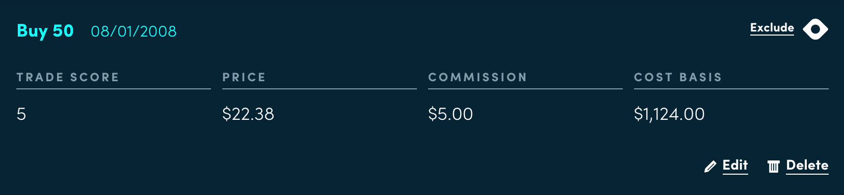
Trade score helps users identify and assess their investment decisions to help them make more informed for greater returns.
Trade Suppression allows users to see the theoretical impact of erasing a trade from their portfolio’s history.

YouTube embeds track user data for advertising purposes. You can watch the video on YouTube if you prefer not to grant consent for YouTube embeds.
Executing with MVP Mentality Paves the Way for Iteration
With some strategic and intentional thinking rooted in YoPortfolio’s vision, we were able to deliver a well-thought-out initial product. Our MVP thinking ultimately proved valuable because we were able to meet what we set out from the beginning while also maintaining a delightful, first-rate experience for the user.
To make the most out of user feedback, we added Hotjar, a user interaction tracking tool. This allowed for a more streamlined way to collect user feedback—what parts of the application were they finding most valuable, where were their pain points, how was their experience using the application, etc. Armed with this information, the client has been able to come back to us several times with these analytics and we’ve made improvements to the application. And we’ve learned there are several features from the original plans—ultimate list of features—that users are ok waiting for. This is exactly why we iterate and why it makes sense for users to determine where the next dollars of a new application are spent.
