Security is something we take seriously at Sparkbox. As a team that builds with open-source code and packages, we’re always looking for better ways to find, fix, and monitor vulnerabilities. Snyk is a product we use to track dependencies in our software, which is a crucial aspect of our mission to “build better.” So when our friends at Snyk approached us about working together on their State of Open Source Security report, we jumped at the chance.

Snyk based this report on a survey with more than 500 responses, as well on reviewing Github, Snyk internal data, information published by RedHat Linux, and package management registries.
Working with Snyk on this report is the kind of project that not only helps our community better understand the landscape in which we’re all working, but also helps us all do better. Knowledge is the first step to action, and by partnering with Snyk to share the findings of their extensive research, we are doing our part to help create a safer, more secure web.
Spread the Word to The Right People in the Right Way
Snyk came to Sparkbox with more than 25 pages of analysis and reams of raw data they knew they needed to condense. Our project’s primary goal was clear right away–translate this comprehensive research into something that would be engaging both for people who want to skim for highlights and those who want to take a deep dive into specifics.
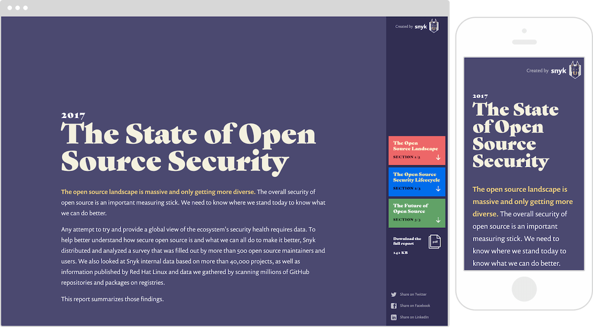
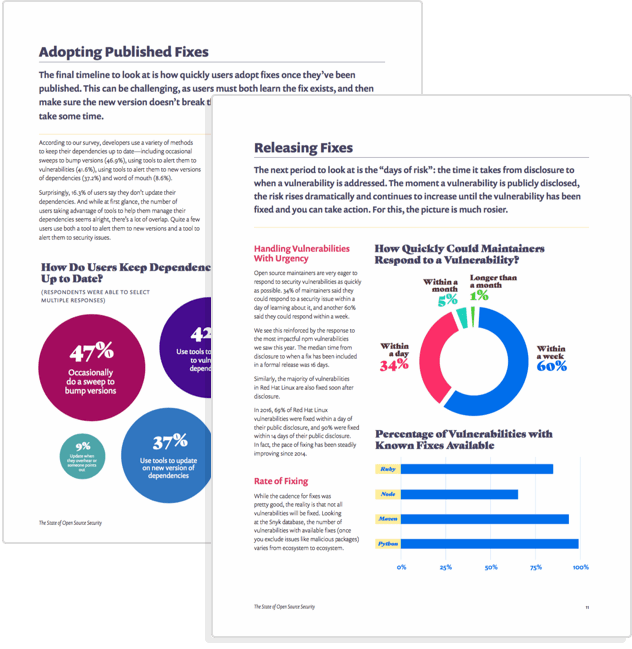
Our team worked with Snyk to design and build not just a website for the report, but also a PDF. The website targets the on-the-ground developers who build, maintain, and use open-source code, emphasizing high-level takeaways, action items, and social sharing. The PDF is meant for those C-level leaders at enterprise organizations who, as research demonstrates, are more likely to download, email, and share longform white papers.

This targeted approach worked. The report was covered in publications including Digital Journal, JAXenter, and CSO, was widely shared on social media, and will be cited in an upcoming Forrester report.
Work Quickly and Deliver Results
It was important to the Snyk team to launch the State of Open Source Security report before the holiday season when offices and the news cycle tend to go quiet. That meant a tight turnaround on an already-tight deadline, which meant that putting together the right team was crucial. Our long history of doing responsive work like this was just one reason why Snyk chose to work with us, its head of developer relations shared.
“A lot of agencies out there are doing strong responsive work, but Sparkbox is one of a handful that has been doing it for so long now. I knew that they could pull off something like this in a short amount of time.” -Tim Kadlec, Head of Developer Relations, Snyk
Each team member brought a value-plus background to our work: A developer with expertise in data science, a project manager who doubles as a content and UX strategist, a designer who works directly in code, and a creative director who steps in and gets his hands dirty.
We came up with an approach that would keep the project moving quickly and efficiently – creating layouts and interfaces we could reuse for multiple sections and content types, and using the charting library Chartist.js to get the visualizations 80% there, then custom-styling the rest.
We also worked iteratively, prioritizing MVP features like the data visualizations before backlog nice-to-haves that we still managed to pull off before launch—like the sticky sidebar navigation on large screens and a back-to-top button to make wayfinding easier.

Translate Data Into A Meaningful Story
All data tells a story, even if that story isn’t clear from the start. Snyk had lots of data about how people discover vulnerabilities, release fixes, notify users, and adopt published fixes. It was up to us to work together to figure out what that data meant and how to visualize its meaning.
For every piece of data, we questioned: How could this be interpreted, or misinterpreted? How could this information directly relate to the person reading it? How could that person use this to feel informed and empowered?
Every team member pushed for the very best user experience possible. This attention to detail did not go unnoticed by Snyk’s CEO, who said that this commitment to outcomes is what helps set us apart from other agencies.
There’s a level of attention to detail and care that Sparkbox puts into the entire process. They took the time to go through discovery, zeroed in on certain goals, and pushed for outcomes. Along the way they came back with things they were excited to do that we hadn’t put down as requirements—ways to make the report better we hadn’t even thought about.” -Guy Podjarny, Founder/CEO, Snyk
We selected the right chart or graph for each data set–bar, bubble, or line–and even moved some data out of charts and into colorful, shareable callouts. We added graphic highlights for many of the visualizations, and easy-to-scan lists of key takeaways. And, of course, we made sure this information was accessible to all users, including those who use screen readers and/or who may not have Javascript enabled.

Make Potentially Scary Content Feel Friendly and Empowering
Not everything in Snyk’s State of Open Source Security report is reassuring. For instance, the study finds an increase in severity of known vulnerabilities, lapses in security know-how by code maintainers, a lack of policy on public disclosure, and inadequate timelines for remediation. But the last thing Snyk wants its users and the open-source community to feel is scared. Fear leads to rash decisions and stagnancy, rather than to progress. Instead, Snyk wants people to feel empowered to make changes in their policies and practices to ensure a safer web.
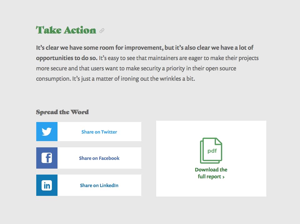
The report ends with a call to “take action”—steps we can take as people who use and maintain open source code to catch, report, and fix vulnerabilities.

Snyk’s branding supports this friendly, encouraging tone. Its primary colors are purple and teal, its font is a warm san-serif with calligraphic roots, and its logo is an illustrated doberman pinscher—a guard dog, surely, but still a dog that curls up for a cuddle at the end of the day.
The website and PDF report that we designed built on this branding with a candy-colored palette, flat iconography, and a classically inspired fat-face font with a hint of whimsy.
The takeaway is clear: The report is serious, but we don’t get scared; we get better.

