
The Numbers Don’t Lie
Every once in a while I read a statistic that changes the way I think about what we do. Two days ago I read an article on Business Insider that had this impact.
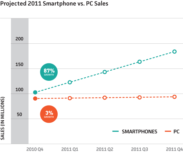
As of Q4, 2010 smartphone sales outpaced personal computer sales.
I suppose we’ve all known this was coming; this certainly isn’t the first time I’ve read this kind of statistic. The other half of the data reported from IDC was the rate of growth for both sectors:
The smartphone sector achieved 87% growth year over year while the PC sector achieved 3%.
What This Means for Us
I thought it might be helpful to look into some analytics for sites we’ve built over the past few years. These stats are an attempt to gauge how quickly users are shifting to mobile devices for browsing our clients’ sites. Here’s what I found:
Comparing January 2009 to January 2010 we saw a 235% increase in mobile screen sizes* accessing our clients’ websites.
Comparing January 2010 to January 2011 we saw a 290% increase in mobile screen sizes* accessing our clients’ websites.
It’s at this point that you need to start thinking about how your website handles these devices. These percentages are staggering because they drive the point home that your site doesn’t just sit on a desk anymore. The next generation of computer users might not be using a mouse to navigate your site, they might not be able to view your Flash content, and they probably won’t understand your message if they can’t view your site on their phone.
Wrapping it Up
These are amazing times to be a web designer. The technologies available to us now can address these issues, but doing so takes time and attention to detail. At Sparkbox, we face these challenges head-on with what we call SmartSites, sites that adjust their primary message and basic layout based on the context in which they are being viewed. It’s not cheap to do it and it takes a real commitment from our clients and our team, but the results are well worth it. The question is: Are you willing to invest in your site so it’s ready for the flood of mobile devices heading your way?
We decided upon any screen width less than 800 pixels as a “mobile screen size” to provide a good point of reference as most websites are built for a 1024 pixel screen width.
