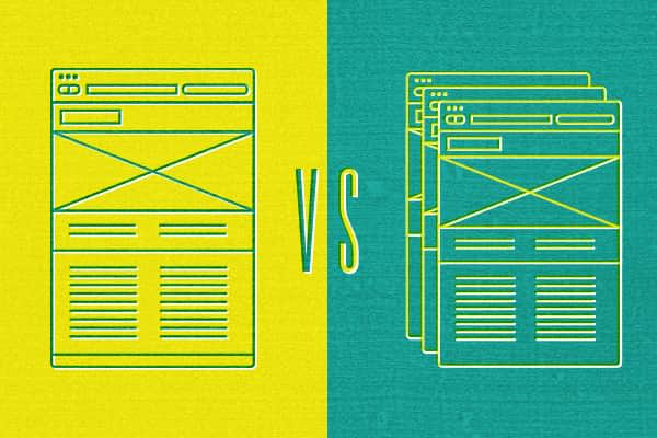
I’ve had a decent amount of discussion with clients and peers about the advantages and disadvantages of showing multiple or single web design concepts. At Sparkbox, our design process is built around showing a single design concept which we feel confident supports the client’s brand and goals.
This doesn’t mean we’re against exploring options. In fact, we typically create two or three rough design directions internally for each site we build. Delivering a single design just means that we have to make sure our process is that much better—gathering all information necessary to make informed design decisions.
Why We Work This Way
We used to present clients with multiple design concepts. However, we found that clients usually wanted to combine what they liked from each of the concepts into a single, “hand-picked” concept. Of course, this is commonly known as the “Frankendesign”—stitched together pieces that were never meant to be together. It was a constant struggle to keep the final design direction cohesive. In the end, we were left with only hope that it still met the site goals, and we often felt that we weren’t given the chance to deliver our best product to the client.
Designing multiple design directions also ate up a lot of time. It took time for us to come up with multiple concepts which all achieved the same goals (though we always had a favorite anyway.) It took time on our client’s part to digest the different concepts, discuss them internally, and provide feedback on each one. It then took more of our time to make extensive edits for further client review. Truthfully, this was all time we didn’t have in the project schedule, and as we all know, time is money.
So we abandoned the multiple design approach, trading for time savings by adding the “risk” of a single design concept for client approval. We arrived at a process which requires us to ask the right questions and keep the client involved throughout design exploration. This, of course, minimizes said “risk;” and in the end, we believe it delivers a better solution to our clients.
Sparkbox’s General Planning and Design Process
Brand Familiarization
This is where we get a 30,000 foot view of our client by asking a lot of questions. What service do they provide? Who is their audience? Where do they land on the spectrum of value versus premium pricing? What is their competitive advantage? Is their culture fun or serious? Are they small and agile or large and resourceful? Are they an industry leader or an up-and-comer?
Web Strategy
We take the information gathered and begin exploring the client’s goals for the web. This is often done in realtime with the client.
What is the desired action of the user—to buy a product, schedule a conversation, get information? What kind of person will generally be using the site?
What contexts can we address for the average user? We generally address different devices with responsive techniques, but there are other questions of context to consider. What time of day, location, disability, etc. might affect the user? As an example, we recently spoke with a client about multiple language support for their future site based on location detection.
Site Map and Priority Guides
We build fairly conventional site maps; though, the tools change depending on the site’s size and the client’s requirements for deliverables. Once we have approval on a general site map, we create priority guides.
Priority guides are essentially mobile-width wireframes with a priority on real content. They provide a content-centric wireframe with a mobile-first mentality, allowing the client to visualize how the content will be prioritized on the site. No visual design decisions have been made at this point, however, as the placement of content on the guide is meant to communicate hierarchy and not aesthetics. Priority guides are created for each unique template, and we generally use them as a deliverable for client approval.
Style Tiles
As we begin design concepts, we find it can be helpful to have clients gather links to sites they feel are similar to their aesthetic or functional goals. This is a fairly common practice that we feel is still useful, and clients generally enjoy giving that feedback.
There is another step that we’re beginning to integrate into our process to hone in on aesthetics before we get too far down the design path. Style tiles are essentially a single designed page which outlines colors, typography, photo style, button styles, etc. They are intended to allow a client to get a visual summary of the design direction without creating pages and pages of Photoshop comps. Similar to the “mood boards” of other design disciplines, these super handy tools were developed by Samantha Warren, with a great site explaining them.
Note: these days we’ve actually taken Samantha’s style tiles a step further into our very own style prototype.
Design Concept
Now we’re ready to design. After the previous steps, the designer really knows the client, the goals of the site, and its audience. The designer knows site architecture, the priority of content, and has a good idea of the aesthetic appropriate for the site. Not only that, the designer knows the client has been kept in the loop along the way, and they are on board with the current direction of the site—a great position to be in.
Conclusion
It should be said that the success of this process depends on two main things: client involvement and the makeup of the team. You’ll notice that during every step in the process the client is involved. Also, we essentially built this process around the team we have. It takes individuals developing good content and strategy, and it takes good designers interpreting that information well.
In the end, showing a single design concept—a fully informed and carefully planned concept—has allowed us to be more efficient and deliver better websites that meet our clients’ goals.
We’d be curious to hear your stories around design deliverables. What has been your experience?

