There are around 3.5 million registered nurses and licensed practical nurses in the United States. Every one of these nurses must be licensed through their state’s board of nursing, and each state board belongs to the National Council of State Boards of Nursing (NCSBN)—an independent, not-for-profit organization that serves every US state as well as Canada, Australia, and several other countries.
In 2014, Sparkbox had the opportunity to serve this organization whose mission is to indirectly serve every individual passing through our healthcare system. Pretty awesome stuff. Our intention with this case study is not only to celebrate a great project with a great organization but to share more firsthand details about the experience in hopes to influence and benefit others. If you are considering a project of your own or if you are a web builder wishing to understand our process, this is for you.
Summary
NCSBN approached us with a very common situation—one that many customers approach us with. They asked us to rethink, redesign, and rebuild their website, providing a great experience for users on all devices. They also wanted us to work closely with their internal team to integrate it into their legacy content management system for a relaunch. These are a few of our favorite things.
They came to the table with an explicit reworked information architecture, general list of pages, features that the rebuilt site needed to include, and an enthusiastic internal team ready to collaborate. We came to the table hungry to work together to build something beautiful and functional. We weren’t disappointed.
Over the course of the engagement, we provided an extensive HTML/CSS/JS library of modules and templates—including a new navigation, header, and footer—built for flexibility to allow NCSBN to build out nearly anything that their organization might need to serve their many audiences. What’s more than that, we had the opportunity to partner with their internal team; level-up their frontend workflow, capabilities, and toolset; and support them through their CMS integration work and site launch.
The Project
When NCSBN initially contacted us, the request was not for a complete site. We’ve discussed our affinity for initial engagements in other articles, and NCSBN’s desire was for something of that sort. Rather than engaging for a full site rebuild out of the gate, they requested we begin with a Phase 1 focusing just on major global pieces of the site: the header, footer, and navigation.
Eventually, we would continue on to a Phase 2 where the scope would include the remainder of the modules and templates on NCSBN’s wishlist, immediately followed by a Phase 3 of support, continued training, and miscellaneous development requests. The level of effort for the three phases broke down like this:
Phase 1: Exploration, Header, Footer, Navigation = 18% of actual total hours
Phase 2: Remaining Page Templates = 60% of actual total hours
Phase 3: Integration Support = 22% of actual total hours
As you can see, often overlooked work—exploration, headers, footers, integration support—accounted for roughly 40% of the NCSBN project. These are critical areas of work to a project’s success. They certainly were in this case, and we were grateful that the NCSBN team recognized that.
Flexible Strategy
For the project to be a success, we needed to deliver a usable design system of HTML/CSS/JS modules that both we and the NCSBN internal development team could use to create unique templates and pages from scratch. To do so, we followed basic atomic design principles and built a Grunt and Assemble-based toolset inspired by Pattern Lab.
We had been evolving our CSS naming conventions for a while, inspired by SMACSS and our previous experiences, but at the time, we had not yet had the opportunity to build a full project with atomic design principles. Given the goals of modularity and reusability in this project—and the project’s significant size—it was the perfect opportunity to get atomic.
For all you developers in the audience, the logical question at this point is, “Why didn’t you just use Pattern Lab as it was built? Why build your own?” Good question. I’m glad you asked.
We did not build Phase 1 with an atomic structure. Given the unique elements found in headers, footers, and navigations, we’ve found little cause to force these into an atomic system. However, we did have a Grunt-based build process in place for this first phase—a build process we generally started all of our projects with at the time.
When we began Phase 2, however, we knew we would need a good way to organize partials. At the time, Grunt and Pattern Lab didn’t really have a way to play nicely (we tried our best to make them friends). We would have had to scrap our existing build process in order to work with Pattern Lab, so we opted to build something similar on our own with Assemble.
Currently, Pattern Lab plays more nicely with Grunt. If we were to begin this project today, we’d probably just use Pattern Lab.
The Result
The final patterns amounted to:
33 Page Templates: Built at NCSBN’s request for their most unique pages. They later built upon these templates and created many more on their own.
35 Major Organisms: Such as “event listing” or “one column chart.”
57 Foundational Molecules: Such as “news item” or “labeled input.”
30 Atomic Elements: Though we chose not to break out atoms on every occasion—we only created them when they seemed potentially useful for later use. Otherwise, we believe we would have had hundreds of atoms.
Now, this sort of build process isn’t for everyone. However, the NCSBN team understood the benefits of the tooling and project structure, and they were eager to learn. With a little upfront training, several collaborative online work sessions, and their great attitudes, they were building the project—and new pages—soon enough.
Truly, one of the greatest successes of this project was the excellence built through the efficiency of close collaboration among all teams involved.
Design Strategy
We were working directly with NCSBN team members who were both designers and developers. Not only were we provided a basic foundation of design direction at the project’s inception, we also had design feedback given throughout the project. The NCSBN team desired to update the site aesthetic and provide a clear way to display their immense amount of content—all while prioritizing usability and maintaining a fresh-yet-conservative look.
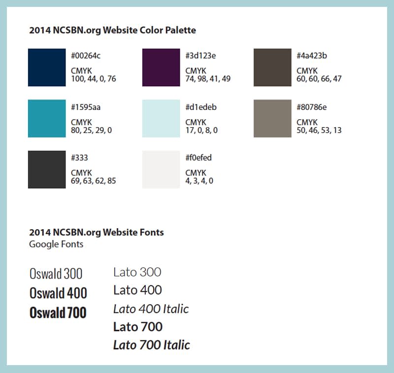
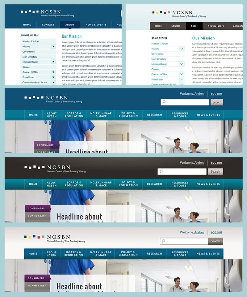
As a starting point, we were provided simple brand guidelines, which outlined colors and fonts for the brand. With this in hand, we began Phase 1 by designing the site header and footer. We regularly discussed our static design progress (constructed in Sketch) with the NCSBN team for quick feedback. Early discussions involved small, rougher design chunks that allowed us the opportunity to show variation without full-page work involved. We were able to react quickly to feedback, and after only a few rounds, we had a general look nailed down on which to build the rest of the site design direction.
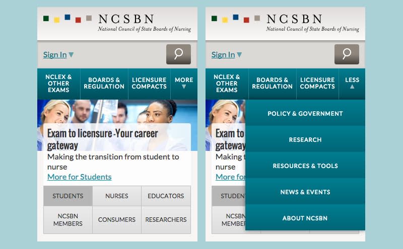
The main site navigation hierarchy (based on the previously completed information architecture work by NCSBN) included eight main navigation items. Every responsive navigation problem is unique, depending on the breadth, depth, and goals of a site architecture. However, NCSBN’s traffic data was fairly clear—of the eight main navigation items, two or three of them received the vast majority of traffic. This lends itself well to a “priority plus” responsive navigation approach, which we confirmed through discussion and sketching with NCSBN.

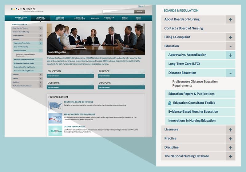
In addition, we designed a secondary navigation system for interior pages. This secondary navigation could drill down three or four levels deep, so great intentionality was devoted to the unique type styles and colors for each page level. We arrived at an accordion style solution for this secondary nav that we used consistently throughout viewport widths.
Priority Plus Navigation
Ben has been working on cataloging, organizing, and normalizing nomenclature for responsive navigation techniques for awhile. It’s his labor of love. In that effort, he has cataloged several major methods of navigation used for small screens. We (and many others in the industry) believe that some of the most popular methods, such as the “hamburger icon” or “menu button,” are likely less effective than previously assumed.
As mentioned previously, the NCSBN team brought with them a prioritized content hierarchy. Their content is especially suited for a navigation solution that emphasized a handful of major menu items. Given that we are suspect of “hide all menu items behind an ambiguous trigger” navigation solutions, we felt this was an excellent project to employ a “Priority Plus” navigation solution.
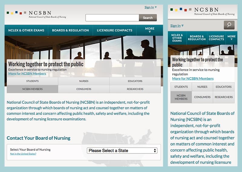
Essentially, this solution uses a familiar-looking navigation bar on all screen sizes. On large screen sizes, it contains all major menu items.
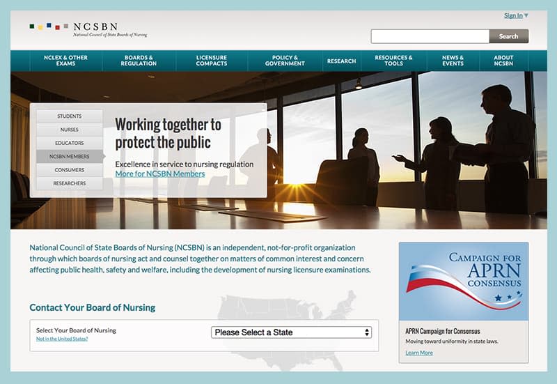
At smaller screen sizes, when all major menu items are no longer able to fit in the available screen real estate, only the prioritized menu items are visible. The remaining menu items are hidden behind a trigger. Thus the “Priority Plus” monicker—the priority items plus the other items that you have the opportunity to invite into view if needed.
There are a variety of ways to accomplish this technically, depending on your specific design needs. However, for a simple example, check out Brad Frost’s Priority Plus example CodePen, which comes straight from his growing catalog of RWD navigation patterns.
A System of Page Modules
At the beginning of the project, we had the NCSBN team designate the types of content modules they would need for the new site. Some of these modules existed on their current site and needed to be restyled to fit the new look. Other modules were new and needed to be created from scratch. This was the meat of our design effort on the project.
Since these modules were to be reused in combination with other modules per page content needs, we designed the modules individually as part of a design system (atomic elements) rather than as full-page comps. In the course of this exercise, we were able to provide NCSBN feedback for modules not actually needed, modules that could be combined, and modules that could share a common base to reduce complexity for the user and the development process.
It’s good to note that we did create some full-page comps to compliment the elemental design system. These full-page comps allowed us to work through layout decisions and ensure that the individual elements did combine well onto a page. For some unique pages—such as the home page—NCSBN understandably needed to see the full pages assembled to provide eventual design approval. However, this was the exception and not the rule. We provided only a handful of full-page comps, in contrast to the dozens of HTML/CSS/JS page templates that were eventually created without full comps.
Delivery & Integration
Project “delivery” began on day one. As mentioned previously, we began to engage with NCSBN on design and planning deliverables early and often. The same was true of the production code. Their development team was given access to the project’s GitHub repo near the very beginning, along with training on git, GitHub, and our development workflow.
When Phase 1 (header/footer/navigation) had progressed far enough that the markup was fairly stable, the NCSBN development team had the opportunity to take that code and begin attempts at integration. This allowed us early feedback on our code and allowed us to course-correct early when needed.
Once Phase 1 was complete, we were able to hand off a codeline that was already familiar to the NCSBN development team, support their integration of that portion of the project, and move forward to Phase 2. From that moment forward, our two development teams were regularly working in tandem, communicating regularly, and influencing one another’s decisions.
During Phase 2, we continued with a rolling delivery. As groups of modules were completed and approved, they were made available to the NCSBN development team for integration. Each wave of integrated modules gave us more perspective on the next.
This naturally flowed into Phase 3 when the NCSBN team began pulling together whole pages in their CMS. As we continued to support the integration, new module needs arose from time to time, and we were already involved and engaged in a way that allowed us to quickly respond with additional modules added to the overall system.
Collaboration Isn’t Just a Buzzword
We are extremely proud of the redesigned and rebuilt ncsbn.org. It is further proof that a large-scale site, heavy in content types and content volume, can be usable and beautiful on all devices. We are just as proud of the collaborative relationship built between our two teams. Our approach allowed us to stay within a comfortable budget and timeline for NCSBN.
A happy customer is the ultimate sign of a healthy project, and we’re glad to walk away from the project knowing that is the case. In fact, our relationship with NCSBN has continued into discussions of further testing and refinement of ncsbn.org and other properties. We look forward to serving them, and the nursing community, for a long time to come.

