
As of late, I’ve been seeing a lot of hype in the development community regarding web components. And for good reason, of course—they give many people hope that the world of massive JavaScript frameworks is not the final frontier. No more need to npx create-react-app every time you’d like to build a component-based application.
But how do you make the jump to web components? I’ll tell you what you need to get started using web components today with a little example project—a single element—and I’ll show you some of the cool features that this technology offers. By the end of this article, you’ll know the basics of building great web components.
What are Web Components?
‘Web components’ refers to a set of three specific technologies that can be used together to create custom components (à la every popular JavaScript frontend framework ever), which are then pieced together into a full application. These technologies are custom elements, HTML templates, and the shadow DOM (more on that later!).
Web components have been around in some form since about 2011. However, the template element wasn’t even available in major browsers until around 2013. The custom element registry, which we’ll go over in a minute, wasn’t available until about four years after that. So web components are still a fairly new technology and have only recently started being discussed because of new major features being added to the API.
What’s the Point?
When frameworks like React are so mature and widely used compared to web components, what is the point of using something else? On top of being hugely overshadowed by frameworks, native web components have historically been a pretty controversial topic. A lot of concerns have been raised regarding the technology—including those regarding accessibility, complexity of the web components ecosystem, and issues with progressive enhancement. However, web components can be well-architected, accessible, and simplistic, and I’ll show you how.
The technology is still very raw, and the W3C is working hard as usual to improve them. Web components also enable developers to create component-based applications using only native technologies that ship with the browser. I believe that web components potentially hold a large place in the future of web development. So I’d like to present a case for actually using web components in reality.
How do Web Components Work?
Let’s go through a little exercise to demonstrate the basics of web components. We’ll make a rudimentary clock component and learn how to set up a basic project to use web components. If you’d like to follow along, clone this starter repo and open it up in your editor. The completed project can also be found in the same repo under the completed branch.
Setting Up
When creating custom elements, you’re just extending the functionality of the good old HTMLElement. And—while not necessary—I highly recommend setting up a ‘base’ component that you can then use to extend to all your components. This will allow you to add more functionality to all components without writing extra methods on every component you make. It will look something like this:
class Component extends HTMLElement {
  addClass(className) {
    this.classList.add(className)
  }

  removeClass(className) {
    this.classList.remove(className)
  }

  toggleClass(className) {
    this.classList.toggle(className)
  }

  setId(id) {
    this.id = id
  }

  attr(name, val) {
    return val
           ? this.setAttribute(name, val)
           : this.getAttribute(name)
  }
}

export default Component
Also included in the demo project is a barebones index.html file that links to a main.mjs file and a blank clock component. Let’s take a look!
Base Component Usage
The only function of this clock component is to tell the time. So of course, only one element is needed. But where does the HTML go? Let’s first go over lifecycle methods and the shadow DOM.
Lifecycle Methods
If you’ve ever used class-based React, you’re probably familiar with the concept of a lifecycle—a method that fires when a component mounts, updates, dismounts, or whatever. That same concept exists in web components! Here are three key callbacks for basic use (and their React equivalent): connectedCallback (componentDidMount), attributeChangedCallback(componentDidUpdate), and disconnectedCallback (componentWillUnmount).
For the purposes of this clock, we’ll only use connectedCallback because the element needs to immediately render its content after being attached to the DOM. In this case, what’s rendered by the element will be determined by what’s in the shadow DOM.
The Shadow DOM
The shadow DOM is also a pretty important concept here. One of the main draws of web components is the concept of total encapsulation, meaning that a component’s markup and styling are completely independent of anything else in the dom. This can be achieved through the use of the shadow dom.
If you’ve ever taken a peek into a native media type element—such as video or audio—you’ve probably seen the shadow DOM. You may also have noticed that it’s often impossible or incredibly difficult to override the style of these elements. That’s the power of the shadow DOM. It keeps your custom elements from ‘leaking’ styles to any other element, and it also prevents the shadow DOM itself from being leaked into.
So let’s set up a little shadow DOM for our clock component. It would look something like the code below. Be mindful to call super before you use any parent class methods such as attachShadow because it’s the only way to access such methods.
class Clock extends Component {
    constructor() {
        super()

        this.attachShadow({ mode: 'open' })
     }
}
Then, attach some HTML to the shadow DOM inside of connectedCallback:
connectedCallback() {
    this.shadowRoot.innerHTML = `
      <time id="clock" part="time">${this.getTime()}</time>
    `
}
And here’s the method used above to get the current time, this.getTime:
getTime() {
  return new Date().toLocaleTimeString()
}
Now, let’s implement some functionality so that the clock can do what clocks typically do. Which is tick. We’ll use a setInterval that updates the text in the shadow DOM. Since this custom element is just extending a DOM element, you have access to getElementById, which we’ll use to set the textContent inside the time element. Your connectedCallback should now look like this:
connectedCallback() {
  this.shadowRoot.innerHTML = `
    <time id="clock" part="time">${this.getTime()}</time>
  `

  setInterval(() => {
    this.shadowRoot.getElementById('clock').textContent =
      this.getTime()
  }, 1000)
}
If you load index.html now, you’ll see a blank page since you haven’t actually yet registered and inserted your new custom element. Here’s one way to do that! This approach works very well if you need to bulk register custom elements. In main.mjs, you need to iterate through the elements and register them one by one. Of course, we only need one, but I’ll show you the method for the sake of example.
import Clock from './components/clock.mjs'

const elements = [Clock]

// the clock component is exported as an object
// containing a name and a custom element class
elements.forEach(({ name, element }) => {
  customElements.define(name, element)
})
Now it’s ready to use, and all you have to do is insert it somewhere in your HTML.
<body>
  <clock-element/>
</body>
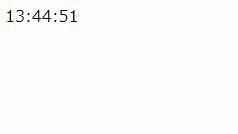
Then take a look at it in a browser. You should see this:
There’s one more thing in this project that hasn’t been explained. What is that part attribute for our clock component? That’s a way of giving CSS access to styling certain pieces of our components directly. This could be useful, for example, in cases where you want certain parts of your element to be directly targetable in CSS. I’ve added some basic CSS to the index.html file to demonstrate this:
<style media="screen">
  clock-element::part(time) {
    color: red;
  }
</style>
And here’s the result:

Again, note that the elements that are in the shadow DOM of our component are basically inaccessible to direct selection in CSS. What I mean is that if you wrote a style targeting just the time element within the clock component, whatever style you wrote would not apply. You’d have to either target the clock-element tag itself or use part, which I think is a little cleaner.
Web components are something you may be able to use today. No polyfills, no nothing. The technology is supported in the latest versions of all major browsers (barring Edge, and Safari has an incomplete but functional implementation). Web components hold a lot of potential to make interesting and useful things. So please, please give web components a try!
