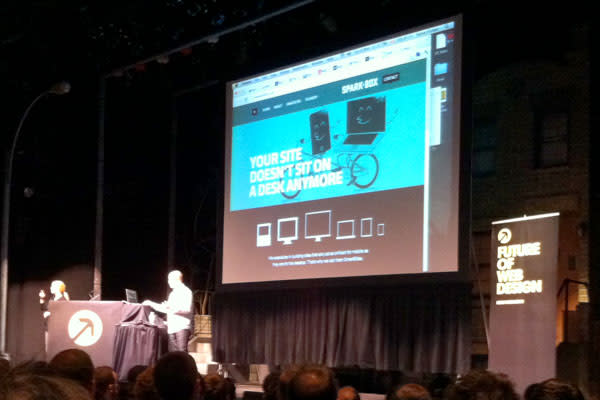
Rob Harr and I had the opportunity to attend the Future of Web Design conference in New York City this year. Overall, it was a good conference, but three presenters really stood out to us both. We thought it might be fun to give our opinions on each of these three. You can share your opinion in comments or on Twitter.
Before we jump into it, I wanted to share a really bad photo of one of the speakers (@hellofisher) using the Sparkbox website as an example of great responsive web design. We’re proud to help represent the Midwest!

And now, the rest of the story.
Tina Roth Eisenberg
Ben’s Thoughts
Tina is an amazing woman. She’s highly respected in the design world, and she has an amazing string of successes converting her personal projects into money-makers. She presented as if we were her children, giving us the wisdom she hoped to pass along.
It was very good stuff.
We’ve looked up to her and the Studiomates crew for a while now. It’s the kind of environment we try to create here–one of collaboration. My primary takeaway from her presentation was that you must find time to tackle your own projects. It keeps you sharp, and it gives you credibility. We are, after all, in the business of creating.
Rob’s Thoughts
Tina’s presentation was well timed. Ben and I have spent a lot of time talking about personal projects. It was a nice kick in the shorts to hear someone that we respected remind us of their importance. The two things about her presentation that stuck out to me most:
When she felt that she should change direction, Tina did so quickly.
When asked if any of her personal projects were not successful, Tina said no. She explained that success does not always have to equal financial gain. Her main point seemed to be, “If you do what you love as best as you can, then success will find you.”
Cameron Moll
Ben’s Thoughts
Cameron is the kind of guy you can’t help but like. His relaxed presentation style felt more like a conversation than a teaching. This is a bit ironic considering the topic was on the value of “pith.” Cameron is certainly qualified to share about how his passions have directed his path in business. His work is fantastic, and he has committed some serious time to his personal projects. Quite inspiring.
Also, he and his wife homeschool their kids. He even teaches them HTML on Friday afternoons. Tell me that isn’t cool.
Rob’s Thoughts
My main takeaway from Cameron is that we should be generating original thoughts and ideas. We will grow more professionally if we challenge our ideas and ways of thinking.
Joshua Davis
Ben’s Thoughts
I had mixed thoughts on Joshua Davis’s presentation. He actually had a significant impact on me early in my career on the web. As a developer, I jumped into ActionScript animation quickly, and Josh owned that space at the time. His work is undeniably fantastic.
So, why was a Flash Animation genius closing the Future of Web Design conference just moments before Adobe announced the end of Flash for mobile? I think the message that Josh brought to FOWD was one of persistence. As he walked through a bit of his generative art process, it was very clear that the key ingredient was iteration. So many potentially brilliant artworks are discarded for every amazing final print that Josh creates. Sometimes I think we lose site of this in the business world. Andy said it best, “The Nth time is the charm.”
Rob’s Thoughts
If we could take Joshua Davis’s energy and passion and bottle it up, it would be some powerful stuff. To be completely honest, I didn’t know who he was before this conference. In the days since, I have become amazed at the work he does.
Fact: I love Jeopardy. I was completely enthralled by the Watson project earlier this year, so it was neat to hear the visual creator talk about the project. I think one reason for Joshua’s ability to generate such unique art is his obsession with discovering and trying new things. This is a lesson that we can all take away and use everyday.
It is not often that you feel like you get a true picture of who someone really is after listening to them for just forty minutes, but I believe Joshua showed us his true self. It was very authentic and raw. The rough edges of Joshua made an amazing contrast to his art.
Conclusion
You should always be able to walk away from a conference saying three things:
I met new people.
I learned something new.
I feel inspired to do better work.
With those criteria, it’s worth the trip. The Future of Web Design conference this year passed the test.
