Does your Figma file still match what shipped? Explore how design drift happens, why it’s not a failure, and how to reconcile it before it compounds.
The designer sips her coffee in the Gatherwell app offices, where they help people connect in real life; the app calls them “Gatherings”. Her job today is to begin a design change to the flow for making Gatherings. She has found the Figma files from the last revision nine months ago and pulls in her screenshots of the current app flow. As she compares them, some differences immediately draw her attention.
The biggest difference is a set of radio buttons that wasn’t there before: hosts can now choose between recurring, one-time, and drop-in Gatherings, and Figma only shows one path. A last-minute change during review went live without design review. It looks messy.
These kinds of failures are quiet as nothing is broken, no alarms sound. It’s what happens in any system complex enough to have moving parts. The team calls the Figma file the “source of truth,” but reality tells another story.
“Design Drift” Is the Gap Between What’s in Figma and What Is Shipped.
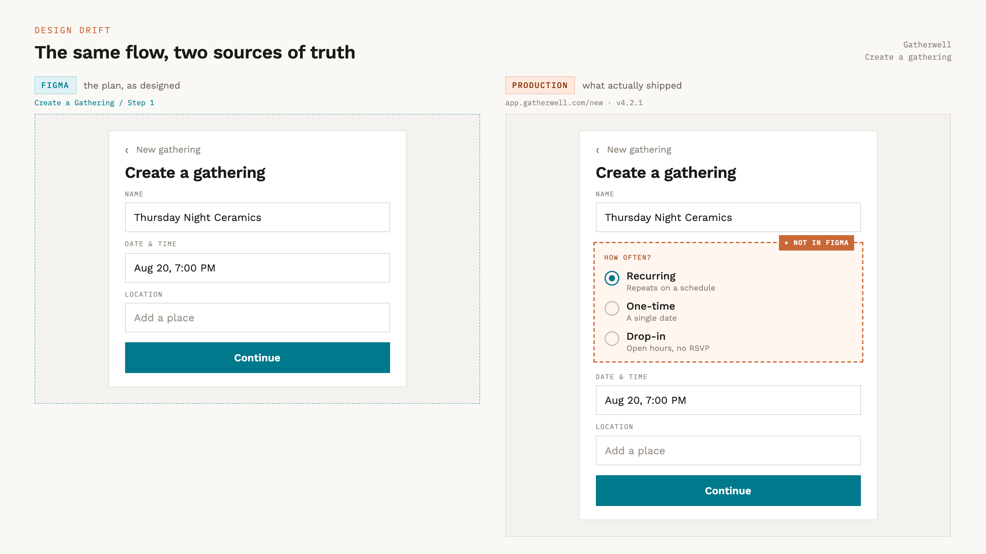
Reality shows us that the product design and the actual product have drifted apart.
It’s not a bug or negligence, it’s entropy. It happens to every system that ships faster than it documents.
Together we’re going to close that gap and the first step is admitting that Figma isn’t the source of truth you think it is.
Canonical Is Not the Same as Correct.
In a fast-moving product, the shipped code is the canonical record of what your product is. Users experience the code. The pixels they touch are, by definition, the design.
Code is full of last-minute marketing requests, business decisions, copy changes pushed Friday afternoons, and options added to hit deadlines. Devs are the last leg of the relay race, and they hand their baton—their work—directly to the user.
We need to acknowledge that Figma and the code will never be in sync. They pass each other like ships in the night. It is better to embrace and use each for its own power.
Code is the truth about now. What the product currently is, whether you like it or not.
Figma is the truth about next. You plan, explore, and decide what the product should become.
As Figma silently drifts away from “now”, it loses its authority over “next”. It is hard to plan the next change from a map of a city that has already been rebuilt. We have to reconcile the difference.
This isn’t Figma surrendering to code. It’s about catching up to reality so it can lead again.
Not All Design Drift Is the Same.
There are two major ways that design and code can shift apart.
Screen drift — a rendered screen has diverged.
Component drift — the underlying component has changed.
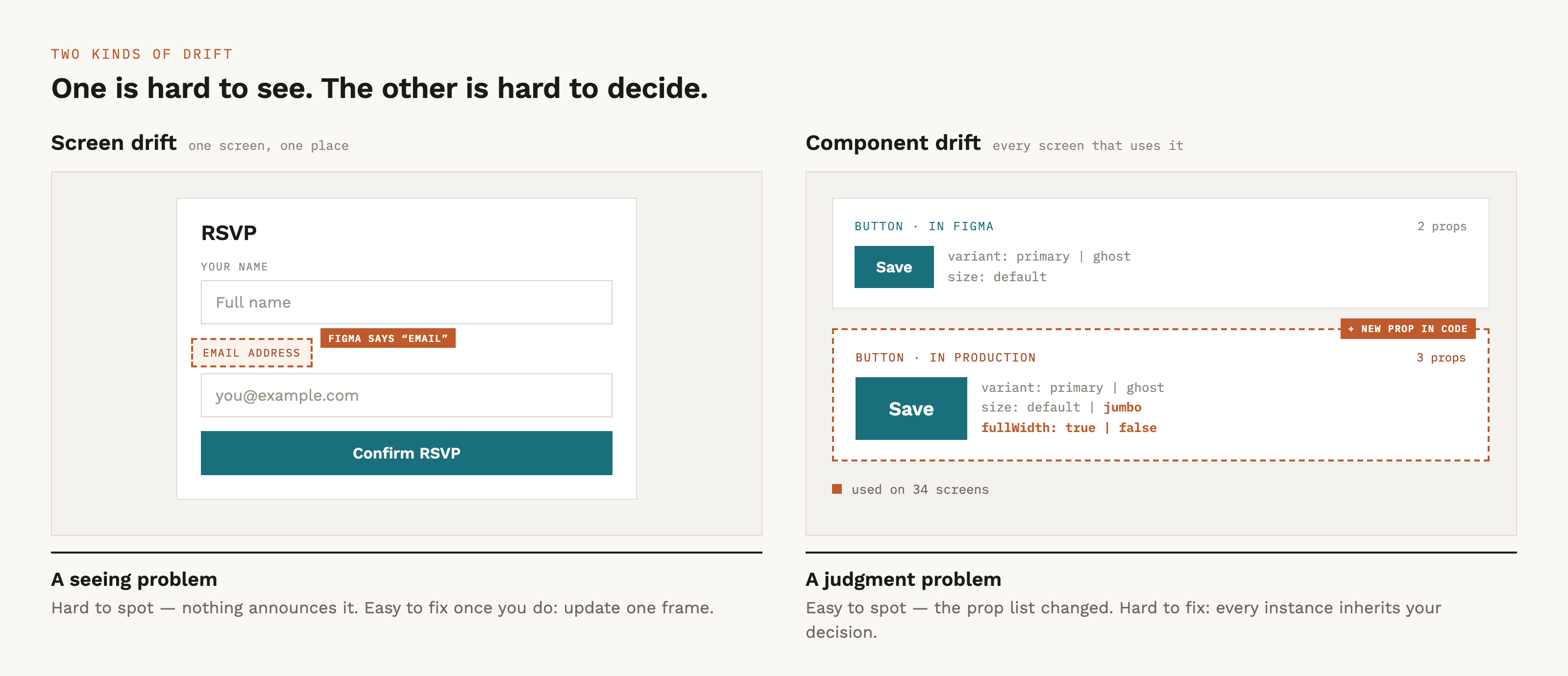
Screen drift is when the content, styling, and layout are made different. It is the design system in use. Forms get more fields, copy edits are made, and extra steps may even be added to user flows. These changes are not inherently bad; they are just changes.
Some of these changes to screens can be subtle. Finding them can be hard, but the fix is easy because you’re not designing anything new. The components already exist in your library; you’re just placing them into the file that fell behind.
Component drift is when the underlying component has changed or is used in an unintended way. Someone created a new variant at the last minute without a designer; props were changed that impact other areas of the product.
Component drift is usually easy to spot when it changes what’s rendered by default — but state-based props (hover, focus, error) can hide in plain sight, since Figma rarely shows every state. A component may only need revisions, or it might need a full rebuild with new variants, new props, sometimes a new name, because the old shape can’t absorb the change.
The key difference between them is that screen drift is a seeing problem, which is easy to detect with AI, while component drift is a judgment problem, which is perfect for your skill and judgment.
Making Exhaustive Visual Diffing Practical with AI
One screen, one difference, easy to spot, right? For a computer, yes. For a human, not so much. As a designer, your eye is trained to notice subtle differences, to feel where things are different, where they may have gone wrong. But even the most keen-eyed designer takes time to notice them across dozens of screens.
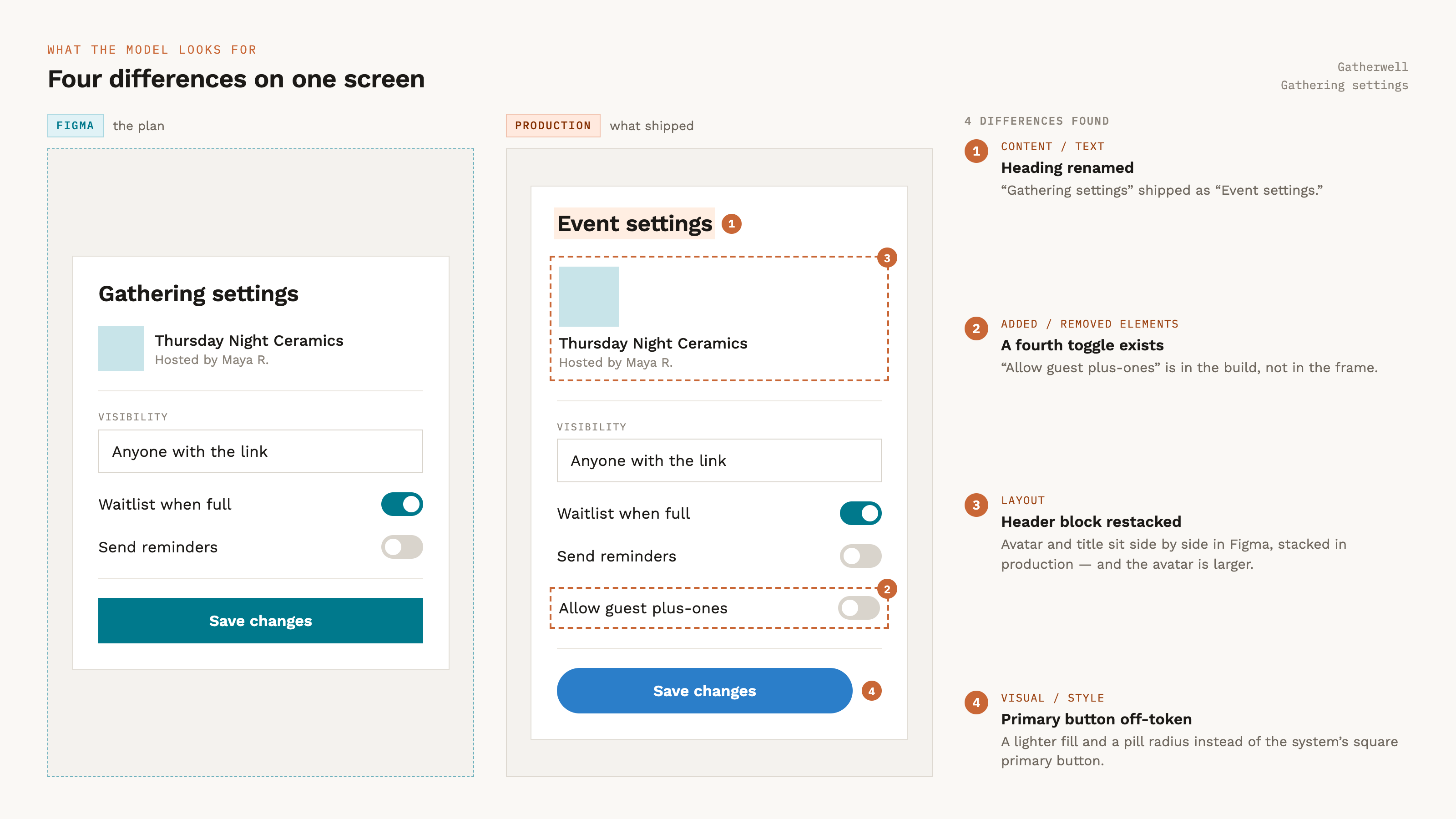
This is the perfect place to take advantage of AI. The machines can do this work faster than you can, and review more pages and flows while they’re at it. Use computers for what they are good for: computing!
How to Set Up AI to Find the Differences
Capture both versions of a page or series of pages. You’ll need a vision-capable model to run the evaluation. Then ask the model to list every difference: additions, removals, copy changes, layout, styling, etc.
Check out “compare-design-to-product” as an example of what a skill like this can look like.
The Skill in Action
Gatherwell has a lot of security, and the only AI that our designer has access to is Figma Agents. Luckily, her team has a shared skill called “compare-design-to-product”. This skill focuses on four major areas:
Content/text — different copy, labels, headings, button text, numbers, dates, placeholder text, or text that was added or removed.
Added/removed elements — whole components, sections, buttons, fields, icons, or UI blocks present in one but missing from the other.
Major layout changes — reordered sections, restructured arrangement, elements moved to a clearly different position, changed columns/rows, or a different overall composition.
Visual/style changes — meaningfully different color, typography (family, weight, size), component sizing, imagery, or states, where the change is clearly intentional rather than a rounding difference.
She selects a frame that has the Figma page and the screenshot of the live product page and runs the skill. Shortly, she has a working list of updates to review.
A detected difference does not automatically mean “update Figma”. This is where canonical does not equal correct. This review is neutral; the changes that have to be made are a human call.
If the code is right → update Figma.
If the code is wrong → file a fix.
This judgment is what AI cannot do and shouldn’t do. The tools inform you, and you decide the truth.
“Breaking” Is About Who Gets Affected, Not How Big the Change Looks
Our Gatherwell designer examines the pricing in the flow. The “TicketTier” component has always assumed a single price. Marketing has shipped an Early Bird price, meaning this component now has a regular price, a promotional price, and an expiration date.
When components are used in unexpected ways, we have to figure out what the change means for the design system. What will the impact be on Figma’s design system?
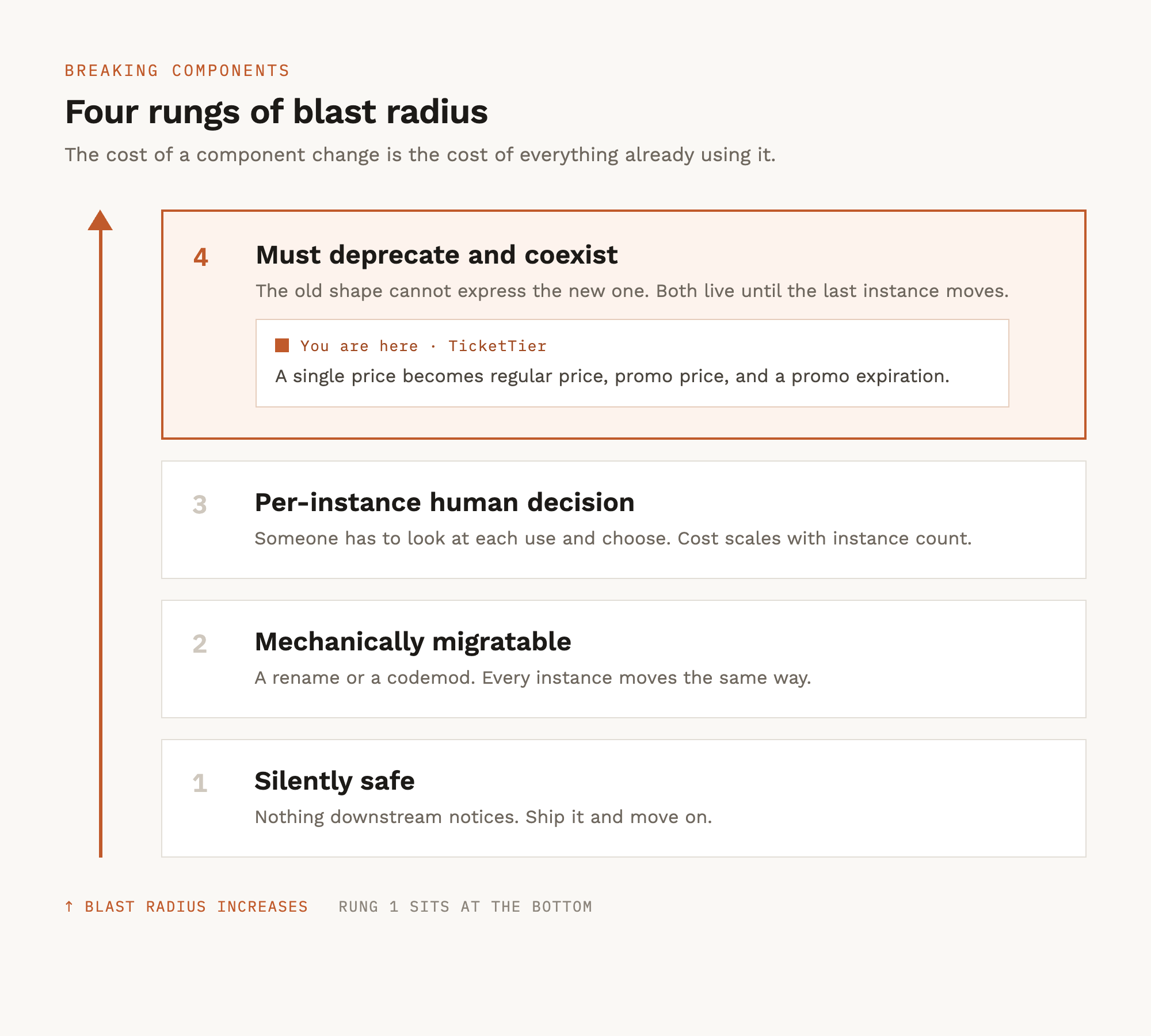
Silently safe—a styling tweak, a new optional prop with a sensible default. Every consumer of the component absorbs it for free. Just update the component in Figma and move on.
Mechanically migratable—a rename or restructure that a find-and-replace can handle. Annoying but automatable.
Per-instance human decision—each use of the component needs a person to decide something—no safe automatic upgrade.
Must deprecate and coexist — the change is incompatible enough that old and new components must live side by side while consumers migrate.
As much as possible, you’ll want to absorb the changes into the existing component, even when each change means a person needs to review it. Once it is obvious that you can’t, mark the current component for deprecation and make a new component.
Our Gatherwell designer makes her case. Every instance of TicketTier would need a redesign to show two prices instead of one. There’s no default that fits a regular price, a promotional price, and a countdown to when it expires. The team decides to deprecate TicketTier and make a new component for future use. They rename “TicketTier” to “TicketTier (deprecated)” and make a fresh TicketTier component.
Once you’ve made the deprecation call, you enter a migration window where the old and new coexist, and every instance has to move over time. Keeping those two parallel components aligned through that window is a real problem, and a topic for another day.
Making Review a Habit
Reconciliation fails when it’s heroic and occasional. It works when it’s boring and scheduled.
When beginning new work, the first thing all Gatherwell designers do is compare the flow in the file against the live product and make needed adjustments. This policy keeps everything in alignment and is part of the workflow.
When possible, have triggers in your process that queue up design drift reviews. They can be demos, as part of a launch checklist, or as part of a monthly “clean up day”.
The more reviews are integrated into your process, the easier it will be to keep Figma and code in alignment.
Our Gatherwell designer closes her comparison tab. Her file finally matches what people are using and for the first time in nine months, she can trust it enough to plan from it. She opens a fresh task list.
Reconciliation doesn’t mean Figma surrendering to code. It means Figma earning back its authority over what’s next. Drift is inevitable. Staying drifted is a choice.