When Boom Crate Studios, our Dayton office neighbors, approached us with website needs, we were eager to help. We’re fans of the work they’ve done for us, including helping us create videos for our Girls Can Code curriculum, and were excited to have the opportunity to help them achieve their goals.
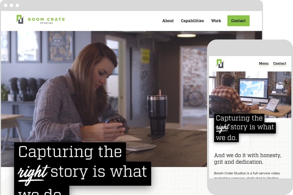
Boom Crate came to us with an outdated website, which is a familiar place for many companies. Their brand had matured over the years and they wanted it to better reflect who they are now and where they’re headed. The goal was for the new site to communicate their work as a video production company and their unique approach to video strategy and production. That meant it should embrace their personality, validate their abilities, include a clear call to action, and provide a good user experience for both clients and Boom Crate team members handling content entry.
Setting up the Right CMS
Boom Crate’s client pipeline is largely based on referrals. Potential clients visit the site for validation, looking at both the type of video work Boom Crate does and the kinds of clients they serve. This meant that case studies would play an important role in the site’s refresh and that choosing a CMS that would best support case studies was a high priority.
Craft CMS, created by Pixel & Tonic, came onto the scene in 2013 and had been receiving high praise from the web community. And for good reason. It’s been heralded for its flexibility and usability, which matter greatly when selecting a CMS for an organization. While we regularly re-evaluate the CMS landscape and consider all potential options, Craft was the best fit for Boom Crate for the following reasons:
Fit for Flexibility
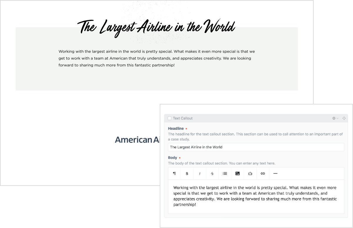
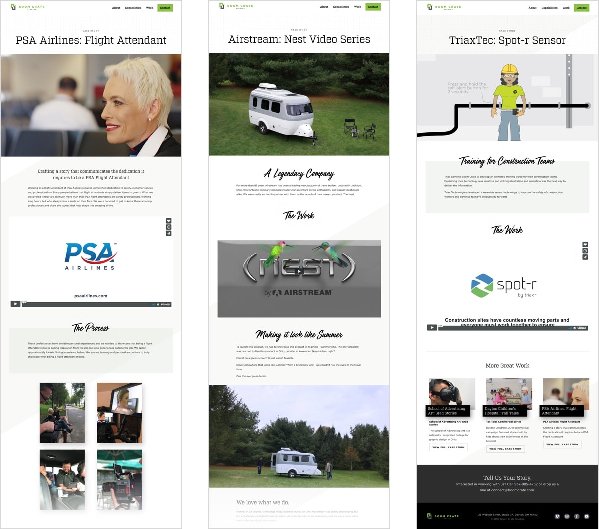
Flexibility was an important consideration when choosing a CMS for Boom Crate. Because Boom Crate’s capabilities are varied, their work is varied, and they needed different ways to showcase that varied work, whether it be videos, gifs, or text-based stories and designs. Craft’s foundation, which is built on modules, allows for an a-la-carte experience without having to sacrifice design, which comes in handy when creating case study pages.

User-Friendly Content Management
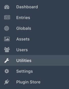
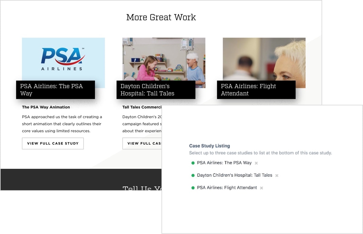
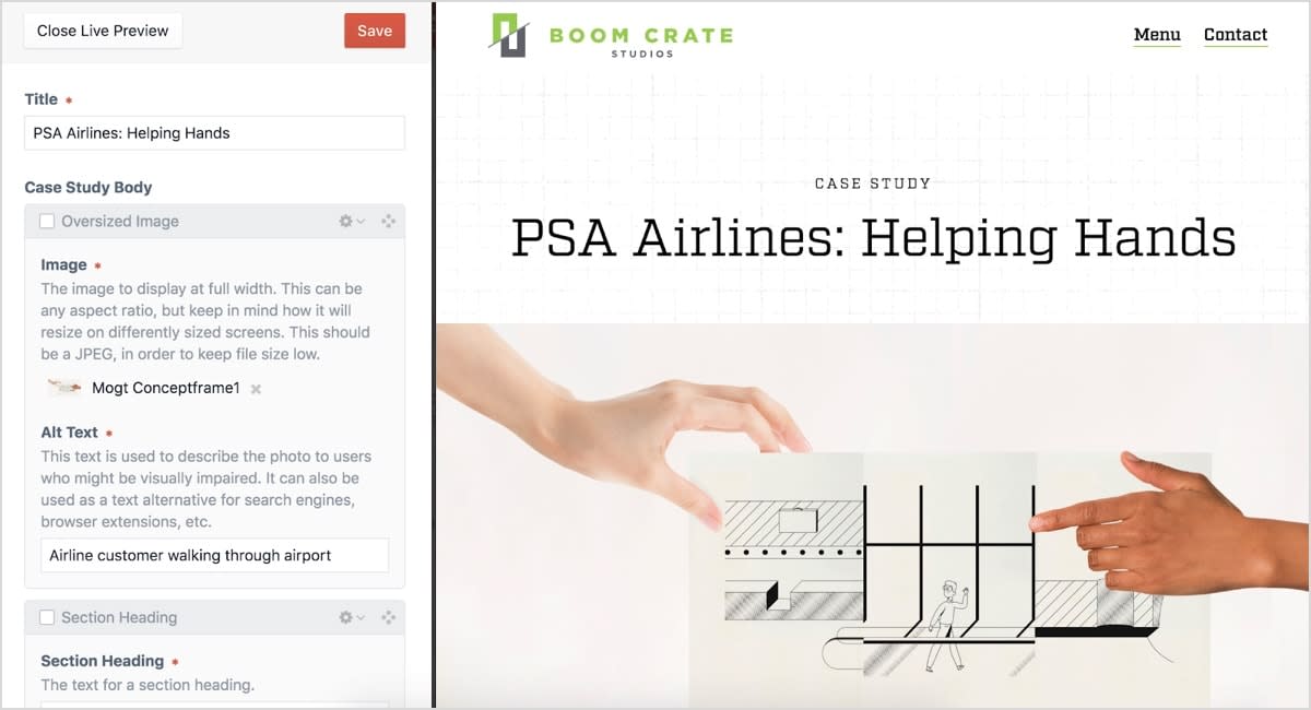
Ease-of-use was another high priority when selecting the appropriate CMS for Boom Crate. And Craft is just that: extremely user-friendly. Managing content starts at the control panel—or dashboard—which has a simple and intuitive design. Because relationships can be built using matrices, users can edit multiple types of content in one section. And the module-like framework makes it easy to build pages in a way that makes sense, giving Boom Crate the opportunity to create unique and dynamic case studies as they add new work. Another user-friendly feature of Craft is the live preview mode, which creates a split-screen viewing experience so the editor can see changes in real-time. Even better, editors can share preview screen URLs before publishing edits, which is a great value-add for Boom Crate’s editorial workflow, especially when getting client approval for case studies.
A Framework for Growth
We’re not exclusively a Craft shop at Sparkbox but we are fans. As with every project, we research what tools and approaches will be the best fit considering our client’s needs. For Boom Crate, we wanted to build a site that supports a growing and evolving case study repertoire with beautiful designs and a flexible, intuitive CMS.
With Craft, Boom Crate can update their site easily and keep it fresh and relevant for a long time to come.
