When I joined Sparkbox, I wasn’t thrilled when it was recommended that I create my wireframes in Keynote. After using Balsamiq for a few years, I didn’t see how anything could compare. After becoming more comfortable with Keynote, though, I’ve seen the light! Clients have reacted so positively to wireframes done in Keynote that I would never go back to Balsamiq. With Balasmiq, I experienced clients getting upset with Comic Sans and not understanding that was not the font we would be using on their site. The overall ability to create a cleaner wireframe currently makes Keynote my top choice.
Since Keynote’s intended use is making slideshow presentations and not wireframes, I wanted to point out some ways I make it work for me.
Time Savers
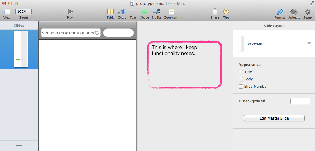
I use two different themes, one for small screens and another for larger (desktop) size. I add a 250px margin to the right of the wireframe; this space is for notes and functionality callouts.
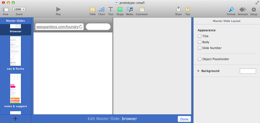
On a project-to-project basis, I use master slides for the header/navigation and elements that I use on more than one screen. Changing the navigation order in one place instead of 19 slides keeps my wireframe consistent and me sane.
Apple says 44x44px is the smallest acceptable touch target in the HIG (human interface guidelines) . Using real-world button sizes and clickable areas stops me from trying to pack too much in. For a small screen wireframe, I use a 44x44px square as a touch size guide, placing it next to elements. As I resize, they snap to the dimensions of my square. Placing this square by a button to adjust the height lets me use the usually irritating Snap-to-Grid to my advantage.

Hotkeys
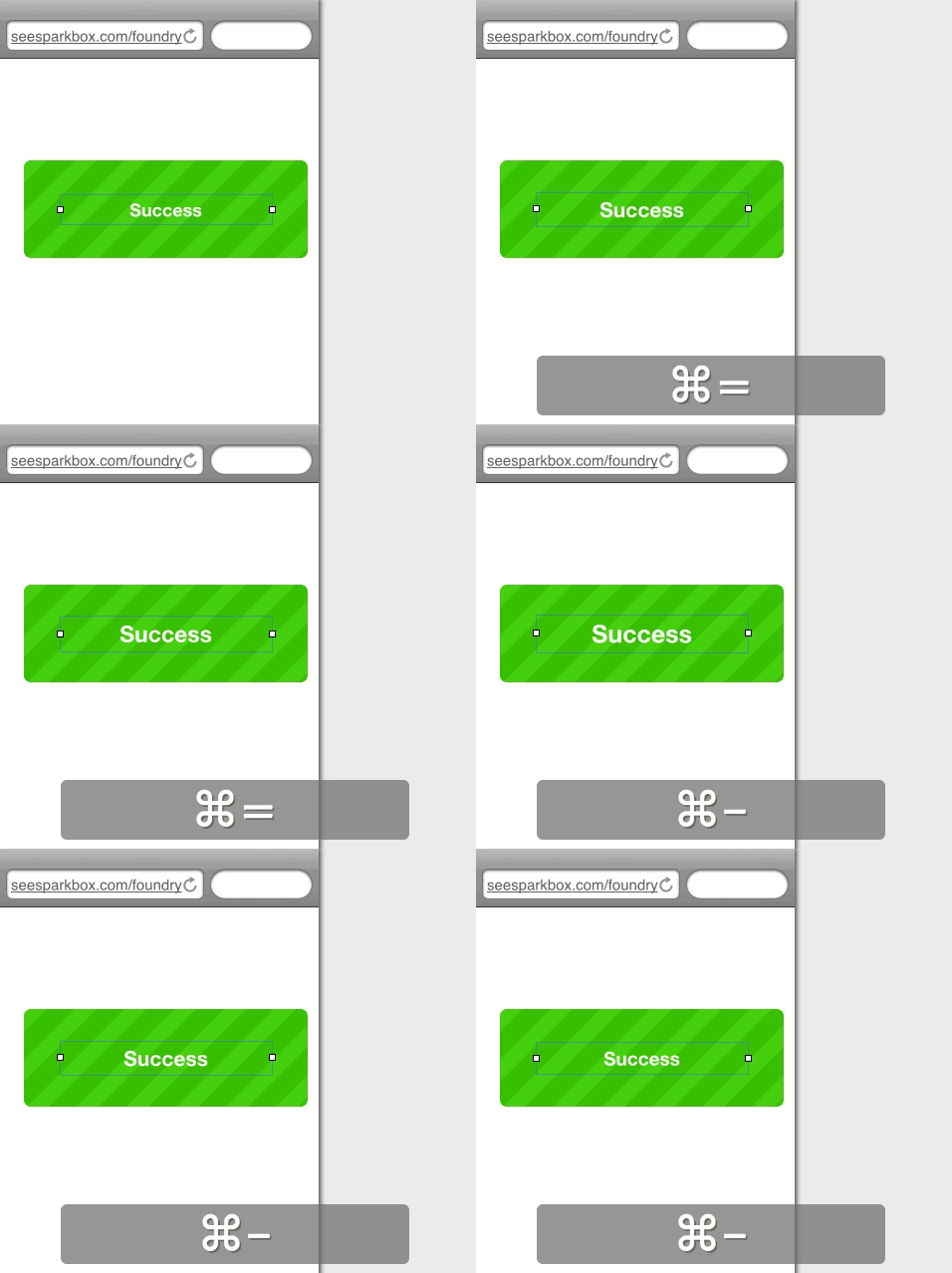
Resizing Text
Command = (increase)
Command - (decrease)
Scaling from Object’s Center Point
Option-Shift

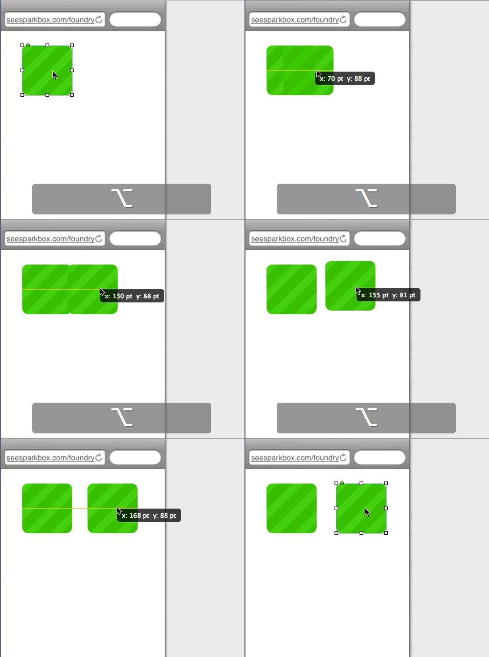
Duplicate Objects - No More Copy and Paste
Option
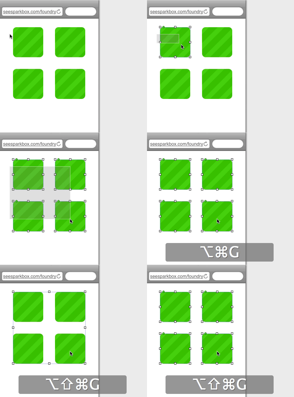
Grouping Objects
Option-Command-G (group)
Option-Shift-Command-G (ungroup)
