
Have you been curious about lazy loading and what it’s used for? Come with me as we explore a recent lazy loading bug we found and fixed while working on a multi-brand global retailer’s ecommerce site, ultimately improving their site’s speed and performance.
What is Lazy Loading?
In web development, lazy loading is a method to delay the loading of resources until they’re needed. For this ecommerce client, their site needed to load a large number of product images—often hundreds per page. Loading all of the images at once would cause the page to load slowly which can be frustrating for users—especially those with a less-than-optimal connection. Therefore, instead of loading all of the images at once, lazy loading allows you to tell the browser to only load the images that appear above the fold (the visible area of the browser) and wait to load additional images until they come into view when the user scrolls. This allows the page to load faster and potentially use less data by not loading unnecessary images.
The Bug
When we were doing a major redesign for one of our client’s brands, the lazy loading functionality on the product grid that had been used for all of the client’s other brands broke. Instead of loading product images a few at a time as we scrolled down the page, all the images were loading all at once. After investigating further, we discovered that the unlikely culprit had been in the design itself—some CSS that had been removed in the redesign was causing the problem. This was because the browser needed to detect when the product grid’s elements were in the viewport in order to lazy load the element.
The ability to lazy load depends on the browser detecting when the product grid’s elements are in the viewport. If the product grid element is in the viewport, then the image inside is loaded. In this case, the updated styling made it so that more grid elements than necessary were detected in the viewport. This caused an excess number of images to load.
Recreating the Buggy Lazy Loading Grid
There are lots of approaches to implementing lazy loading (see some others here). However, since our client’s project used React, and React Intersection Observer for lazy loading, this example will use a similar method to show the broken grid.
First, in App.js, images are fetched in the useEffect hook. In this example, we’re using a dog.ceo endpoint to fetch an array of corgi pictures, which are saved to an images state variable, then sent to a Grid component as a prop.
import { useEffect, useState } from "react";
import Grid from "./Grid";
import "./styles.css";

export default function App() {
  const [images, setImages] = useState([]);

  useEffect(() => {
    const getDoggies = async () => {
      const response = await fetch("https://dog.ceo/api/breed/corgi/images");
      if (!response.ok) {
        throw new Error("Fetch error");
      }
      const data = await response.json();
      setImages(data.message);
    };
    getDoggies();
  }, [setImages]);

  return (
    <main className="app">
      <h1>Hello Dog Pictures</h1>
      <Grid items={images} />
    </main>
  );
}
Next, in Grid.js, we’ll use map to iterate over the images array to create a GridItem for each image url we’ve received:
import GridItem from "./GridItem";

export default function Grid({ items }) {
  return (
    <div className="grid">
      {items.map((item) => (
        <GridItem key={item} url={item} />
      ))}</div>
  );
}
Finally, the GridItem component is where we will put our intersection observer logic. The useInView hook is imported and used here (following the documentation).
For our simple example, we will need a ref and the inView options--ref will allow us to choose a DOM element to monitor, and inView will allow us to access the inView status (that is, whether the DOM element is within the viewport). We’ll put the ref on the div element that is returned here, and render the image card (a div that wraps an img, see note below) if our GridItem is within the viewport.
Note: we’re doing an unnecessary amount of div-wrapping for this simple example. However, for many ecommerce sites, images in a product grid are often wrapped with other elements, such as anchor tags to link to the product page, as well as other wrapping elements that group the image with other information related to it, such as product information, color swatches, icons, images, or badges that might appear on the image itself.
import { useInView } from "react-intersection-observer";

export default function GridItem({ url }) {
  const { ref, inView } = useInView({
    threshold: 0,
    triggerOnce: true
  });

  const imgCard = (
    <div className="image-container">
      <img className="dog-image" src={url} alt="" />
    </div>
  );

  return (
    <div className="grid-item" ref={ref}>
      {inView ? imgCard : null}</div>
  );
}
Finally, here’s the CSS we used to implement a simple grid:
.grid {
  padding: 0.5em;
  display: flex;
  flex-wrap: wrap;
  justify-content: center;
}

.grid-item {
  width: 30vw;
  margin: 0.5rem;
}

.image-container {
  width: 100%;
  height: 100%;
}

.dog-image {
  width: 100%;
  height: 100%;
  object-fit: cover;
}
With this, our example appears to be working to create a grid of dog images. Here’s the end result:
If you load the page with the Network tab open and filter Network requests to only show images you should see something like this:
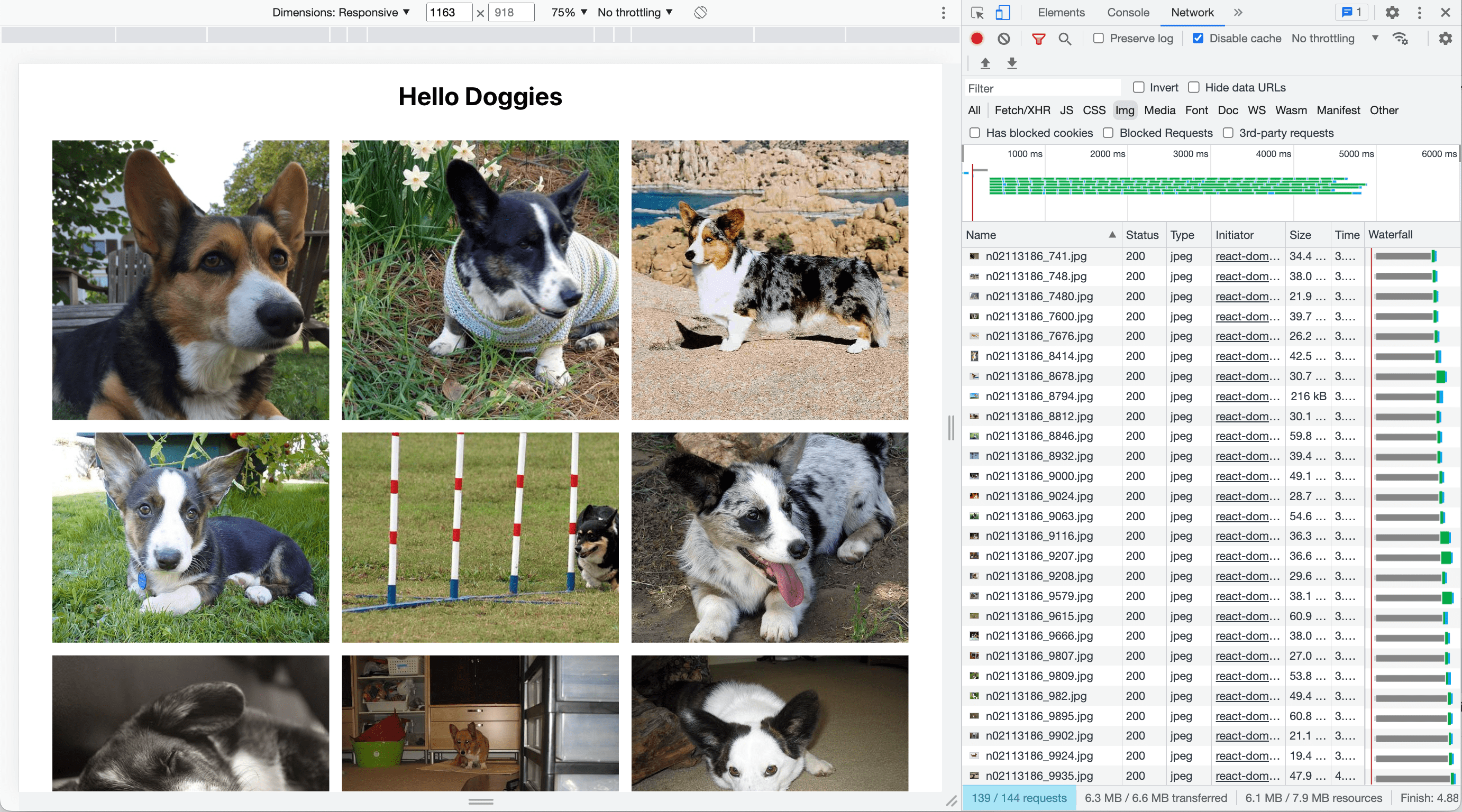
With all 139 of the corgi images loading, lazy loading does not appear to be working. As demonstrated in the image above, we can now see that all 139 of the corgi images have loaded. This is the same problem we experienced with our client. Luckily, it had an easy fix.
The lazy loading breaks in the example above because we need a specified height on .grid-item, the element that we are using react-intersection-observer to observe (the element with the ref on it). If we don’t have one, before images load, the intersection observer thinks that each of the .grid-item elements are only as tall as the margins (a total of 1rem when adding top and bottom). With 3 grid items in each row as in the image below, 139 images divided by 3 in each row would give us 47 rows, and 47 rows that are 1rem tall each (16px) take up 752px, which will fit within our 918px tall browser window nicely, causing all 139 images to load.
All that’s needed to fix lazy loading here is to add a height to the element that the intersection observer is watching:
.grid-item {
 height: 30vw;
 width: 30vw;
 margin: 0.5rem;
}
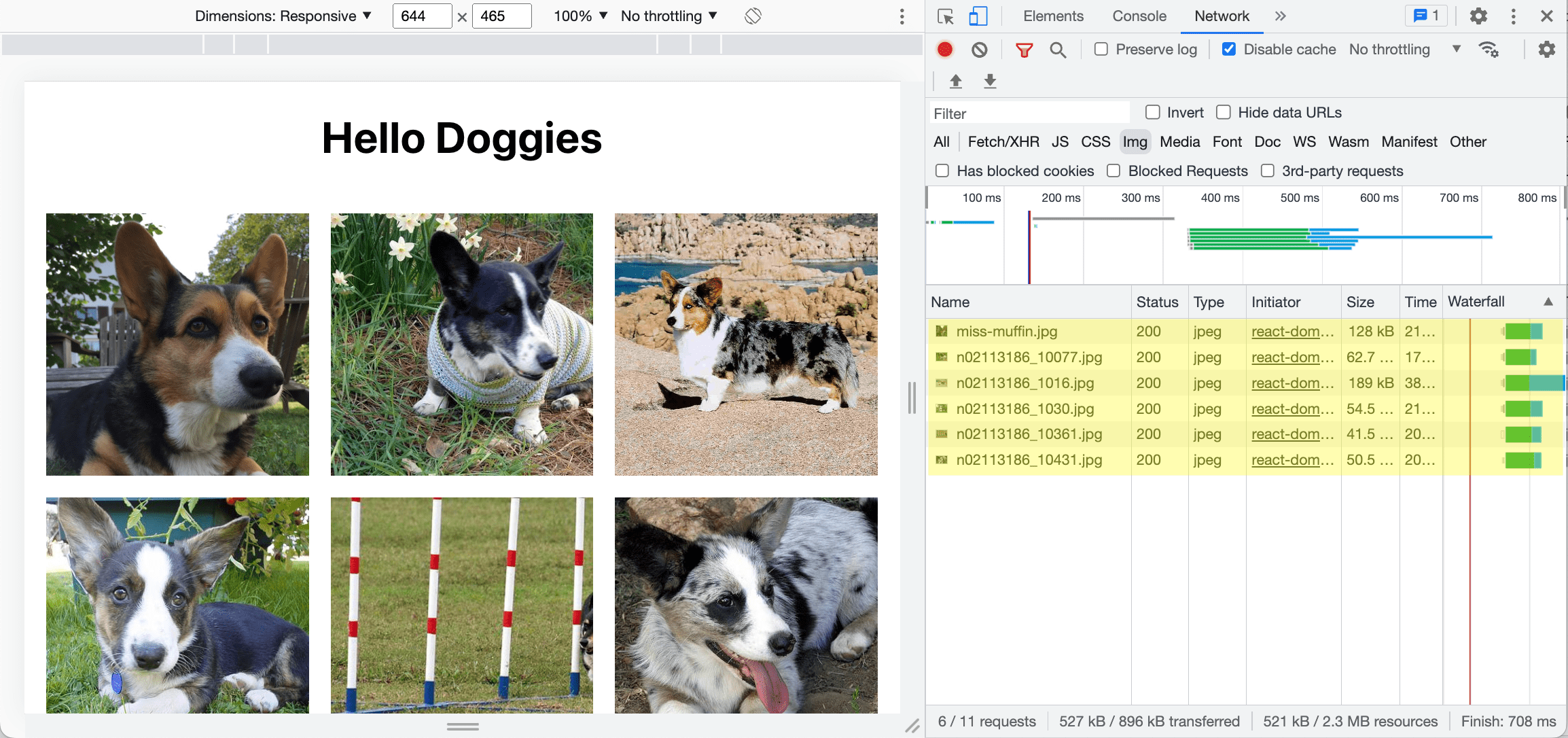
When we reload the page with this minor CSS change, the Network tab shows only the first 2 rows of images that are visible in the browser window, highlighted in yellow:
Then if we scroll down just a little bit to where the next row is visible, we can see 3 more images loading in the Network tab. These purple highlighted images below the yellow ones we’ve already seen are the images that correspond to the next row:
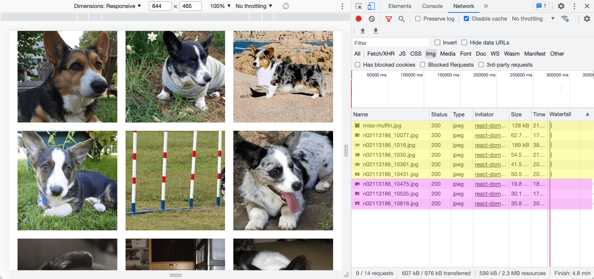
If we continue scrolling down row by row, we can see images load in groups of 3 until we reach the bottom of the page. This works great!
Performance implications
We can run Lighthouse performance tests on our dog picture app with lazy loading working and with it broken to see the difference that lazy loading makes on these scores.
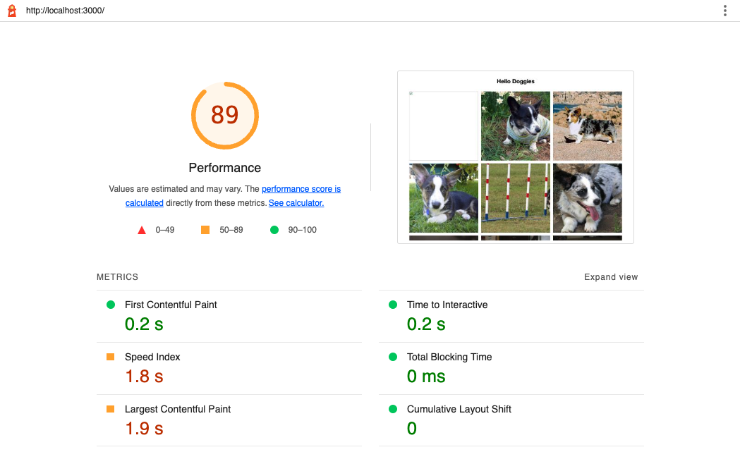
First, Lighthouse scores with Lazy Loading working:
And Lighthouse scores with Lazy Loading broken:
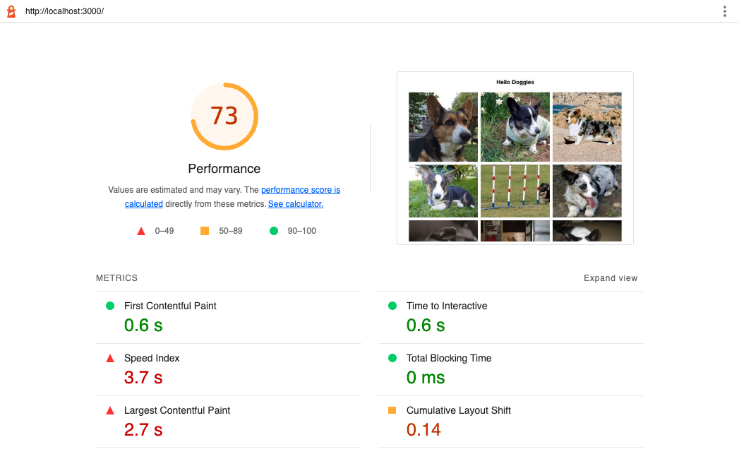
Note that both sites do need improvement, and optimizing images as well as adding height and width attributes would likely make a huge difference here. Aside from that, the overall performance is noticeably improved when lazy loading works (scoring 89 on performance overall) compared to when it doesn’t (scoring 73 on performance overall). The most notable contributor to this difference in scores is Cumulative Layout Shift (CLS) jumping from 0 to 0.14.
Considering that a score of 0 is considered good and a score of 0.25 is considered poor, this is a pretty drastic jump for CLS.
Some other notes: Performance scores were run locally on the same code rather than from the code sandbox, and it is typical to have some variability in Lighthouse scores. The scores shown here are representative of the median scores we found while testing.
Conclusion
Here, we covered what lazy loading is, one way to implement it, and a way around a pitfall that we encountered with our ecommerce client. We saw that one line of CSS could determine whether or not lazy loading worked in our dog picture app, which is a great reminder not to underestimate the power of CSS. We also saw how much lazy loading could improve speed and performance, showing the importance of such a tool in building performant websites. In the end, one small line of CSS determined whether or not lazy loading worked in our dog picture app, which had a significant impact on speed and performance.
