You have a large, content-rich website with subsites and hundreds or thousands of pages. The desktop view of the site has room for visible navigation and wayfinding aids, but the mobile site doesn’t. In fact, the mobile navigation was more of an afterthought than you’d care to admit.
Sound familiar? If so, you’re not alone. Many organizations with large, content-rich websites struggle with mobile navigation, and we wanted to identify research-backed best practices that would help overcome some of these common design challenges.
To do this, the Sparkbox experience design team conducted a usability evaluation of 30 university and college websites. We chose the higher education sector because it is notorious for having countless pages of content, lots of web properties, and a myriad of competing audiences and internal stakeholders to serve. After we identified the most effective of these websites during our evaluation, we usability tested the sites with college-bound students to see what else we could learn. (You can read more about our findings for higher education websites here.) From this, we developed these guiding principles for mobile navigation for large websites.
- Menus: Distinguish primary and secondary navigation with visual hierarchy.
- Submenus: Enable users to open and close menu folders to preview second-level pages and third-level pages in more than one section at a time. Build a robust main menu rather than creating an additional section menu.
- You Are Here Indicators: Indicate the page the user is on when they open the main menu. Include breadcrumbs for increased clarity.
- Navigating Between Websites: Use a global header or consistent header conventions across all subdomains and microsites to link back to the main site’s homepage. If the main navigation links to other websites that don’t follow the header convention, make sure the link is clearly indicated as an external link.
- Site Search: Optimize site search with alternate keywords that match the vernacular of your audience. Ensure that every page on your website has enough context to be the first page or the only page someone visits through search.
To verify that our guiding principles could be applied to a variety of robust websites, we evaluated 10 of the most-visited, content-rich websites from Alexa’s list of top 500 U.S. websites. These websites were from sectors like government, health care, nonprofit, financial services, and business solutions. We looked for the same trouble-spots identified by our usability testers, and we also looked for mobile navigation improvements or innovations that could benefit users. Read our methodology to find out more.
Menus
Use visual hierarchy to distinguish primary and secondary navigation in mobile menus.
Nearly all of the websites we evaluated used the menu icon (aka the “hamburger”) to open and close a navigation panel on mobile. As web professionals, we’re very familiar with this interface, and it turned out that our 16- to 19-year-old usability testers were too. We still prefer including the “Menu” label in our designs because more clarity can’t hurt when you are serving an audience with varying abilities and many cultures, but clearly the hamburger menu is well-known.
Takeaway
While the hamburger menu can stand on its own, we still prefer including a Menu label for insurance.
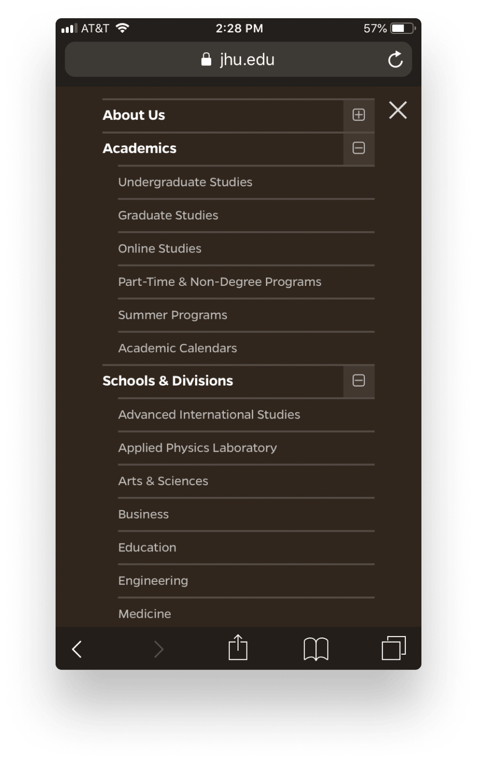
Usability testers found it easier to navigate the large sites when the menus were organized by types. For example, it was easier when menus were organized into primary and secondary navigation or when they were organized into different audiences or uses.
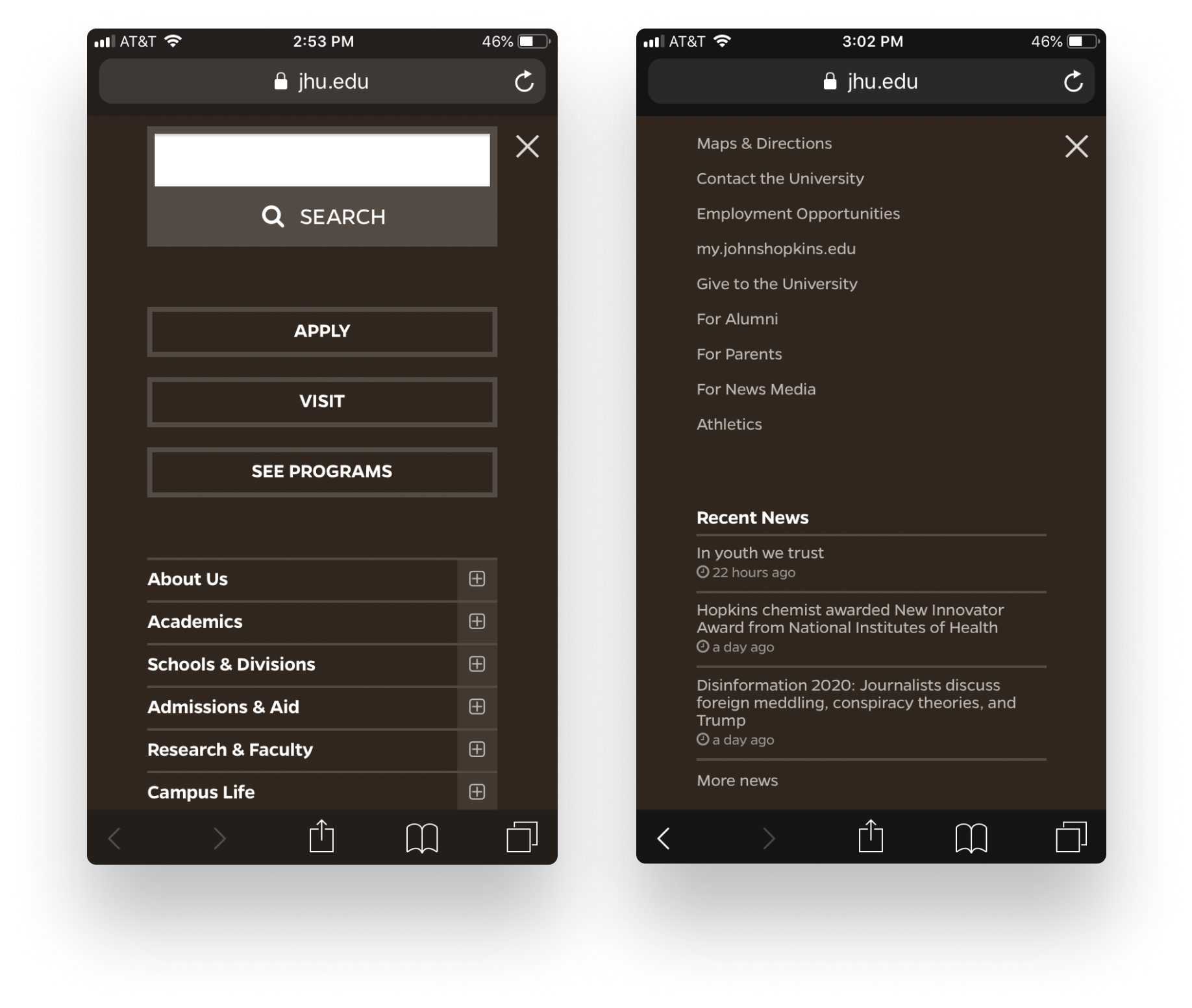
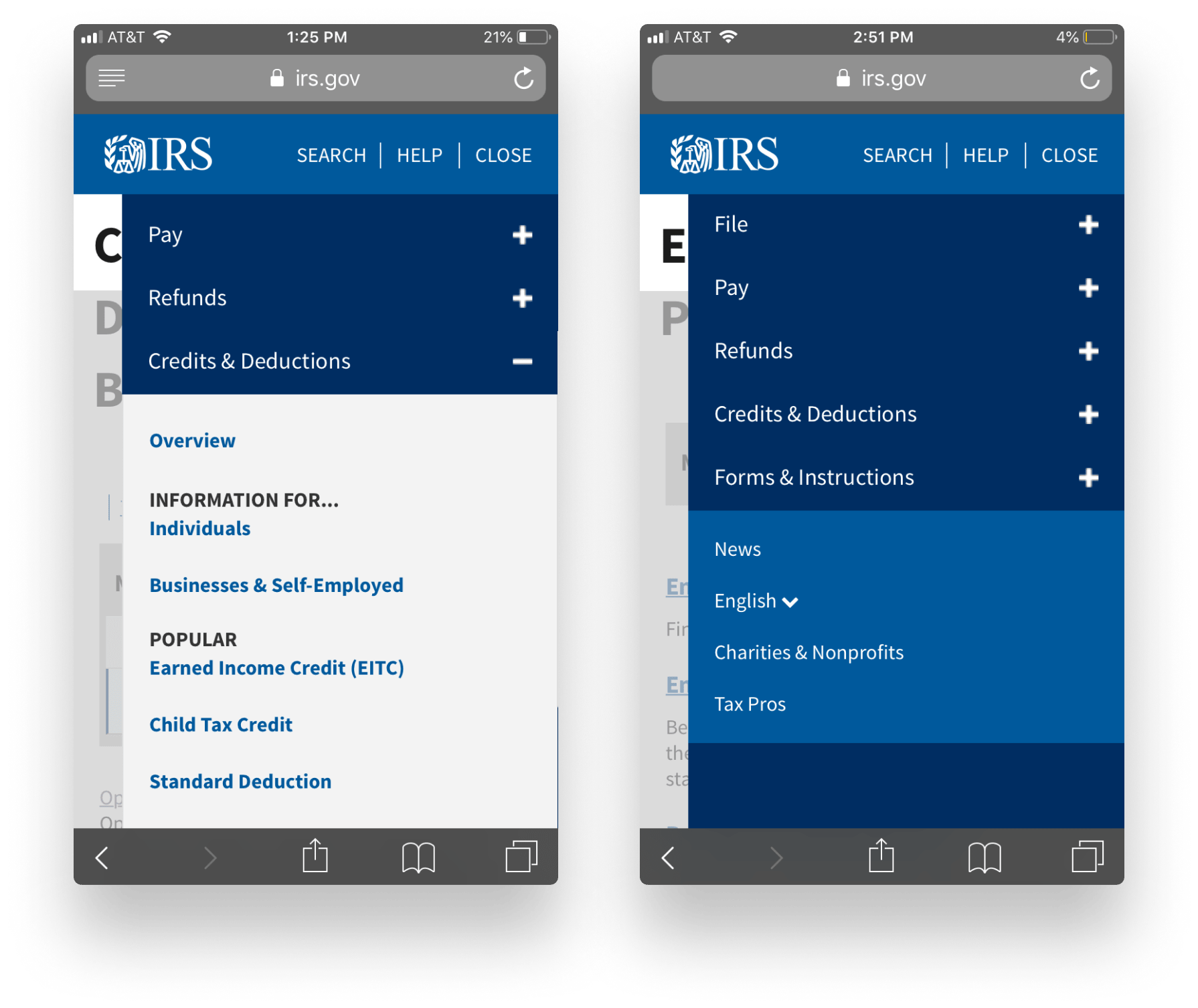
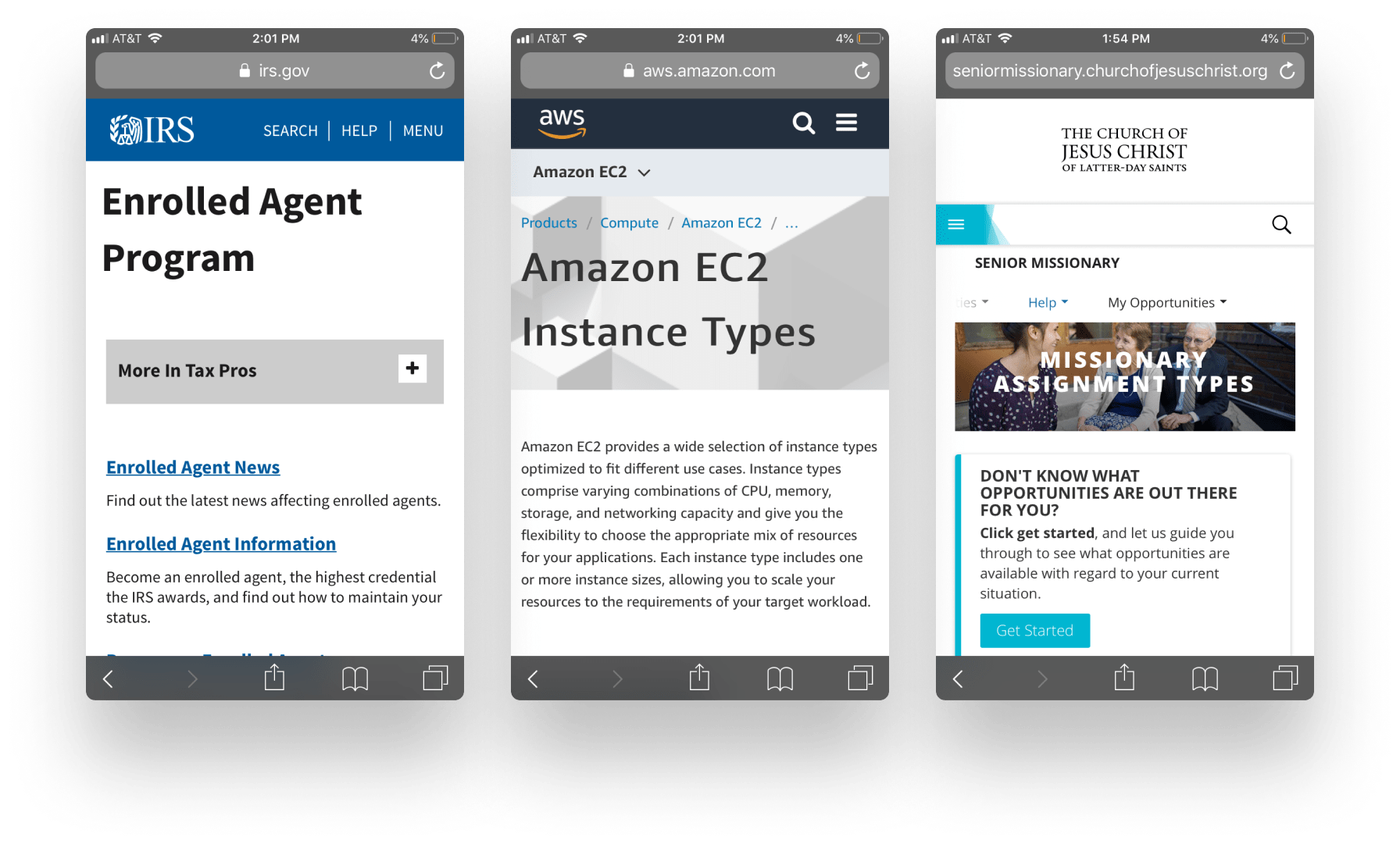
IRS.gov took this one step further. They not only visually distinguished their primary and secondary navigation, but they also added organizational headings into the menu to highlight audiences and popular content.
Takeaway
Use visual hierarchy to distinguish primary navigation, secondary navigation, and calls to action in mobile menus. Consider breaking up lists of links in menus with headings.
Submenus
Enable users to open and close menu folders to preview second-level pages and third-level pages in more than one section at a time. Build a robust main menu rather than creating an additional section menu.
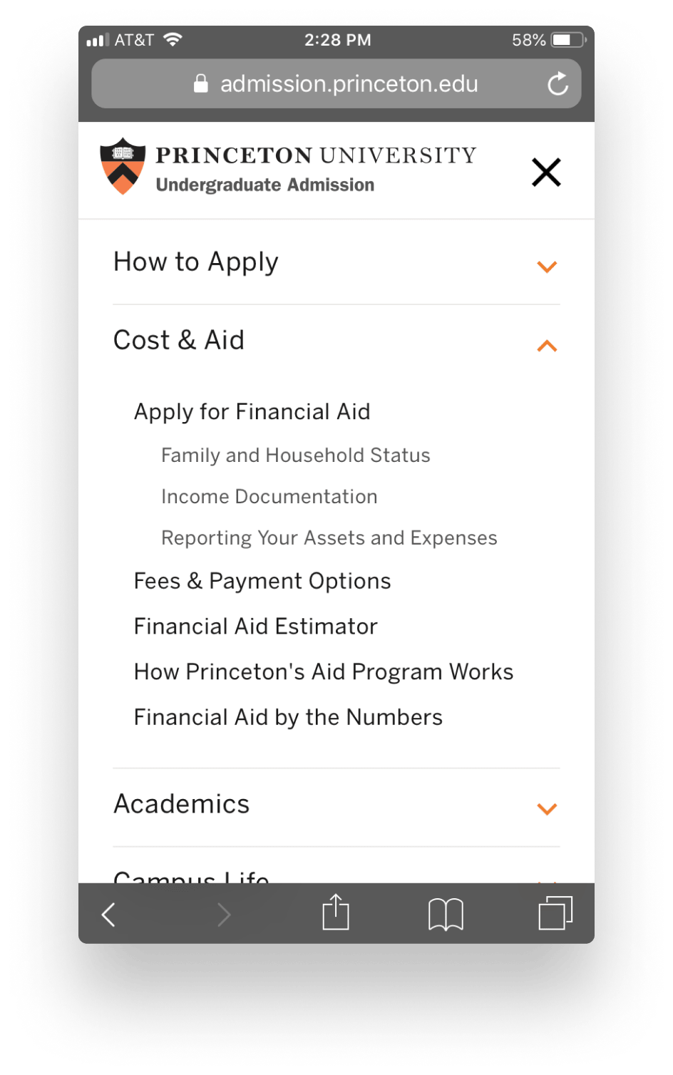
All of the mobile navigations we selected as most usable had open/close buttons that enabled users to drill down to subpages.
During usability testing, nearly all of the testers opened more than one section of the navigation at a time to compare the subpages underneath each top-level item. When they weren’t sure where to look first, this helped them decide in which section they would most likely find what they were looking for.
One mobile navigation design even included the third-level of navigation in the menu. When visually designed well, this proved to be a good solution for deep sections.
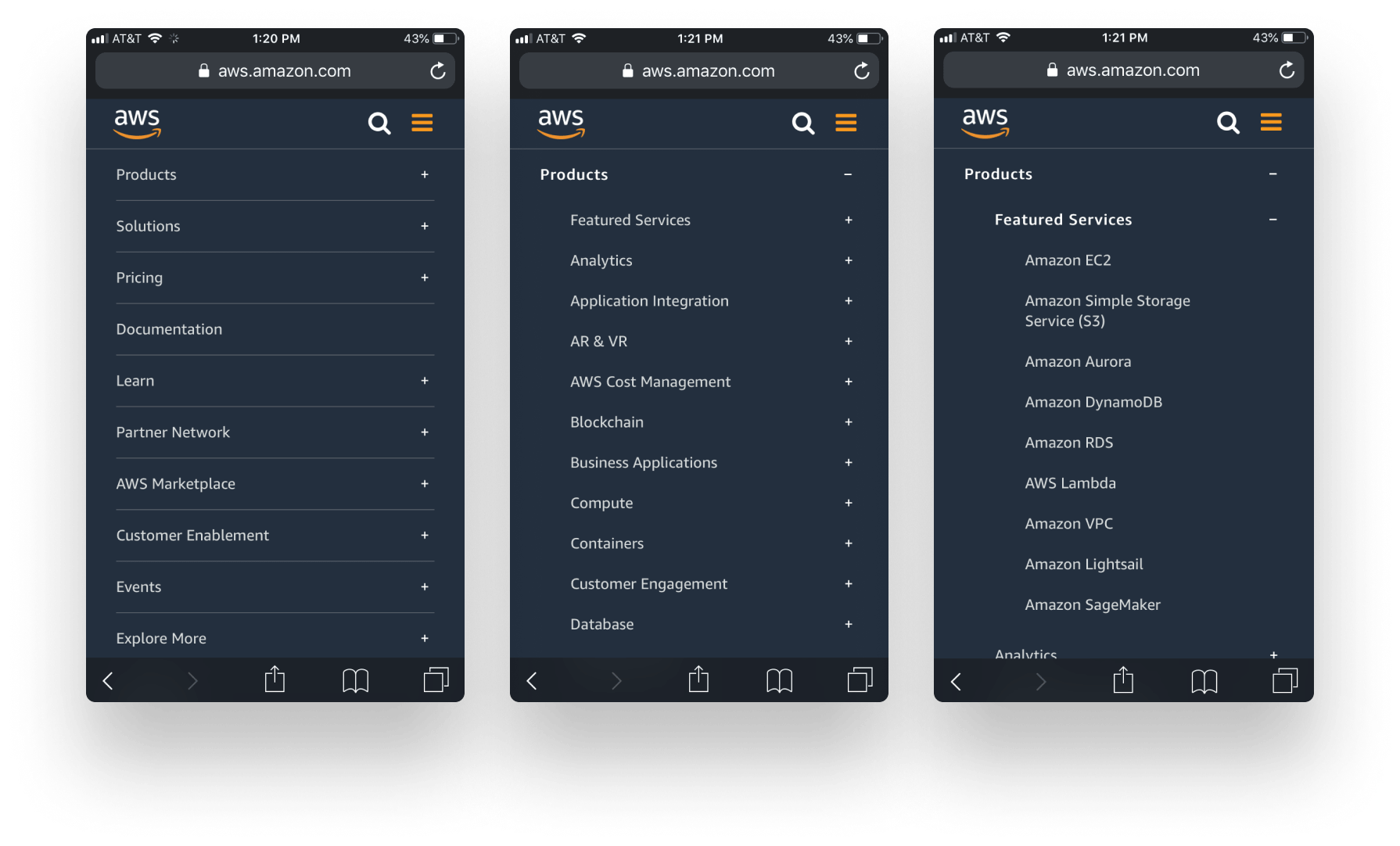
We noticed that websites like aws.amazon.com and salesforce.com also enabled users to drill into a third level in their navigation. On AWS, a user would open the menu, click Products, click Featured Services, then once they clicked a service like Amazon EC2, they would finally leave the menu to visit a page. This is different from the navigation pattern used by many of the higher education sites, where a page corresponds to each navigation item in the hierarchy. However, an AWS-style menu could be designed to both open a page (by clicking directly on the label) or open a folder (by clicking the plus sign).
Takeaway
Enable your users to drill down within the main menu to find the information they are looking for without having to dig through pages. Consider using expand/collapse sections that enable your users to have more than one section open at once for ease of comparison.
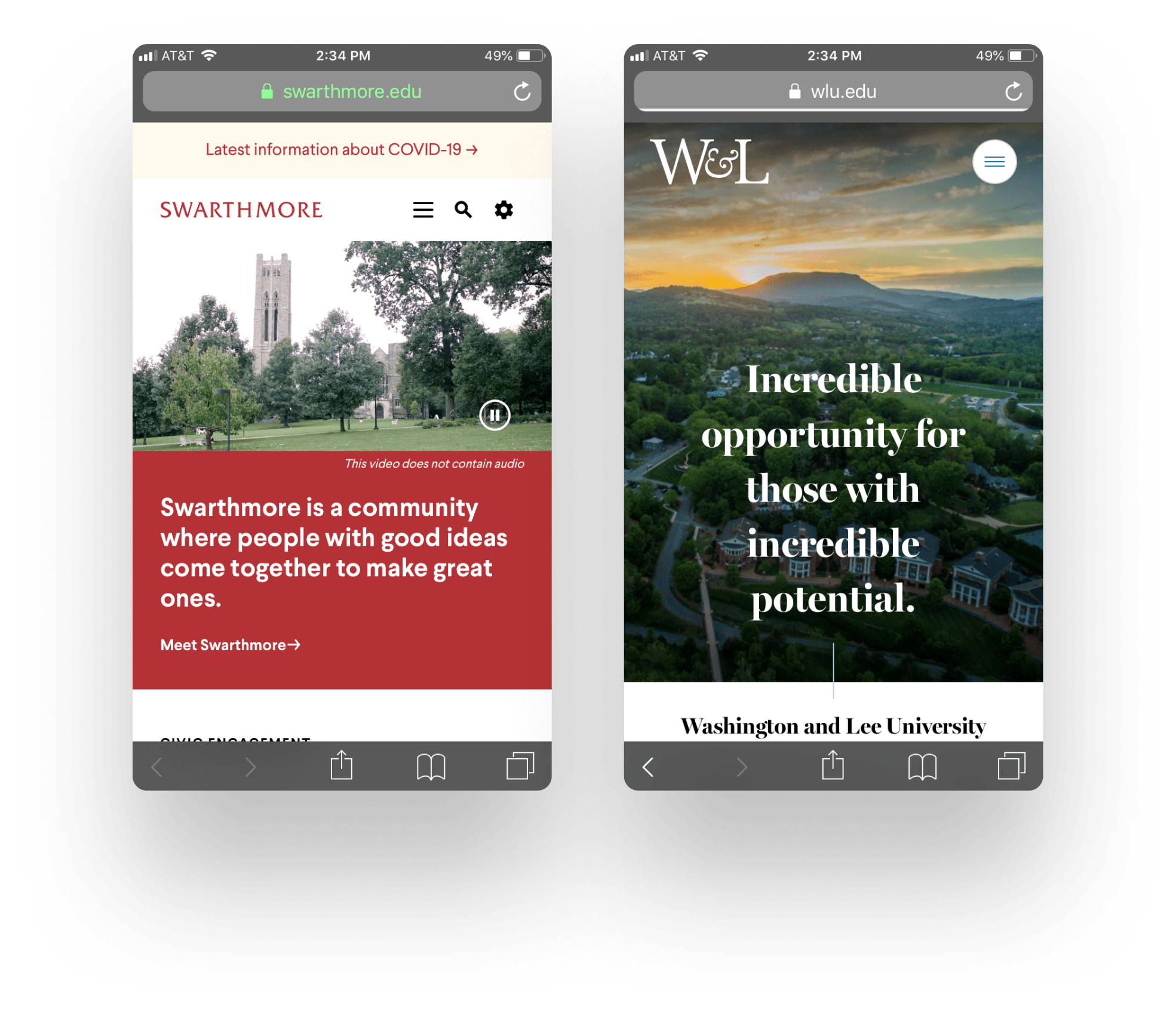
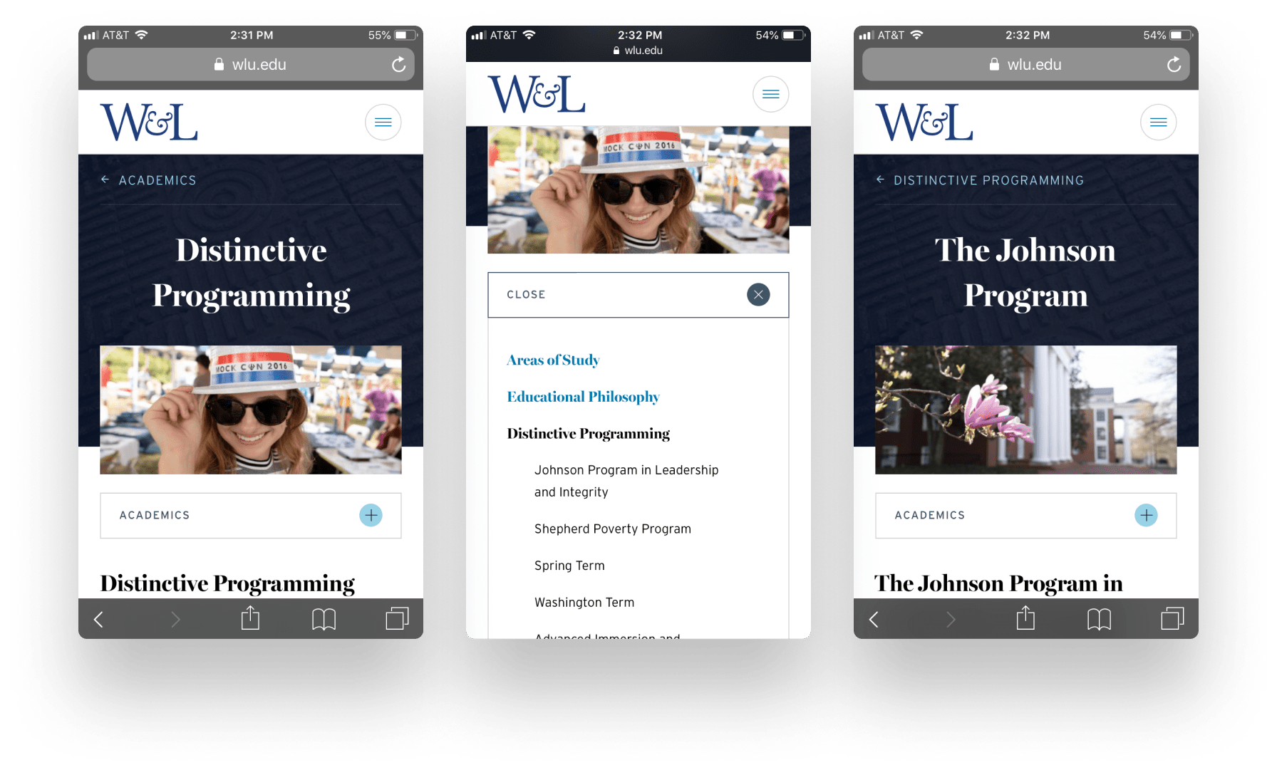
Two of the websites we tested had section navigation available in an on-page menu. This was used occasionally by the testers, although everyone gravitated toward the main menu most often. One website exposed sibling pages at the bottom of the page. Our usability testers did not engage with this style of navigation to find information, so we recommend avoiding a bottom placement.
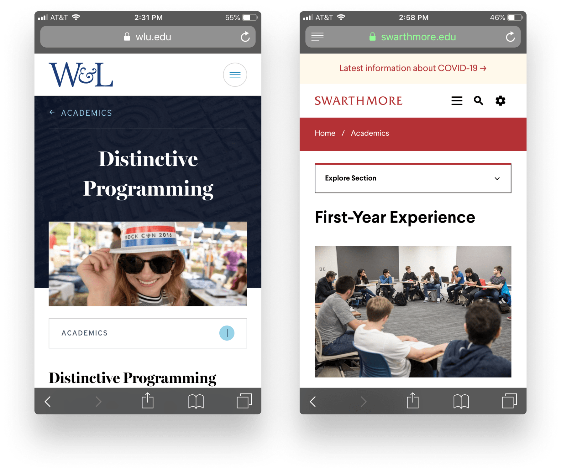
It’s possible that our usability testers skipped the section navigation because of the design. In the Swarthmore example above, the section navigation is above a photo, so users may have quickly scrolled past it to get to the content. In the example of W&L, the photo element may overwhelm the more subtle menu.
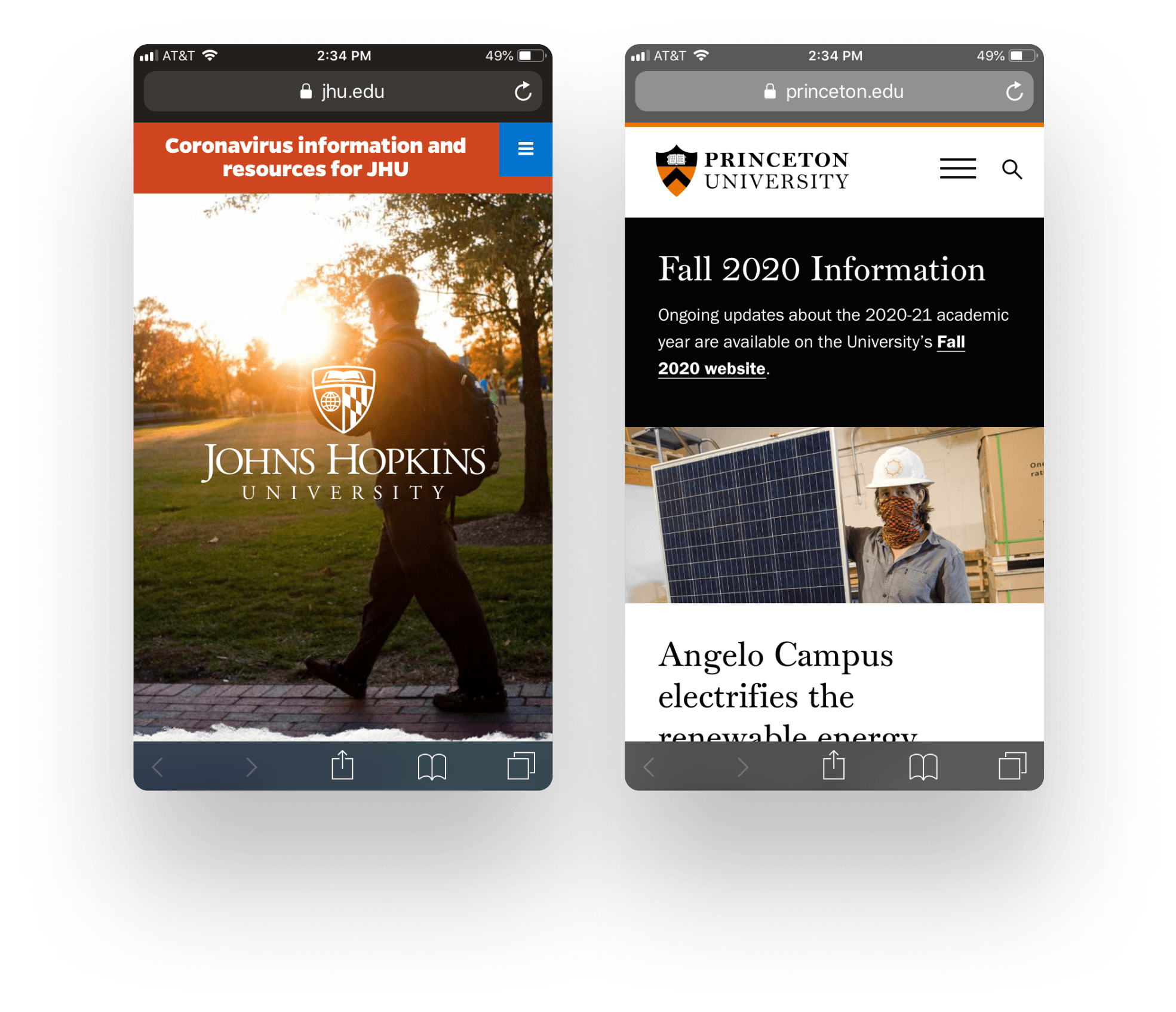
A few of the top US websites we evaluated treated their section navigation differently. For example, IRS.gov put the menu close to the content and is utilitarian in design. While AWS puts the navigation above the page title and above a visual treatment, the visual treatment is a background, not an image. Lastly, the LDS Church employs a different section navigation treatment entirely—they expose the submenu items in a slider, so there’s no question about what lies inside.
Takeaway
If you use section navigation, make sure it is noticeable, high on the screen, and close to the content so that users can find it when they need it.
You Are Here Indicators
Indicate the page the user is on when they open the main menu. Include breadcrumbs for increased clarity.
While page titles mostly matched the navigation labels, it became clear during usability testing that not all of our users realized what page they were on. Several times, our testers would not find what they were looking for, return to the menu, and select the same exact page or a page they had just visited, and they became frustrated.
Why was this happening? The users were experiencing lostness because of a lack of state. When they opened the menu, they had no context for the page they were already on—there was no indication of “you are here” relative to the other pages. This makes accidentally revisiting pages an inevitability. One school’s on-page submenu nearly solved this problem by indicating the top level section in the button, the page you were on in the list, and the child and sibling pages. This solution, extended to the main menu, would improve menu usability.
On the websites we evaluated, breadcrumbs were frequently present on the mobile view, though not always. Of course, including breadcrumb navigation is a well-known best practice for communicating where you are on a website and could be more widely used on mobile.
Takeaway
Always communicate the user’s location within the navigation with selected states and offer a fallback like breadcrumbs.
Navigating Between Websites
Use a global header or consistent header conventions across all subdomains and microsites to link back to the main site’s homepage. If the main navigation links to other websites that don’t follow the header convention, make sure the link is clearly indicated as an external link. It was all too common during both our internal evaluations and during the usability tests for the menu navigation to send users to a new website with no indication that this was about to happen. This was jarring for everyone, us included.
Some sites we evaluated would open these new sites in new tabs, which turned out to be bad form on mobile. Opening new tabs in the mobile context was both disconcerting when you noticed it happening and confusing later on to realize that you’ve inadvertently opened many windows or tabs.
While some sites used an offsite link indicator, it wasn’t entirely clear that our usability testers were familiar with the icon. And they were particularly confused when a typical-looking navigation item linked to an entirely new website.
Takeaway
If linking directly from the navigation menu to a different website, use an offsite indicator, a button treatment, or another indicator to set expectations.
In the best cases, our usability testers didn’t notice they’d changed websites at all. This was evident when they were always able to get back to the primary website by clicking a logo in the header.
When the header logo didn’t return them to the primary website’s homepage and instead went to the subsite’s homepage, they felt lost. Our testers would also try to click a logo in the footer (if there was one) to go home. When neither of these logos took them to the primary site’s homepage, most clicked the back button until they found their place again. And if the site opened in a new tab without them realizing, the back button trick would fail.
Takeaway
For best usability, always make sure a link to the primary website is available in the header of all secondary sites. Ensure that it is consistently located or uses the same design. Essentially, employ a global header on all sites.
Site Search
Optimize site search with alternate keywords that match the vernacular of your audience. Ensure that every page on your website has enough context to be the first page or the only page someone visits through search.
When all else fails, users can always find information using site search, right? On the websites our usability testers used, most of the site searches were clear afterthoughts for the organization.
The keywords the testers searched didn’t match the words that the website’s authors used. Remember, the testers were not yet in college, so the ins-and-outs of how departments are organized and lingo like “bursar” meant little to them. The same would be true of people who are navigating other large websites with their own internal languages, like hospital systems and government sites. Possibly for this reason, half of the Alexa websites we evaluated had an auto-suggest feature enabled for their keyword search.
Takeaway
When implementing site search, improve search results by incorporating keywords the audience would use in the content or the metadata and consider auto-suggest.
Worse, often the site search was not global across all web properties, so users would assume the organization didn’t have what they were looking for when they got zero results. Having a global site search also had its downsides. One usability tester who searched for information about applications found themselves on the graduate admissions site, not the undergraduate website. The page was sadly lacking clear context clues to help them realize their error.
Takeaway
Make sure that any page, when landed on via any search—site search or a Google search—provides appropriate context.
What Next?
An underperforming mobile navigation could be hurting your website. Most of our clients get at least half of their overall website traffic from mobile devices, and some of our clients have mobile traffic as high as 70-80%. If your website’s mobile navigation is poor, frustrated users will abandon your site and look elsewhere. They may think you don’t offer certain goods or services when you actually do, or they may perceive your organization negatively.
While many of the best practices listed above aren’t deal breakers for every user, combined, they contribute to a poor user experience on mobile. And some issues (like being unable to get back to the primary website from the header or an unhelpful site search) affect users on any device they use.
Over the course of our usability testing, we uncovered four additional user experience best practices for higher education websites. Read our findings for college and university website usability here.
If you’d like to discuss how usability evaluations can improve your website’s navigation, or perhaps if you’d like to redesign your mobile navigation for a better user experience, let’s talk.
Methodology
Usability Evaluation
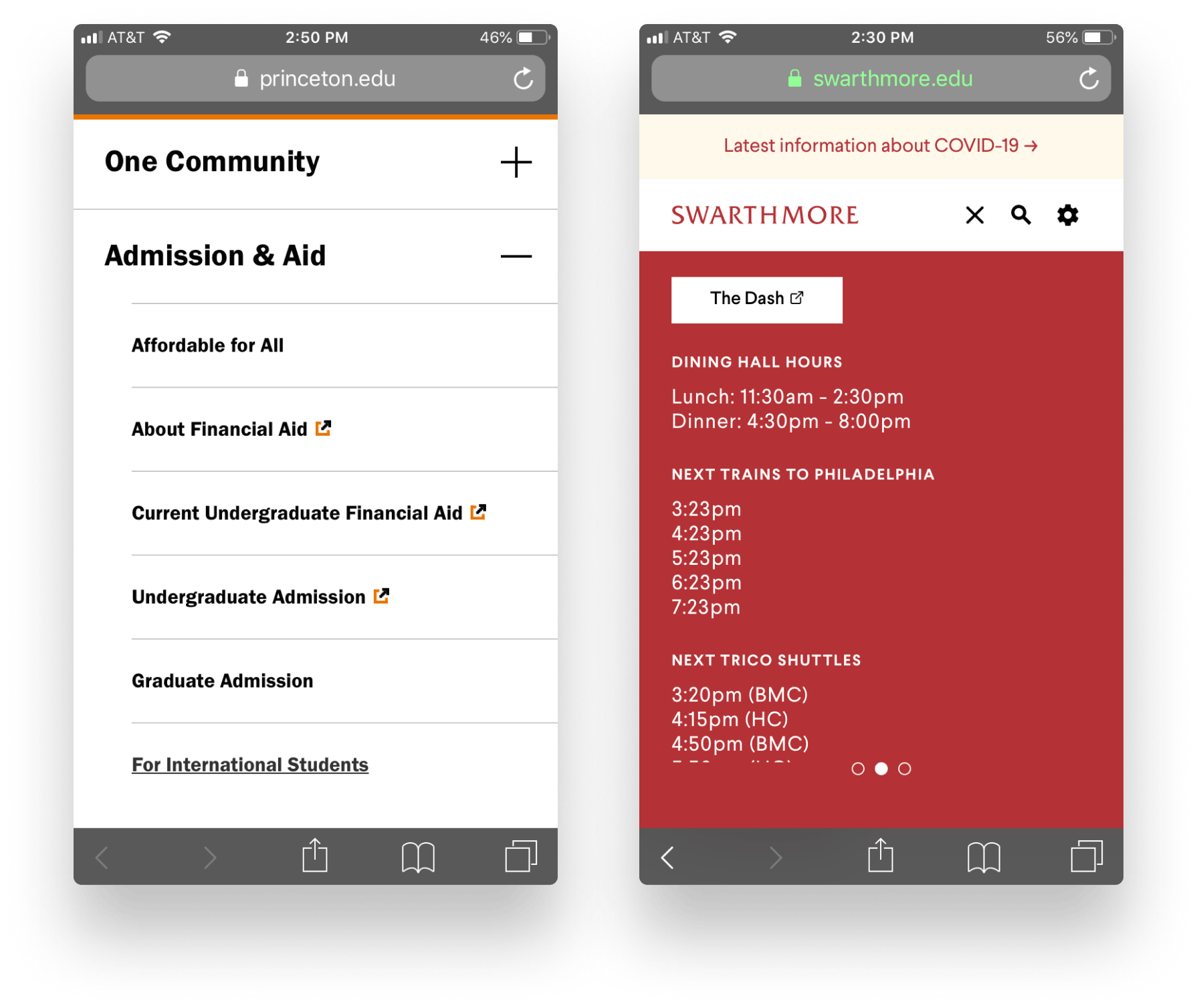
We examined the first 15 universities and the first 15 liberal arts colleges from US News’ Best Colleges Rankings for 2020 as reported by Wikipedia.
| 2020 Top National Universities | 2020 Top Liberal Arts Colleges |
|---|---|
| Princeton University | Williams College |
| Harvard University | Amherst College |
| Columbia University | Swarthmore College |
| Massachusetts Institute of Technology | Wellesley College |
| Yale University | Bowdoin College |
| Stanford University | Carleton College |
| University of Chicago | Middlebury College |
| University of Pennsylvania | Pomona College |
| Northwestern University | Claremont McKenna College |
| Duke University | Davidson College |
| John Hopkins University | Grinnell College |
| California Institute of Technology | Haverford College |
| Dartmouth College | Smith College |
| Brown University | Vassar College |
| Vanderbilt University | Washington and Lee University |
We documented the mobile navigation pattern (inclusive of how the second and third level of pages were represented in the navigation), if sticky elements were used, if breadcrumbs were present, and so forth. Then each evaluator attempted some common tasks, like finding an undergraduate major, finding a master’s degree, finding the undergraduate application, making a donation to the alumni fund, and so on. Each task was ranked on a five point scale, and each website received an overall score.
Usability Testing
The evaluator group looked at the top scoring websites and chose two national universities and two liberals arts colleges that had different or novel navigation schemes to test via moderated usability testing using think-aloud protocol. We tested these four websites with 9 college-bound students entering their junior or senior year of high school or their first year of college as well as one student entering her second year of college.
Each participant tested two websites: either two university sites or two liberal arts college websites. The websites tested were Princeton,Johns Hopkins, Swarthmore, and Washington & Lee. The order of the websites tested was alternated as was the order of questions. Sessions were conducted using Zoom screen sharing and the participants’ mobile devices.
Our tasks and questions focused on the following key areas:
- On subpages, is sub-navigation noticeable and actionable?
- Do users notice and use the primary navigation to get around, or do they use on-page links? Is there a pattern?
- If users are taken to a new site, do users keep their context, and are they able to find their way back?
- Do the labels use language that makes sense to users?
- Do the labels create appropriate expectations?
- Do information groupings make sense to users?
Evaluation of Findings against Top US Sites
We evaluated 10 content-rich websites from Alexa’s list of top 500 websites in the United States.
- NIH.gov
- IRS.gov
- ChurchofJesusChrist.org
- KaiserPermanente.org
- MayoClinic.org
- CapitalOne.com
- AmazonAWS.com
- Salesforce.com
- Paypal.com
- UPS.com
We documented the mobile navigation pattern based on the same list we used for the higher education websites, and then we examined their navigations against the guiding principles we defined from our usability study of college and university sites. We noted improvements that could be beneficial to users or solve problems uncovered in usability testing.
Credits
Analysis: Julie Young and Naomi Leak
Heuristic evaluators: Merani Cosme, Naomi Leak, Jeremy Loyd, Ethan Muller, Andrew Spencer, Heather Taylor, Julie Young, Philip Zastrow
Usability testing moderators: Merani Cosme, Naomi Leak, Jeremy Loyd, Andrew Spencer, Heather Taylor, Julie Young
Usability testing notetakers: Erin Blad and Catherine Meade
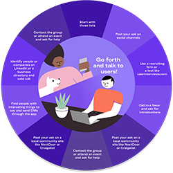
User Research Toolkit
Sometimes the biggest barrier to user research is finding real users. We’re here to help! This toolkit streamlines the process of finding users, contacting them, and tracking your wins. Start Finding Users